The Kid And The Mud by Rolly 2024-04-22T05:55:52Z ♥ 1
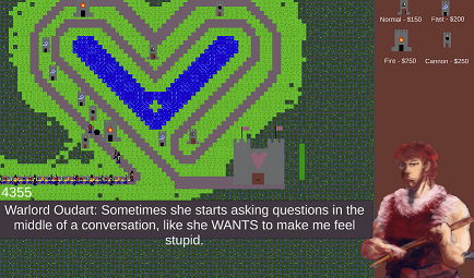
Controller support and voice acting in a Compo entry? Colour me impressed.
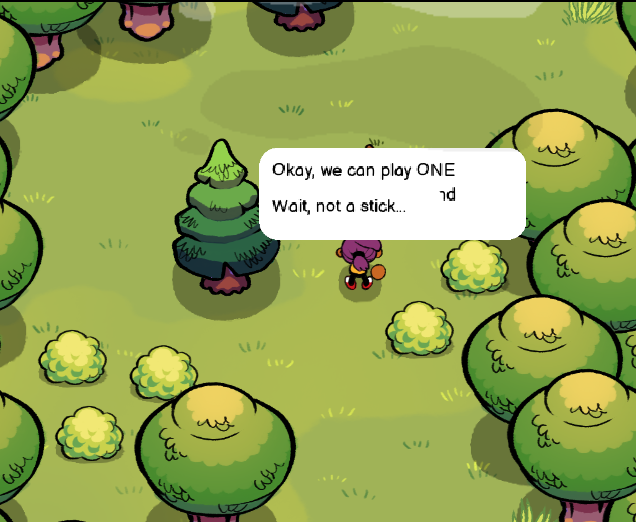
I almost gave up after the first cutscene as I tried to interact with the stone using keyboard and controller. It would have been a lot more clear if the instructions in-game were to "Press and hold", which is what the game wants for the stones - "press" alone indicates a quick hit of the button and releasing immediately. I only learned this from skimming through the comments.
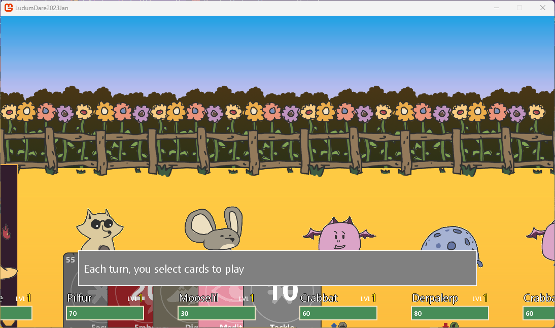
I think this entry is really strong gameplay-wise. I love the idea of summoning enemies to fend off villagers and trying to find the next stone in the process. Using key combinations to summon the enemies was fantastic, though I wish the controls were set up a little differently. I feel like I failed too many of these combinations because I was trying to press some keys while having to press and hold the shoulder buttons and I really wish the controls for flipping through the summons were just pressing the L1 button not pressing and holding. Then you could have another button just to quit while on the summon screen if needed.
The area also felt a bit barebones and I wish there were some additional background elements to give a better sense of moving through an arena rather than travelling through an empty void. I really liked the little pixel art characters.
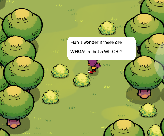
The audio was also very strong - there's good delivery in the voice acting that helps to get the humourous lines across. I like nonchalant delivery when there's a game over; that was pretty hilarious. The music was pretty on point in helping to set the mood and complementing the narrative. I like the story and I think it would have been cool if the mud were more connected to the summoning rather than being incidental - like if the kid, while digging through the mud, accidentally dug up a special item that caused a bunch of stones to summon and then the gameplay goes from there. But as it is, I enjoyed this entry overall - for the timeframe you were given, it's got a lot of charm and fun.


LD59 — Signal (5)
Captain Distress by HexStart 2026-04-27T08:07:42Z ♥ 1
(comment 1/2)
There was one thing that drew me into checking this game out: the colour purple. And even though what piqued my interest was something very shallow, I'm glad I checked this one out. I played the Hotfix build.
It might be strange, but what stood out to me most about this game is the UI. The text was very clean and easy to read, there were a lot of good indicators for the planets and their distances from where the player is at, along with the previous distance. If I had to nitpick one thing, I would have liked to see bold text applied to the yellow for the distress beacon messages. With yellow and white having a lower contrast ratio to one another, it would help players who may not be able to see low contrast as well to distinguish the emphasized text in another matter that is not just colour.
I appreciate the elaborate settings menu. I found I didn't have to mess with it too much, but I'm glad it was there.
Fun
The controls were simple and easy to understand, which made it easy to focus on building up the skill of the actual gameplay. During my gameplay, I was curious if fuel was going to cost extra for going longer distances, but that didn't seem to be the case. However, it made sense from a gameplay standpoint since the limited placement of the fuel station and funds balances out the difficulty. It was easy to want to replay this multiple times to discover the names of the planets and their appearances. I even threw a couple of times just to go to super far distances to see what other planets were out there. I also enjoyed the puzzle aspect of the gameplay, figuring out from the message clues and the distances to pinpoint the location of these ships to be rescued.
Captain Distress screenshot 03.png
Innovation
A puzzle game where you have to manage your own limited resources seems pretty straightforward, however, I do like that this entry is not so much focused on the journey between the planets and treats it more like a tactical turn-based sort of game.
Theme
A game about responding to signals fits the theme just fine for me. I do like that in the game over, you end up being the one having to send out signals yourself, which does give this feeling of continuity to retries where the distress signals you're responding to feel as though they are a previous player's "attempts".
Graphics
The game has a nice colour palette. I like the appearance of many of the planets and the details on the ship. If there's one thing I would have liked to see, graphics-wise, it would be animations. I don't think it needs to be flashy or anything, but it would have been nice to see some lights on the ship, maybe some tints on certain planets - some smaller animations to make the game feel a little more immersive.
Stargazer by plutonicrock 2026-04-27T05:13:09Z ♥ 0
(comment 1/2)
I was interested in playing this game upon seeing a preview of the graphics and learning that the gameplay centred around discovery through audio. The visual style definitely delivered, but the audio was a bit hit-or-miss in terms of its execution. The gameplay was also difficult to understand, but reading through some of the previous comments, I understand that this was more a result of not having the full extent of the jam to work on the game. In the end, I think you delivered something playable that works, albeit confusingly - but still a good setup to work with and expand upon for the future.
Fun
The gameplay was difficult for me to understand within the context of the game and its description - particularly when it came to the attuning. The telescope searching part of the gameplay worked quite well, and it was fun and satisfying to come across a planet with the limited scope of vision. The planets seem to have thoughtful names and appearances, from what I've seen thus far.
When it comes to the tuning, the biggest problem I had was that the knob-tuning was very tedious. Having to click each time to move the knob a notch clockwise just didn't work with not knowing what exactly the knobs do. In a game about tuning, I would have liked to have the knobs behave a little more like a dial. I think the incremental knobs could have worked if the audio feedback in response to those settings were more obvious, as the challenge would then be to not "overtune". But in this current setting, it's difficult to have these hard-to-manage controls without giving the player more direction as to what they are supposed to be playing for.
The page description mentions "static", but I only heard static in one of the planets out of the 4 I came across (the purple one with the eye, to be exact). The other 3 planets didn't seem to have any static, so I had no idea what I was tuning or affecting. I'm not sure what the intention here was supposed to be, but my intuition was that the two knobs maybe control two frequencies or maybe the panning. It also seemed like the audio itself was fading in and out of the static itself, so it wasn't really clear what was from the music itself vs. the audio in response to the dials being turned.
Stargazer screenshot 01.png
I love the idea of searching for particular planets to create unique combinations of poems. I didn't have a chance to explore all the planets, but I like that this game incentivizes multiple replays.
Innovation
Using audio itself and tuning as the "signal" to find the other planets was a super neat idea, and I think it's distinct from the other entries I've played and seen thus far. That plus the overall aesthetic and gameplay makes this entry stand out - particularly the idea of using the planets as "songs" and building off of that.
Theme
Two things stand out to me in regards to this entry's use of the theme: the "signal" of the audio cues when searching for planets and the signal calling out to the planets to attune them. Both elements are relatively clear, even if the signal is not noticeably visual - I think this was an interesting use of the theme that I think has a lot of potential within the game to be worked with and expanded upon.
I Contact by gamebuilder 2026-04-24T07:21:37Z ♥ 4
(comment 1/2)
Wow. I had some difficulty figuring out what to do at first, but it was fairly easy to pick up where I left off at a game over. However, I do wish there was a restart button within the game itself. If there was one, I couldn't figure it out - I tried spacebar and the arrow keys but no response and had to manually refresh my browser every time. Thankfully, the game loads pretty fast so it wasn't the end of the world.
Some of the navigation seemed wonky (it was possible to go back to the overworld within the TV world, which I don't know if that was supposed to happen).
Fun
I found this game engaging enough to want to try and figure out the clue. I eventually did win, but I really overthought the "clue" that was mentioned in the previous comments. Here was my thought process hunting for clues:
!>1. Looking at the flowers !>2. Looking at the shapes (triangles, circles) !>3. Looking at the tree on the far left - maybe branching paths, what does the bird represent? !>4. Observing which areas had the minions in the main area before the TV.
!>Then I looked at the channel and thought "oh, it's the children and when they appear on the TV". I thought maybe it was by the order of the screens - the third channel change had a child, so I thought it would be after the 3rd screen. But it also seemed that the children on TV resemble the children in the TV world. I wasn't 100% sure which is the actual clue, but I knew it had something to do with the kiddos.
I Contact screenshot 02.png
Innovation
I found the aesthetic of the game to be very distinct, and I love the concept of being in this mysterious sort of land going into the static-y TV.
In a longer-form version of this game, I would be interested to see an alternation between going into the "real" world vs. the TV world, rather than just having one section with finding all the kids and a simple puzzle just to get into the house with a ton of backtracking. There's a lot of great setup here to expand on further.
Theme
I didn't really feel the theme in the gameplay but rather the concept itself. The changing of the channels, what they represent - I suppose that was the most I got in terms of the theme integration. It's definitely not a bad thing - it didn't necessarily scream "signal" to me, but I do see where the theme was used when thinking of the game as a whole.
Graphics
Using coloured pencils and paints to create your game graphics is a power move. At times, it felt a bit like a collage with the pencil-coloured flowers, minions and protagonist. It was very strange, seeing the abstract with the traditional and the cut out photos, but I think that really helps play into the game's mood/atmosphere and gives a lot of opportunity to use the art narratively.
Perhaps the combination of graphical styles could represent the worlds sort of shifting gradually - maybe the whole real world starts as a traditional art style, but as you rescue the kids, things start to become more and more abstract (or could be the reverse of that).
Crashout by leenoi 2026-04-23T07:43:20Z ♥ 1
I'm glad to come across a game that approached the theme in a similar way to what my team did. I saw the traffic light on the thumbnail on the front page and was instantly curious. Overall, I like the structuring of the levels around days and gradually introducing newer gameplay/balancing mechanics and other elements. It was really well done especially given the compo timeframe. I love the way the traffic light in the menu responds when you hit Play.
I wish the game also mentioned that arrow keys were also valid controls in addition to WASD. I'm glad that there's dual support regardless.
Fun
At first, I found myself spamming the WASD keys to keep the lights red, but I like that the first day is very open to allow the player to get used to the controls before introducing the warning of the power usage. I found myself being quite on edge while playing, so I do think the gameplay was generally engaging in that sense, and it helped that it was easy to understand how to play and focus more on having to play well.
Was there a limit to the power usage? I didn't quite understand it as the game would show the total amount of times the lights were used and that accumulated through levels. The way the tutorial presented it made it seem like there was a power bank limit, but there was no UI showing what that limit was.
Innovation
I think the general presentation of the game is memorable enough, like there's a distinct enough style with the recorded audio.
Theme
As far as being direct to the theme, this is a game about controlling traffic signals, and I think it executes that well.
Graphics
The colour palette is cohesive, and I like the design of the roads and cars. I like the freehand drawn lines on the traffic lights. The cars have a nice little animation as they drive.
Audio
It sounded like the menu music was a live-recorded acoustic guitar, which I really enjoyed. I kind of wish there was in-game music, or at least some ambience like sfx for the cars driving on the road to fill the empty space left when there are no other actions occurring. It did sound like there was some sort of hum while there was supposedly no audio during gameplay, which was a little strange.
The crash sound felt a bit like a plastic bag being crinkled. Is that what it is? I struggled with coming up with a good crash sound effect and tried using a plastic bag and heavily processing it, but I couldn't get it to sound right.
I did only get up to day 3 and was having some trouble with timing those traffic lights for the ambulance - I might come back to this entry later to try it again. Personally, I think the siren sounds could be panned in the direction that the ambulance would be approaching from, since that sound appears to be the cue before the ambulance approaches - at least for the left and right directions. I even think with some dynamic changes, you could possibly imply top and bottom cues. In addition to the sfx, it would be nice to have some visual cues of where the ambulance will appear at the same time as the sfx plays - maybe some of the lights of the ambulance appearing on the side it's approaching briefly before it drives through.
Humor
Were the ambulance sounds your voice simulating a siren? I really like that; it's very funny. I did laugh out loud when I first heard the siren.
Mood
Things do feel a bit ominous without music during the gameplay. I guess if you really wanted to enhance the mood, some ambience could have been nice here, like road sounds. But I think for what was done in the timeframe, the mood is cohesive enough and no element of the game felt overly distracting or at odds with the other elements.
In Control by MelissaL 2026-04-23T05:33:51Z ♥ 1
(comment 1/2)
For a game that mentions being able to "explore freely", it felt more like an action-puzzle game where you have to activate the levers quickly and get to the next checkpoint/area before you run out of power. I think the general flow of the areas and the concept of the gameplay was solid, but I definitely had a lot of trouble getting into this one. I stopped just after the area with the long passage upward to the exit, which took about 20 minutes ish.
I appreciate that the game has controller support, though. I pulled out my gamepad for this one. I did notice that the "X" key on my Logitech (akin to an Xbox controller I think) was mapped to the Restart key, which made it too easy to accidentally restart.
Fun
After reading the description and controls, I found I had a lot of trouble figuring out what to do. The wall at the top at the beginning of the game did not seem to be a solid area, and I was trying to interact with the other objects that stood on the wall and kept dying. Eventually I did figure out that oh, you're supposed to hit the switches to progress.
I'm glad there were lots of checkpoints, because I found it was super easy to run out of power. I wish the game communicated this more clearly that there was a power level, and I'm not even sure if that's the case of those satellite signals around me were the cause of it. I think maybe some of the sound effects gave the implication that the controllable robot was dying, but there was nothing visually. I would have liked to see some kind of bar or a change in the character to show the passage from being at full power to death.
The puzzles were a bit on the simpler side, but I think it worked to the game's benefit having the time-based element to balance it out.
I also noticed that in later sections - the long vertical passageway up to the exit, for example - the respawning was super weird. The camera seemed to start from the left and then slowly pan to the right while the player actually had that window of time to control the robot and would lose time the moment the camera finished panning to that checkpoint. I also had some issues with respawning when I first played, where if I passed one of the earlier checkpoints (I think 2nd or 3rd) and died, it respawned me back at the very first, but my character was not present in the area and I had to completely refresh.
Innovation
The main distinctive element I could think of from the game was the the addition of the little barrier robot that you had to go up to in order to interact with it and chase it away. The sound effect choices for it were kind of silly. Other than that, it did seem like a somewhat standard puzzle game, albeit with a pressure element to make the player execute the correct actions quickly.
On a tangent, I found that the signs mentioned the H key needed to be pressed to chase away the barrier robot, but there is nothing mapped to the gamepad I was using that seemed to trigger it. I pressed every button I could think of, but none of them seemed to be the equivalent of the H key. So whenever the barrier robot came up, I would have to put down my controller and hit the H key.
Theme
At first, I thought the robot was being powered by the green intermittent satellite signals, but this did not seem to factor into the gameplay at all? I might have missed this, because it just seemed to be time-based. I did see the theme in the sense that you have to interact with these levers and they "signal" to trigger other elements in order to progress, though I'm not certain if this was the intention of integrating the theme.
Graphics
I like the details in the background tiled elements, and the green signal waves stand out. The robot seems a bit stocky, which is an interesting design.