Foon → Ludum Dare Explorer → LD46 → Feedback comment stats → Antti Haavikko
Feedback comments for LD46
Antti Haavikko's games and stats for all events →
| Timestamp | Since previous | Game | Antti Haavikko's comment | |
|---|---|---|---|---|
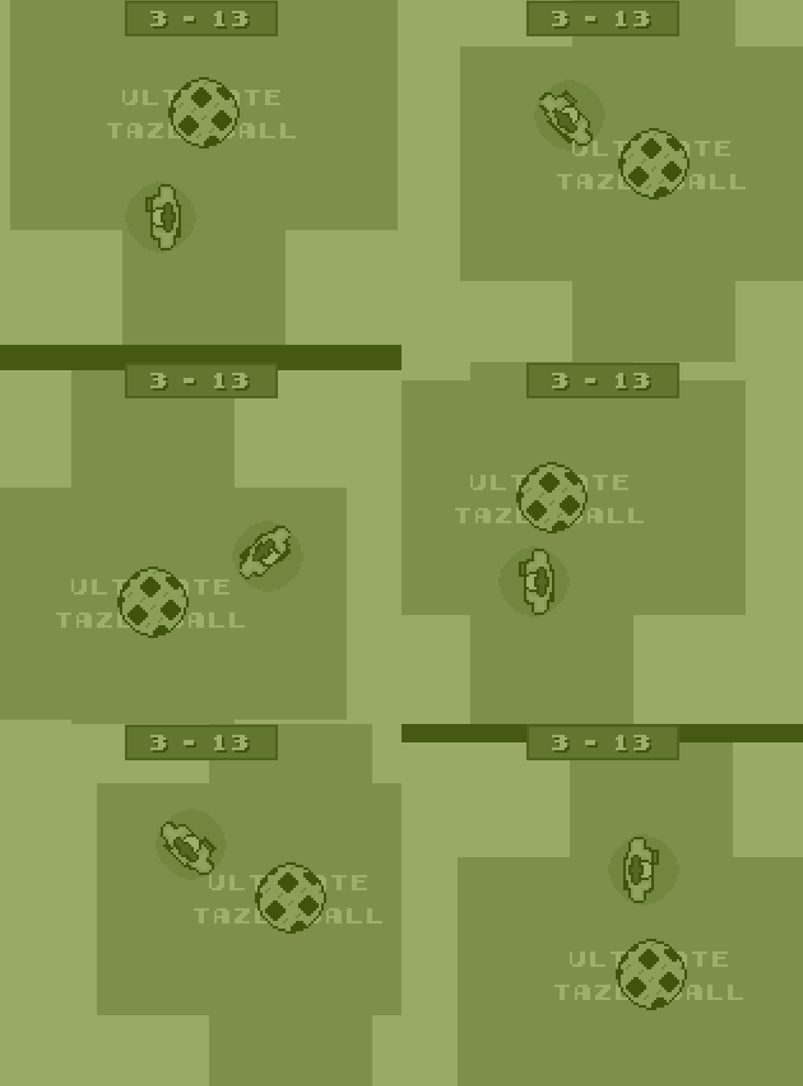
| Apr 21 12:28:17 | Leif Kellenberger's Tazing Challenge | ♥ 2 | So this is pretty much a win right? taser.gif Quite funny one. I'm guessing the whole Blades of Steel / Double Dribble speech was an intentional nod. Could have been even more bit crushed though. And even the cardiac arrest thing reminded me of Blades of Steel where the one actually losing the fight got kicked out of the game. Then to the downsides. The gameplay was very limited because the camera was so zoomed in. Because of that, character switching was completely pointless because either you had to ball or had no clue what was going on. Even though the cardiac arrest thing was fun and all, it got old quite quick and waiting for that "cutscene" got less fun every time it happened again. Controls were a bit clunky. Especially when trying to walk diagonally, it just didn't seem to co-operate at all. I still have no idea what the shoot power meter thing was. Didn't seem to do much. Aiming the taser was nigh impossible, luckily my team mates were as good using it as my opponents so I just had to focus on doing goals. And it wasn't even clear which was which goal. Had to let the opponent score first to see which way I should be scoring to. The intro was quite confusing. It's 2015 (future) now and in three years so 2014 something something. I mean, WHAT? 🤔 Anyways, good job! 👍 | |
| Apr 21 12:55:23 | 27m 06s | HEART LORDS | ♥ 0 | Awesome style, really liked the visuals. Even the UI looked cool which isn't that common to see on jam games. Audio worked too. Controls felt very clunky. Even more so because I played with a macbook touchpad so blocking was devilishly difficult. Well, even attacking and aiming but these were really my own faults more than the game's. The walking speed was waaaaay too slow and and I think you had this bug where the diagonal movement speed was faster. If you just plot down the input x and y to a vector, you end up like that. Pretty basic maths here, sqrt(1x1 + 1x1) is not 1. The enemies had too much health too. Those two things combined made the game feel very slow for a action packed game it could have been. Also did not see any use for the double slash at all and it was weird that one slash couldn't hit multiple enemies. Well of course major part of this clunkiness came for the lack of real mouse, I do understand that, but in my opinion it would have worked better as a twin stick shooter anyway. The dash was quite fun but the cooldown was so quick that it would have been pretty much the equal as having movement speed be faster. Just requiring less key presses for the same effect. And lastly a very minor nitpick, it was quite hard to see/hear the difference between a hit and when it was blocked. Resulting in wasted time on a blocking enemy when could have been focusing elsewhere. Anyways, very nice job! 👍 |
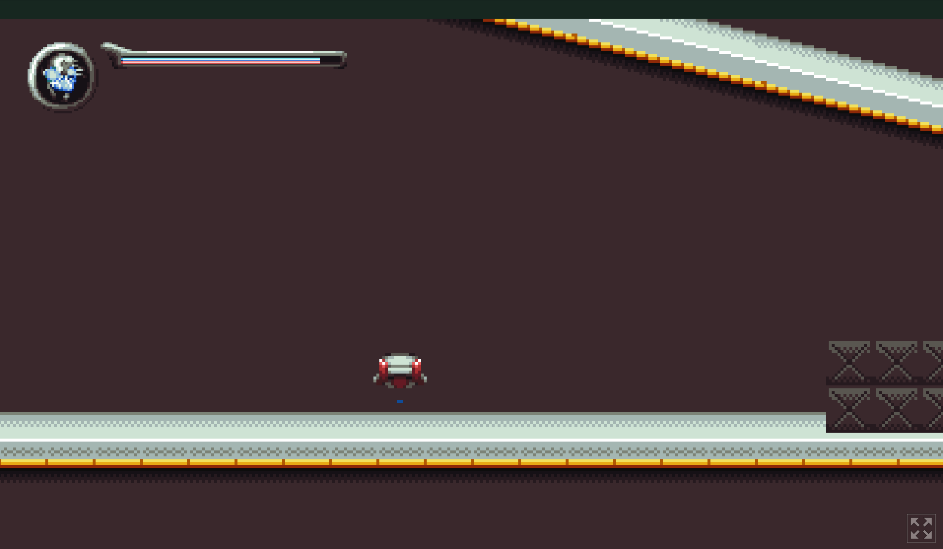
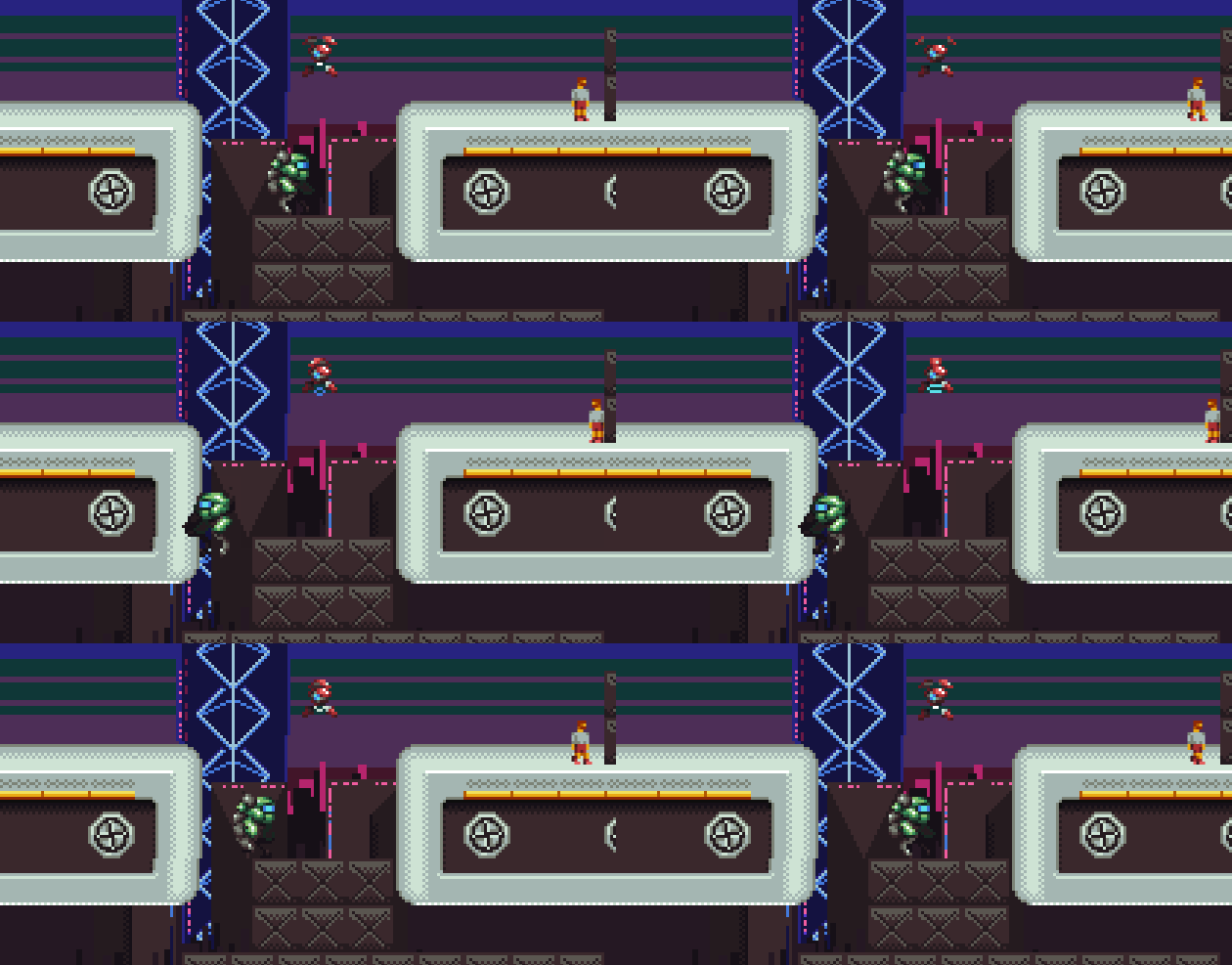
| Apr 21 13:25:45 | 30m 22s | Mumei | ♥ 4 | So you forgot to put a wall here and that was the last straw for me. I already saw the whole map and I'm thinking the goal is to get all those hp upgrade thingies. Just can't be bothered anymore. mumeinowall.png Music was very nice. Sounds effects were not that amazing. Very boring and monotonous. Even the bfxr'y chippy bleeps and bloops can be made more varied and lively. And there were a bunch of things where the sound effect was missing completely. And the jump sound played on button press, not the actual jump. Pixel art was crispy and nice and the animations were quite smooth too. The background had these weird flashing lines sometimes, I'm guessing that wasn't intentional. So whats up with this? 🤔 mumei.gif I'm not the biggest fan of over hand holding but some direction of what to do would have been nice. And just wasting the players time is never fun. You did this on multiple occasions. Those breakable things, having even multiple layers of them and them taking a million hits to get destroyed. Not fun. And even requiring to keep mashing the shooting button instead of letting the player just hold it down. Another thing that isn't really fun is blind drops to either instant death or sometimes the actual way to proceed. Speaking of controls, something weird happened on my first try. Nothing did anything. Well except for I noticed that mouse click shot too. Arrows did nothing and neither did z or space. Dunno if that is a godot thing or something weird you did. Would have been fun if jumping on the soldiers would have killed them too. I mean, would have made sense too, a big mech standing on a dude wasn't. Also would have been nice to be able to kill the tanks (even though they didn't really pose a threat, just like pretty much everything in this game expect for instant death spikes). And giving feedback to user with sound and effects whether they're actually damaging something or not. Kinda like how you did with those dark boxes. Anyways, good job! I seem to have really pretty much just pointed out "negative" things but it was fun game! 👍 |
| Apr 22 12:58:46 | 23h 33m | Type it alive | ♥ 1 | Reached round 10, guess I should be proud... Would have been a lot more fun if it was real words that I was writing. It did seem to have these constant same strings so might have as well replaced them with some fun words or even sentences. Also was quite confusing when the letters disappeared and more appeared on the other side. Would have been better o see the whole string at once and maybe color the portion that is already written differently or something. Messed up quite a few times because of that. Any particular reason you only had letters from the top two rows of a qwerty keyboard? Also another thing that made it a bit awkward was he constant need to swap between arrow keys and writing mode. Could probably just remove the whole moving portion and detect the building I'm writing for from the prompt. The different building types didn't seem to matter much. It seems to be quite balanced so that everything needs to be kept there to succeed. Also the space pressing requirement was completely pointless. You even stopped requiring it when upgrading, why the need on initial build? Sound would have been a great addition. Having an audio feedback on misspells etc would have made it easier to notice. Of course that could have used better visual cue too, maybe something like blinking red. Anyways, good job! |
| Apr 22 13:28:31 | 29m 45s | Keep our planet alive | ♥ 1 | First of all, not a great control scheme for playing on a touchpad. On mac at least where right click is just clicking on the touchpad with two fingers. Sure I'm stubbornly gimping myself but adding alternative control methods like doing the rotation with some two buttons would have only taken seconds. Of course it didn't really require that much dexterity and playing was still very much possible but could have been better too. 160.png The visual style was neat, even though there wasn't that much of it. I would have wanted to se a bit more oomph on those asteroid explosions. Didn't feel satisfying enough for me. The music was nice and relaxing. Made the game feel nicely moody. Sound effects (or singular sound effect to be more precise) was not that great. It was super clicky and just felt off putting. Being the only sound, it got super repetitive too. I mean, if your game only has a single action and a single outcome for that action, you better make it feel nice and rewarding somehow. Then the gameplay. It was way too slow. It was like, I don't even know, five minutes of mind numbing panning around and clicking on an asteroid every now and then (which could have all been a bit bigger too) and then pretty much suddenly out of nowhere getting out of hand. Felt like there was no middle ground, it was either borderline boredom or just too much (for touchpad at least). And the super slow start makes it very discouraging to try again. The game could actually start at around that "too much to handle" point and stretch it a bit wider. Of course this isn't that straight forward since not all players are the same. But yeeeah, good job! 👍 |
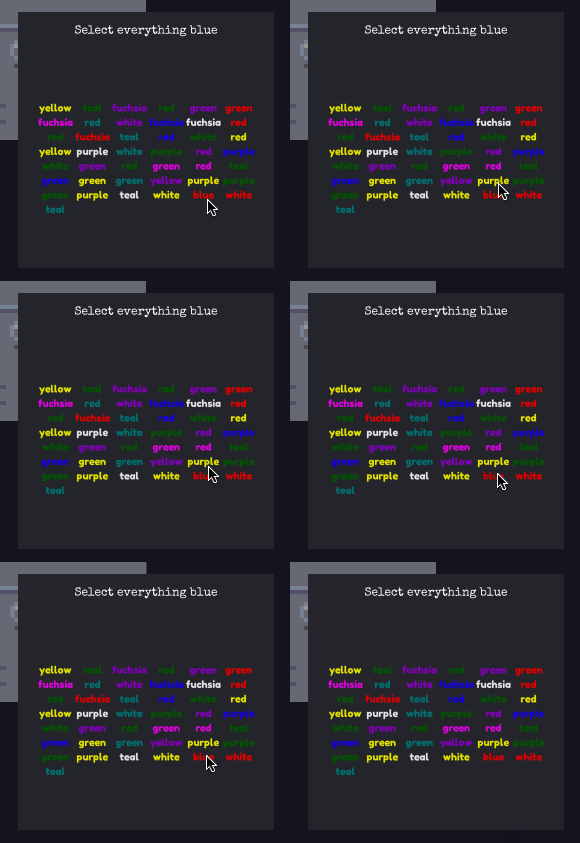
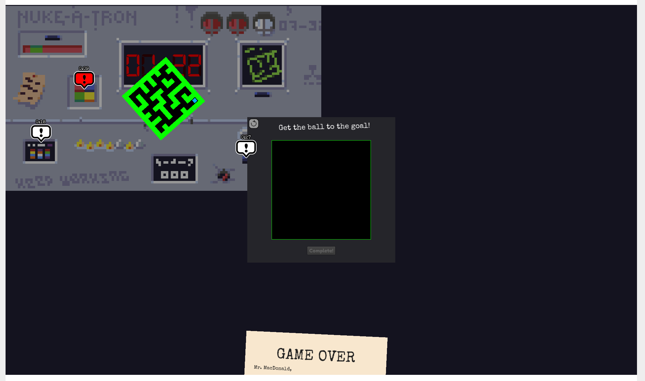
| Apr 22 14:03:52 | 35m 21s | Nuke-A-Tron 2000 | ♥ 0 | Fans of Keep Talking and Nobody Explodes, eh? At least the HTML5 version was annoyingly glitchy. Got stuck on tutorial. Always showing the game over page on bottom. The actual play area only being a quarter of the screen. Everything being extremely tiny which made it needlessly hard to play. Had to stick my face to the monitor to read any of the texts and something like the line in that press the button when on green was almost invisible. I'm guessing pretty much all of these points came from the fact the the game didn't scale to different sizes properly. The game looked quite nice, not counting the fact that everything was too small. There were some z fighting issues thoguh. Like the new minigame info bubble thing could be on top of the actual minigame. Sound effects were quite fine but the music got repetitive quick. And it even didn't loop properly. The color selection game seemed to be completely bugged. The items on the last two rows weren't selectable. Well I guess the words do move out of there when clicking enough of the earlier words. Maybe because of the small size too, the blue was very hard to read on the dark background. Here I'm trying to click on blue but it's not registering. And it's not even showing the hover color. noclick.gif Stay in the circle game is way harder than the rest of the games. Well, again, at least when the circle in question is barely the size of the mouse cursor. I mean yeah, when the other games decided to play fair and just didn't lock you out of the game for some stupid reason. Some things were not completely clickable. Noticeable example was the click button x times confirm button. Only the upper half of the button would register a click. Now that I think about it, this might even be the same issue as the color picking game one I explained earlier. Something is blocking the lower half of the screen. bomb.png This single picture pretty much explains everything I've been talking about. Also, where is the ball even? Anyways, with bug fixes (mainly the scaling issues) and some minor balancing, this would have been a great game. Good job! 👍 |
| Apr 22 14:42:39 | 38m 47s | Sparks Of Light | ♥ 1 | Neat idea. But the actual mechanic might need some more work. It was a total gamble who wins a "battle". The fish could sometimes just easily shoot between your sparks and there was nothing you could really do about it. Also was quite frequent to soft lock you out when running out of recharge spots because of the forementioned crapshoot with the fishes. I usually don't like to just tell that the mechanic isn't very fun and doesn't work without offering some solutions. I pretty much think that any mechanic can be made work with enough tweaks and fine tuning. But I'm kinda drawing blanks here. Well first of all, it needs to be slowed down a lot so you can actually try to time things correctly. I think just slowing down the spark rotation and enemy projectiles would do the trick here. Or are my old man reflexes just too slow for this kind of game? And yeah, as someone already has pointed out, enemy variation would be good too. But you can't really just do cookie cutter enemies (like the current fish kinda is) in a mechanic driven game, you need to design them around the mechanic to compliment it and pull forward fun/clever different uses for it. The tutorial straight up lied few times... "Use a spark and you lose it..." sparkslose.gif "You must kill everything to go to next level..." sparks.gif There was this minor visual glitch where the low health flashing didn't reset properly... sparks3.gif But yeah, it was quite a fun little game. Of course as I already mentioned, the mechanic isn't really encaging and doesn't have enough depth in it but it did have the wings to carry through those few levels of content that the game currently had quite easily. Anyways, good job! 👍 |
| Apr 22 18:29:44 | 3h 47m | Gregg | ♥ 2 | Looks cool but also very busy looking. It's very hard to distinguish what is what. I also think the camera is bit too close so it leaves like no time to react to whats coming past screen boundaries. Or then you just need to inch forward very carefully and that just isn't really fun. The turrets seem to have god like reflexes so unless you outrange them or bounce kill them, you're pretty much dead on the spot. Quite often even the health bar doesn't matter with all that knockback and like no cooldown on their next shots. Oh and if you're trying to play too careful, you're sol too because the plant life depletes so fast and the plant life pellets give so little. On the other hand, I think the was too many player life pickups since it was very rare to take any damage without dying anyway. Ugh, can it really take that long to load? I'm guessing you're generating levels there but still can't possibly take that long. You can also at least shoot while it's "loading" so I'm quite suspicious about that. And if it's just a faux loading screen tho show the story, you should not force it on retries. Didn't really feel like a jetpack. More like a double jump where the second jump propels you to the sky with the speed of light. Which made my first point about the god turrets even worse. Moving vertically with such insane speeds made it like a russian roulette when moving upwards. If there was a turret there, you'd probably die. And since screens have less height than width, you had even less time to react. A jetpack that would work like, well, like a jetpack would have been better. So after each jump you'd have specific amount of juice and holding jump would then add some upwards force and deplete the juice. With that you could make some more careful ascends and descends and might be more equipped to survive longer. Never found the portal but in the end I have this feeling that up is the way you're going too. That was the direction the level seemed to span the furthest and even changed visually the higher you climbed. And from the player perspective, it was the most dangerous direction to go. Probably should have made the background color that is seen from the holes something else besides red. That way the red would be more easily and faster get tied to danger because of turrets and lava. The "level edge" dark blocks too blended way too well to the background walls. Made it hard to tell them apart. Anyways, good job! 👍 |
| Apr 23 12:12:11 | 17h 42m | Flame Bearer | ♥ 0 | Very cool and fun game! Loved the art and especially the color palette. The level design was great with some nice hints and smooth learning curve. Dunno what the deal with the bats was near the end. Was there some kind of puzzle that I needed to trap them in the side rooms or what? Cause I did trap majority of them and the last one decided to head north and not come back so I followed him and never returned to the "puzzle" itself. Obviously the lack of any audio was a letdown. The game already had a nice and relaxing (albeit, a bit ominous) and some ambient music and nice soundscape would have enhanced it even more. And seeing that it was a jam game and not compo, you could have even used some third party stuff. Of course you'd need to opt out of audio category (which you did anyway) but I'm like 100 percent sure that it would have increased your mood rating. Probably overall too. Why did you submit to jam instead of compo? Just a time thing? The end room was kinda neat. But its coolness was hindered a bit by the fact that first time I arrived there, I went too close to the south edge and was clipped to almost the beginning of the game. Quick run back to the end room and I managed to decipher the message and dumb me then decided to repeat the clipping process on the right edge of the screen. But the camera didn't follow there and the torch was lost forever. My biggest annoyance was how the torch always dropped on screen transitions. Well I say always but there was this bug where it didn't and you didn't have to hold down the button to carry anymore. And it was actually better that way in my opinion. Glad to hear that you are planning on taking this further. The base mechanic is simple yet flexible enough to build tons and tons of different neat puzzles around it. And the mechanic can be quite easily extended too so it doesn't get too boring. Something like different color flames or having multiple torches. Awesome job! It was short and sweet and left me wanting for more... 👍 |
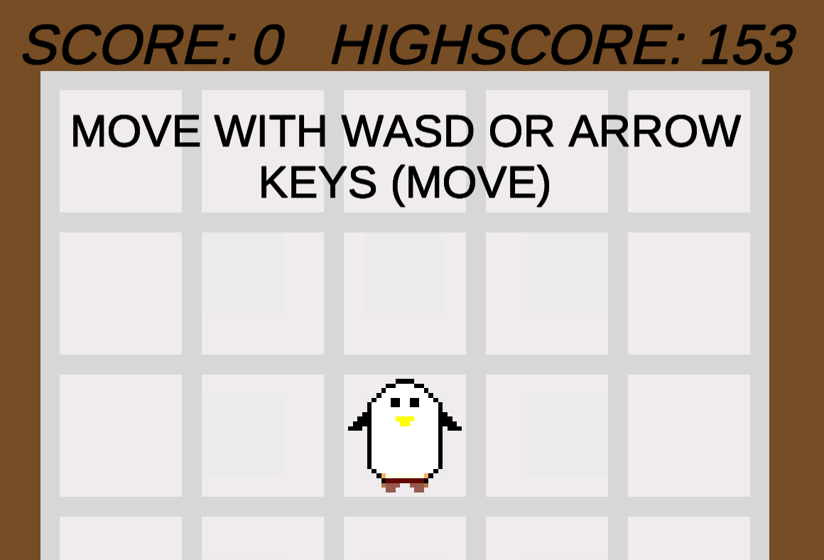
| Apr 23 12:51:03 | 38m 52s | DON`T DIE STAY ALIVE! | ♥ 2 | Yeah, this seems to be as high as I can manage. penguin.png Pretty cool! It was kinda unforgiving. The fact that there was no telegraph at all where the spears would be coming from made being on edge extremely dangerous. And if you're trying to just hang in the middle, the spears will pretty quickly drive you to the edges and your impending doom. Adding something like a brief danger icon on a spot just before the spear would appear there would help immensely. I'd also like to see the tail end of the spears be less dangerous. Something like 10% of the tail of the spear could be non harming to make squeezing between spears more possible. And actually that could be taken even further and added to the tip too on a lesser scale. It would create more of these "close calls" (so actually instances where the player should have died but didn't) which are always fun and make the game seem more fair. Sure it would be very stack towards favouring the player but when you die and even have a slight inkling that you didn't hit the spike, it feels bad. A classic shmup mechanic which just makes the game feel better and less unfair. Game development is full of these little tricks that stack the favour towards the player just to seem fair and to be more fun. Stuff like jump button buffering before actually hitting the ground from a previous jump or the so called "coyote air" which lets the player still jump for a tiny bit of time even after running off the ledge. That's what the player is trying to do, don't punish them for their silly slow human reflexes. Restarting could be quicker. Sometimes the runs take just mere seconds, and it takes almost as long to restart and get the controls back to you. Obviously there are stuff that could be improved. Sound effects for starters. It's a simple thing to add to make the actions seem more impactful. Then of course some special effects and (more) animations. You say there are cool animations but there were barely there and were very subtle. I'd like to see more. Maybe an idle animation for the penguin easily implemented with just by adding some squash and stretch. Fish too could be flopping around, just little position and rotation animations. The penguin could use some more black to be actually more easily distinguished as a penguin. Then the final visual thing I'd change is revising the color palette. I mean, so much brown. Why submit to jam and not compo? Just for the extra day? Anyways, good job! 👍 |
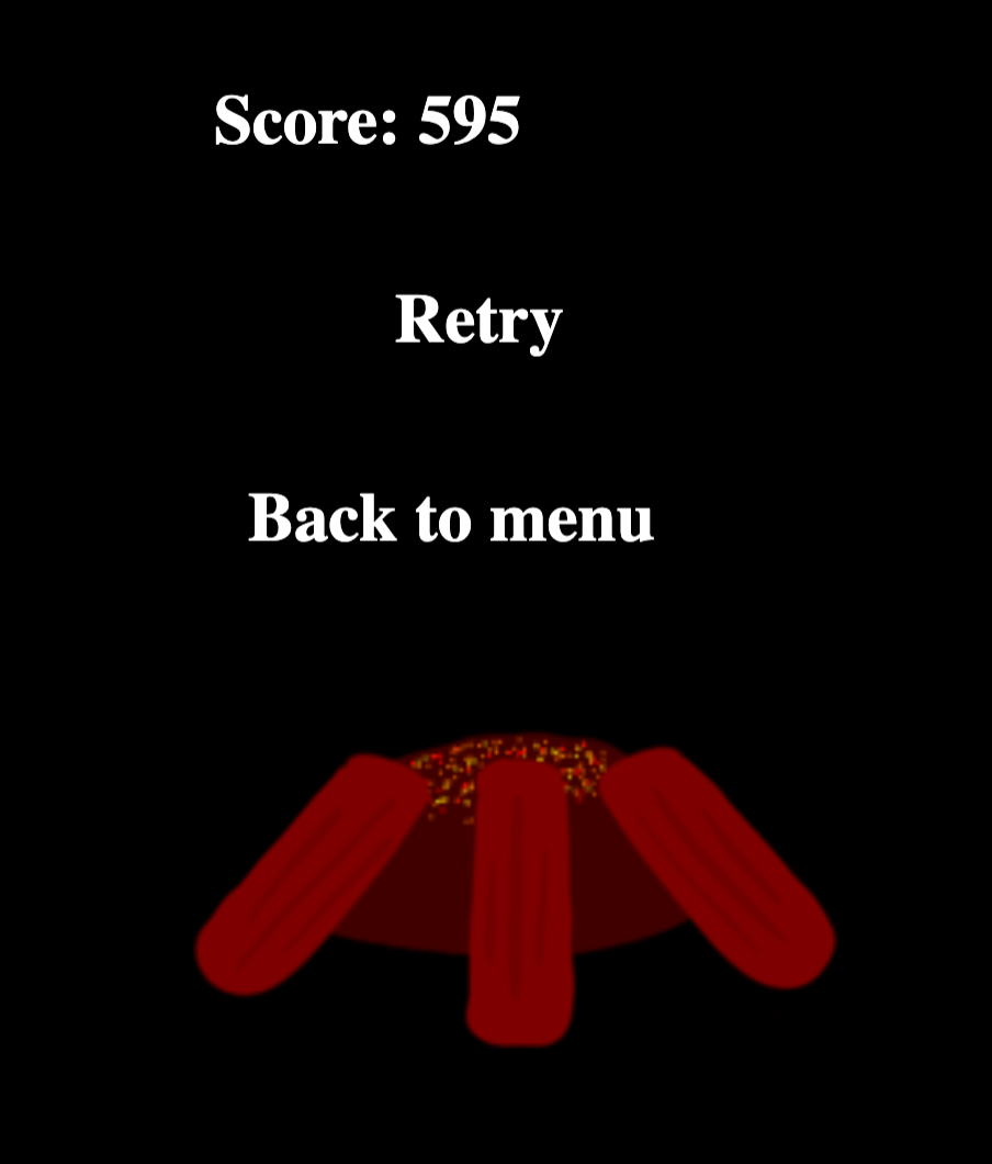
| Apr 23 13:32:01 | 40m 58s | Keep it burning | ♥ 1 | Kinda cool but got very boring quick. fire.png Could have been more lenient on the pickup and fire feeding areas. Being so precise with it server like no purpose. And sometimes while there were multiple branches on the same spot, the dude picked up all of them yet I'm guessing it only counts for a single when you drop it to the fire. Could also add some collision detection so the player couldn't walk trough trees and nests. Took me ages to understand what yelling actually did. I indeed kept yelling at the beavers and new that it had something to do with that but took until the latter half of my run to actually see a beaver with a branch for the first time and then it of course was obvious. And on total it happened to me only twice during the game. So the whole thing was pretty much pointless and was just like a very long despawn timer on the branches. But fixing it would be quite easy too! First of all, I'd decrease the yelling cooldown. Since the range isn't clear, you shouldn't punish too hard for a missed yell. Also would decrease the beaver speed so that you could more easily catch up to them and yell when you see them with a branch. The beavers should only come out to go grab a branch. So you would know to follow them if they didn't have a branch. You could even telegraph a beaver emerging from a nest with an audio cue and if you'd like to be a pro about it (since it's not a very inclusive to only inform about something with only audio) add in a visual effect on the edge of the screen notifying about that too. Same audio/visual notification could be done about the branches "falling from trees" too. Of course these would make the game easier but it's easy enough to balance in other ways. Like that there would be more actual gameplay and less downtime just faffing around. I kinda digged the art direction but it was quite inconsistent at places. The rain was kinda, umm, not great. The dude could have used an actual idle state too so he wouldn't be marching on place all the time. You actually animated the flame but then didn't use that same animation on the UI fire. Missed recycling opportunity! Wasn't quite clear to me if the fire "health" was indicated somehow. Sure it wouldn't really matter since you couldn't really affect it at all but would add a nice state of emergency and would notify about the nearing end so it wouldn't just end so abruptly. The intro song wasn't that bad in my opinion, probably would have been better than the silence. All that silence made the few sounds effects that were there kinda gratihng and boring. Some variation on them would have been nice. You already recorded a shout, could have recorder a few more and always played a random one of those. Would have made it a lot better. And of course more sounds too, like subtle foot steps. Were there actually some ambient sounds like birds chirping or was I just imaging things? If there were, there should be more of them and if there wasn't, there should be! I think thats about all I have to say about it. Good job! 👍 |
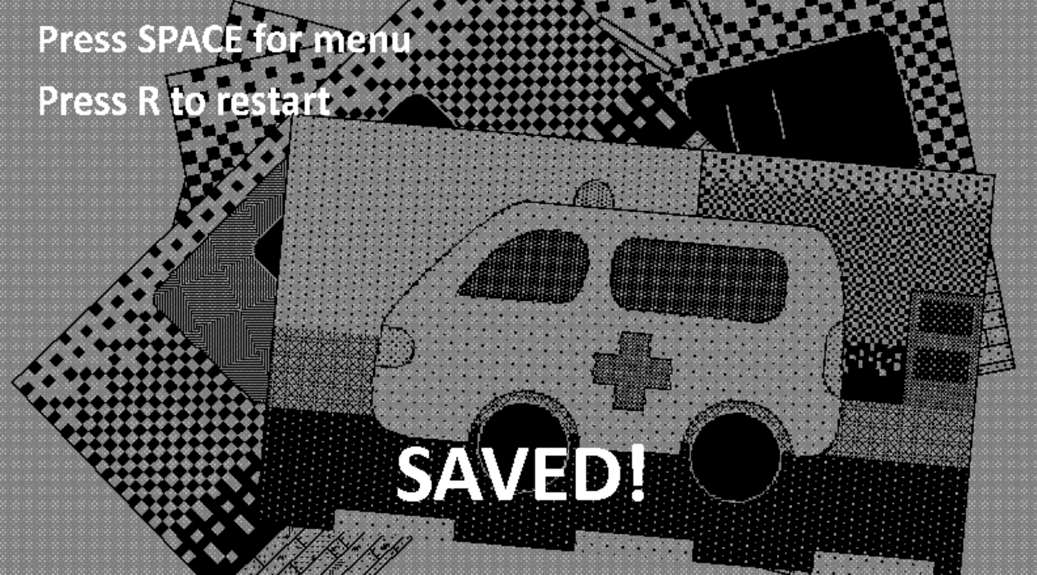
| Apr 23 15:57:41 | 2h 25m | Tough without friends | ♥ 1 | Quite nice idea but execution would need some major work. The mac version kinda worked, I think. Dunno if these issues are only present in it but there were no crashes etc. Btw, your Mac version download link icon is wrong (and you replaced the text too), that is the web version icon. Well, I do look for the mac/web version to see whether I can play so either works for me really. Same kinda goes for art style. If looked interesting and nice but at the same time it wasn't very clear to look at. The style is neat but not very easy to distinguish what I'm looking at quickly. Especially when the movement speed was lightning fast. First of all, every time the game came to start screen, the resolution changed to default and it popped out from fullscreen. Very annoying. And when I tried to actually check the options, the resolution couldn't be changed and there was no way to come back from it. Looking at your screenshots, that actually might have been a good size for the window. At least on those, everything looks a bit clearer. My options were either this original stamp sized window (which wasn't that bad except for the dude and the kill spots were not easily distinguished on the map) and full screen which then made the environment stuff bleed together. The difficulty is way too hard. In the beginning at least. You could at least make the first attempts take a bit longer and then ramp up the speed once the player is accustomed to the mechanic. The controls were clunky as hell. The actual movement was just fine but the map stuff was just ridiculous. The map should be its own button and toggled on and off with the same one. No need to have crap like restart and quit in the same view. For you should probably lock the player movement while on the map, it made it just disorientating. Or if you wanted to keep movement while on map, the floor selection should be a different key. But that way it would be easier to just play on the map screen all the time and 90% of the stuff you made would be wasted. I did eventually beat it. That may have been partly due the fact that latter half of the whole run he went for the rope and I then intercepted his journey after which he always went for the balcony jump. Just going between those two things so it was easy as a breeze. Did kinda have to memorize the whole house layout first though. That would have come more organically if the start was slower (ramping up on speed) and the help arriving time was a bit further away. The button layout was also awkward for playing, WASD for the movement and swapping between esc and space for the "actions", not the most intuitive button configuration. Also had to keep a mental note all the time to not do anything else while looking at the map besides quick A/D when needing to change floors to not disorient myself. saved.png Actually went for an another run after that to verify something that I was writing at that time and beat it quite comfortably. Didn't even get that same rotating between just two spots this time and still had no issues. So there isn't really a difficulty issue here but the game starts and just goes from 0 to 100 immediately. Was this on jam and not compo because of audio? Even though you opted out from the category, I'd still say it's a good idea to credit the author/source. Anyways, good job! 👍 |
| Apr 24 14:35:26 | 22h 37m | Dog Signal - Ludum Dare 46 entry | ♥ 2 | Pretty net! Really liked the art style. The screen shake felt a bit too aggressive and short in my opinion. Bit lit less movement magnitude and a bit longer shake time would probably feel better. The sound effects that were there were good but would have needed more. Like the dog spawning and turning into a balloon could easily have some neat sounds too. Maybe moving your ship too. Had some weird scaling issues when going full screen. The score indicator was weirdly positioned. The dogs didn't drift to the correct position before they started eating your bones either. Also, the background environment clipped too on left side at least. The gameplay was super simple but quite solid in its simplicity. The movement didn't really serve much purpose. Felt like the best strategy was to just stay almost all the way down and time your shots correctly. It was almost a lost cause if you miss a shot. Well you can save one maybe two situations if you get lucky. The game does get repetitive very fast. Since it's pretty much a single button game, you could have made that same button function as a start button on the menu view too. Would make it just smoother to play without need to swap from keyboard to mouse between tries. Anyways, good job! 👍 |
| Apr 24 15:22:26 | 47m 00s | Feed The Monster | ♥ 3 | Yay I made it. 🎉 alien.png Pretty damn cool! The tutorial was quite fun way to do it even though I enjoy having it more interactive while playing much more. But that's a one way to make a wall of text less boring. Would have been better if the timer ticked down to more tell about the actual objective. I almost quite after my first decent run of almost 2 minutes and 30 seconds. I guess I was like a second off since that seemed to be the magic mark though. Cool to see that you added a fail state for pumping too hard too. Didn't encounter it but I'm guessing there is one for over feeding as well? 🍖 Didn't quite like how the meats spawned in completely randomly. Would have made more sense if the hooks came off screen with one or without it. It was quite fun to try to find out an optimal place to throw the meats so they reach the alien with too much hassle. But since you need to pump some air constantly too, it didn't really matter much and you could just throw them on the obvious platform closest to the pump. These two things made like 90% of the whole playable area completely pointless. Maybe if something spawned on random platforms which you had to retrieve too would force taking advantage of the whole level more. Wouldn't be too hard to come up with another bodily requirement for the alien dude. I was positively surprised to notice that you can carry more than one meat at a time. Noticed it completely on accident when a meat spawn right on my trajectory. Knowing this made the game a whole lot easier since you were never in much of a rush to feed and could mainly focus on just gathering the meats and pumping. Then when the hunger was getting dangerously low, you could just chuck them all at once. Would have been cool to visually know how many meats I was carrying too. And Mashing ctrl too fast kept cancelling the already started throwing animation which wasn't fun. Quite solid controls. I must say that ctrl+arrows is a bad combo for macs since it cycles between desktops. Well I knew about it and knew to be careful about pressing them together. Luckily didn't need to throw my meats on the run that much. Alternative keys would be cool, decent classics to compliment left control could be X or C, not Z so much because of AZERTY keyboards). And some weirdos do prefer playing with WASD even when there is no mouse functionality at all. I will never understand why but they do. I would have liked to see the menu keyboard controllable too. 🤔 The sound scape could be enriched a bit too. Some sound effects were kinda missing. Grabbing meat, landing from a jump and maybe even a subtle footstep sound. Maybe the alien could make some adorable alien noises at random instead of only making the same eating sound. And other ambient stuff like that to make the game feel more alive. Anyways, I think I've rambled enough. Good job! 👍 |
| Apr 24 15:49:04 | 26m 38s | Run A Morte | ♥ 0 | Either I'm just dumb or there is a quite severe bug (in the mac version at least) where the toolbar isn't visible at all. Tried to click everywhere and press every button on the keyboard with no luck... notools.png |
| Apr 24 16:52:13 | 1h 03m | PollUFO | ♥ 1 | So damn, I had this whole thing pretty much written already and went for a quick more check to the game to verify something I wrote. Then forgot that I was in a browser game and force quit the whole browser losing everything I wrote. 😞 Oh well, here we go again... Very nice pixel art and funny sound effects! It was still way too silent overall, there just could have been more of the sounds. The cars could make some wroom wroom noises and maybe even some periodical honkings. And other stuff like that to more liven up the place. The missile sounds (especially when it missed) could have used a bit more oomph, felt kinda lackluster. The music got repetitive and kinda annoying pretty quick. There was so much empty space. Probably would have been better to not cap the camera movement so high up so that there was more ground visible. Would be easier to make the ground look interesting than the sky. Currently like 95% of the screen estate was just that grayish blue sky. Of course adding more clouds would help too. Managed to start at a bit of a disadvantage because you could already shoot while still on the how to play menu. And since it made a funny sound, guess who mashed the button on blank space a bit. And it seems like I have a miraculously amazing hit percentage on trees while firing blindly. So I was already pretty deep on the negatives when the game began. Even after that, I realized quite quickly that the stakes were like nonexistent. It was easy enough to just aim between the trees and wait for the cars to position themselves on my crosshairs. Even the tanks that seemed scary at first quite quickly lost their intimidation when their shots did nothing but push you back a bit. The missile was too overpowered in my opinion and had like no downside to using it. Makes the normal laser almost pointless. Maybe it could have even longer cooldown to discourage the spam, bigger blast radius so it would be more dangerous to use around trees and even a slight homing on the closest target to differentiate it a bit from the normal shots. You said it yourself oo, the game is kinda barebones. Even without adding any additional real content, spicing up the scoring system could make the game more interesting. Adding a multiplier is always a quick and easy way to make scoring systems deeper. You could add up a multiplier on each "kill" and then reset it back on tree hit, getting hit yourself or maybe even after a certain amount of time without a kill. And then the different polluters could have a varying base score amounts to add a bit of strategy in your target prioritizing. And of course by adding more actual content would be sweet way to enliven the gameplay too. Additional "enemy" types such as already pointed out by other commenters would really make it better. Especially the helicopter since it would add more stuff to the sky and balance out some of the action off the ground. And speaking of ground, having it less flat would also help. Actual terrain shapes would make the aiming less linear and boring. And of course, some additional non-polluters too! Like maybe birds that you would need to dodge too. Anyways, I don't remember if I had anything more on my previous writeup so I guess this'll have to do, good job! 👍 |
| Apr 24 17:17:21 | 25m 08s | Keep "It" alive | ♥ 3 | Umm, I don't really get it. Is it just supposed to be survive as long as you can? Does it ramp up in the hiding spot range each feeding or were I just getting a godlike RNG? For like way past ten feedings, he was just always right next to my house, almost visible from the fridge. If it is indeed ramping up the range, it should do it a whole lot faster. And since the map was huge and I had ample time to explore, I kinda thought there was some other thing I was supposed to be doing. But sadly, nothing did anything. Couldn't even grab stuff from the other fridge. The art was pretty nice. The scales were all over the place though. Most of the stuff was just too huge compared to the characters. Those picking up and feeding animation cutscenes got old fast! Would have been better as a not completely whole screen blocking cutout with a dialogue box or something so you could start moving already while checking it. Especially so since you already could move while it was on. Weren't hugest fan of the controls. They felt a bit slidy. Wasn't the biggest of deals though since didn't really require any precision or anything like that. Anyways, good job! 👍 |
| Apr 24 17:44:35 | 27m 14s | Blob | ♥ 0 | First of all, I do not know if any of these are limitations PICO-8... 🤔 blob.png Not a biggest fan of the color palette. I quite sure you have at least somewhat of a free range of palettes on PICO-8. Otherwise it looks pretty ok but the red (especially with the light blue) really clashes. Other than the palette, I think the pixel art looked quite fine. The enemy blobs could have been more blob shaped and less perfect circles. The friendly one could have been more friendly too. Also maybe some animation would have made it stick out a bit from not just being a wall. You had all four different sprites for moving different directions. But the idle pose always returned to downward facing one and same goes for attacking. Made it look a bit clunky and made aiming the attacks harder and disorientating. Would have liked for the attack area to be bigger. There was no need to have own individual buttons for both feeding and attacking. They both could use the same one, you're not gonna attack your friend anyway. Or you could also just feed them by just walking towards them just like you do when picking up enemy remains. The enemies knocking you around felt obnoxious. I guess in a way that's good sine it is supposed to be bad and just waste your time but I think it was a bit much. This of course too would have been better if the own attack area was bigger so it wouldn't need to be so pixel perfect. Anyways, good job! 👍 Always fun to see PICO-8 games and what people manage to do with such limitations... ❤️ |
| Apr 25 08:58:15 | 15h 13m | Medically Inaccurate | ♥ 2 | Pretty damn solid gameplay around a simple idea. Of course, as usual, some kind of multiplier system or something along those lines would make the scoring more interesting. Now it's very linear with the survival time so it's kinda like you're getting two same grades. viruses.png And that was played on hard mode (ie. laptop touchpad)... Weren't a biggest fan of the controls. Somehow found it funny that your menu was "press space to continue" stuff while the game itself was mainly mouse controlled. It's very common to see people do it the other way around, needing mouse for menus while the game is only played with keyboard but I think this is the first time seeing it this way around. I think `Input.anyKeyDown` would be the way to go. The movement felt too slippery. Just would need so minor tinkering around with the numbers. Moving is a simple thing to do but needs a lot of trial and error to get to feel right. I also quite often got stuck to walls and the heart, I think an easy way around this would be to drop down the friction on them and tweaking the collider shapes maybe. I liked the multiple functionalities shooting had. Obviously you could kill stuff with it but also can use the recoil to move faster. And then you could even use it to move the health pickups. Which were kinda awkward though. Quite often they ended up being so damn far and then you even shoot them a bit further. So they end up in the corners. Making the shots affect them more and adding way more bounciness to them might fix the issue. They wouldn't just get stuck in the corners but would bounce and get closer to the middle perhaps. The AI was very good at getting stuck on the walls. Would be pretty easy to fix. Raycast from them to target and if hitting a wall, just do something to fix it. For example get the closest point of the four "holes" between walls and move there before resuming their normal behaviour. It was also very easy to shoot them through the walls. Changing collision detection mode to contiuous from discrete would fix this. Or could check manually with raycasting too. I liked the sound effects and visual effects that were there. Well, the sound effects could have packed a bit more punch though. Just would have liked to see and hear more. Like a spawning effect for the enemies. So much of the early game was just circling around the heart checking all the spawns. The enemies getting hit would have needed some feedback effect too. Or not needed really but would have made it way more satisfying to mow them down. The overall visual style was ok but I really didn't like the color selection. The bright almost pure reds and blues just clash together and do not look harmonious at all. A better ligting job could have also improved the look immensly. Also took me ages to realize that those were actually enemy health bars. They really blended to the models. The color palette plays a huge role here as well. And the same was true for player/heart health bars too. They're something that should be like noticeable all the time without really looking at them and red on red just made them camoflage themselves very well. And the huge scale and double sided nature didn't make it very clear to get their value at a glance either. Funnily the player model was graphically the weakest part of the game. Even the static heart had more character with its animation. So obviously it could use some more love. Also its movements were very jerky at times. Lerp and MoveTowards are your friends here to make stuff look smoother. Anyways, good job! 👍 |
| Apr 26 14:08:15 | 29h 10m | SAVE THE DINOS! | ♥ 1 | Brilliant idea to make the dinos breed! I've been toying around quite a lot with genetic algorithms over the years but still never used one in a game. Haven't come up with a clever game that could use one yet. Well sure, I'm guessing that the algorithm here is "fairly" simple (ie. just male or female randomly) but breeding nonetheless. The pixel art was good, the dino really reminds me of the chrome "no internet" game dino but just more detailed and with colors. Really lion kingish color scheme, I dig it! The particle effects and sound were kinda bland though. It was nice that the asteroid click area was very generous. So many people do exact pixel perfect colliders and hit checks without understanding the fact that those make stuff seem unfair. The bigger asteroids requiring multiple clicks was bit of a curveball. And because you didn't give any feedback about the clicks, it kinda felt like a bug. Maybe a better idea would be split the asteroid to two smaller ones on click and they could move diagonal. Another things that seem more like a bug instead of a feature was the trees blocking the asteroids. I think the trees should do some kind of a shake or something when they block an asteroid or something along those lines to make it more clear that it is a feature of the game. The balancing between clicking asteroids and dinos seemed impossible. For my simple monkey brain at least it was just better to focus on either or. And at this point I of course remembered the space pause thing and went to try it out. Sadly it did not work at all on macOS Chrome at least. Ability to quickly pause and unpause with a press of a key would have most likely made it lot easier and more strategic to play. Albeit a lot less actiony. I'm playing on touchpad so especially would have helped here because quick and accurate movements aren't the best with it. The fullscreen was borked too. It kept the game size the same but just had it in a black void. Anyways, good job! 👍 |
| Apr 26 15:01:10 | 52m 55s | Social Distancing For LadyBugs | ♥ 2 | ladybugs.png Excellent idea! I actually did a flocking algorithm this LD too. Kinda funny how you show the rules after the first fail. That got a chuckle out of me (after I splatted the ladybugs instantly on start). Could get rid of the second dialog box though. It was a bit unforgiving. One missed more by a slight margin and it was over. I'd decrease the swatter hitbox radius so like the flys radius on the edge of it wouldn't kill anything (especially the ladybugs). Just grazing a ladybug currently kills them and while technically fair, it doesn't seem that way really. Having close calls (where player should actually lose) makes a game more actiony. Very nice audio work. I really like the fail song bit, really fits it and hammers in the whole "oh you dun goofed" vibe. The art was good but very very static. First of all, should flip the sprite x scale so that the bugs face their movement direction. Also a simple wing flapping animation would do wonders. I mean it's super easy, just make them consist of three sprites, the base and one for each wing. Then just slap in an animator there and rotate the wings around to points and voila, you got a less static bug. It was very hard to distinguish other bigger bugs from ladybugs the further the game got. I was just kinda squinting my eyes and focusing on red. It probably is quite impossible for colorblind people. Would have liked to see the same fancy font used for all texts. Although, it could be quite unreadable. It already was quite hard to make out what the red circle buttons on dialogs were saying. But kudos at least for not using default unity buttons, so often see people use those without even changing the color. The scoring could be improved too. I think (it's very hard to dissect right now too) it is very linear now. Getting more score the more you squash with one hit would make sense. Like so that if you kill 10 bugs with a single hit, you'd get more points than killing 10 individually. Bug limit seemed too high. Even while idling, it takes ages to fail because of that and more often than not you just end up splatting a ladybug way before that. Congrats on the first game jam and easily clearing the bar by making a fully functioning game. Good job! 👍 |
| Apr 26 19:14:07 | 4h 12m | Sitbot 5000 | ♥ 1 | Pretty funny! Instead of huge walls of text, I think it'd be better to feed that text like one paragraph at a time. Sure, it would be the same amount to read but in a less intimidating and not so inviting for a skip. Of course it would need to be changed not to be a letter but just the parents telling the "rules" instead. The graphics were a bit messy and quite unclear on the hud bits. Went for a second playthrough and even then had to kinda focus on them to see what they're supposed to mean. Did not like the colour selection at all. It was very, umm, mspaint default colour swatch. The game also had some z fighting issues. At least the action bar thingy was constantly below some other sprites and so on. The house also felt very deserted, could have used some non-functional decorations. Like throw a carpet in there. Then there was the balancing. The first level was fine I guess. I accidentally skipped the last paragraph of the letter so whole baby dying on the machine was confusing at first. And since the food hud was so unclear, I kept overfeeding the baby even though I noticed on the second run that the two bottles are more than enough. The hunger death could come a bit faster, compared to all other dangers, that one is way too generous. The second level balancing was off too. It was way too easy and boring. You should have kept the feeding there too in my opinion instead of going backwards on difficulty. If you make the baby eat some shit, they slow down with no real downside. That's a good lesson for life. The third level was where the game actually started picking up the pace and got interesting. And of course this is where the game ended also... Desperately would have needed more content. The third level was like the end of the tutorial introducing the mechanics. And once the player has grasped them, the game is already over. Such a wasted opportunity. Even with the current mechanics, you could design a plethora of different levels without still getting repetitive. And of course coming up with new dangers wouldn't be too hard either. Then what about multiple babies? That might be a good way to put your multitasking and prioritizing to the test. So yeah, great idea with just enough depth while still remaining simple to grasp. The execution just needs some polish. Like spice up and clarify the sprite work. I'd completely replace the colour palette with something more harmonious and eye pleasing. That's about it, then just would need a buttload more content. Good job! 👍 |
| Apr 27 12:45:08 | 17h 31m | Waifus please | ♥ 1 | @juice-lizard Got it working on macOS with: ```sh java -XstartOnFirstThread -jar ld46.jar ``` There was no sound though. Dunno if the game even had any since you opted out from audio. The idea fas very fun and could be expanded upon quite easily but you were leaning on Papers Please a "bit" too much. The same UI doesn't really work here. Papers Please stamping also had this rewarding tactileness with sweet animation, juicy sound and the oh so fun ability to freely stamp anywhere on the passport. You missed all these points. Even though it seems to be a parody and not too serious, the game has some potential. First of all, would have been good to explain the rules in the game itself. And just like the source material, it should start simple and then get more complex each day. Like the first day could only be checking unit tests and merging to dev only. The second day then could be dev to master too and adding more difficulty by sprinkling in some typos like deb instead of dev or something like that that isn't so easily noticed on a glance. Then you could start actually showing the code of the PR itself and slowly start adding some checks for the player. Maybe something like checking that the code is commented, has semicolons on line ends, doesn't have too long lines etc. Something that was actually relevant but still something that could be done by a person who doesn't know or understand code at all. Anyways, pretty much the only issue here was the the whole game visuals were taken from another game and they didn't quite work here. Even though the mechanics are similar, the same UI doesn't work in this context. Good job! 👍 |
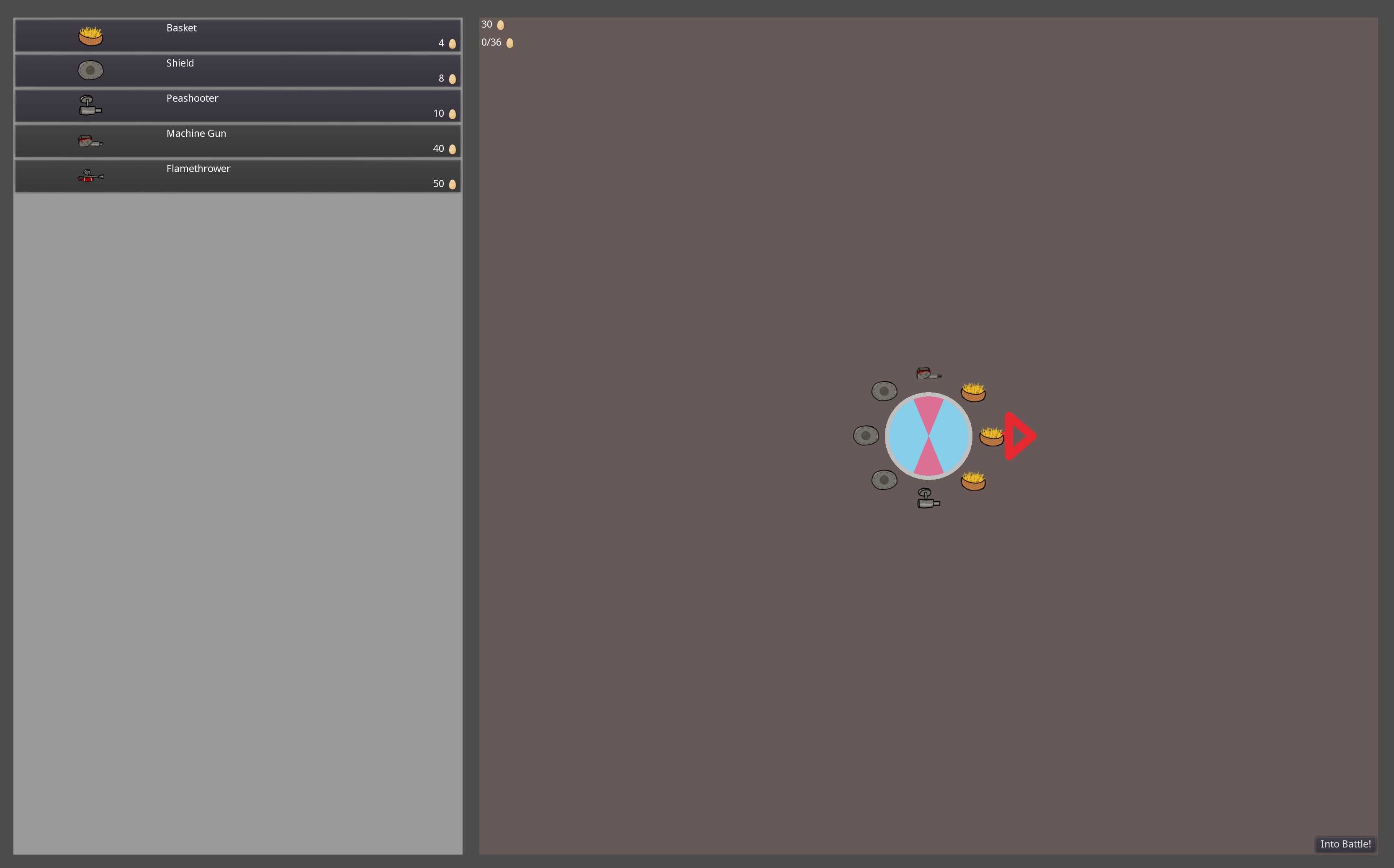
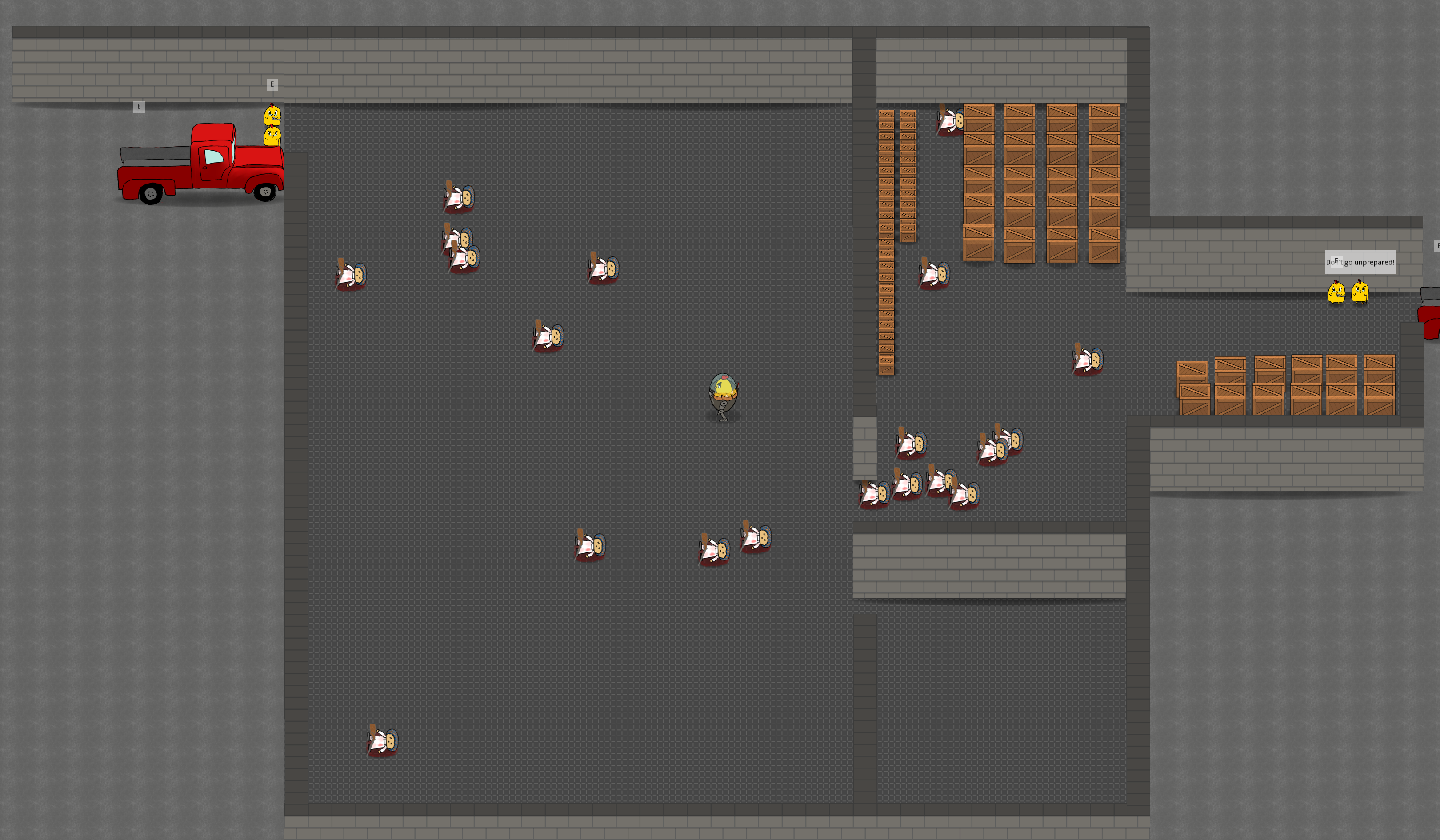
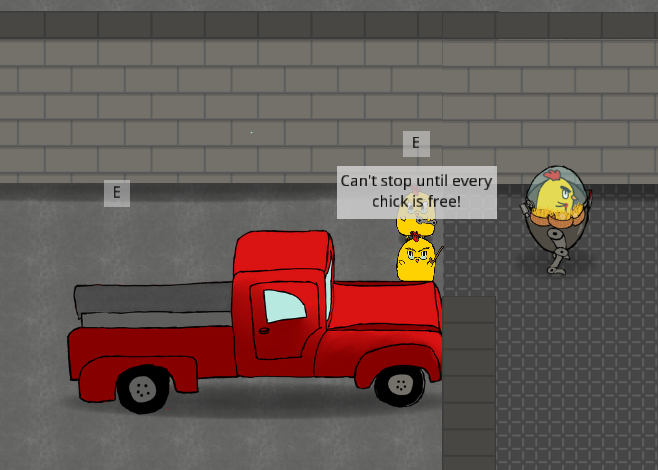
| Apr 27 13:44:28 | 59m 20s | Eggs With Legs | ♥ 2 | All these eggs are giving my Animal Crossing bunny day flashbacks! 😡💢 Awesome art but everything was so damn tiny! The biggest offender of course being the bullets. Seeing them was near impossible. Of course this got better on the later levels with better contrast but they just would need to be bigger. The text was also too tiny and didn't even fit the box. The shop really suffered from the tinyness too. And not like there was any shortage of screen estate here... eggshop.png Could have used some descriptions for the items too. The control scheme wasn't great for someone playing on a touchpad without actual buttons. It was physically impossible to shoot both weapons at the same time so I just had to work around with using one. And of course I bought a second one before realizing this and postponed by machine gun (overpowered goodness in comparison) purchase by a lot. There was like no reason to bind weapons to individual buttons. I mean, why would you only shoot one of them? The enemies felt too bullet spongy and it was too easy to outrange them. And even before I started outranging them, I was just zigzagging back and forth while keeping the mouse button pressed. Not the most encaging combat really. The action even felt kinda slow. And those long egg gathering runs and laps back to shop made it even slower. There could be a fun functionality (just off combat maybe) to make these shopping trips more bearable. Or maybe the vendor could kinda follow you from a safe distance so that the shop would never be that far. The enemy hitbox also felt wonky. It seemed like I kinda had to hit them on the head part of the sprite. And same for sure didn't seem to apply to the player character. The bad accuracy didn't really help either, just made the pacing even slower. Also would have been nice to reorganize the eqipped stuff on the mech egg. Guess the positions didn't really matter much though. The equip wheel thing could have described better too. Sure it's kinda obvious now after playing and of course has always been crystal clear to yourself but it was confusing at first. Also would have been cool if you didn't limit to just two weapons. I wanted weapons all around the mechgg! And for more strategy in equipping stuff you could do something like shields doing more when they're on front or getting a bonus for having same pieces right next to each other or something along those lines. Soo, I'm not sure what was supposed to happen here... allchicks.png While first clearing the room, I was careful not to shoot the cages because it wasn't clear whether I was killing or freeing them. And after clearing the room I saw the message and started blasting them. But still nothing. And it was very tedious to mow them all down because even the cages had too much health. And the lingering hitbox on them was super annoying too. end.png So yeah, that was the end of my run. Pretty fun game, just would require some slight improvements. Good job! 👍 |
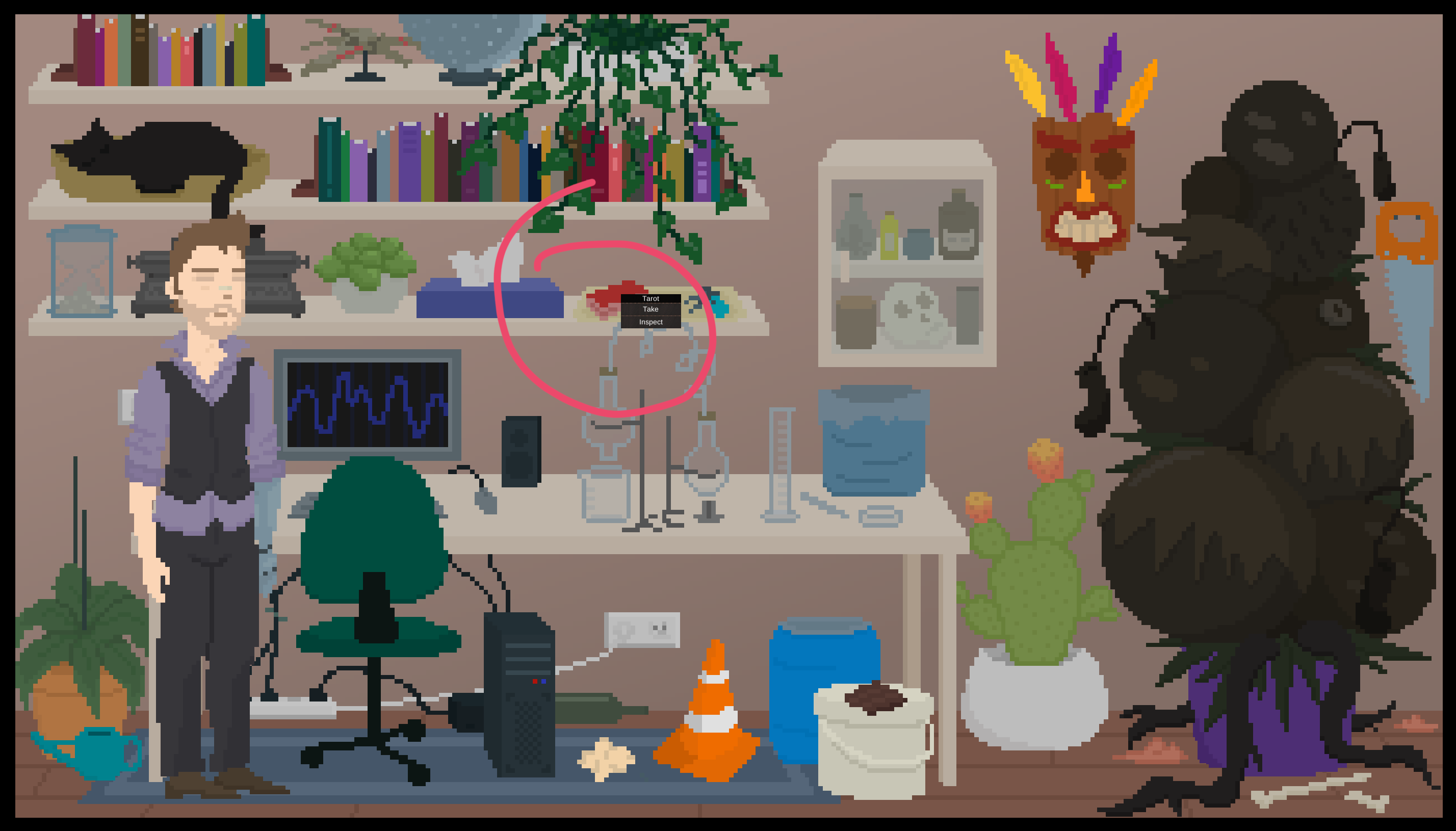
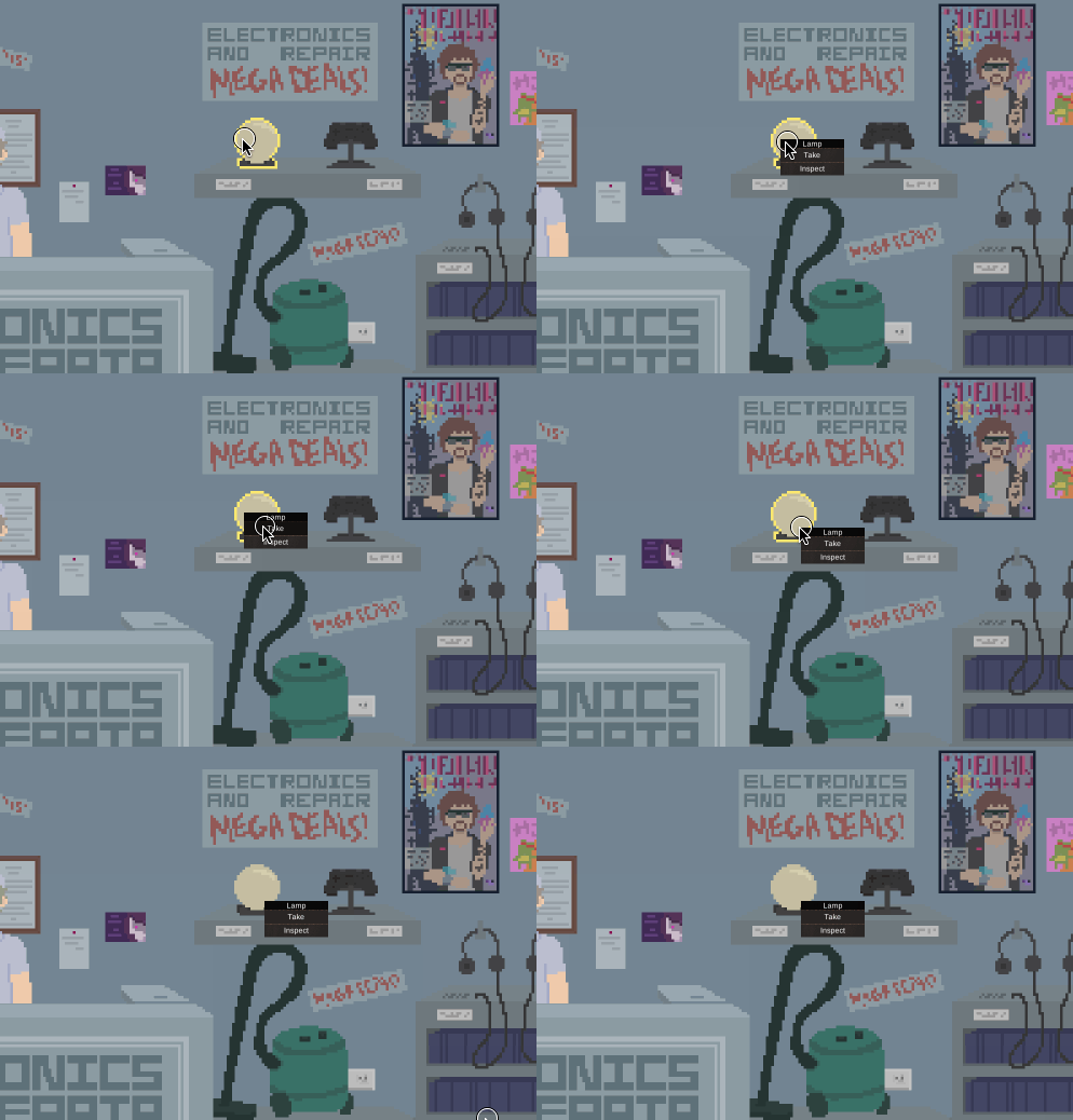
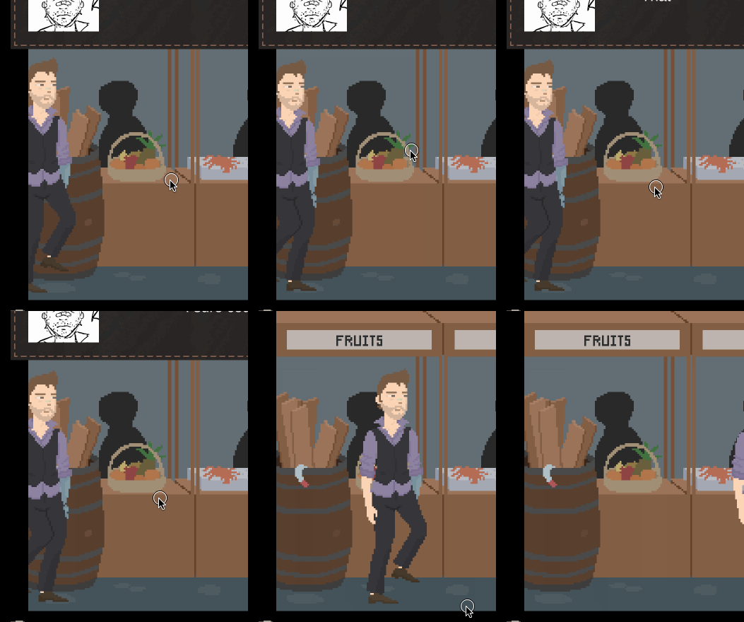
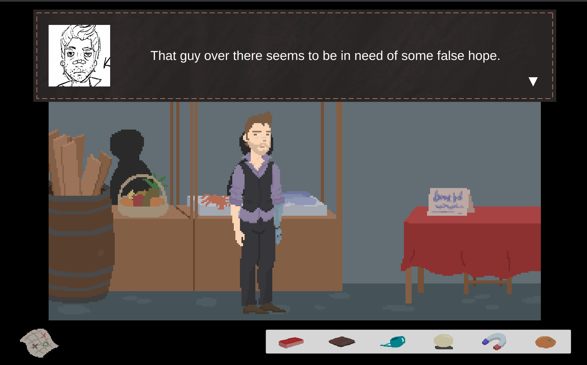
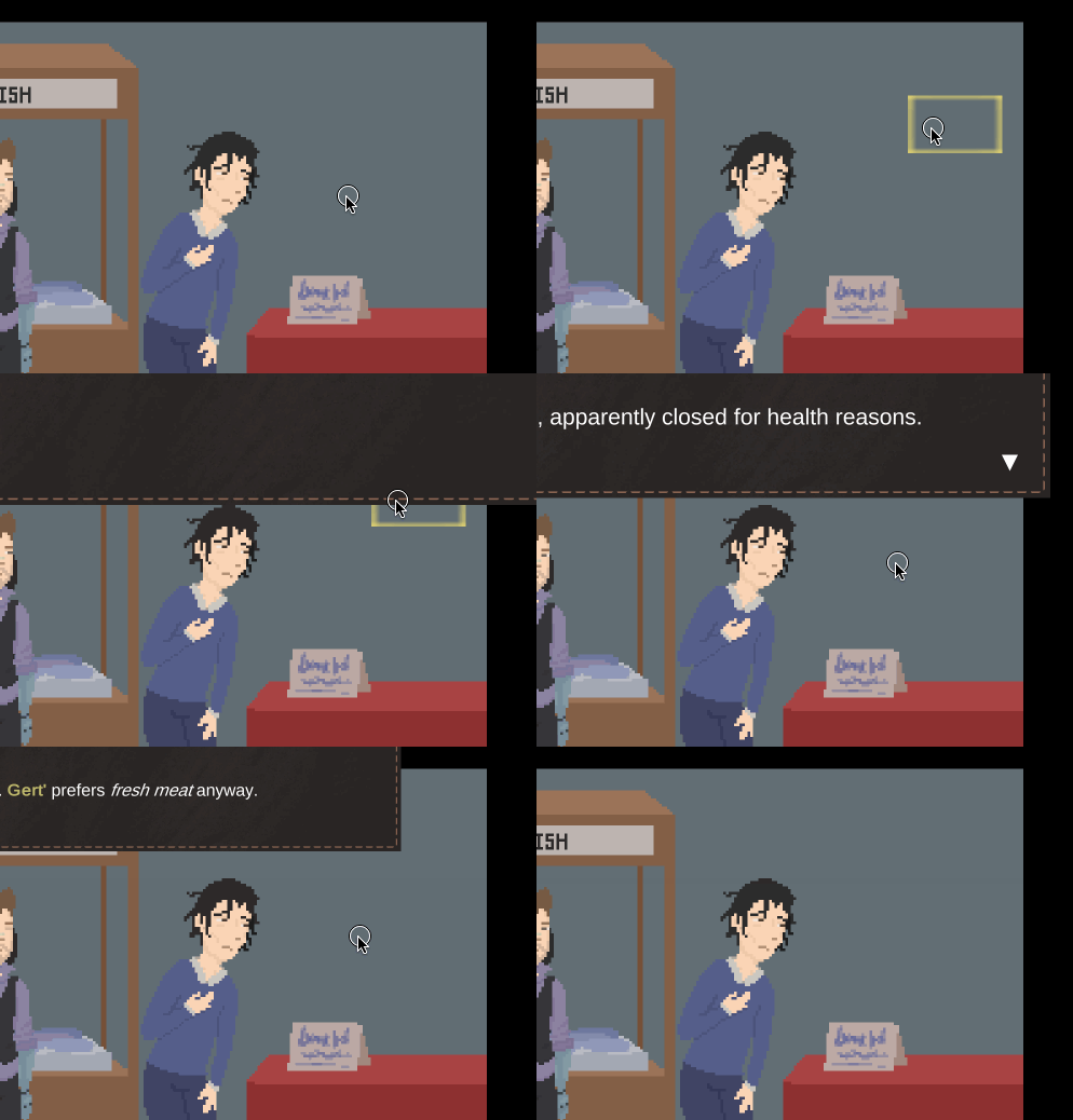
| Apr 28 15:27:27 | 25h 42m | The Consequences of Gardening | ♥ 5 | Nice! Quite ambitious project for a jam game. Congrats on mainly pulling it off... The story was kinda cool but it really lacked depth. Obviously this is something well out of scope for a jam though. Like the whole hand thing was barely mentioned in the actual game. The lack of deeper introduction to the protagonist and his motivations made him very unlikeable made the whole story feel bland. After a bit, it was very predictable too. The idea was there but really would have required some meat around the bones. I would have also split the intro text to be fed one line at a time. Wells of text are never too fun. I really liked the art. The only annoyance in that department really was the ugly yellow squares around the objects on highlight. If they had the same kind of shaped outline as the characters it would have been several times better. The UI should scale with the screen size too, it was borderline unplayable on full screen... gertmenu.png Well the font was kinda boring too... The pick up menu also had this very annoying bug where if the item was still behind the take/inspect button, it would glitch out and just reopen the menu instead. gertreopen.gif And speaking of items, didn't like the fact that the items either were complete red herrings or just used themselves automatically. It removed that tiny bit on actual interactivity the game could have had. The puzzles weren't that complicated anyway that one wouldn't be able to solve them quite easily but would have made it feel more like a game. Of course this would introduce quite a huge task of more narration for trying to use different items on wrong spots but would have more organically given more places to add some more clever quips the game already had a few of. There was this funny bug when you trigger something while an animation was still playing... gertwalk.gif The repeating conversations were a bad experience. Happened first with the girl and then because of that mashed through the repairman convo and didn't quite understand what made it change. I don't think I had any new items between those two tries either. Should have just added a simple bool flag to keep track if the conversation has already taken place and replace it with a shorter one on repetitions. And of course one that would smoothly transition to the branching plot when you have met the requirement. Also lacked some other permanence like the dude already being gone... gertnodude.png The sound work was great! Especially the music. The piece had these noises that I at least associated with Gert making noises while at first chilling at home so it was weird hearing those too everywhere else. Might have just been my brain doing connection where there shouldn't have been any. Might be a good idea to proof read the whole script at least once before the end of a jam... gertitalics.png There also was this invisible butcher shop which I'm guessing was cut out of the game due to scoping issues. gertbutcher.gif All in all, good job! 👍 |
| Apr 28 16:27:04 | 59m 37s | Keep The Night Short | ♥ 2 | That was pretty fun! Well, kinda pointless too (literally even). Didn't understand what the goal was. Was it an endless runner? Or were I supposed have more of those entrances to next level and have some kind of real progression. I only saw those right at the start and never again. And I did play several times and the best run even took quite some while. The controls were horrific. I guess they would work on mobile and that's what you were kinda going for but it was not great to play with a mouse (or touchpad even on my case). I constantly kept missing the buttons because I was mainly trying to focus on the actual action. I was fun to figure out the different actions and how they should be used to get around different hazards. At first I was like wtf, no explanation at all? But quite quickly it clicked and everything mede sense. Even the icons that looked like weird hieroglyphics at first were actually well designed and perfect for their actions. Never really found out a use for the run though. Or a solution to those triple tribal guys. On my lenghtiest run they stopped spawning too so couldn't really experiment with them too much. The trees dropped fruit a bit too rarely, made it almost not worth it to interact with them since it also cost a hefty amount of, umm, potion bar? 🤔 The 1-bit art was nice and all but damn it made it more difficult to read and react in time. Some colour would have really helped here but style over function I guess 😎. My only gripe with the art really was that the character having a solid colour background made it look awkward when it was in from of stuff. The music fit the game very well too. Sure, you didn't make it but it was a good fit. Some simple chippy sound effects would have been nice too. And they even would have helped with the detecting different stuff on that 1-bit style. I mean, two senses are better than just one. So just now saw your mention about the game having an ending. Guess I have to dive back in. I don't give up that easily, I'm a stubborn old man! ‼️ Ok my guess that it has something to do with those triple guys didn't seem to be correct and just waiting them out was the right move. Back to the drawing board... safe.png Well that was actually quite disappointing. Was it just time or distance based? I must have been so damn close on my first lengthy run... And my key to success (and around a bad control scheme) was to exploit the crap out of stop button. I basically hovered on it all the time and used it to buy me some extra time to react to those monsters and apples. The rest was just a walk in the park. Ignored the gamble trees (house always wins) completely and the ground fruit were more than enough to keep me alive. The game was just so much more boring to play this way. So yeah, should probably have distance/time left ticking down shown on the screen to hint about the end. Then an actual difficulty curve, some sounds, use of physical buttons and some overall polish and you'd have an awesome little game in your hands. Anyways, good job! 👍 |
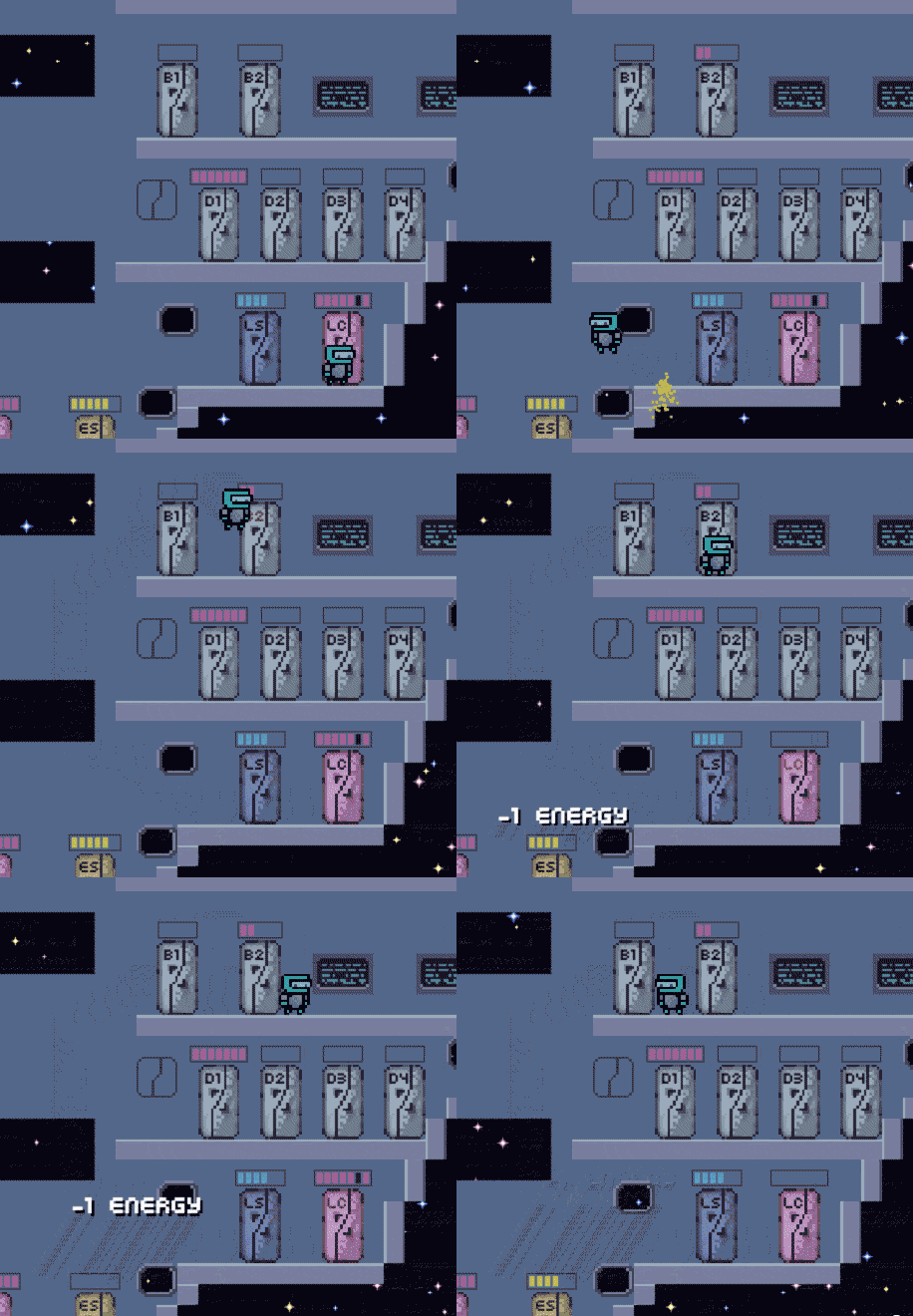
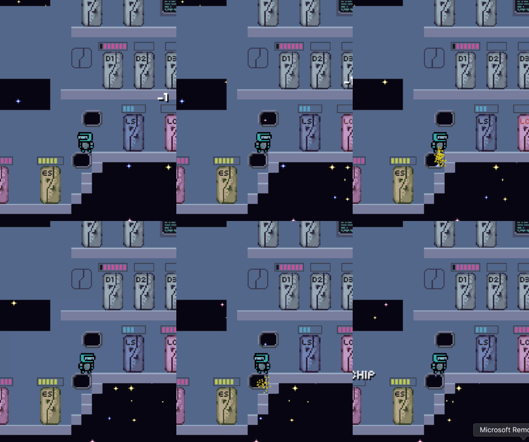
| Apr 29 16:18:33 | 23h 51m | Station Keeping | ♥ 1 | It was so overly complicated to begin with. So many numbers and buzz words everywhere. The tutorial too did a pretty poor job at explaining stuff. It was just like do this and do this, not explaining anything really. Oh and it was so overly structured that one missed move (like not picking up what you were supposed to) completely hard locks you out of progressing... stationkeepstucktutorialsmall.gif There was just way too much crammed to the beginning. Could have started with a small ship with like only one locker of each type (if even that). Then introduce the mechanics way better and more thoroughly and let the player get used to them in a less complex environment. Then extend the tutorial some to have a portion of that freeform action too. And then finally after some good enough accomplishment, throw them to the actual game. Even after playing for quite some time, I'm still pretty clueless what the top row lockers and panels are all about. Or those blue screens, tutorial didn't even mention those. I guess that fact that the trade ship takes ages to arrive makes sense in the actual game but on tutorial it was just irritating. Making the player just straight up wait is almost never fun. Made it even worse that due to all the bugs, I played the tutorial several times and also had to do the ship waiting way too many times. Sure, I could have skipped the tutorial but was still very unfamiliar about the mechanics and wanter a bit of a refresher. The pixel art was pretty good. Having more distinction between the lockers would have been nice. Especially on the tutorial where you're pointing to some locker, first you have to read the text from bottom corder (ie. not a great placement for that either) and then scan the screen for the mildly blinking locker. Some way more easily visible flashing indicator on what locker you were supposed to go to and having the text appear close to that point would have made sense too. Just like when you have that "-1 fuel" text fly on the screen. It is very easily noticeable but funnily enough, serves like no purpose to player at all since it's a very non-critical information. Cool to see a multiplier addition too. Well sure, you probably have all your player behaviour in that object and just throwing another one there and binding different keys isn't too hard. Really nicely done! But I just don't see it working for four people as of it's now. Even when playing alone you get these lull periods where you have like nothing to do. Can't even think what it would be like with four. I wasn't a big fan of the inventory system. I don't really know why but I kept confusing which row is which for like the longest of times. Even though the way they were made perfect sense. Just having them look visually different might help alleviate this. Esc also didn't work on closing it like you said and I completely forgot about Q which did seem to work. Clicking on empty space was a nice addition but as a sole closing mechanic, it was clunky as hell. Another thing I didn't enjoy very much was the controls. Well they were fine kinda and served their purpose really but didn't feel good. Especially the horizontal movement while floating or falling down got easily out of hand. Glad that there was like no precision required anywhere. I also think that the jetpack would have been better as a continuous lift instead of those bursts. Would give more control to player. For example they do like a slight bursting to slow down a descent. Actually got stuck in a corner too... stationkeepstuck.gif Anyways, good job! 👍 |
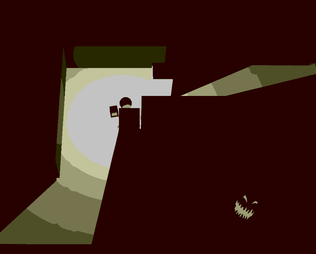
| Apr 29 17:19:25 | 1h 00m | Eradication | ♥ 1 | Hmm, was about to give up and quit so many times but stuck with it till the end. Banging my head against the unfair and unforgiving wall until I made it through. Made like no sense in the grand scheme of things. Seems like you just slapped on every mechanic you could think of there and like none of them had any practical use. The grapple hook had like no uses. Sure it could make you move faster trough those slowing tiles and what ever but then you stuck you to the wall for a split second which would pretty much always be punished. The crystal thing was very unnecessary too. I'm not even fully sure what it did. Was it like some kind of instant cover thing? And then the orb. Still like no idea what it did. If I had to guess I'd say it was like teleportation but in my case it was more like disorientation and certain doom. The first kind of enemy was weirdly the deadliest one. So unfair. They shoot you from outside he screen obviously outranging you easily. Their shots are like lightning fast almost impossible to dodge except on the max range. And they did way too much damage too. Like the only way to kill them was to cheese them through the walls or corners. And you for sure had learn their position the hard way around. So unfair and punishing. The same "lets just slap on everything there" mentality was in the graphics too. The art itself was fine but there was like no rhyme or reason for most of the things. Why only one arm? Why the (extremely pixelated) nudity? The whole flashlight thing felt like an addition just because you wanted to do dynamic shadow stuff. There were some red keys and health pickups (which could have easily been more plentiful) on red ground which made them very hard to notice. The red key could have replaced with some other color without affecting the game at all except making them more visible. The dialog box "scrollbar" didn't indicate too well about there being more text. Gladly there was like a single row of pixels visible from the next row which hinted at it even though it looked more like a bug. Changing the box size or font size so that you see almost half of the partly visible line is like a cookie cutter UX trick to let users know about there being more. Of course a more visually informative scroll would do wonders too. The damaging tiles added like nothing to the game. Well maybe just annoyance. Kinda same goes for the slippery and slowing down ones. Other than the ones that had an item in the middle could have just as easily been walls. The respawn timer was pointless too. And you could even keep playing while your were dead. Wonder what would happen if you'd trigger a door or some other important bit while dead... And kinda funnily as a contradiction, audio department was not packed with everything you could come up with. It was actually very sparse. A lot of the things were missing a sound effect completely. And of course the lack of music didn't really help here either but I can't really blame you too hard on that. Anyways, I've listed quite a lot of flaws in the game but it wasn't bad by any means. It was an amazing amount of stuff you managed to do during the weekend but at the same time you spread it so thin that nothing really stood out as the main hook of the game. It would have been better to take one mechanic, hone it to perfection and build a game around that. Good job though! 👍 |
| Apr 29 19:43:37 | 2h 24m | Last Lantern | ♥ 2 | I'm sadly giving up on this. And not because the difficulty but game breaking bug that completely halts my progress at times. noarrow.png After bashing my head against the puzzles. At some point the arrows on the pushable boxes stop appearing and they can't be pushed anymore. And if one time wasn't bad enough. After a full hard restart and making a good amount of progress, it happened again! noarrow2.png Well, I kinda lied. Went for another try, couldn't help myself. Made it a little bit further this time before the arrow disappearing bug but not until the third checkpoint though. If such even exists. And damn were you way too stingy with those checkpoints. They should be there almost like after every puzzle. Punishing players with making them repeat the same puzzles over and over again makes like zero sense. And due the fact that like half of the fails are because of clunky controls wonky enemy sightlines, it's even less fun. Loved the art style. Simple yet refined, I think the only thing I'd change was the walk marker. Well maybe the blue of the pills didn't really fit the other look of the game. Just like the art, same goes for audio, superb stuff! Very nice and moody. And the camera movement was pretty damn nice too! Fuck it, I can't resist myself. One more try... Yeah, seems like a no go. This time I only got two deaths before it happened again. I'm on the room with the triple boxes if you know what I'm talking about. This just needs to be stupidly accurate. Of course if I could try it several times without playing the whole game up to that point, I might keep bashing my head against it but no. There was this easy cheese for the room just before the second checkpoint. You could just ignore the second monster and let it catch you. You have enough time to activate the checkpoint anyway. Maybe you'd want to disable the checkpoint activation while being chased. The block pushing mechanic felt rushed. No sound or animation and even the speed was weirdly faster than just walking normally. Every annoyance really came from these boxes. The monster detection around them was very finicky. And pushing the monster with the block (like in the horizontal corridor just prior to the room I got to) was awkward as hell. It quite often resulted in situations where you should be able to recover a slight detection for a small duration by pushing the monster with a box but they just do what ever the hell they please and just might slip through and see you. Or then might get randomly pushed to the exact spot you were supposed to go to. Anyways, good job! Wish I could have played the whole thing... 👍 |
| May 1 08:07:50 | 36h 24m | City Soundscapes | ♥ 1 | Well something at least should have been explained in the actual game. It was like a "watch these dudes fight, you can see their stats too" type of game. Sure, after a whole lot of experimentation and trying to click on everything I found some actual interactivity. Seems like the fountain healed the injured policemen. Fine. The dialog was confusing though and the icons in it made like no sense to me at least. Then I found out the sound things on the roofs they seemed to affect the people somehow but still was super confusing and unclear whether I was doing something wrong or what. Might have tried and experimented some more but there was this very nasty bug in the macOS version at least where every single button had its hitbox misaligned from the graphic. Some were like 50% down and some were 50% up. Even something as simple as clicking ok on the fountain dialog was super annoying since I had to move my mouse cursor far enough down that the camera started moving. So pretty much every time I healed, I was looking at the southern sea afterwards. The prices seemed to constantly be too much for the income to actually do anything. Sure it might be my own fault for not playing right. But on the other hand it's kinda your fault for not even giving a slightest shred of information to the player on what to do, how to do it or even what anything means. Of course everything is crystal clear to you guys since you made it but I'll bet no one else can really understand everything without quite frustrating trial and error. The art was fine, even though I'm not a fan of this PS1 era 3D graphics style. The color palette was very muddy and dark, something lighter and more vibrant would have fit the cartoony style so much better. The fight sound effect got super annoying quick. Hearing a single damn audio clip stacked multiple times on multiple spots like 100% of the time you're playing is not great. It was ear grating, clicky and repetitive as hell. The only other sound effect that I think even was in the game, the police crying (or at least that is what I think it was) was ok though. Desperately would have needed more sound with some variation sprinkled in. The UI was very confusing too. Even in the end I had like no clue what those different bars or their icons were supposed to represent. Even the health bars were not that informative because the people kept stacking on top of each other. Would have made more sense if the people would spread out some so like they would pick a random angle around their target to fight them from. And what was that blue circle on the map even? Anyways, good job! The game would need some polish and whole lot of player guidance (or even starting off simpler on a smaller scale and then expanding from there) but not a bad game by any means. 👍 |
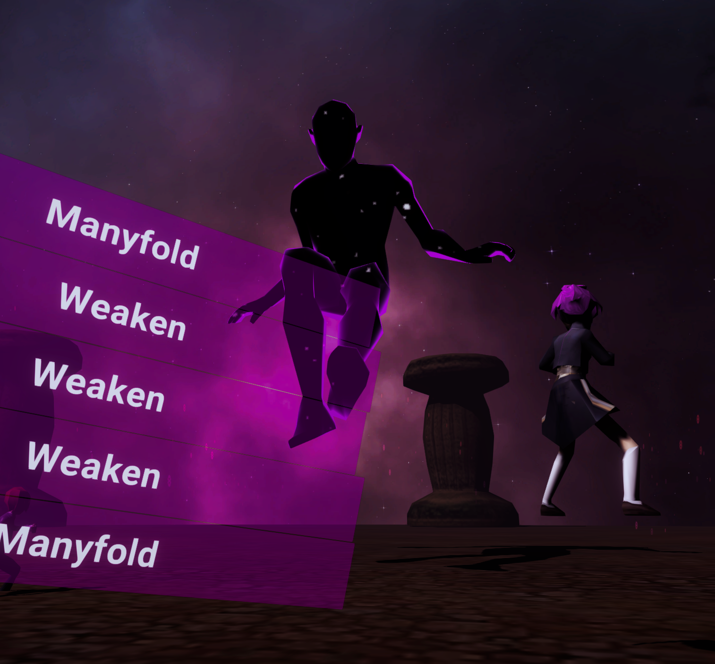
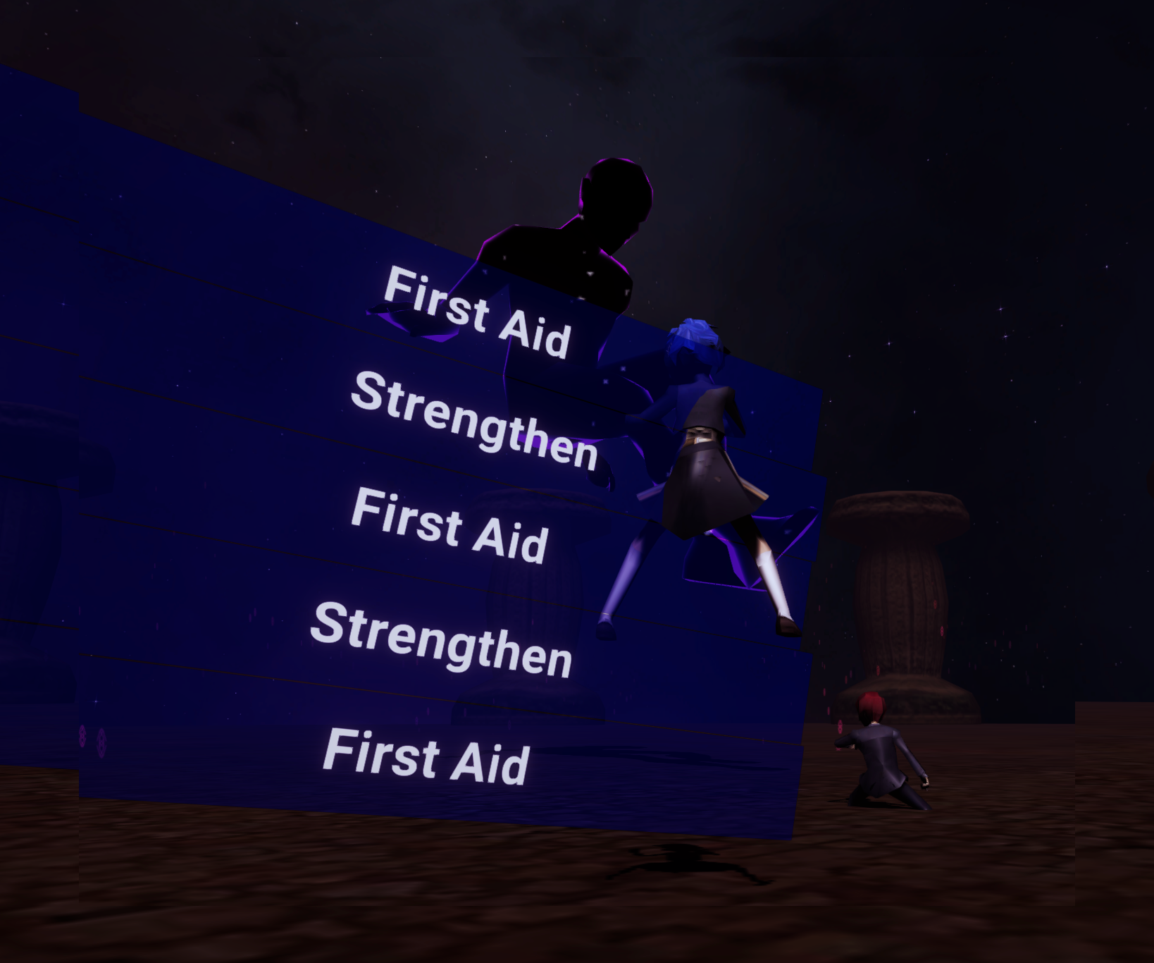
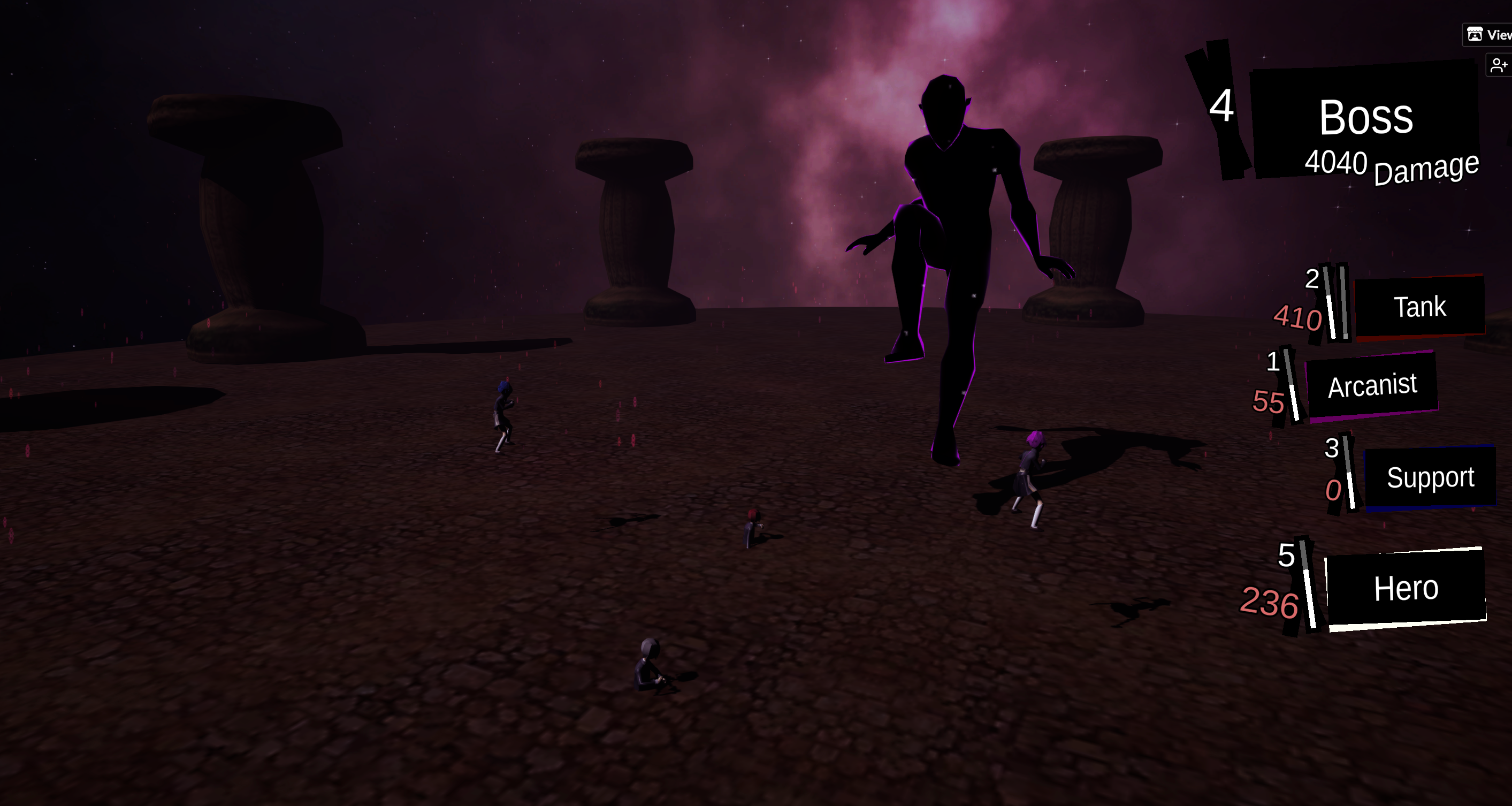
| May 1 09:07:04 | 59m 14s | SMT V final Boss leak | ♥ 2 | Cool idea and very neat execution! 👌 I really digged the visual style and with dynamic camera angles and so, very Personaish. Wasn't quite perfect though. Took me quite a while to understand which character was which. The color coding of them didn't really click to me for quite some while and at that point I had already learned their positions and order of actions. Could add the same colors to character "names" in the intro text too. And then obviously somehow indicate the active character on the sidebar thingy. Maybe something like a pointing arrow, other sections being more dimmed or pulsating the active section. And same goes for when selecting a target for your spell. And speaking of spells, the would have needed some descriptions. No need to spoon feed everything but some hint on them would have been nice. Quite a few were obvious from the name but others could have used some info on. And having duplicates on the selection menu was quite pointless. The numbers and bars were confusing too. Still no idea what those different numbers meant. The bar seemed to be the health but why on earth did the tank have two bars? The action effects seemed a bit lackluster. They also could get a nice dynamic camera angles on the target and a spicier effects. The tank ones were the best since he always targeted himself but that too could have been nicer with a change of camera angle after selection. This thing made the so called hero seem weak as hell since his swing just did this tiny effect and a weak little ding sound. That should have been the flashiest effect with the mightiest sound too. Also with some spicy screen shake to hammer in that he is doing some god damn damage! And the same goes for the baddie too. His actions had these almighty names but lacked the feedback to also make them feel powerful. Arcanist and support seemed to have some problems that they slowly kept rising higher and higher every turn. arcanist.png And tank might be actually sinking too... support2.png I'm currently at 2000 damage done and it's getting quite repetitive. Might as well try a bit further. Even if there is an end it's a bit too far in my opinion. Or something different at least should happen to break up the repetitiveness. Maybe the boss could summon some minions! Sill have no idea what difference boost and manyfold have or even if either of them does anything really. Also not quite sure whether I should use strengthen on tank or hero. Well, I'm guessing that hero since with boost and strengthen he did 120 damage. At least didn't notice any difference on the healing amount when boosting or manyfolding the support. That would have added a nice bit of versatility. The tank was also very boring, just taunting seemed like the best thing to do. Ok, now at over 4k damage and nothing has changed at all. Expect arcanist and support soon escaping from the atmosphere and tank and hero being waist deep in the ground. 4040.png And here is where I quit. Seeing your comment that there is no end and it seems like you can pretty much go on forever unless you're getting hella unlucky with god's wrath spam. Anyways, very good job! 👍 |
| May 1 13:39:42 | 4h 32m | Dr. Kronenberg | ♥ 1 | Tried several times but I have no idea what I'm doing wrong (ior even what I'm doing at all). I'm stuck at around two minute mark (the timer seems to bug though and keep adding on your previous time on reset) and no matter what I try to do differently, game almost always just abruptly ends there with no indication on why. Surely this would need some kind of tutorial and easing up to the actual gameplay somehow. The UI was the most confusing part. The meat dropping were kinda fine I guess but on the other had very unnecessary too. The whole game seems to be about transporting meat from a spot to another, surely there is no need to keep showing the spot where to pick it up and drop it constantly. The spots were way too pixel perfect too. The whole rooms could be it. I don't see why anyone would pick up some meat and just store it somewhere without putting it to another machine. The machine bars could use some explanation too. Feeding them gave red but running out of green seemed to be bad. I mean, what the hell? The controls weren't great. Especially so around the ladders. That pseudo jump launch on top of ladders was just stupid and very annoying. It just wasted time and happened like every time I climbed up. And the ladder hole was weirdly small. Having to stop on top of ladder and try to aim for the perfect spot to actually be allowed to go through was not fun at all. At this point I went for a few more tries and it seems that the minions carrying stuff adds green and me carrying stuff adds red. Still no idea what to do with that though since I just suddenly lost with everything very nicely on the green. Nope, can't figure it out, I'll give up... Wow, just noticed, that's a huge team! The pixel art looked nice. Especially liked the palette selection of the background. The rooms looked a bit messy though. I mean there was a lack of clarity on them. On their own while staring at them, they looked fine but somehow in the actual game they don't work that well. The background and the lack of contrast might play a key on it. Anyways, good job! 👍 |
| May 1 19:01:58 | 5h 22m | Core Transport | ♥ 0 | So this was my key to success on the first level... rocket.png Tried to repeat the same on the second level but the rocket did not propel this time. Dunno if it was some bug or what but the second level lagged like hell. Also all the available control spots were visible as seen on the pic. The idea was fun and building stuff is always fun but the controls were awkward and complicated as hell. You did this on Unity so I'm guessing you know how to move, rotate and scale stuff there. It's the tried and true way, intuitive and been like that in like ever 3d modelling program since like forever. No need to try to re-invent the wheel, just try to do a similar system. Then you could just detect when pieces are close enough to each other and snap them together automatically. Or since you had the first person controller there, might as well just let it pick up and carry stuff. Then detect collision with that piece and when it's touching something add option to glue it to what it's touching with a button. 🎉 Ez pz! And the play mode should still stay on the same "character" and should just have some other button to start the rocket. Would have made the two modes more consistent and improved the flow. Or maybe wouldn't even need to different modes if done like this. But yeah, should have also added the info about the rocket to the actual game and all around improved the instructions. |
| May 1 19:07:06 | 5m 08s | Meteorite Pig | ♥ 2 | Itch link still broken. Did you forget to press publish on it? And I'm not on windows either... |
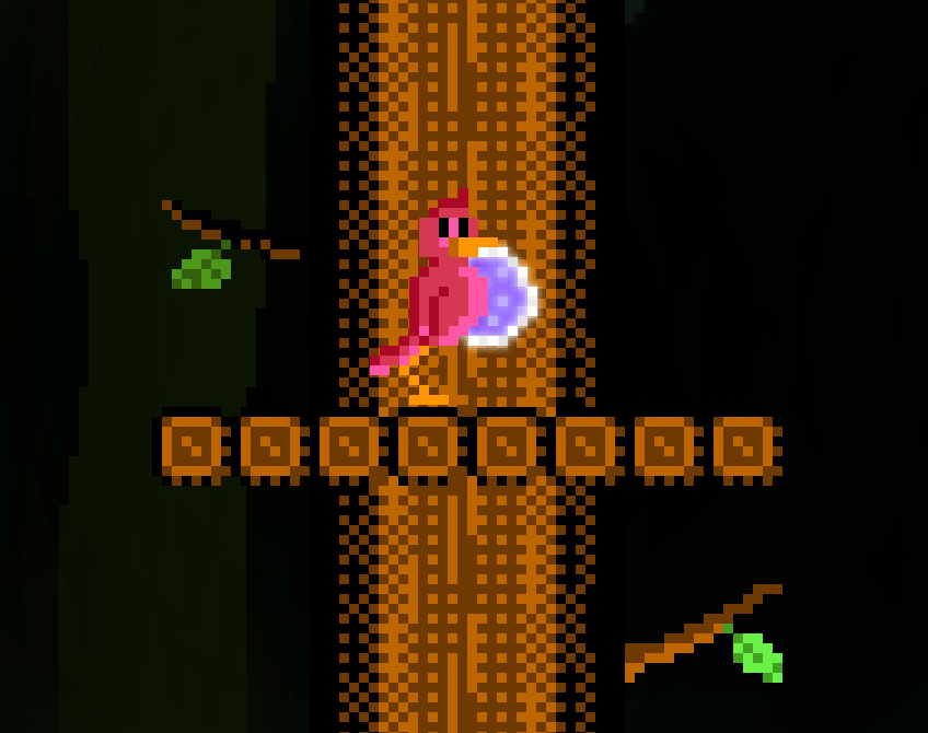
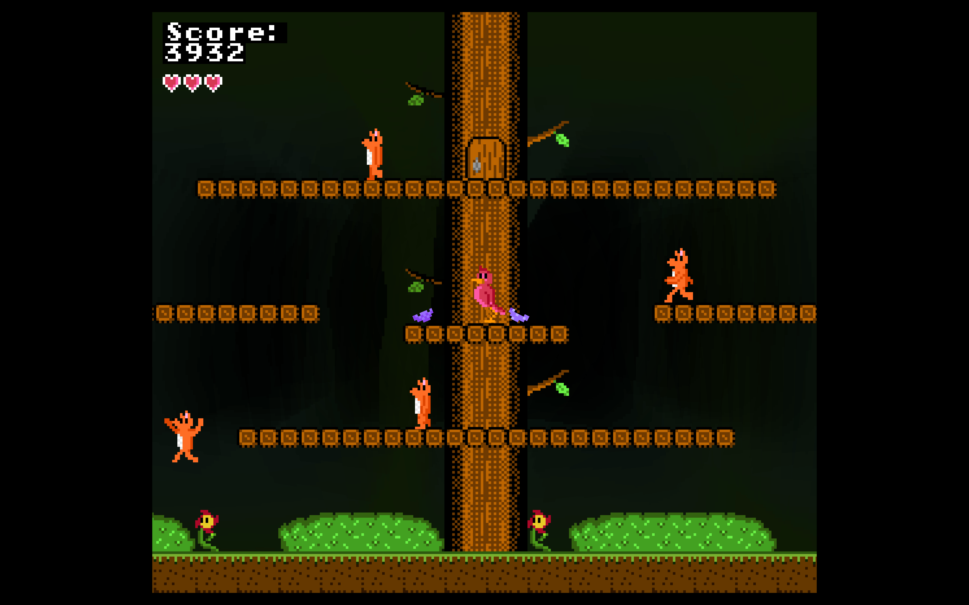
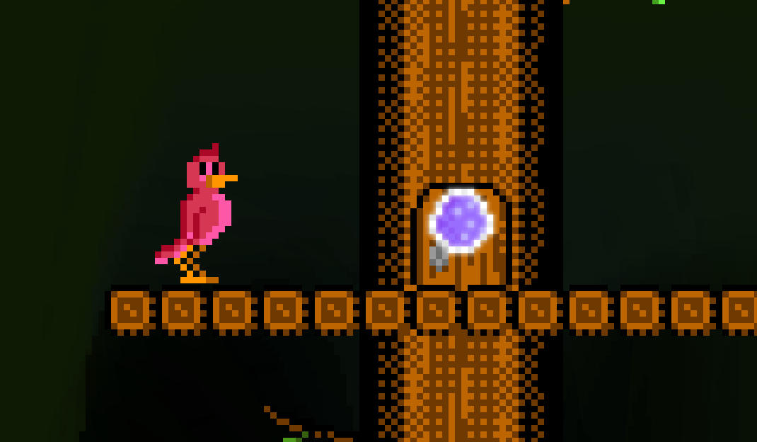
| May 1 19:51:11 | 44m 05s | The Adventures of Eggbert | ♥ 1 | Press any key to return... except the one you used to come here! 😏 There is bit of a cheese. You can just chill here and let the score rack up while you're idling and already writing a comment feedback for the game. 😎 eggbertsafe.png Oh, it seems like the eggs have death timer. Didn't even get to screenshot my score because of the "any key" but it was something a bit over 4k. Took quite a long time for the idling game over though so still very abusable. Went for a "proper" run just about the same score there too. Should have just idlet after this point, it quickly went downhill from here... eggbertscore.png Best strategy seems to be to grab an egg and then just go chill on those safe platforms. Still very boring to just wait on a completely safe space for like forever until you can continue playing. Without changing the mechanics, it could detect when player has been still for like, umm lets say few seconds, it would hatch the egg right then and there and spawn next. There could even be a cute hatching animation that would start when idling for a bit. That would hint about the functionality without any additional tutorials or whatnot. Nice sprite work! The fox sprite wasn't quite up there with rest of the sprites in my opinion. It looked comparatively flat and even the animation was stiffer than even the flowers that are just decorations. This was bit cheap. The foxes could have had some sort of warning indicator on doors just before they were about to appear. eggbertlame.png The controls felt super good! Not something that can too often be said about jam games. It's surprisly hard thing to get right and too often neglected. The jump could have used a bit more horizontal movement for my liking but that's just nitpicking really. 👌 Also, you kinda stole the name from my Animal Crossing neighbor... IMG_0326.JPG Anyways, good job! 👍 |