Foon → Ludum Dare Explorer → LD47 → Feedback comment stats → Antti Haavikko
Feedback comments for LD47
Antti Haavikko's games and stats for all events →
| Timestamp | Since previous | Game | Antti Haavikko's comment | |
|---|---|---|---|---|
| Oct 7 16:45:48 | iLoop - the 2D endless runner game of a robot stuck in a loop :) | ♥ 1 | Pretty cool! Obviously not a game with too much replay value and longevity due to the lack of difficulty curve and overall repetitiveness. Screenshot 2020-10-07 at 19.07.11.png So yeah, the difficulty curve was pretty much nonexistent. The enemy speed increased so damn slow and it even didn't matter really. The only points where you can take damage was either when completely misestimating the huge unfair enemy hitbox or when two of them came so close together that is was impossible to land between and do a new jump. It was also quite unfun that the foods and enemies liked to sync up so that you couldn't get the foods. There was no point on going for a risky food grab (especially with the hard to read enemy hitboxes) because there was no way to recover from a mistake and zero consequence of not going for them unless completely safe. Some kind of mechanic for needing food would maybe enhance the game by giving the player some decisions to make. And the food placement could spice things up too by variating their distance from each other (now it seemed very close to fixed at least) and by having some of them be in air. And of course flying enemies would make it more varied too! Classic endless runner stuff. Didn't the intro text say something about the robot growing? 🤔 Didn't happen to me at least. Oh now checking the screenshots on the description, it was just about the rank growing. Every piece of art looked fine on their own. I especially loved the background(s). There was a big lack of consistency on them though. Every piece had their own color palettes and styles. Like they were done by different artists altogether. And now that I actually look at the rating category options, I'm guessing that you didn't do them and they actually were different artists. Looks like the bot had other animations too besides the walk but you didn't use them for the jumping at all. That's actually something I just had to go back and check, I recalled seeing some kind of jump on the intro/stats screen. So yeah, no own animation for jump. Obviously not a too big of a deal since I barely even noticed it but on the other hand, a cool jump animation I would have definitely noticed. And it would have made the game "feel" better. The parallax on the background felt a bit too strong (i.e. too slow background movement speed). Maybe it's just me but I quite often started admiring the pixel art there and when I snapped back to focusing on game it was very disorientating. The sound effects seemed to be too late. You were already at like the peak of the jump when the sound effect happened. And the same goes for all other effects too. The sound effects weren't bad but some variety would have been nice. And overall they were kinda lackluster, would have wanted to hear more oomph on them to give the actions they were enforcing some more weight. And the same goes for visual effects too, some particle effects, screen shake and so on give the actions some nice and meaningful feedback. Anyways, job well done and congrats on your first jam! 👍 | |
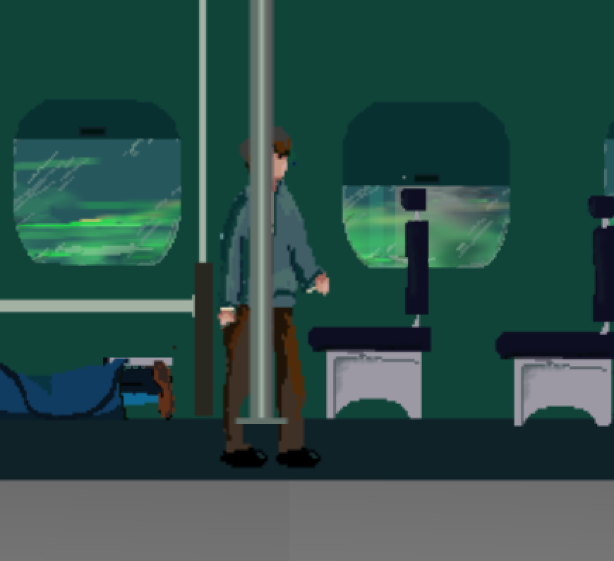
| Oct 7 17:30:25 | 44m 37s | Hyperloop hell | ♥ 1 | Well the Mac version worked just fine. The web version full screen didn't really work so had to go for the desktop version. Mac version at least was a debug build, should probably do a release one the next time. I don't really know Godot well enough (just done one jam game with it) to know what the difference is but it's easy enough to do so probably worth doing. The pixel art overall looked nice but wasn't without issues. The biggest one I think was the lack of variety. Sure, reusing the same sprite work over and over again is fine, especially in a scene like train but adding even a little bit of variety would go a long way. There was some like the half closed windows but would have liked to see some more. This one pole was also weird looking since it was positioned too high and you could see the character sprite from under it. The other copies of that same pole were pretty much fine. Screenshot 2020-10-07 at 19.59.25.png Then to the UI side of things. The font was super hard to read. The s letters were just confusing and looked more like g. And you didn't make it any easier with very poor color selection for those highlighted words. I had to literally squint and get closer to the screen to be able to read the blue one. And I don't even have any sort color blindness or any other sight imparity at all. The emphasis words were with different font too. Pretty much ticking all the boxes on what not to do here. There was also this one point were you messed up the text coloring... Screenshot 2020-10-07 at 19.54.26.png The walking speed was too slow and I guess you noticed that yourself too because you added the speed walk key. But there is no point in having a functionality behind a key where the player would want to use it 100% of the time. There would need to be some sort of drawback or other reason on not using it for it to exist at all. Like the most common (cop-out) one being a stamina system which obviously wouldn't work here. Every action behind a button press needs to have a reason for player to use it and not use it too. Then you also broke your own rule of making the text only proceed with x press on the lavatory hiding scene. The text scrolled past too fast, especially due to font and emphasis colors hindering the readed way too much. Too bad too since it seemed like you were actually dropping some major lore bits and jokes on that scene. The story was of course then reiterated to Diane on the phone right afterwards but the damage was already done at that point and it left a bad first impression. The ending was super rushed. That very out of place single freeze frame sprite flip death animation, the abruptly ending story and the hastily mocked UI. The story was going at pretty decent pace up until that point but it was just then like "oh yeah, bad guys die and you win congrats"! And the end UI stuff was just like you just threw in some UI components to the screen last minute. Completely ditching the font used previously and even trying to align the stuff to look decent. Screenshot 2020-10-07 at 20.00.17.png Anyways, good job! Always cool to see people tackle more story based games on jams. 👍 |
| Oct 7 19:53:46 | 2h 23m | Moby's Trip | ♥ 2 | Never a LD without a synthwave themed car game! 😅 This was my first hurdle, didn't quite understand why it didn't let me write my name. Seems like I was trying to write it on the disabled button and the fancy looking label was the actual input box. Focus could have been on the field by default. Screenshot 2020-10-07 at 21.57.57.png Nice look and overall very consistent style. Same goes for music. Sound effects were a bit bland though. The camera movement was very wonky. Even quite nauseating on tighter corners and especially on the bumps. The bumps were so disorientating that I died like half of the time encountering them. Wasn't a fan of the controls at all. I think they were too stuff, abrupt and had too much inertia for the precise movements needed. The collision areas seemed too big too. In quite an unfair way really. You could even have already gone past something so that it wasn't even visible on the screen anymore and still collide with it. That in conjunction with the punishing gameplay of not allowing any mistakes made for a non risk taking (boring coward) strategy of just being safe and going as slow as possible seem like the best one. Really unfitting for the game in my opinion! Giving players some leeway and allowing them to recover from small mistakes would habe made it more fun. Something like maybe not make the player lose on first hit but start a timer of a minute and if they get hit during that another time, they'll lose. Currently it punishes way too hard for small mistakes that a partly even not their fault. Like the already mentioned bumps or the following configuration that was so damn deadly with the inaccurate controls... 🅱🅱🅱⚪️⚪️⚪️ ⚪️⚪️⚪️⚪️⚪️⚪️ ⚪️⚪️🚗🚙⚪️⚪️ ⚪️⚪️⚪️⚪️⚪️⚪️ ⚪️⚪️⚪️🅱🅱🅱 I tried to pay attention but at least I didn't notice any effect on the speed on scoring. Is that really the case? If it is, why so? It really doesn't make any sense. Why wouldn't the player go as slow as possible since it's a lot easier to dodge stuff that way? But it is also lot more boring. And completely defeats the purpose of having speed control at all if one is just straight up better in all ways (except for boredom factor). At least you added a downside to shooting (destroying the casette tapes, which I think did give some points). Quite often on jam games people just add a shooting or run button all willy nilly with no downside at all even though in those cases it could just have been automatic instead of having the player hold a button down 100% of the time. Didn't quite figure out how you did the level randomization stuff. Obviously it was made from smaller sections or something like that. Some sections seemed to be hella rare though. Like once I saw this big bunch of several tapes in once. So RNG seems to play a big role on scoring too. Especially with those sections that require super precise movements to sneak past alive. Anyways, good job! 👍 |
| Oct 8 18:59:28 | 23h 05m | A Certain Particle Chamber | ♥ 1 | Awesome stuff! This is where I will call it quits... Screenshot 2020-10-08 at 21.36.21.png At start it was very confusing, would have needed more linear and drip like introduction. I just threw too much (information) against the player right from the get go. At least you can really go at your own pace and there isn't any rush to learn stuff but I think might easily scare some people off before they really get to know what it is even about really. I was also dumb and confused left and right at the start and thought the level names were the hints on what to do. And even managed to beat like the first four ones like that before noticing the error of my ways... 😅 It could also use some more gamification. It was a bit too much of a physics toy with some goals. Nothing wrong with it really though and at least I was very much enjoying my time with it. Really liked that the levels had a normal goal and then the gold one. The difficulty was all over the place. Doesn't really matter that much because you can complete the levels in what ever order you wish. But some more linear curve would have made more sense and made for an easier introduction. The "hit beta" levels were obnoxiously hard! The beta particles just repelled the beams way too much. I wasted so much time trying to gold these, and these are probably the reason I gave up on trying to gold em all. You see, stuff like this. The beta particle is shooting the beam pretty much straight backwards... 😠 Screenshot 2020-10-08 at 21.57.02.png Sometimes you set the bar kinda too high like this subpixel perfection requiring torture (even with just one moving piece, it was one of the "hardest"). Screenshot 2020-10-08 at 21.46.34.png And sometimes on the other hand the the par was way too low (and yes, I am mixing limbo/golf analogies because I can't come up with anything else)... 😎 Screenshot 2020-10-08 at 21.44.27.png The game really suffered from the lack of zoom functionality. Quite often even moving one piece a pixel made too huge of an impact. Obviously the graphics weren't anything to write home about. The pure primary colors just do not look good together. The biggest offenders of course are pure red and blue which are very hard to read from a black background too. Made it really hard to locate which particle was which letter. Just applying some nice looking color palette here would do wonders with the game look. Anyways, very good job! 👍 |
| Oct 9 13:38:45 | 18h 39m | Time Crash | ♥ 1 | Pretty damn nice! I don't think I can beat this, my memory ability seems to not be too great 😓 Screenshot 2020-10-09 at 16.17.55.png Very nice amount of polish here. And overall pleasant looking and cohesive visuals. Everything was nicely animated too. Music was very nice too, the clicking sound started to get a bit old and it was too loud in comparison. The gameplay was rather simple but worked for what it is. The difficulty curve could have been quit a bit steeper in my opinion at least. Now it took quite some while to increase and it really makes it harder to go for another try after a failed attempt. A more quicker games would leave space for more motivation to try again. Basic game loop starts getting quite repetitive too and the scoring is fairly uninteresting being so linear. Spicing he gameplay up with stuff like powerups could easily give the game more longevity. Could have stuff like "free pass, 50/50 stolen straight out of who wants to be a millionaire or more thinking time. Would be easy to come up with a bunch of them. And these could even be bought/earned between rounds to give like an overall progression thing. The scoring could be quite easily improved with multiplier system where multiplier could be for example increased every time you pass a level without a single missed input. That would make the scoring more interesting, varied and skill based. Not just being based on a single thing (getting as far as possible) but two (getting as far as possible as cleanly as possible). Anyways, awesome job! 👍 |
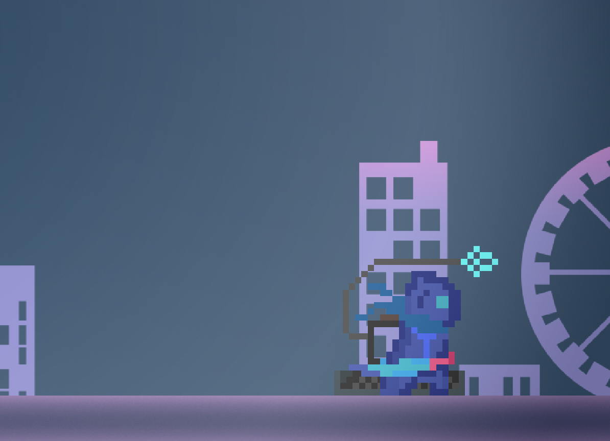
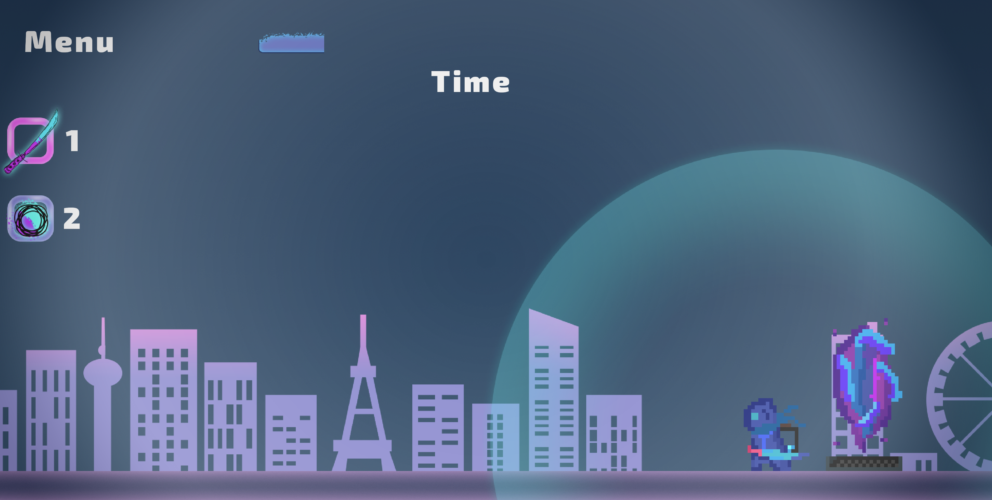
| Oct 9 14:17:01 | 38m 16s | Time Saver | ♥ 3 | Well the base mechanic of getting more time to your next try should have been introduced (or at least hinted on) better. Or not better, at all really. Had to go back to read the description on what the hell I was doing wrong. And I guess that was nothing, the game just needed a too big of a grind to get going over the first hump. The look was pretty hit or miss. There was a clear mismatch of two different styles, pixel art for the characters and cleaner vector style for everything else. Of course such thing can work too but here it seemed like just like a bit too big of a leap to me. The design of the main character was pretty cool. Nice touch that the available time was also represented in the tank or whatever that was supposed to be. The dashing frame could have gotten some more love, I think it was just one of the walking ones right now. Something like make him lean forwards a bit more and give the sword some movement too. The enemy sprites paled in comparison, they looked quite messy. And especially their potion throws looked janky as hell. The eye enemies looked pretty. The enemies overall could have used some animation love too. No idea what is going on this end scene though... Screenshot 2020-10-09 at 16.52.16.png The game controlled pretty nice. Especially late on the level when you start jump dashing and chain killing the eye enemies, it was quite fun. The second weapon felt completely unnecessary. Mainly because it was too awkward to use. Having the throwable bound to another button would have made more sense. The goal of the game wasn't very clear either. Of course it wasn't too hard to guess but having one harder to kill enemy (I even though it was just decoration) at the start was just a dick move really. Having to do a complete new run because you didn't realize that was not too cool. Well, it was quite short anyway. Screenshot 2020-10-09 at 16.50.38.png The sound effects were not great! Only few sound effects with no variance started really getting old fast. Especially that long deafening screech siren on death/spawn really starts getting annoying. And there was a bunch of stuff that didn't have a sound effect at all, really made these action seem insignificant. More feedback overall would have been nice. Like some sort of flash or other type of hit registering effect would have helped in the case of the "immortal guy" in the beginning. Stuff like that overall (screen shake too) would really help sell the weight behind all actions. Anyways, good job! 👍 |
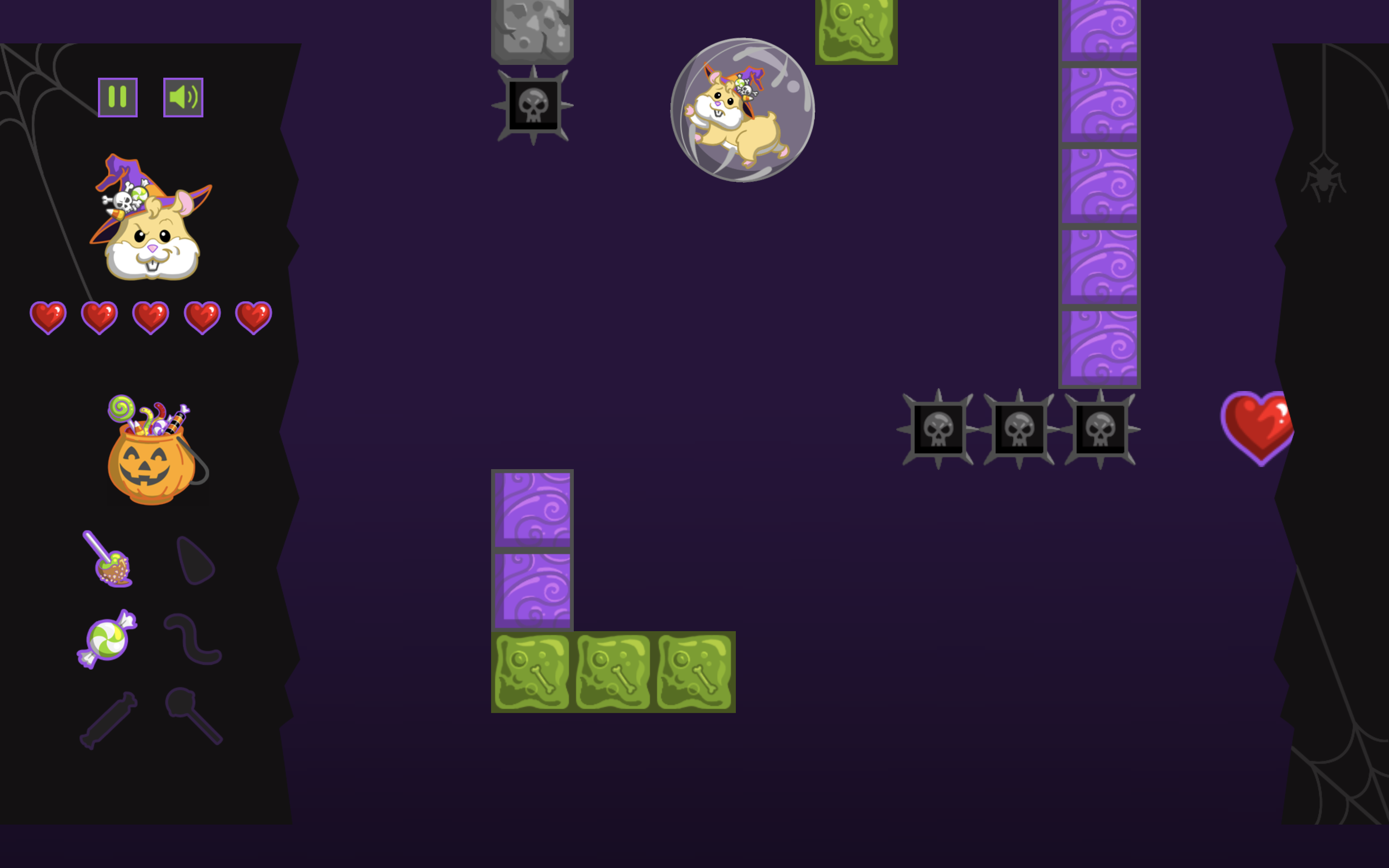
| Oct 10 15:44:59 | 25h 27m | Mr. Cheeks Sweet Dreams | ♥ 3 | Piece of cake! Screenshot 2020-10-10 at 18.13.43.png The game looked good! Very clean and consistent throughout. The sound effects too had a lot of personality. The music was ok too but it got kinda repetitive fast because of the short loop with no variety. Of course the game was short enough for it not to get too annoying anyway. Would have wanted to see more visual effects there too to emphasise stuff like getting hit and so on. Like particle effects and screen shake are some quick and common ways to give some punchy feedback. Looks like you didn't properly plan for any other aspect ratios. Screenshot 2020-10-10 at 18.11.28.png The actual mechanics were executed quite well but there was an issue with the main game loop in my opinion. The knockback from the block punches was just way too much. It took ages for the speed to start picking up downwards and to get to the same position where you hit the punch. And waiting is never fun! The knockback was rarely useful for actually going back for something missed. Pretty impossible to plan for such moments without memorizing the map completely and organically those moments just did not really happen. It was mostly (for me at least) for slowing down the descent and blasting through the platforms. And for those purposes it was just annoyingly slow. This could be solved by cutting the punch knockback distance and time down by quite a lot. Or you could even do two different buttons for two different types of punches. One with knockback and one without it really. Of course the level design could be improved too to more facilitate the existance of these two different ones. The max health seemed quite high and the heart pickups were so plentiful that there isn't any real danger of failing ever. Of course I'm very bad at making correct difficulty games too but this might have been just too easy. I could comfortably blast through hitting as much spikes as needed without any danger of running too low on health. I missed the candy corn on my first loop but managed to snag it on the second one. What would happen if I missed it there too? Needing to do the whole empty loop just to try again? 😱 How are you supposed to grab this gummy work in the correct way? I'm guessing not glitch through the green blocks with low speed like I did. The through glitching also looks super awkward because the sprites start z-fighting. Same happens when you go through the hearts. Screenshot 2020-10-10 at 18.20.19.png The spike hitboxes were too big. Like physically bigger than the sprite. Screenshot 2020-10-10 at 18.09.35.png And to feel fair, hitboxes would need to be at least a bit smaller than the actual sprite. So that close calls would favour the player and they wouldn't feel like they were hit unfairly. It's often hard to correctly estimate the hitboxes in the midst of action so it's safer to shrink them so when the player gets hit they know for sure it was due to their own fault. Anyways, good job! 👍 |
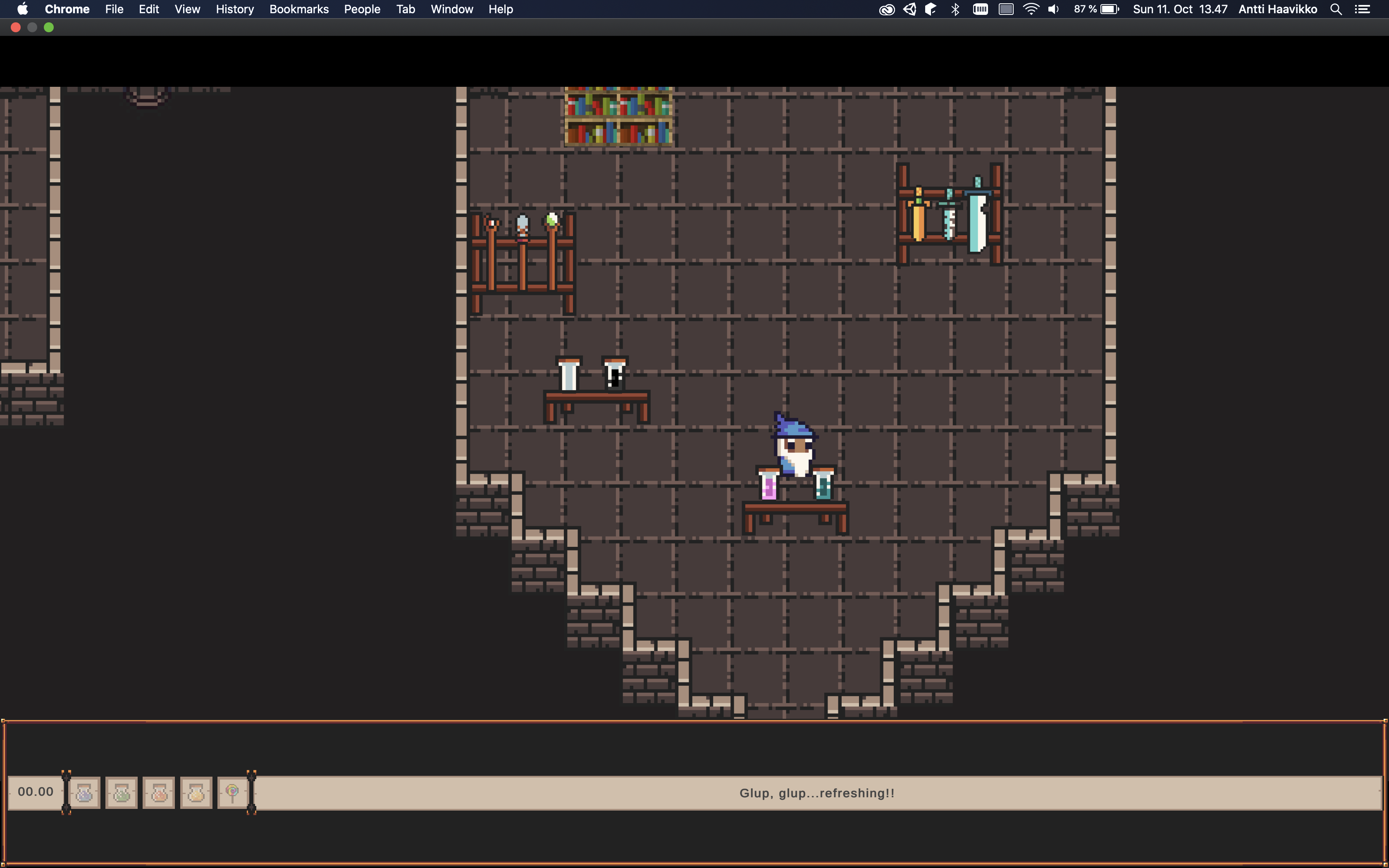
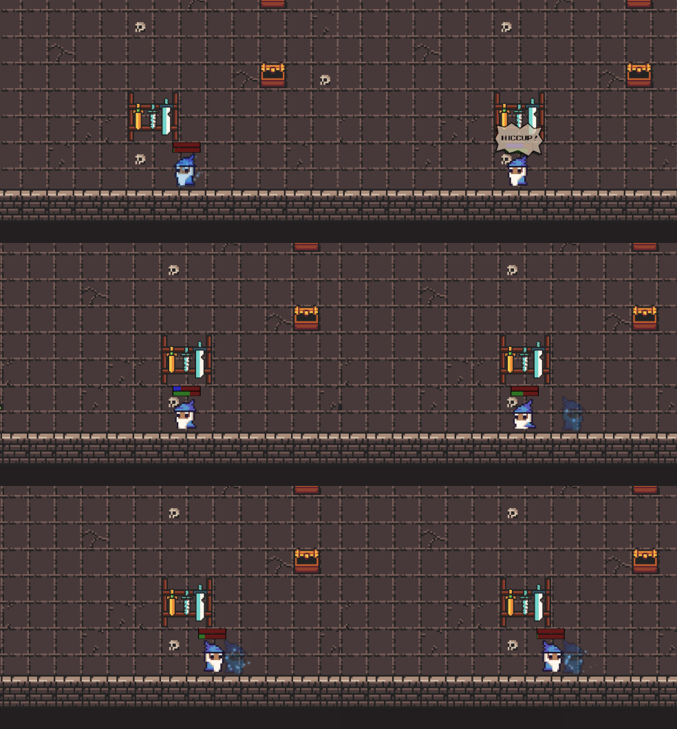
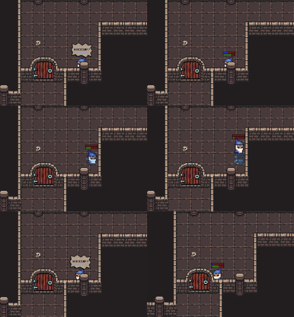
| Oct 11 11:20:26 | 19h 35m | Hiccup Time | ♥ 4 | Cool! Very interesting and quite unique mechanic and used nicely for few puzzle ideas. The mechanic would need some tweaking though. Currently it was quite often just annoying and hindering the traversal, slowing down the pace of the game by a lot. Maybe there could even be a "hold breath" functionality to pause the hiccup timer for some duration. The ingredient display glitched out all over. Sometimes grabbing one ingredient made another disappear from the menu and so on. Made it really confusing to understand and made it seem like you lose the collected ingredients with some trigger i.e. death or time. The lack of real end made it even more confusing. Having some sort of an outro before looping back to start would have been nice. I had to play the game twice since I wasn't sure if I beat it or what on the first one. I never noticed I had gathered the chest items (lollipop and yellow potion) since they had disappeared from the UI before noticing them. The intro pacing was a bit off too. It was quite fast and having the text and the action itself be that separated meant that it was hard to follow both. I pretty much completely missed the whole idea the first time I saw it and only started to realize what was going on after bumbling around getting confused about the teleporting for like a half a minute. And the UI didn't quite look great because it didn't scale properly. It looks nice on your screenshots but it looked like this to me. Screenshot 2020-10-11 at 13.47.14.png Especially for the intro speech it was quite awkward. Having it in a speech bubble like that hiccup thing would have worked better in my opinion at least. Could even have gotten rid of the whole UI bar and have the icons just floating on top of the game view. Now it was just occupying quite a big portion of the screen real estate for pretty much no function at all. The timer there was completely pointless. The hiccup timer bars were also quite confusing. Maybe just one pingponging bar would work better. 🤔 Like it would go from full to empty, then hiccup, slowly back to full, place the shadow and then just repeat like that. I did not rate on graphics and audio as you requested but I can still comment about them. Looks like you didn't quite stick with the chosen tileset style. The bookshelf and book sprites (at least) didn't fit the look of everything else (no outline etc), were those straight from Minecraft? The hiccup bubble look weird with the half transparency. And the text on it wasn't centered vertically correctly. Were there like three different fonts? One on menu, second on timer/intro text area and last one on the hiccup bubble? And none of them really fit the tileset style either. Same goes for the hiccup bars, they had a different "pixel size" and the colors could have been picked from the tileset palette. There was also some z-fighting issues. Quite often the order was correct (like with doors, bookshelves and those wall pillars) but some others (normal walls, weapon racks) always stayed behind the character. The blue particles were also always on top of everything so could be seen through closed doors and so on. The music fit the game well and overall the sound effects were fine. Just the hiccupping effect got quite repetitive. Having few variations of it and playing them randomly would have been nice. Or just varying the pitch by a small percentage each time would also alleviate the repetitiveness. Found a minor collision issue here. hiccup-collision.gif And corners had these weird rounded colliders too. hiccup-corners.gif Anyways, good job! 👍 |
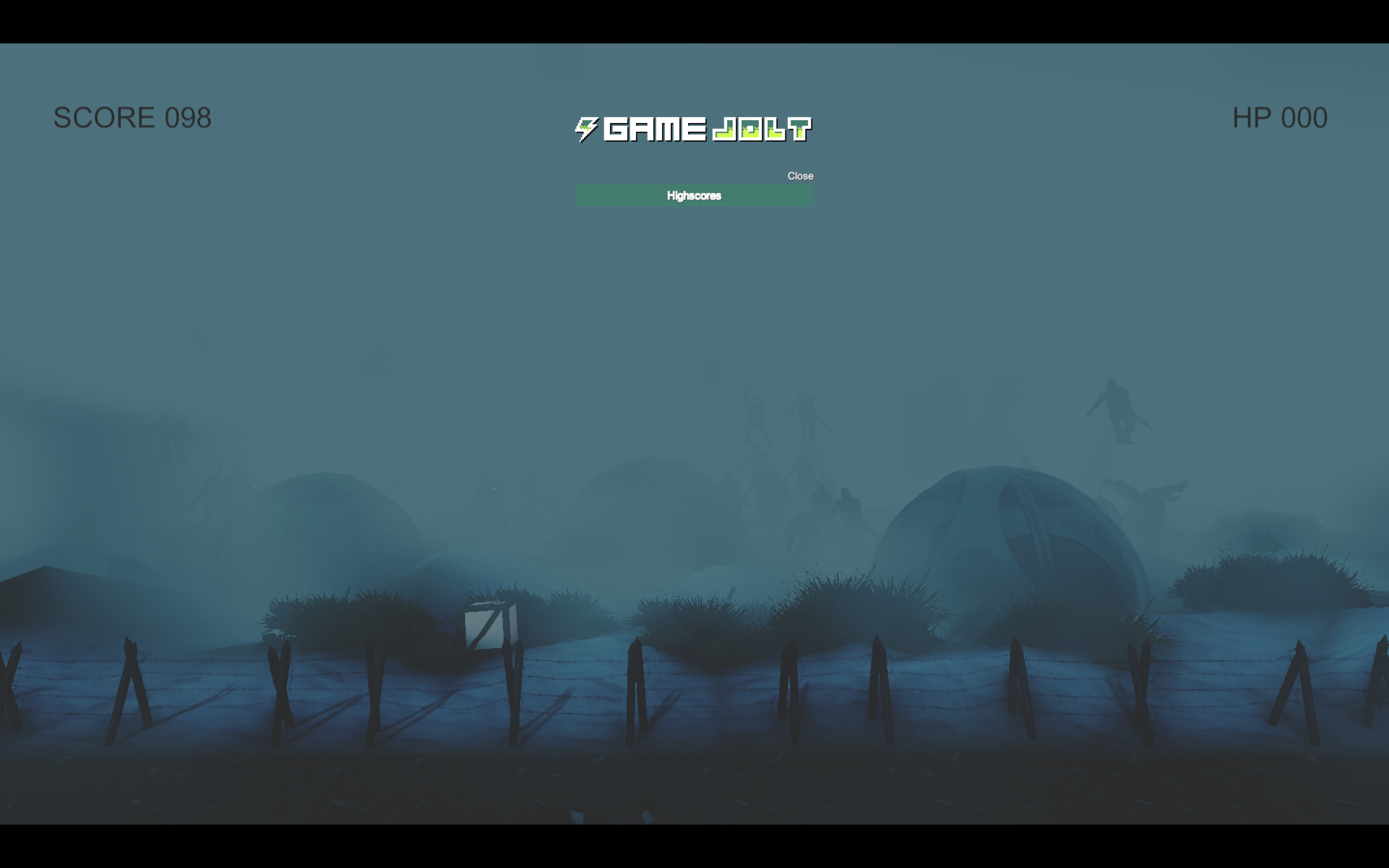
| Oct 11 13:44:13 | 2h 23m | Frozen Potency | ♥ 1 | The game was buggy as hell. Sure, some parts seemed even intentional but forcing a full app restart between rounds because the leaderboards gets stuck on the screen for example was not cool. And what even is the point of a leaderboard if everyone there is just "unknown". Controls had some issues too. Like there was no downside at all for running so you never actually needed the walk. So you just forced your players to keep holding one button down 100% of the time. The picking up boxes was glitching too, quite often it just didn't register from some box positions and had to switch to another one. Binding grab and throw to different buttons was pointless. It was almost like a platformer which would change the jump button after each consecutive jump. And it was especially bad playing on a laptop touchpad where there is no physical right mouse button. Obviously that's my fault too for trying to play games without a proper mouse. I think this is the best I can do without a mouse at least... Screenshot 2020-10-11 at 16.27.21.png Oh and Mac version indeed did require the following before the actual app wanted to start up: ```` chmod +x Frozen\ Potency\ for\ Mac.app/Contents/MacOS/LD47 ``` The game looked good. The serious gritty graphics didn't quite fit the goofy theme of screen edge walking and silly physics though. And I guess they were just some already existing assets also. And the UI things looked quite sloppy with the default font and so on. The fog was a bit too strong, couldn't even see half of the enemies. The sounds were good too but got kinda out of hand when there was tons on enemies on the screen. Getting around corners felt like a slog. It was quite often just a coin flip whether or not you're gonna make it or die trying. Didn't seem like there was that much strategy really. Just always keep the run button held and do small steps forward while grabbing the boxes and hurling them towards the enemy masses. The aiming was also hugely affected by RNG too since the boxes bounced around uncontrollably so it was completely up to luck whether the box knock out few guys or none at all. Anyways, good job! 👍 |
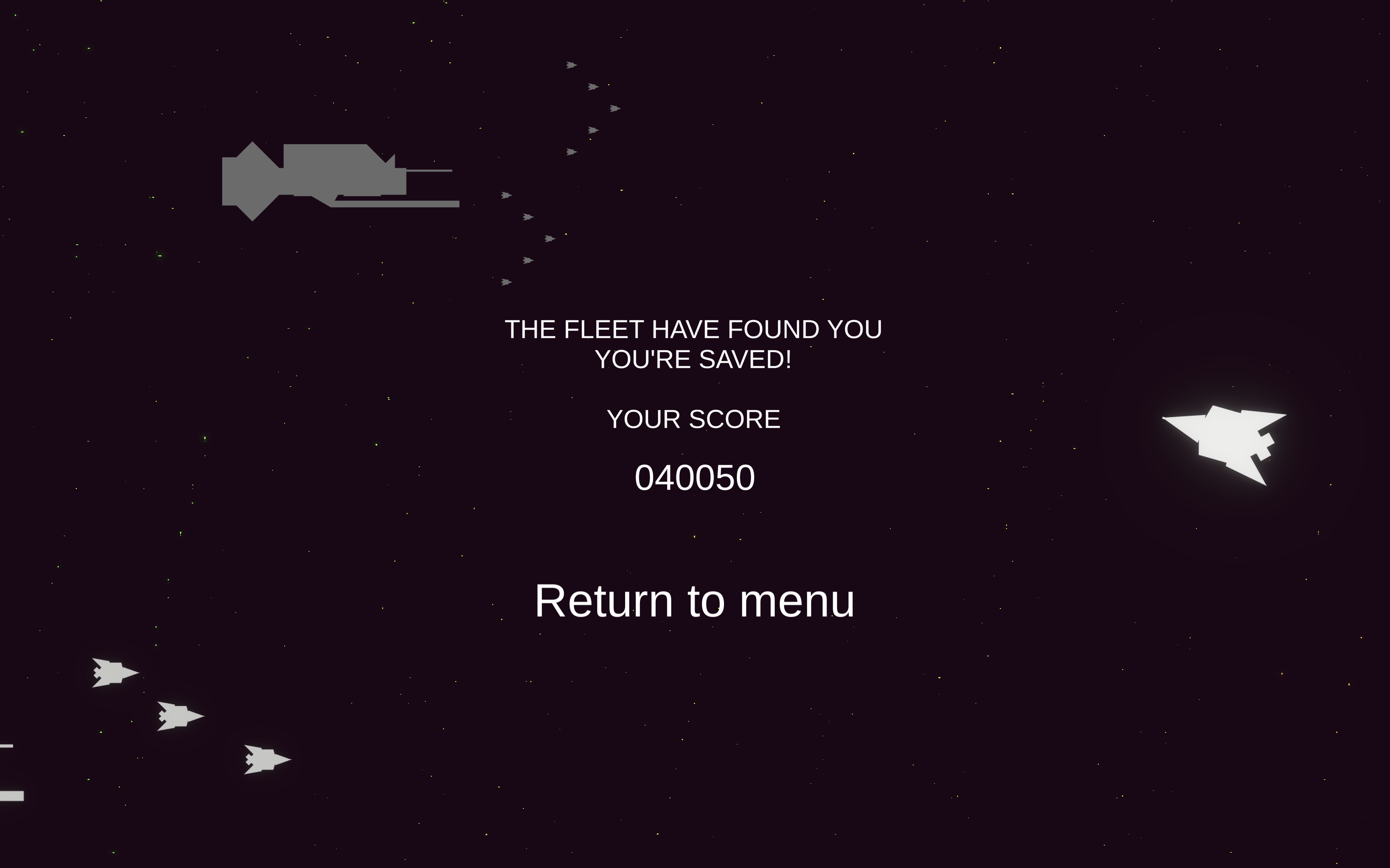
| Oct 11 14:34:30 | 50m 17s | Loopfield | ♥ 1 | Aight, finally beat it! 😎 Screenshot 2020-10-11 at 17.05.04.png The fastest asteroids and pickups were too much for my reflexes at least. I mean I were just on the edge of managing to block them but no way I got to actually decipher the color before that. I think it was quite a good move to not have the things spawn from top and bottom because then you'd have even less time to react. On the other hand it made half of the play time mind numbingly boring since you could just keep your cursor just above the ship and be completely safe from everything, only just keeping an eye out of pickups. Probably might have been better to just lock the aspect ratio to square and allow spawning on any edges. Obviously that would require either zooming back a bit or slowing down the projectiles. The scoring is bit of a miss here. At its current state, it is quite pointless since it's almost like just a timer. And speaking of which, a timer to the rescue arrival would have been nice. And definitely could have made the difficulty ramp up towards the end to up the action just before the release. The scoring could be spiced up with a multiplier system. Could for example increase the multiplier on each destroyed asteroid and reset when getting hit. Maybe the timed reset of shield could reset the multiplier too so you'd want to manage your shield more manually. The come up with some scoring thing on powerup destroying too, kinda something like risk vs reward. It was kinda weird how the powerups came closely togerher in groups of three. I mean it was kinda a good thing and kinda not. Grabbing a shield for example made it impossible for you to grab some health right afterwards and obviously wouldn't even need another shield. I do like the double edged sword thing you got going on in shield replenishing though. Kinda made you have to think and sometimes actually skip getting them when you had like 75% shield already in favour of maybe getting some health ones. The look was pretty good! The color palette was mostly pleasant to look at (the asteroids felt a bit dirty looking compared to anything else). The destroying effects looked nice but would have just wanted to see a lot more. And they looked awkward when going fast speed and ending up inside (and under) the shield. Should have added the effect on the actual collision position instead of where the asteroid body would have ended up in. Giving the asteroids some size variation would be cool too and make it look less repetitive. The shield filling visuals were kinda glitched too, it did like some weird 90 degree turn before actually going full. And I feel like the shield timer was completely pointless, the circle was already more than enough. The health bar could have also had either a frame/border or a background. Now it was quite hard to estimate how much health you actually had. The sound effects weren't really anything to write home about. Kinda repetitive too because there was no variation. Especially with the lack of music. Why have the music play only on the menu scene? And the getting hit sound was very bland and seemed insignificant. Even though it should be the scariest thing in the game really! So the sound effect for it should pack a mean punch and be accompanied with some flashy visuals too. Anyways, good job! And congrats on your first (and successful too) Ludum Dare entry! 👍 |
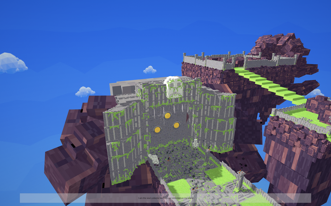
| Oct 11 17:01:59 | 2h 27m | Beyond Death | ♥ 4 | Nice. Consistent good looking style and especially the animations were top notch! The UI could have used some of that same love. It looked rather bland and stock Unity and didn't even scale properly. asd.png The landscape changing the look the more you died was cool and on my first run I think I was on the last possible loop while getting through the door. The red water, blood on the altar and so on really sold the ominous feel of impending doom. Was quite confused about the lack of any ending and kinda missed the whole thing about 12 deaths my first time seeing the intro so actually played the game twice. The second run was obviously much smoother and squeezed through with what I think is minimum number of deaths possible (i.e. three). I even walked back from the final totem! 😎 The intro should be able to be skipped though... The corpse usage as a helper for next round was cool. I was even admiring the previous corpse being there even before it really clicked to me that that it the main mechanic of the game and the way to solve the puzzles. But on the other hand even if it was cool and worked early on, later on in the stage it became just annoying really. It was just forced death and a time waste which is never fun. Thankfully you didn't do these too late in the stage really. Might have actually made more sense to have the final idol also be on its own branch. Now it just kinda made the middle one almost pointless. And that would have made the trek to it shorter too so you could have used the death mechanic more. But this was unacceptable! The dude falls down in the death animation and his hat falls off too... Screenshot 2020-10-11 at 19.23.20.png </sarcasm> The block pushing was hella broken. Dumb me didn't realize that it was on a button which controlled the flame trap so I tried to push it to block the flame trap with. I managed to kinda do it but the block fell out of the world on top of the stairs. Should have introduced the flame trap in a more clear setting. Sure you had it once earlier before but it was too much covered by the wall and I only got to really see the button (which didn't even look deadly at all) and then the character just getting lit ablaze. And when encountering the pushable block (*time to crate* of around 3/4ths of the game 😉) it kinda just looked like a pedestal for it. The pushing didn't always work, had to stop and try again several times often for it to move and getting it close to walls made it even more glitchy. Of course it wasn't even supposed to be pushed that much really so not a huge problem. The game controlled fine but the locked isometric 45 degree view made it a bit awkward since you usually had to be holding down two keys. I guess it would work fine with an analog stick though. But allowing the player to rotate the camera would obviously be the best way to go. This would also fix those annoying places where a trap was hiding behind a wall up until you got too close to it to really react. Anyways, good job! 👍 |
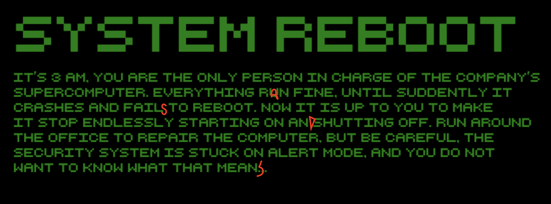
| Oct 11 18:01:02 | 59m 03s | System Reboot | ♥ 1 | Aight, lets start with some spell check! Screenshot 2020-10-11 at 20.10.22.png **1st try** Completely missed the map prompt and ran up until got the wrench. Then I started wondering what the first item was and how to use it. First restart... **2nd try** Oh yeah, now I can use the map. Cool! Run up to the wrench again and then completely forget that pressing space was a thing. Run around the first few rooms desperately trying to hit everything with the wrench. Then by some fluke hit space on the supercomputer and remember that oh yeah, space exists. Back to the switch and continue on. Oh cool, those enemy bots the intro warned me about. 😱 Psh, no problem at all, my wrench is op as heck hitting through walls/corners and so on. 🔧 Got to the room with black squiggly line walls and it was absolutely filled with bots. Met my end there, these bots are no joke when encountering them on closed spaces because you can't really control your swing direction that well. **3rd try** Do a full loop. Heck, no punch card. Oh here again, lets investigate the map. Boss room and archive are the target. But can't access them. **nth try** Just repeating the same stuff over and over again with no luck on finding the punch card or getting to either boss room or the archive. Getting really frustrated about the combat too. The room with the computers that can be turned off seem to hold some significance but no luck with it really. Some doors (I think mainly the starting room ones) were also acting weird, not always being open even though I think I was doing the same thing each time. And here is where I need to give up! --- Really digged the visuals. Super simple yet charming. Color palette was pretty eye pleasing to look at. The sounds were also fine but just too few effects. And obviously the lack of music didn't really help in that department either. Sound is one thing that really could have sold the scariness of the enemy bots too. Also some visual feedback would have been needed to emphasise getting hit and hitting enemies. Something like color flashes, particle effects, screen shake and so on. Anyways, good job! 👍 Too bad I didn't get to finish it... 😢 |
| Oct 12 17:14:30 | 23h 13m | Under The Moon | ♥ 2 | Pretty nice art! Very spelunkyish main character. 😉 And the other characters looked good too. Simple yet quite effective "walking animation". Could have done the similar treatment for idle and jumping too. Now jumping with the walk animation playing just looked goofy and the idle looked too static. The environment looked kinda bland to everything else in comparison. They could have used even just a little bit more details rather than just being solid color rectangles. The game had already a nice moody vibe which could have been improved even further by adding some sounds and a moody piece of music. Managed to snag a win on my third try. Screenshot 2020-10-12 at 19.51.57.png Really find it weird choice and kinda annoying too that the game was pretty much just on a timer. You had to rush because being too slow meant the death. But then on the other hand, timed game events really lock you from progressing. Things like shop opening, sand falling (sure, you could glitch out the physics and do real high jumps to bypass this) and sacrifice starting. And my final run I was fast enough that I had to wait for store opening for at least a minute or so. And if you're playing the way I think is intended, so just loop around the world and see events unfold, the timing of the end bits is way too strict. Even waiting for the baby to spawn at the altar and having a good guess on what to do with it, it still seemed like there wasn't too much time left. I think a way better option would have been to trigger each event on a new loop instead of just timers. And maybe do something to kinda force the looping too like the initial key grab. Then you could also play a bit slower and enjoy the npc chats and so on. Rushing through didn't really fit the game theme wise. Controls didn't feel great either. The jump was floaty and was quite easy to glitch the physics on the stairs. And the stairs were bad too. You pretty much had to either keep jumping (and eventually end up with those immersion breaking physics glitches) or to that sweet spot jump holding to levitate up the stairs which obviously also broke any final bits of immersion. I also think it was unnecessary to have running, without any downside it should be always on. And having talking and other interactions (carry/drop) on different keys felt pointless too. I personally am not one of these "up to jump" tribe people and would have loved to see a separate jump button. I always kept hitting space while going for jumps and then dropped what ever I was holding. But yeeah, good job! 👍 Nice art which could be taken to a whole new level with some further additional polish and a a solid gameplay loop which could also quite easily be perfected. |
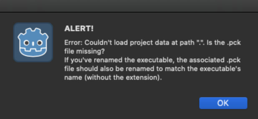
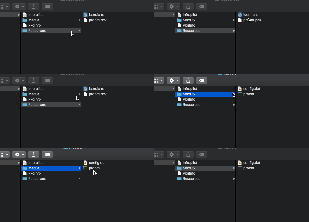
| Oct 12 17:24:04 | 9m 34s | Project R.O.O.M | ♥ 1 | The Mac version does not work. Kinda weird, I think it's first time ever seeing a Godot game which didn't. On the other hand, might also be a first time ever seeing an fps made with Godot too. 😅 Screenshot 2020-10-12 at 20.16.56.png Might have something to do with all those dots in the name. The pck file seems to exist under `Contents/Resources/Project R.O.O.M LD47 v0.4.pck` though... 🤔 Too bad, managed to peak my interest with all the secrecy. 🕵 **edit:** Seems like my guess was correct. Got it working by renaming the following files to not have periods in the name. proom.gif |
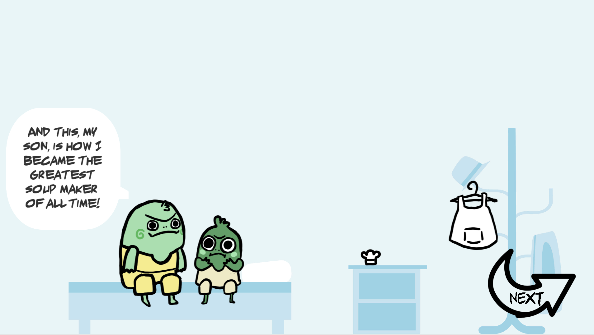
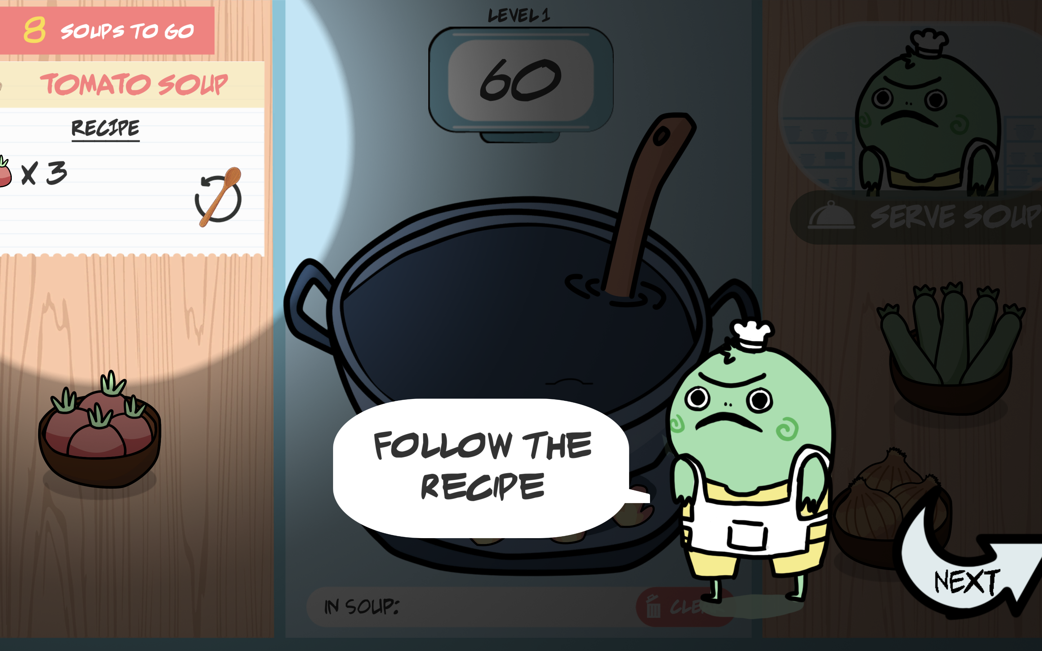
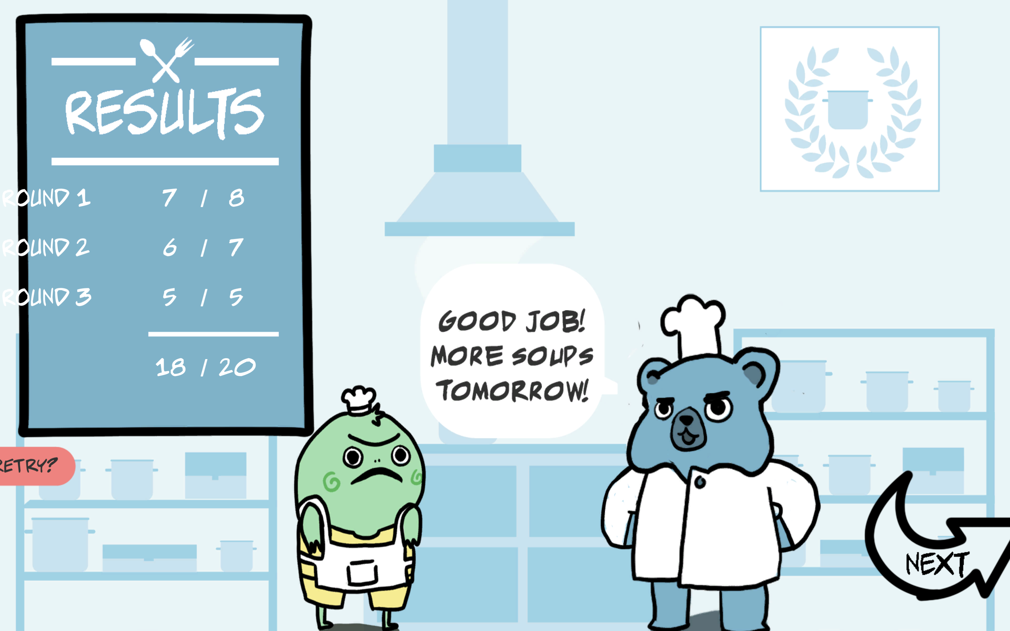
| Oct 12 20:16:54 | 2h 52m | Stuck in a Soup Loop | ♥ 4 | Cool! Nice art style and catchy music. Loved the charming children book like art style. Of course it could have been brought more to life with even some subtle animations. Just some moving/scaling/rotating would been already a huge boost, no need to go for a full blown hand drawn animations. Didn't really seem like it really mattered how well (or badly in my case) I did, the progress was the same. Screenshot 2020-10-12 at 22.47.17.png The tutorial was nice, clear and concise! It was straight to the point, with no need for huge walls of texts, telling exactly what is needed and when it is needed! Loved it! ❤️ Game started off easy, maybe eve too easy. But then on the second and third days it really started picking up. And the last ones weren't really that much harder really, it was just way too many ingredients to throw in. The time just wasn't enough to manage to do but a few soups. And the recipes were not even really balanced. On same level there were 8 ingredient ones and 5 ingredient ones. Dunno if these were in random order though. Having them be fixed would obviously be better for balancing reasons but random would offer more replayability. Oh the choices! Is it even possible to do the full ten soups on the last day in the lotted 40 seconds? I think they were mainly 8 ingredient ones, then the stir and serve. So ten steps per soup and ten soups meaning 0.4 second per step. Sounds like a tough one. 🤔 All screens aren't 16:9 and the game didn't really support anything else. Screenshot 2020-10-12 at 22.35.25.png Made the results screen look even more awkward with the clipping text. Of course this wasn't so bad in this case and playing ended up being better in a smaller window anyway because the movement distances were shorter. 😆 Screenshot 2020-10-12 at 22.38.14.png Could have introduced other elements to make the recipes harder rather than just making them longer. Sure, they needed to get a bit lengthier from the start but by the end it was just too much an repetitive. Something easy to add like changing the stirring direction or having to do the ingredients in some specific order would have really spiced it up. Then it could even go to the Papers Please route and add new stuff every new day to make it more complex. Something like maybe controlling the temperature of the soup or maybe showing the basic recipe but the customer would have an allergy to some ingredient. So broaden the complexity, not lengthen it. Anyways, I think that's all I have to say about it. Well done, good game! 👍 |
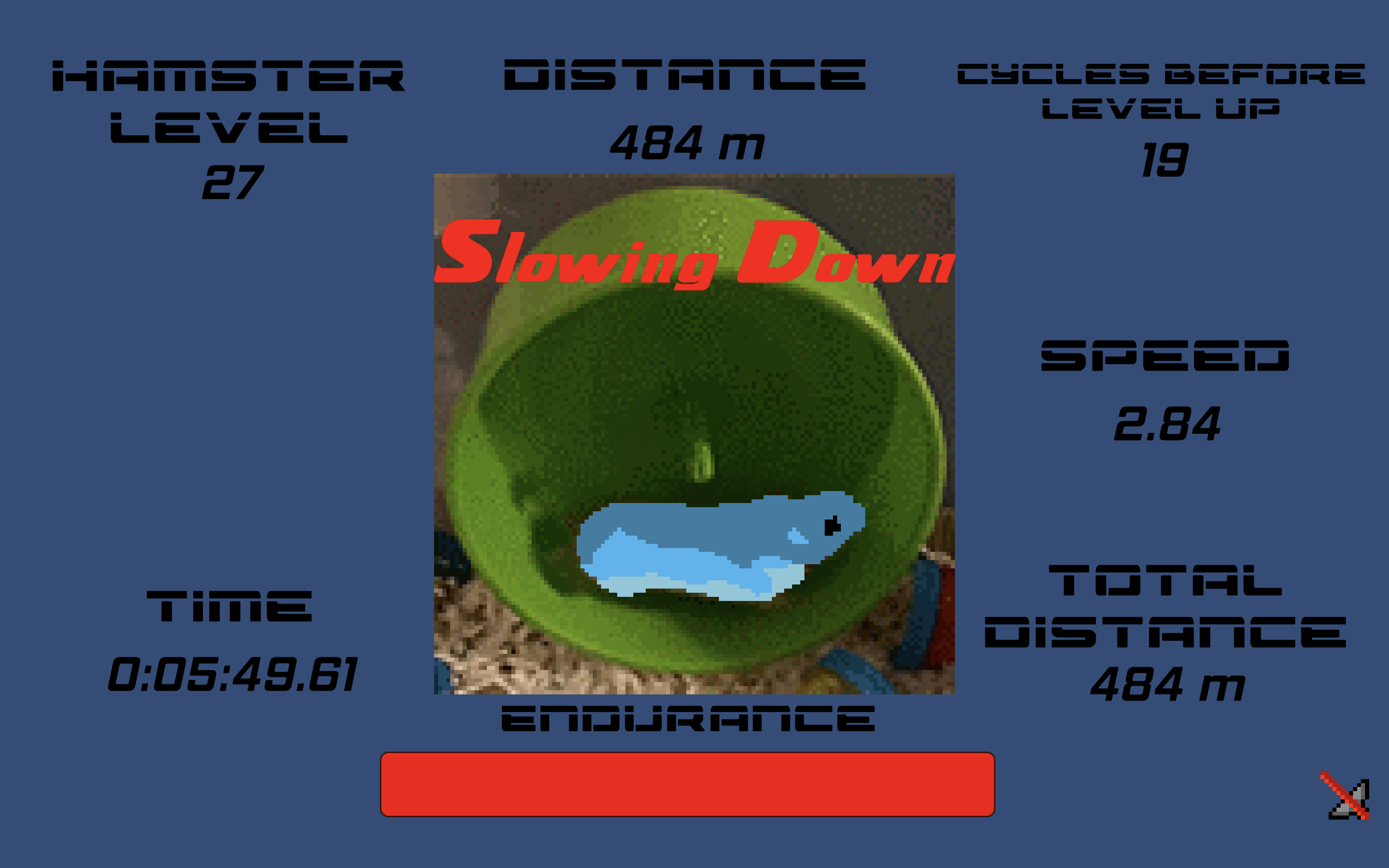
| Oct 13 15:00:25 | 18h 43m | Hamster Simulator | ♥ 1 | Haha, pretty funny stuff! Kinda lacks the depth of clicker games (even though it really isn't even a one). There is a complete lack of any goal to aim for really. If you wanna go for a good single try, only get endurance. If you wanna go far in a long run, balance all the stats. Really basic and void of any strategy. This was my first sprint. Screenshot 2020-10-13 at 17.39.22.png Obviously would need to also run in the background. A classic trope for idle/clicker games. Actually, weirdly enough it kinda does run even while on an inactive tab but the timing is way slower. The upgrade menu should be open all the time so the whole UI would need some reordering. Currently the best way to play was to just keep it always open (cause you could still click the speed increase button) which then hid the main focus of the game, the hamster. So I think it could have been made better by first of all just making it one shot so that you can't do another run (without restarting) if the endurance runs out. Then add way more stuff and attributes that can be bought (varying prices too)! At least a thing that would replenish the used endurance. Maybe something like upgrades to the wheel so it would accumulate "currency" faster. Maybe even bring hydration to the mix. The possibilities are endless! The control setup also was super awkward too. Having just one key to do the speed increase while everything else was mouse controlled was not great. And made it even worse that the selected key resigned on the right side of the keyboard. Especially bad while playing on laptop. The color selection could have been improved too. The hamster itself looked fine but the UI didn't really. Pure primary colors on the endurance bar (never a good look) and was that even the default Unity blue on the background? 🤢 Your color selection on the itch page was more harmonious and thousand percent better looking even. Anyway, good job! 👍 |