Foon → Ludum Dare Explorer → LD48 → Feedback comment stats → Antti Haavikko
Feedback comments for LD48
Antti Haavikko's games and stats for all events →
| Timestamp | Since previous | Game | Antti Haavikko's comment | |
|---|---|---|---|---|
| Apr 27 12:21:45 | Geodiver 48 | ♥ 1 | Cool! Kinda felt that it ended bit too early. Currently it was just scratching the surface and was pretty much just a tutorial. Wouldn't call it too easy though but that was mainly due to some unfortunate design choices. With just those few mechanics you could design a whole slew of interesting levels. The default movement felt very stiff but I guess that makes the dash be even more useful. Two things really hindered my total enjoyment of the game. The bullshit hitboxes and the slogging slow intro between deaths. Hitboxes felt just unfair. Like it happened to me so many times that I sliced a vine or an enemy just fine and got their destroy animation and still crashed to em. I think the spikes were a bit too unforgiving too due to high speeds. And even the non spiked ceilings killing you was fiendish. On the last level I even tried mashing the swing button as fast as I could (and I'm an NES Track & Field master!) since it had to cooldown but still sometimes managed to die while also killing em. I guess it deters the users away from mashing and properly time their swings. And yeah, the intro bit repetition thing was annoying. No need to repeat it every single time. Difficult games, or lets say games where you need to try again and again should restart very quickly. Could go even further and spawn right at the start and give the control to player while still displaying the tutorial message. Would get the best of both worlds, not making the player wait and still showing the repeated tutorial in case the player might have missed it. Another thing I didn't quite like (and skipped before half point) was the wall of text intro. I'm not against having some story even in a simple game like this at all but it could be better than making the player read an essay before even starting the game. The first thing that comes to mind is just split the huge text to smaller bits and show them one by one. Maybe even accompanied by some visuals. Something along the lines of Ninja Gaiden or Undertale intros for example. I liked the pixel art. Not too eye pleasing color palette in my opinion but still looked good. Sound were a bit bland. Bfxr bleeps and bloops are fine (I use em too) but they need some variations (I usually just go for ~10% random variation on pitch at run time) and everything needs the effects and not just some few actions. And of course some music would be a great addition in masking the repetitive sound effects. Anyways, good job! Left me wanting more... 👍 | |
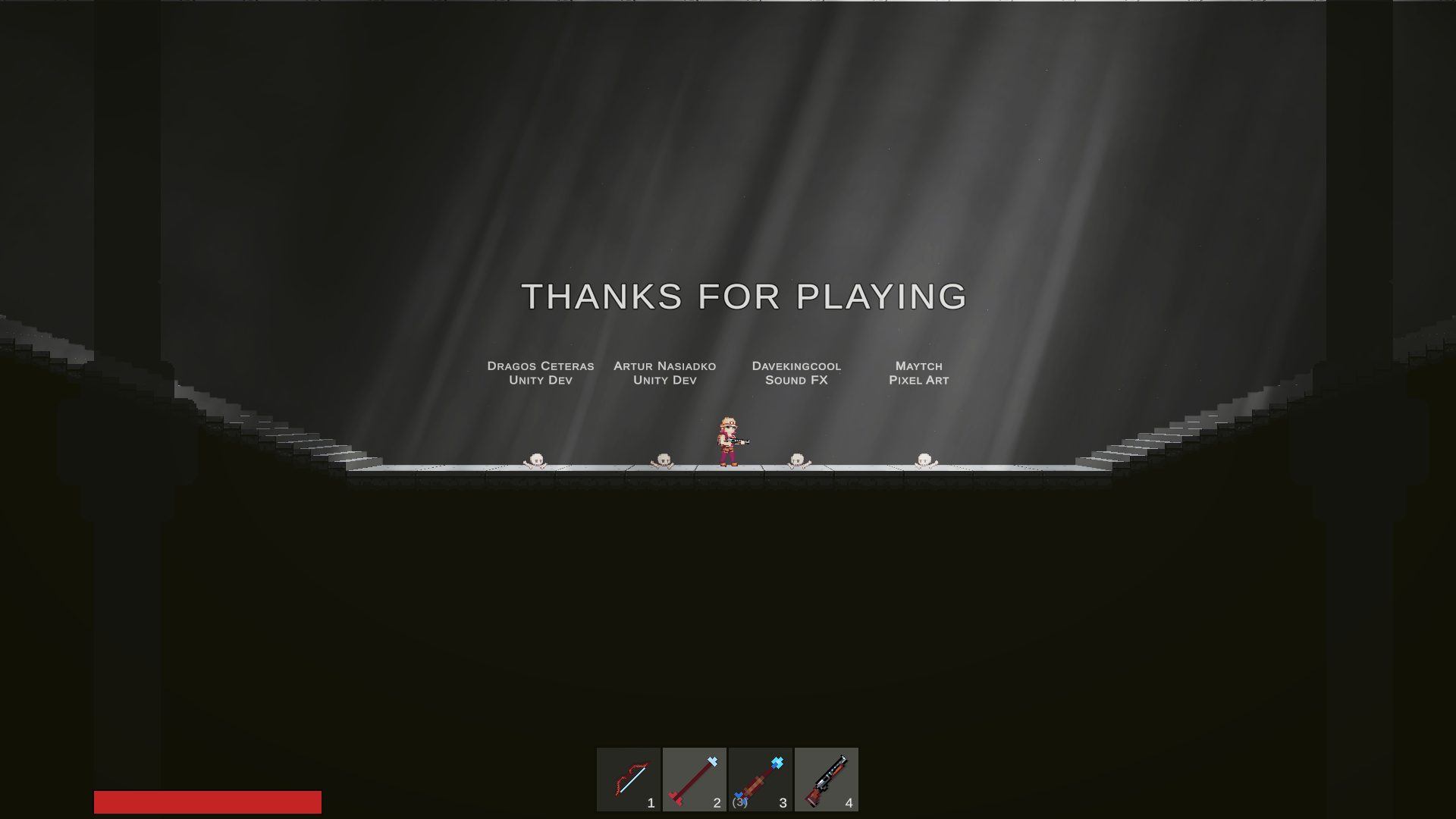
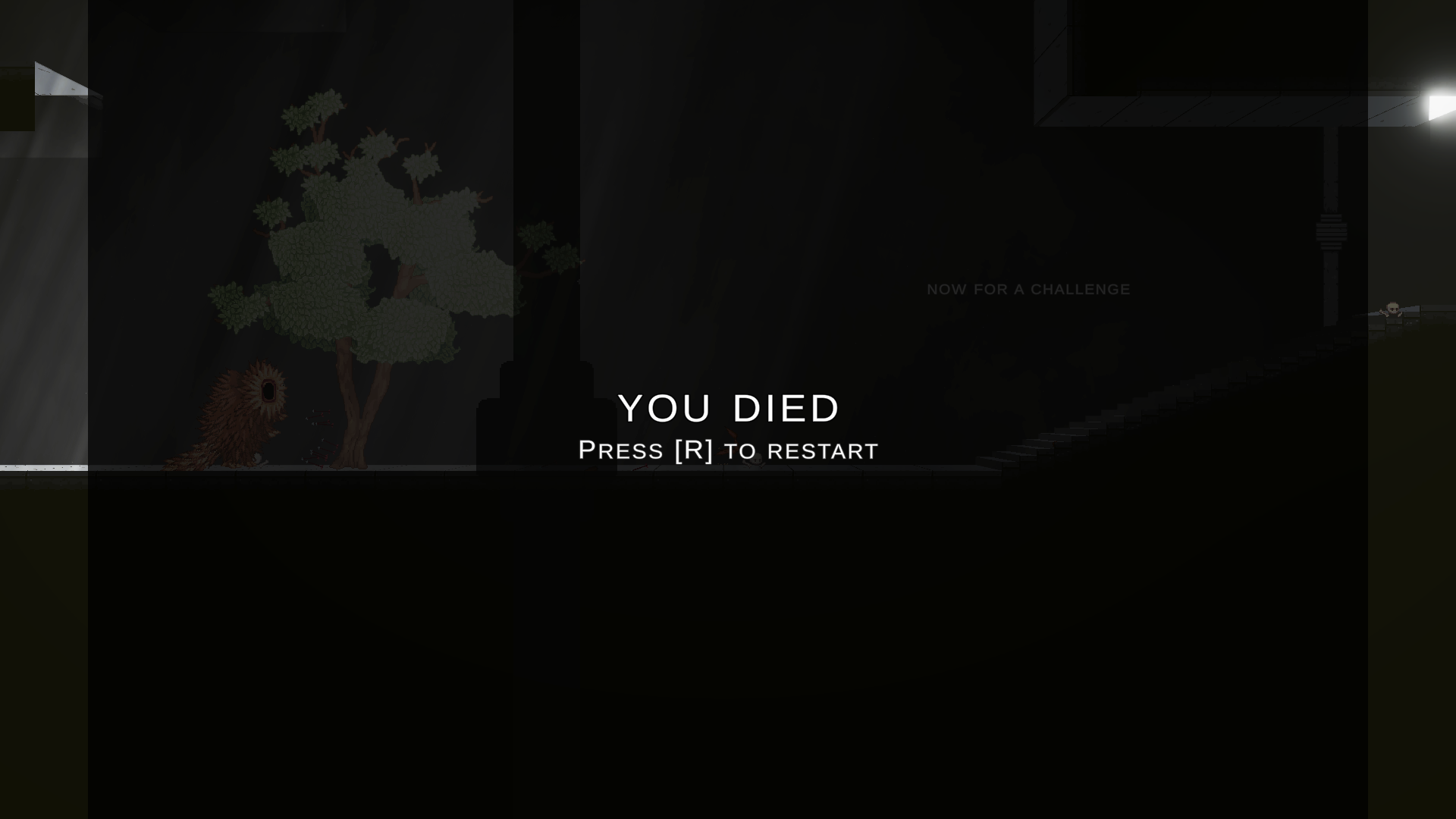
| Apr 27 13:01:41 | 39m 56s | End of my Rope | ♥ 3 | Cool! Pretty damn advanced for a jam game. Somehow got myself clipped out of the play area on the room right after the second blue turret (I think). I shot the rope arrow to the ceiling and was trying to swing to the other side but then when I landed, the character just fell through the wall and into the void. Screenshot 2021-04-27 at 15.32.13.png Almost gave up and restarted but luckily (playing on browser and full screen) I did try hitting the ESC key again after getting off full screen and gladly there was a restart level option there. I'm quite sure I tried hitting R which seemed to be the restart key on deaths. The rope mechanic was wonky as hell but oh so fun. You could do completely bonkers stuff like just shoot and arrow straight into air and then proceed to jump climb that same rope for a good amount of height. And then there was stuff like balancing your rope around a platform so that there were same length of rope on both sides and you could weirdly enough reverse your climbing direction keys. Showing the shotgun on the bar before the end was bit of a spoiler. And giving the shotgun (again) on the final room even if you don't go properly pick it up was a disappointment. Well maybe even bigger disappointment was that the game ended right when you got it. At least you should let the player go for a second round with the shotty. And maybe even just the shotty! You could get some mad propulsion hops with it... 🤔 Screenshot 2021-04-27 at 15.42.42.png I for one wasn't a huge fan of the weird rumblings of the enemies. Somehow it didn't quite fit the otherwise look and feel of the game. Other than those it was taking itself quite seriously and that made the sounds seem out of place. Well of course there were the wonky physics too. The movement speed of the character was too damn slow. This was super noticeable on the final boss which would have been a more fun fight if you could just fight it in a more agile and less turtly kitey way. Now it was just stay in his face shooting barely notched shots and kite away when needed. Boring! Oh yeah, some UI scaling issues... Screenshot 2021-04-27 at 15.40.25.png But yeah, thoroughly enjoyable ride. Good job! 👍 |
| Apr 27 14:08:12 | 1h 06m | Welldiver | ♥ 1 | Like it! On top of the leaderboard for now. Everyone else there was no challenge at all so I had to compete against the ghost score of 2000 and I lost to it too 😢 The first 500 meters was an awful slog (at least after the first attempt). It was like impossible to fail before that and it was just mind numbingly boring. But after then even as early as ~750 meters you could fail just out of bubble starvation even without getting hit at all. And that was the biggest problem of the game, too much reliant on RNG. The bubbles were necessary no matter how well you were dodging due to life and time being bound together. Quite often those bubbles were completely unreachable due to being inside enemy, being too far, being more than 50% off screen or just camped by a stompy or torpedo. And then just binding that time to be the score too made it linear and boring. Some more interesting scoring (multipliers and so on more skill based scores) would also have alleviated the boring early game. The enemies were very nicely designed and telegraphed their moves pretty well. Was quite clear from the beginning already what everything did and how I had to dodge them. I still hated almost every single enemy so I guess they did their job well. Everything was easy enough to dodge in a vacuum but they they combine their attacks and so on it gets hectic. The sound scape was great and the look was nice. Even the color palette was pleasant to look at. Dunno if changing it would make it look weird but it kinda annoyed me that all the mines were rotating on the same direction. And the torpedo "bullets" facing and firing backwards too was weird. Might be a nice addition of strategy on dodging em if they could only fire forwards. Dunno what but there was something funky with the hitboxes. I did do some close call experimenting in the boring early games where there was nothing else to do and overall they seemed very fair. But then when the action was more hectic quite often I felt cases where I shouldn't have been hit but did anyway. I would have liked for it to be a bit more zoomed out. Now it left very little time to react to things. And the progression direction being a shorter axis of the screen didn't help here either. Of course if it was more zoomed out, the difficulty would change drasticly. Anyways, all in all good job guys! 👍 |
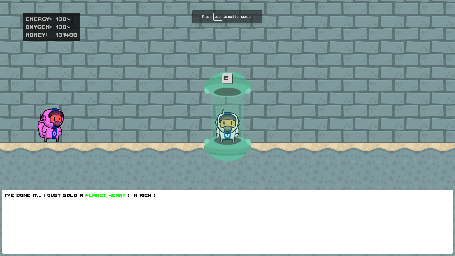
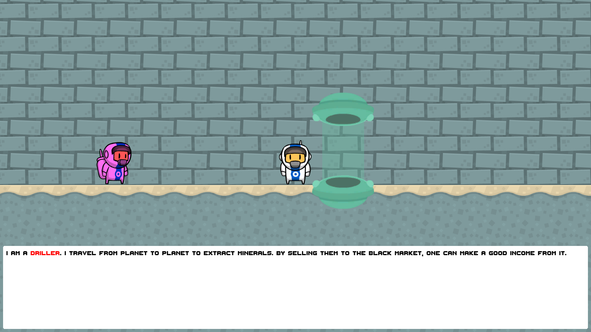
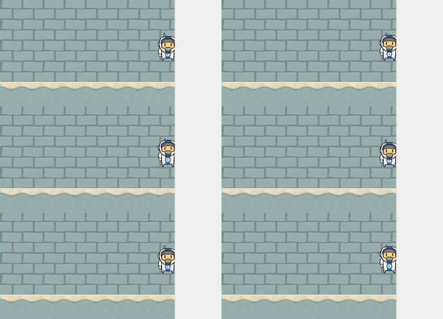
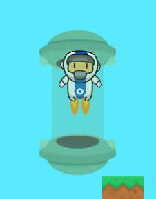
| Apr 28 15:45:57 | 25h 37m | You Know The Drill | ♥ 3 | Cool! Screenshot 2021-04-28 at 17.59.46.png Really liked the intro. Line by line fed story (especially when accompanied with some visuals) is always a superior to walls of text even though they make the player read just the same. Could have made the message box a tiny bit better still though. The color choices seemed like programmer choices (eww yucky pure red and green) in comparison to the artist made pleasant graphics. 😅 Also I would have opted for a line break before the gray help text here... Screenshot 2021-04-28 at 17.41.58.png Also might be a good idea to scale the UI. Unless you're aware, there is a "canvas scaler" component by default attached to canvas element on Unity where you can toggle UI to scale with either screen height or width (or both). That way the UI will remain the same proportion instead of getting ridiculously small on bigger resolutions. Screenshot 2021-04-28 at 17.42.56.png Another weird thing was the magenta NPC. Yet again a pure bright color! Why the hell was it purple. I mean it even had a unique idling animation yet to differentiate it from the player you just tinted it. Would have been better even if it looked identical to player in my opinion. Oh right, I checked the credits and looks like it was some ready made art kit. The base game loop was fine and had the legs to carry my interest till the end even though it did get pretty repetitive fast. The upgrades were kinda boring and didn't feel like they impacted the game that much by offering player any choices. It could have just as easily been triple priced "level" upgrade. And I'm pretty sure your power and speed were flipped. My first purchases were energy and then speed but after then purchasing the power upgrade as my third one, I noticed a pretty significant speed boost. Some more interesting upgrade additions could be a drill range extension or something that would make sideways digging less tedious. Having to dig two blocks to proceed made it not really worth it and it was best to just dig straight down and grab whatever was near enough. Would have been better if the values of different ores were shown somewhere. Especially in the case of diamond/emerald since they both appeared at the same height and wanted to know which one I should prioritize. Kinda had to figure out the values based on mining speeds. The prompt for each time you used the teleporter was pointless and annoying. Just a complete waste of time. Even if the player by some chance didn't want to do with there would be zero repercussions to just immediately teleport back. Something weird going on in the corner here btw... Apr-28-2021 18-35-32.gif The teleporter "glass" isn't high enough. Also would have really preferred if the top portion didn't have collisions at all. It just made it annoying to get inside there at times. Especially with the bit too speedy controls. A lower acceleration for the movements would have really made it more pleasant. Screenshot 2021-04-28 at 18.38.15.png Music was nice and the sounds that were there were ok too. But the missing effects for drilling at least (not sure if there were others missing too) made it less cohesive experience. Digging was the only thing that had a nice particle effect accompanied with some screen shake too so that being the only silent thing was weird. Anyways, I think that's all I've got, good job! 👍 |
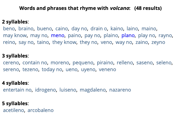
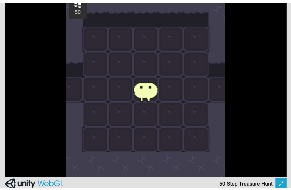
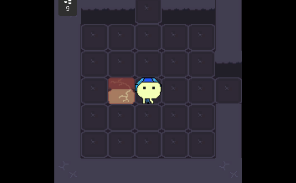
| Apr 28 16:18:51 | 32m 54s | 50 Step Treasure Hunt | ♥ 1 | Sooo, I'm drawing blanks on the rhyme thing. Even tried cheating but this doesn't make any sense... Screenshot 2021-04-28 at 19.00.51.png And it really depends how well you need it to rhyme, there could be at least hundreds of different combination. And the fact that the first word isn't even a real one (to my knowledge at least). I don't know how it's supposed to be pronounced, like "chess" or "jesse". 🤔 So my best guesses for the first word were "press" and "messy". 🤷 Yeah someone obviously is a fan of Baba. 😄 As already mentioned, the undo mechanic was quite broken and also quite unnecessary. I think having just a plain restart would have been better. I mean, it was only 50 steps anyway. This was also already mentioned but it had some scaling issues. The step counter didn't seem to fit to the screen whether I was full screen or not. The sprites also were a bit blurry which is most likely caused by Unity's default bicubic scaling, changing that in the sprite import settings to point/none or whatever it was called would help. And I also think there are some pixel perfect settings on camera (I don't really do pixel art games so can't remember for sure). Screenshot 2021-04-28 at 18.48.27.png The only route to the poet triangle wizard made me push this block to the diamond and that completely breaks everything. Kinda similar how you could mess with the undo to get the blocks stop working too or get yourself lodged inside them. Screenshot 2021-04-28 at 18.51.04.png Anyways, good job on your first game jam game! 👍 It's not perfect by any means but it's fully playable and doesn't have any completely game breaking bugs. |
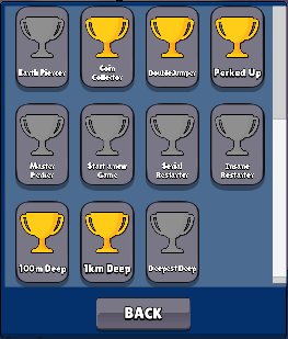
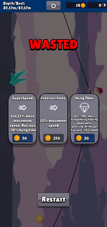
| Apr 28 17:30:02 | 1h 11m | The Bottom Dweller | ♥ 2 | Well of course I have to give the game of my namesake a try! I guess this is good enough for me Screenshot 2021-04-28 at 20.01.16.png So yeah, the visuals were really pixelated and because of that the achievement texts were an eye strain to even try to read. In the end these were the only ones I was missing, whatever they are... Screenshot 2021-04-28 at 20.26.09.png A quite classic endless runner even. The achievements and the upgrades give it a nice amount of replay incentive but the small amount of different level sections makes the game get old kinda quick. Majority of the sections were pretty much trap setups for the early game and even after getting some upgrades, some other sections became traps. So pretty much the whole game progress is gated behind the double jump upgrade which can be unluckily missed for quite some time due to random choices and not affording it when it happens to appear. After getting the double jump, all the other upgrades felt meaningless. And the double jump brings me to my biggest issue with the game. And that is actually probably the only reason one couldn't go on forever. That is the wonky (double) jump mechanic. It doesn't kill the existing momentum so it can be either a huge height boost if hitting the key twice quickly or just a slight speed decrease when falling from great heights. And this same behaviour also happens when just falling from a ledge without hitting jump. So if you hit the jump a fraction of a second too early before touching the ground, you will most likely just faceplant yourself towards some conveniently placed spikes. The game would need some kind of actual difficulty curve. I think the classic and the easiest way would be to do a speed increase the further you got. And I guess it should also increase the reward the further you got. And seems like it's already been mentioned but a classic jam game issue of too big hitboxes. Makes it super unfair and hard to estimate things. The spikes also hurled the player in this uncontrollable and unpredictable arcs which really diminished the value of the armor upgrades. More often than not after the first hit it hurled me straight to another set of spikes. I mean, I got to this height by just ramming the spikes with no jumping at all. Screenshot 2021-04-28 at 19.30.47.png The visuals were pretty nice with a pleasant to look at color palette. Music was ok and got the job done but it was very quiet compared to that blaring coin sound which (being the almost only sound effect) got old fast! A slight variation for that sound would have been welcome addition. A random 10% pitch variation in either direction is my goto. And of course having more sound effects besides just the jump/hurt/coin and better volume balance would have made them feel less repetitive. Another thing I really kinda was annoyed about was the double menu thing between tries. That was an unnecessary step and should have been merged to one only. Nice rope physics by the way! 😅 But yeah, good job! 👍 |
| Apr 29 14:59:08 | 21h 29m | Craftmine | ♥ 2 | Pretty fun! Managed to play for a good chunk of time before (dunno if the game was the reason though) my whole computer froze and force restarted itself. Mac version by the way. Welp, went for another try and this time it froze again after just a few minutes of play. It also took a weirdly long time to launch. Maybe like 5-10 seconds to actually see the pygame intro text and then at least the same for the game window to actually pop up. Screenshot 2021-04-29 at 17.52.18.png The upgrades didn't really feel like they offered anything else besides making farming a bit faster. The enemies posed no real danger even in the beginning. The combat looked very weird and felt kinda awkward since both the player and the enemies had a hidden range stat that was in no way visually represented. The actual sprite work of the character and tiles looked pretty nice but the overall look was kinda hindered by those black "breaking" lines which just looked messy and too dominating being a higher pixel size. And the tiles not connecting properly didn't really help either. The animations also looked quite nice but there were some weird jumps and frame skips all over the place. On my second try I played more close attention to the color palette which after the first try I remembered being a bit too dark and dirty to my liking. But it was actually quite pleasant and all those dark lines were just muddying it down. The special effect side was spicy. There was just about perfect amount of screen shake and the combined with the particle effects, they really brought some nice oomph to block breaking and combat. The sound effects felt a bit jarring. I don't dare to go try a third time to investigate them closer but they left me with a feeling of pretty much every action making the same sound. Really would have needed some variation and of course even a simple background music hides the monotony of sounds pretty nicely. And the sound effect for walking at least just didn't work at all. If you do a walking sound at all, it needs to be very very subtle with some variation too since it's repeated so often. Anyways, good job! 👍 Too bad I couldn't play more of it to see if there was some kind of end, or even anything different to what I already experienced. |
| Apr 29 15:54:32 | 55m 24s | The Rite of Shadows | ♥ 1 | Nice take on the theme! Couldn't really get that into the story, I kinda felt it was spoon feeding too much too fast and getting in the way of the gameplay. Wasn't the biggest of fans of the visuals. The colors were too muddy and murky for my liking. That help HUD was a bit too prominently placed. And everything really lacked on feedback. Enemies had to too big hitboxes which was most noticeable when slightly above them and the worse the bigger enemies were. The hitboxes could easily be shrinked down to cover like just a half of the actual sprite and it would then maybe start to feel fair. And on that same note, the sword hit hitbox could be increased and be moved with the player sprite. Just the same if a character in a run n' gun game could outrun the bullets. The enemies were also all placed such that they got stuck on corners. And even if not that, those white barriers acted as a bit too much of a rubber band for em. Screenshot 2021-04-29 at 18.14.51.png And when the enemies hit you, the only feedback was that instant almost bug seeming huge knockback. At least when hitting enemies they had the red flash but it was very unclear if they were invulnerable during that or not. And the fact that your sword swings hurt you too made this missing piece of information even worse. I did try experimenting on the shooter boss on final fight with this and I'm thinking that they do not take damage when red. With that tactic of circling it when it did the multiple shots and going for a huge punish window afterwards would have actually been a good tactic but alas, it didn't work and fight was ground to a half cause you could only get two hits in per loop. Trying to hit it between the single shots was just too risky due to it somehow hitting you (even though visibly way too far) or you missing the swing because of its unpredictable quick movements. The second level also revealed me the fact that the main mechanic doesn't really work at all. There was a pretty small window for error that you could do before your try was doomed. But of course the game didn't even note the fact that it would be impossible to beat the level even if you played the rest perfectly. I think on the final go when I actually beat the final boss(es), I only took like three hits the entire level and maybe did like few missed swings and was so close to dead that maybe just swinging the sword would have killed me. The trance level mechanic was also quite pointless. Well useful for those slowdowns and dodging em. But if you just do more damage and take more damage, it seems like a stalemate. And it also draining the life constantly tipped it to the useless side. Or maybe I didn't understand it correctly and the damage boost you'd get would really outshine the bad sides. The different level switching was interesting though, should have dug deeper on that one. But the sword swings draining life/energy was just not a good idea. Anyways, good job! 👍 |
| Apr 29 19:21:36 | 3h 27m | Town of Monsters | ♥ 1 | Well that was something quite different. I survived until the final fight (at least I think it was that in the middle against the governor) but met my demise there because of what I'm guessing was just bad RNG. I'm kinda 50/50 on the visuals here. I really liked the drawings but as the buttons there were just too small and messy. Sadly too the player portrait was probably the weakest piece of art of all in my opinion. The combat buttons really would have needed a tooltip or something. It was just a complete guessing game what everything was supposed to do. The combat really should have been explained somewhat. My best guess is that it was kinda like a rock paper scissors thing where you pick attack and defense separately. Probably a good idea would have been to remember the previous player choices and use them as default instead of resetting each time. Went for two more tries but didn't even close to that. Met my end at second to last step on uneven pattern and then the last try I couldn't even beat the second opponent of loving brother. Maybe seeing both the combat messages at once might be good. So it wouldn't clear the player hit info when it was the opponents turn. That way you could digest both pieces of information in peace before choosing your next moves. Would be nice if the conversation would actually reveal something (mainly the health since that seems to be the only thing that matters) about the enemies. Only on my third try I discovered the book but can't really get any reasonable information from that one either. Went for yet another run and faced governor again. Managed to whittle his health to zero but he did the same to me. Which I think is weird that they still get to do their final blow after death. I guess I'm reaching the limit of my stubbornness. The next run I was on my second to last fight against a two healther and he just dodged everything every single time and proceeded to kill me. Thanks! The musics were nice and using guitars for sound effects too was cool. But the sound effects did get very repetitive very fast. Also a very nice addition to have actual voice acting! Very much a rarity in jam games. Okay, a one more final try! But this one will be the last try for sure. Brb... Yeah, yet another double KO with the governor. GG. Anyways, good job! 👍 |
| May 2 08:14:13 | 60h 52m | Sprookies | ♥ 5 | Pretty neat idea even though not highly unique by any means. Mechanics wise there was already quite an interesting amount of stuff but the execution side would have needed some more polish. Everything was a bit rough around the edges. Some of the biggest offenders were really just some slight design mishaps which could have been fixed in mere minutes. The wait amount on the start and end of the level was just bad. And the final straw was the full restart on deaths. I really don't want to keep playing the first two or three levels over and over again due to deaths and full game restarts due to clunky unresponsive controls and unfair hitboxes. Third level also had this blind drop straight to death star (if in a steep enough angle) which was umm, not fun. 💢 This is where my progress was stumped every single time (if not earlier). Grabbing the baby before the death star just kills your momentum and then it's so damn difficult to jump over it. Screenshot 2021-05-02 at 11.02.20.png So yeah, the controls were stiff. I think the rotating worked fine while in the starting position but got jumpier and weirder the further you got. So I guess there was something wrong with your maths. Also how was that implemented, it didn't quite seem physically accurate. I guess you actually rotate the world? Probably would have been easier to just rotate the gravity. Quite often you could rotate the world up till the limit before the ball started rolling at all. Then there is also the slowness issue with the rotating mechanic. You couldn't really do anything even remotely reaction based since rotating from one side to another took ages. Maybe mouse controls where you would map the mouse x coordinate to the rotation might work. Jumping was another issue with the controls. That jump charge just added unnecessary complexity and unprecision to jumping. I don't see the reason for such as there was cases ever where the player would want to do a small jump. The split mechanic could also have been bound to just one button which turned it on and off instead of needing two separate ones. Pretty nice amount of visual fluff like the background particles and fish and the character facial animations. Would have rather you used that time to fix the gameplay though. The music and sounds were nice and funny too but also got a bit annoying the longer I played. The audio side painted this childish and lighthearted mood accompanied smily faces too but the color palette was then dark and muddy and didn't really fit too well. All those dark blues and grays. Something brighter and more colorful would have been a better match overall in my opinion. Good job! 👍 |
| May 2 08:51:42 | 37m 29s | The Deeper The Deadlier | ♥ 1 | Well yes, the web version (at least) was indeed very buggy. I don't think they're any problems with the platform itself though. Your UI was completely messed up. I think you might want to look into Unity's canvas scaler which is attached on canvas elements by default. It allows you to turn on UI scaling by screen width/height so everything will be the correct size no matter the screen size. Got stuck on level four I think. The teleporter just didn't activate and let me go through. The same visually happened on the level before that at least but still teleported me. Screenshot 2021-05-02 at 11.19.19.png And at some point a piece of the background pillars that was previously not visible appeared. Maybe some z-ordering issues. Screenshot 2021-05-02 at 11.19.35.png The controls were kinda fine but the platforming was plagued by weird physics glitches. Getting stuck on ledges and walls was common. That gravity reversing field on the edges of the screen was very odd and confusing at the beginning. I think there were some other floaty gravity affecting placed as well which made contextualising the game whether it's platformer or top down not too clear at first. Needing to pick up the gun was unnecessary in my opinion. Especially annoying on the second level where I managed to kick the gun off screen few times before actually successfully picking it up. At least not having to press a button to pick it up might have been better. Kinda weird that this least used key was the only thing explained in game. The combat could have used more feedback. Shooting the enemies and getting hit just didn't feel like they had any impact. The damage caused by enemies also felt very inconsistent. Sometimes they killed you in mere fractions of a second while sometimes they felt like just tickling you. Maybe some invincibility frames would have offered a better more consistent experience. Gave it a few more tries and now made it to the (final) boss. The boss seemed quite manageable at first before it did the swoop down and ram you manoeuvre. The biggest issue in that fight was getting stuck at the ledges. And holy hell was that boss way too tanky! The same over tankiness issue was actually there on the few levels before that fight too even with that op gun. All the gun effects looked cool by the way. I guess there might have been a better gun on the boss room floor besides the crappy starting pistol but you can't drop or pick up another once you have selected it. Then forcing the player to replay the whole thing again just to give it another go? No thanks! But yeah, good job! 👍 |