Foon → Ludum Dare Explorer → LD45 → Feedback comment stats → Corrade
Feedback comments for LD45
Corrade's games and stats for all events →
| Timestamp | Since previous | Game | Corrade's comment | |
|---|---|---|---|---|
| Oct 7 00:37:13 | Yogurt's Quest | ♥ 1 | I really appreciated the polish, especially regarding the visuals. The tail-end of the first section became a bit difficult to look at as it was so flashy (maybe that's just me though). The lag involved in generating new platforms was a bit jarring. I registered as having died although I was going to fall onto a platform. E.g. on the way back from the 2nd star, jumping off the cliff will kill you despite there being safe ground to land on. A restart button would've been nice for situations where suicide was necessary, e.g. missing the jump to the floating island of the 2nd star. | |
| Oct 7 00:50:11 | 12m 58s | Wordplay | ♥ 2 | I'm not entirely sure how to progress. Some words don't seem to be in the game's dictionary, e.g. I tried to create 'morning' based on Jimbly's comment, but it didn't register. My next guess was to treat the game as a crossword but that didn't seem to work either. Though I definitely like how you've taken a minimalist approach as Evannex said. |
| Oct 7 01:19:03 | 28m 52s | Word Salad | ♥ 2 | Creative and fun! The concept is simple but it offers a lot gameplay-wise. With respect to the time constraints and insane choice of tools, more enemy variation and feedback in general would've been fantastic. Feedback for events like holding a valid string (esp. since not all words have effects) and regening health would've made the game more fluid. A score would've been nice too. The projectiles created by words such as 'it', 'no' and 'go' were sometimes immediately taken by a zombie. I get that they're short words so they should be fairly light, but their quick disappearance gave the impression that their were invalid/didn't do anything. |
| Oct 7 01:36:11 | 17m 08s | Apartment Furnisher | ♥ 0 | I agree with NachtWitch in the need for colour. It'd also be great if there was some indication of when objects are within interact range, and a means to right fallen objects. |
| Oct 7 05:24:44 | 3h 48m | Idle Twit | ♥ 1 | Wow what a funny, whimsical concept! I was initially confused as it took a little while for Twits to begin showing up. Soon afterwards Twits came rolling in at a slightly overwhelming pace. I think the pacing could've been improved in this regard. I would've loved to see better feedback. The player can Eggplant, post Twits, graffiti and re-Twit as often as they like. Suppose that the player gains or loses Peeps/Eggplants - it's really tough to pinpoint what action was responsible for that change (even with the added explanation). It's difficult to feel in control of what's going on. |
| Oct 7 05:55:17 | 30m 33s | Robo-Fort | ♥ 1 | I scored 1.3k. Really convincing graphics and clean gameplay. The landing screen explanation doesn't note that the player can ram into enemies to destroy them. The white text that pops up in-game (e.g. gold crate spawn) is difficult to catch. I also felt that things could've ramped up faster and generally gone faster overall. Besides these points, I'd only like to see extensions on what you've already established. I thought this was really good. |
| Oct 7 06:08:27 | 13m 10s | Tom is Lonely | ♥ 1 | The evolving level concept was pretty cool and fun. However, the player spawned off-screen for me and it was very frustrating to have to negotiate with slippery movement to safely get it on-screen. On lvls 6+ I was pretty much spawncamped in this way and spent most of my time malding off-screen. Audio/visual feedback on respawning would've helped avoid the above situation, though the spawn should've been on-screen in the first place. |
| Oct 7 06:16:59 | 8m 32s | In the beginning | ♥ 1 | I appreciate the ambitious theme and concept. It's unfortunate that you weren't able to finish to the degree that you had planned. When translated to gameplay, I think the player was allowed to progress way too quickly. The atmosphere and plot were lost as a result. I think it was a good choice to leave the player to discover how to jump. That being said, the movement was clunky overall due to the weird gravity and strange collision (or whatever's responsible for phasing through platforms). The visual style reminds me of a collage. It's certainly interesting and artsy, although noisy and tough to read. Falling off the platform just before the 'let there be sky' text results in a rubberband-like effect. |
| Oct 7 06:33:30 | 16m 31s | The Journey with Her | ♥ 1 | I didn't complete the game but was impressed by the puzzle design. The level where blue could be used to block for red (it may be lvl5 as you mentioned above) was particularly nice. Looking at previous comments and my smooth brain, I think the game could've benefited from a hint system or some dampener on the difficulty. The dialogue seemed to reflect on what the player had just achieved, maybe it could instead foreshadow the solution to come? Otherwise the game was neat and felt polished. |
| Oct 7 06:50:37 | 17m 07s | Ultra Quest | ♥ 1 | The visuals are amazing and loose. The attention to detail in the credits, mario-like stage select, transitions, etc. makes the game feel remarkably polished for a jam entry. The seamless transition from BGM to stage-completion sound effect is incredible. Loved it. Upon reaching the boss and falling into the lava pool, I didn't respawn and had to exit the game. The particle effect on the player's death is perhaps a bit overkill, but that's a nitpick. |
| Oct 7 07:03:16 | 12m 39s | Dreamscaping | ♥ 1 | Wow I loved the strangely cute protagonist and the whimsical vibe. I think you did a great job on the aesthetic. The hitboxes of the dreams were very unwieldy. In particular, there was an instance in which I tried to pick up a dream orb stuck in a dream. Holding onto the dream orb, I too became stuck and had to release it. It'd be nice if this awkward interaction wasn't possible. As a small note, the noisy white text border/chat bubble effect wasn't great to look at. |
| Oct 7 07:19:25 | 16m 09s | The jam ends in 1 second | ♥ 1 | I was impressed when I was able to play each stage. The timer in the BG was a nice touch. The stage transition screens (improve/proceed) were muddied by the game in the background. After a certain point I wasn't sure how to progress to the next stage as clicking the button didn't do anything. This was when I had 'more levels' and 'publish' in my to-do list. I assume that faliure was intentional as I tried creating a bunch of levels, but would've liked to know for sure. |
| Oct 7 07:35:56 | 16m 31s | Idle Office Inc. | ♥ 2 | The use of Twitch is stunning, but the level of polish in the graphics and audio is also incredible. I'm floored by this entry. It'd be nice to have a list of all the commands instead of waiting for them to cycle through. The camera panning provides a welcome dash of variety but sometimes hides a player's balance or income. Maybe a chatbot with commands like !balance would help. |
| Oct 7 07:55:10 | 19m 14s | Build up Speed | ♥ 1 | The progression is simple although decently satisfying. Maybe increasing speed after training multiple times, without increasing speed between each training, could result in a greater gain than if speed was increased after each training. This trade-off between time and return might've helped to increase depth. Alike Justus, I encountered a bug where all buttons except for 'train' disappeared. |
| Oct 7 08:43:37 | 48m 27s | The drop to the top | ♥ 2 | Cozy and polished. Although there doesn't seem to be much strategy to stacking, other than to maybe hug a wall. I reckon slippery shapes like the capsule, sphere and cone are responsible for this. Maybe different forms or 'stickier' surfaces could've helped in this department. |
| Oct 7 08:59:51 | 16m 14s | Planet Z33 | ♥ 0 | I couldn't for the life of me figure out how to progress. I've just been collecting resources. Could anyone throw me a bone? |
| Oct 7 10:41:55 | 1h 42m | From Nothing, To Nothing | ♥ 1 | Neat! The minigames are kinda like popcorn. Small nibbles but tasty nonetheless. For the 'start with nothing' level, I found myself focusing on the icon in the top-left instead of on the things being spawned. That took away from the liveliness of the mode. I would've liked to see the 'shelter' stage allow diagonal movement / 2+ keys held down at once. I'm not sure if this is possible with Pico (surely it is?). In the final stage, you can sort of hold jump to slightly 'hover' over boxes. This allowed seemingly impossible jumps to be cleared. I imagine it wasn't an intentional mechanic. |
| Oct 7 11:09:39 | 27m 44s | Light Bots | ♥ 1 | Mechanic were smoothly introduced. I had a bit of a eureka moment when I discovered that the human could swing the weight attached to a rope. I also liked the level of visual polish in the jump animations, movement trail and art style. That being said the art style was a tad too homogeneous. Distinguishing between pipes, walls and toggle-able walls was sometimes tough, but moreover the repetition of the same black/white forms just became bland after a while. And I did spend a little while, wrestling with the platforming before giving up on the lake level (cliff into a section where you had to jump across open air between sides). The jump key isn't mentioned in the game description. As a side note, in an early level one of the humans was dangling on a rope as if it was being hung. I was surprised by that dark theme and think that it would've been cool if you expanded on that idea narrative-wise. |
| Oct 7 11:23:23 | 13m 44s | The Journey of Life | ♥ 1 | First off, I think Gaz probably accidentally spammed his post. Maybe due to internet issues. Happens on Reddit and such at least. I thought the lighthearted dialogue was a good choice. The arrangement of the text could be improved. The buttons and the main text are really far apart. The main text is then difficult to read as it's center-aligned and probably too large. Your eyes have to dart around the place. I think you could've arranged the buttons horizontally and had the main text above it on 1-2 lines. Congrats on completing your first jam! |
| Oct 7 11:49:46 | 26m 23s | Singularity | ♥ 1 | Quaint! Though I think inconsistency in visual style was a notable issue. Some objects such as platforms and buildings are hard-edged and blocky. In contrast to this, the foggy background, player (big emphasis on the player) and rocky objects are considerably rougher and more realistic. This was discomforting. There's also inconsistency in the level of detail, e.g. between the rods on the sides of the buildings versus the buildings themselves. |
| Oct 8 02:53:37 | 15h 03m | Poppy | ♥ 1 | Lovely graphics. The amount of polish overall was really cool, and the eyeball enemies were sick. I think the normal controls should've been default. The firing was slightly clunky as aiming direction was affected by movement/rotation and holding down LMB to auto-fire wasn't possible. UI-wise, I think health bars over enemies would've been great. I also found the soul count difficult to read. Maybe a simple 'souls acquired / needed souls' would've been clearer. |
| Oct 8 03:01:45 | 8m 08s | Hermitage | ♥ 1 | I think you've got a nice little atmosphere here. The spiritual/culty character was nice. Unfortunately I didn't know what a cairn was. Once built, I found the 'praying area' around the cairn to be weirdly shaped. There seems to be a larger range left/right than up/down. |
| Oct 8 03:15:03 | 13m 18s | The Scout | ♥ 1 | This was solid and felt complete, nice! I found the camera to be quite unwieldy however. I think it bugged out when I was near the edge of the map. The trees were rotating but the camera appeared to be fixed. The character was off-screen at this point and I had to restart. The combat was also clunky as there was minimal feedback on hits (only a low sound) and the sword's sprite didn't accurately reflect its hitbox. I also thought that the bottom-left was an awkward place for the player's hearts to be. The pixelly background sound was strange. |
| Oct 8 03:25:44 | 10m 41s | Meager Genesis | ♥ 1 | It may be style-over-substance, but the style was more than enough to make the substance a compelling little piece of gameplay. The visuals and audio were fantastic throughout and it was great to see them progress. Although I found the movement of bubbles to be noticeably choppy when the player was also moving, and would've liked to see the player start with a bit of glow to hide its rough edges. I also thought that the title sounded a bit odd. |
| Oct 8 03:41:58 | 16m 14s | Ludum Dare Simulator | ♥ 1 | This felt well executed and was lots of fun. The game's resolution was off for me (~1280x1024) and a lot of the meters were cut off. I also would've liked to see more info on the cards detailing the amount of player resources they consume. The same kinda purple was used for the background, card backgrounds and UI background. Each element lacked distinctiveness as a result. |
| Oct 8 03:54:58 | 13m 00s | Amnesiac Adventurer | ♥ 1 | Fantastic idea and interpretation of the theme. In addition to a restart button, a 'rewind to latest action' button would've been great. At first it was unclear what the buttons did, especially since the walls they rose had keys marked on them and therefore seemed unrelated. |
| Oct 8 04:14:32 | 19m 34s | Little Robot Run | ♥ 0 | The red key doesn't open the red door for me, even after jumping a lot. I'd love to continue the game if this is fixed. I think you're allowed to patch game-breaking bugs like this (if you want to). The instructions were way too long. I think you should've introduced mechanics as the player encountered them using key prompts, dialogue, etc. Also, in-game, the instructions were pressed up against the borders of the screen and that didn't look great. The player gains a jump whenever they touch the edge of a platform. If this is intentional, I'm not sure it's a great mechanic. Small issues include the key not really looking like a key, and the player's walking animation running when the player isn't moving. |
| Oct 8 04:33:25 | 18m 53s | Homie The Homeless | ♥ 1 | Loved the mood, especially since not many games seem to have gone for something more somber. The vibe reminds me of Paper's Please. That being said I didn't really get what was going on until the end, when the text clarified things. I didn't know what I was picking up around the city, or how I was entering the begging minigame. This minigame clearly took place through an eye, but I couldn't make out what the moving sprite in the center was. The arrows themselves seemed to be detached from the game world. I wasn't sure if missing arrows or hitting them early incurred any penalties, nor if anything was gained by hitting the arrows correctly. |
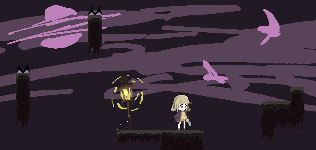
| Oct 8 07:18:54 | 2h 45m | Hold X to Focus | ♥ 0 | I got stuck at the point below. Is the jump to the left really the way to go? I also arrived at this point by failing the previous jump but being respawned ahead. I assume that was a bug? Great aesthetic though. The dark tone and polish was great. Untitled.png |
| Oct 8 07:36:31 | 17m 37s | Star Twit: H. Nothing | ♥ 0 | I was incredibly frustrated by the controls and physics although I guess that was the point. The humor was welcome, especially in the final level. I think the start could've had a faster pace. It took a while to be able to move and during that time I was wondering if you had omitted control instructions. Also, an indication of where the level portals were would've been appreciated (though again maybe forcing discovery was your intention, which is fair enough). I found some sfx pretty harsh to listen to and ended up muting the audio sadly. |
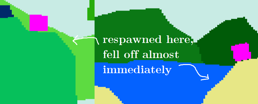
| Oct 8 07:58:38 | 22m 07s | errant | ♥ 1 | Wow how peculiar. I really enjoyed all the surprises and got up to the 'there's no secret ending yet' dialogue. Checking back with the walkthrough, I think I discovered everything there was to discover. I loved the bright, bold and lighthearted visuals. I was like, oh, that's the princess! The ocean layer's use of a big foreground block was really cool. The shift mechanic was super interesting too. It essentially flattened the image and combined layers right? A small bug: the top shadow texture of the tower flickered a bit when I was jumping around the tower. Dying at the locations below respawned me on a sloped edge. I proceeded to slip off. Untitled.png |
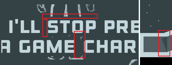
| Oct 8 08:58:01 | 59m 23s | Project Snowball | ♥ 0 | I ended up using my cursor to mark spots where I should press space. Nice little game! There were a few issues with the visuals, and although they were small, they did hurt the polish of the game. The thin vertical slices (maybe related to a non-pixel-perfect view) and overlapping partially-transparent rectangles: Untitled.png |
| Oct 8 09:22:20 | 24m 19s | Ammodillo | ♥ 1 | I'm amazing by the amount of polish you've put into this. There seems to be a little sound effect and animation for everything. It's super tight. Gameplay-wise, it took quite a few tries to squash the rat king but I was consistently enjoying the experience. I ended up farming bullets off of the last enemy left in a round to make further rounds easier - didn't expect to be strategising! I think the border of the stage could just be a normal wall rather than a bouncy boundary. A short tutorial or key prompts would've been great as I didn't know I had to block bullets to gain them. |
| Oct 8 09:36:31 | 14m 11s | Bartered | ♥ 1 | It took a little while to get the hang of things, but once I did I found this interesting and enjoyable. It would've been great to have some UI showing what item I was possessing. Displaying the player's entire barter chain at the end of each round would've been cool too. Some of the dialogue confused me. Stores were offering to give stuff away, but accepting their free stuff meant discarding your own. I didn't immediately understand that I could only own one item at any given moment. I also agree that the player's movement speed was rather slow. |
| Oct 8 09:52:52 | 16m 21s | Mission Start With Nothing | ♥ 1 | Many people have already said this, but the inverted Y axis is truly such a thorn in the side. I also think my turning was restricted to my browser window, which made things even more unplayable. Thankfully this wasn't an issue in the windows build. Feedback on getting hit and dealing damage was sorely lacking. The key to restart the game is E. Since this is also the key to shoot, I ended up immediately restarting on one occasion and being confused as to what happened. Still, the shaders are lovely and I think you have a good mood going. |
| Oct 8 10:06:19 | 13m 27s | Reconcile | ♥ 1 | I think the concept was pretty neat! Though it was difficult to match the correct 'colours' as the white portion of the yin and yang had a black outline, and therefore often appeared like the black portion. The background was also very noisy and I'm certain that it was frequently impossible to not be penalized. The core mechanic was overshadowed by these issues. |
| Oct 9 02:52:44 | 16h 46m | Planet Jumpers | ♥ 1 | Impressively meaty. There's a good deal of replayability here. On one occasion opening the leaderboard from the main screen crashed the game. The audio sometimes stuttered/droned a bit during scene changes. I also landed in the initial crashing phase at about 2k ft as opposed to 0. Otherwise I think you've got a solid foundation going! Edit: Yeah the leaderboard was awesome. It was really cool to see a multiplayer component. |
| Oct 9 03:09:54 | 17m 10s | Yin-Yang | ♥ 1 | Striking visuals, although just constantly rotating the world in one direction and running away from the decaying enemies seems enough to beat the game. It's also unclear how enemies are dying (without referring to your instructions) as they're invisible when shrinking and shrink rather fast. This left me confused. Like niterich said, I thought the game hadn't loaded properly when it began with a grey screen. I like the minimalist vibe in that, but I think you should've put a key prompt or allowed any key to be pressed to continue (instead of just space). |
| Oct 9 03:21:43 | 11m 49s | Knight of Redemption | ♥ 1 | The combat reminded me of Roblox and was pretty satisfying. I would've liked to see fundamental features like auto-restarting on death, dying when you fall off the map, and a clear end point. I personally couldn't see the healthbar (2736x1824 display) and that hurt the experience quite a bit. Some of the drop shadows were so dark that they appeared like tangible objects. |
| Oct 9 03:42:36 | 20m 53s | From Nothing To Nothing | ♥ 1 | Nice twist on traditional gameplay stuff! Swapping from skeleton to 'spirit' form to squeeze through the bars on lvl2 was a highlight, along with the ending and enemy aggro mechanics. Though the SFX for dying/getting hit were unbearably loud and harsh. The collision of the barrels was also unwieldy. The mood was hurt when all the ghosts died after the player took control of the skeleton on lvl3. I get why that was necessary with that level design, but it didn't make much sense narrative-wise. Personally I found the player and ghost sprites to be quite cutesy. That didn't mesh well with the dark tone of the game. When I reached the graves, I wasn't sure whether or not the game had ended or bugged out. |
| Oct 9 07:28:40 | 3h 46m | Fan The Flames | ♥ 2 | Quite cozy and fun. Explanation was severely lacking. Noting controls, mechanics and crafting recipes **exclusively** on this page meant that I constantly had to tab in and out. That destroyed the feel of the game. There were some thin black bars in the sprites, possibly due to a non-pixel-perfect camera. There was also very poor feedback on weapon durability - I didn't know it existed until my shovel broke. |
| Oct 9 07:43:48 | 15m 08s | A Fishermans Friendly Island Builder | ♥ 1 | A really neat way of incorporating skill into a usually RNG-based activity. It would've been nice to see the controls in-game, as well as a more achievable end (as compared to filling up the entire screen). Though I understand what you said about time constraints. I think it would've been cool if the rod's range was determined by how long the player held down LMB before releasing to cast. The current fishing mechanic seems to be a great foundation for something quite engaging. |
| Oct 9 08:00:10 | 16m 22s | Scrawl A Draw | ♥ 0 | Nice BGM, although SFX are missing and that did take away from the sound quite a bit. With all due respect, I think having awkward controls is a questionable way of imposing difficulty/interest. Sure games like QWOP get away with it, but here it feels quite artificial. |
| Oct 9 08:19:35 | 19m 25s | 7 Days | ♥ 2 | Excellent design and gorgeous art. Sometimes I was unable to water a leaf despite hovering my mouse over it, which was unintuitive. The progression would've been more satisfying if the increasing score was more prominent, so in that sense the UI could've been improved. I don't really have any complaints other than these (aside from performance in the web version, which you already addressed). |
| Oct 9 08:43:47 | 24m 12s | JO-KEN-DO! | ♥ 1 | That was an incredible amount of content and depth, although it was really burdened by the UI and feedback issues. I would've liked to see important UI elements, e.g. previously used moves and countdown, placed more centrally. The countdown could've been a meter that stretched across the screen and that would've been miles clearer than a number. * Feedback-wise, it would've been great to have a sound effect or visual indication of an exchange firing off, as well as how that exchange turned out. It was sometimes difficult to notice the countdown expiring due to this and the poor UI. * The controls would've been more fluid if you also offered keybinds and a skip-dialogue action. * Enemy actions were sometimes rather unpredictable. |
| Oct 10 10:01:17 | 25h 17m | Missing Entry | ♥ 0 | Really intriguing and inventive. I didn't get what was happening at first and ended up writing a dumb sequence. I suppose that's really my fault since it does say 'you decide'. I think it would've been cool to ask players for a username at the start and then sign all their stories accordingly. I felt that the images should've faded in faster. |
| Oct 10 10:11:58 | 10m 41s | Genesis | ♥ 0 | Lovely BGM! Although its peacefulness is kinda disrupted by the harsher SFX. The actual area of landmasses didn't seem to be accurately reflected by their sprites. It would've been cool to see the landmasses wrap around the planet to give an illusion of 3D. |