Foon → Ludum Dare Explorer → LD54 → Feedback comment stats → Random-storykeeper
Feedback comments for LD54
Random-storykeeper's games and stats for all events →
| Timestamp | Since previous | Game | Random-storykeeper's comment | |
|---|---|---|---|---|
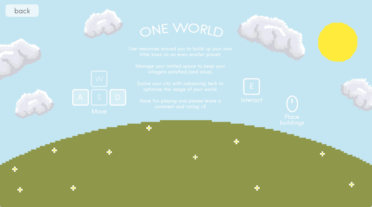
| Oct 2 22:34:59 | One Earth | ♥ 3 | I'm glad that there's an instructions screen in-game. Interacting with the resources was quick and I like the idea of incorporating the theme of "limited space" into how much you can hold. Unfortunately, I couldn't figure out how to craft buildings, so I didn't progress very far. I broke down 4 trees for wood, but I could only pick up one thing at a time. I tried clicking on the button for building a house, but it didn't let me interact. When I tried to drop the wood next to each other, nothing happened and I couldn't drop wood on top of wood that was already in place. I'm not sure if there's something I wasn't understanding, but I couldn't do much besides walk around the area and break down resources for collection. The graphics do look nice and I like the running notes in the piano music with the gentle swelling strings. It gives that sense of time passing fairly quickly, which works well for a setting like this. The music does seem to be mixed too softly compared to the sfx. I also think the white text against the sky blue background is too difficult to read. Perhaps some shadow under the text or maybe switching it to a black colour would help with the contrast. Please let me know if there's something I'm missing and I'll come back and give it another shot, because I couldn't figure out how to place buildings at all. One Earth - Help screen.png ### Edit As promised, I tried it again. I'm not used to having to build the blueprint for the structure then gather the materials, so it was an interesting approach for sure. I do love the idea of passively harvesting and timing all these elements to work together. I just wish that there was more of a gameplay benefit to constructing buildings. Like sure it gets your population up and you can build bigger houses, but without these things, there doesn't seem to be any consequences for just wandering around the area and not constructing buildings. I just wish that the buildings had more of a reason to them, as once I build one, I don't really have a reason to build more (in fact, it just seems to add more stress and nothing else). | |
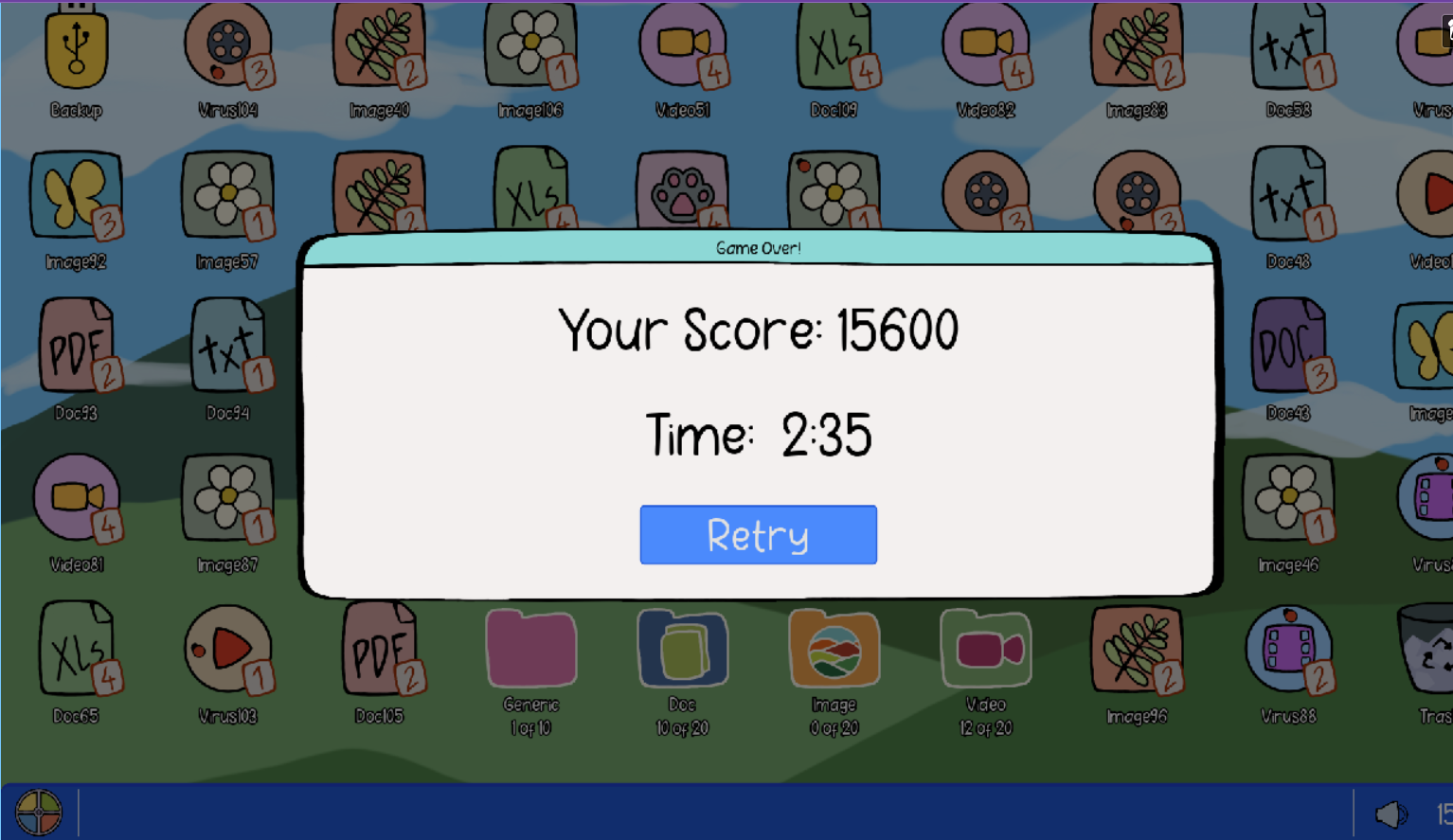
| Oct 2 22:50:20 | 15m 21s | Desktop Madness | ♥ 2 | This was a lot of fun. It's easy to pick up and understand and I love the art style and the way the music captures the playfulness and charm. The idea to have a backup with a timing element works well against the need to manage the piling files coming onto the desktop, but I'm glad that you can still drag and drop files while the folder is being backed up. I do wish that there was a little more of an indicator for the folders when they would fill up, maybe them changing in appearance. While I also like that you're able to drag and drop while backing up, I do wish that the backup window could be minimized or focused out of. There's even a minimize button on it that sadly doesn't work. 😞 Overall, I think this is a very charming and easy-to-pick-up entry. Great job. Desktop Madness - 15600.png |
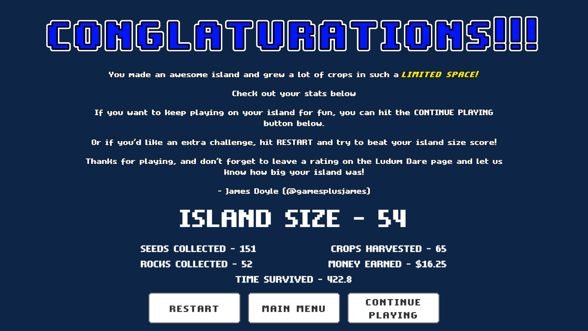
| Oct 2 23:40:05 | 49m 45s | Tiny Farm Island | ♥ 2 | I'm a big fan of farming games with pixel art, so this was right up my alley. It was a little confusing at first, but I love that there were a lot of instructions in-game, including a guide on the actual gameplay screen. I also found the tool structure to be a little unintuitive, especially with the incorporation of "hands" being a tool and a hammer being used to smash rocks instead of using a pickaxe like how a lot of other farming sims handle rocks. I kept mistaking the hammer for a hoe. But after a while, I got used to it and found myself enjoying this. After a while, it becomes quite relaxing in spite of the shrinking time limit and limited space to plant crops. I didn't really use the shop all that much since it felt like the upgrades weren't really that beneficial. I guess by expanding, they would become more useful, but even though I used up all my rocks, I didn't find the island that much larger (especially given the more rocks appear to be used to build 1 piece of the island as the time gets shorter). The music helped give the game a relaxing mood and the blocky style graphics were cute. I do like the tiny tidbits of humour sprinkled into the shop and the game description. It was adorable. The sound effects worked well, but I do think that the notification messages that pop up on the screen (the ones that tell you how much money you get while harvesting) become overwhelming when you're trying to harvest a lot at once. A quality of life suggestion I have is that I would have liked to be able to continuously use the same tool by clicking and holding when you're nearby an actionable item instead of having to constantly click and hold. I do see that there are upgrades related to clicking and holding, but they seem more for range rather. I think for non-upgraded tools, clicking and holding could still be executed as long as the character was directly next to the applicable item. Overall, I thought this game hit all the right notes and was quite a chill experience. Great work. (apparently images are broken right now but that's supposed to be my end screen, hope it works soon) Tiny Farm Island - End screen RSK.png |
| Oct 3 00:14:58 | 34m 53s | High Tide Heist | ♥ 3 | I played the web build and it seems like the tutorial text is REALLY small in comparison to the giant pixel art. The two buttons in the top-right corner are not very clear in terms of what they do. I clicked one out of curiosity and was booted back to the title screen. I thought I lose my progress but it turns out it was just a tutorial. I appreciate the tutorial, although I do feel like it just kind of threw a lot of information at me without a lot of sense of progression to the tutorial. I know there is some, a lot of the steps are just multiple textboxes scattered across the map. I also had trouble understanding what to do after building the ship. After assembling it to the point where I couldn't place any more wood to build said ship, I wasn't able to progress. I like the concept of the game a lot though; it's fun to dodge the cannon balls while trying to gather the resources needed. I just had trouble understanding a lot of the UI and progress. The direction with the treasure wasn't very clear. Was I supposed to pick it up? I thought they were grenades at first. Is it possible to do combat with the ships while you're collecting resources and not on a ship? The music is fitting and the chunky pixel art style is neat. I just found a lot of the text difficult to read - even on the Itch.io page, it seems like the logo and Game Over text become more of a background and are hard to discern as text. I like the idea a lot and the look of the ship on the game page is very nice. |
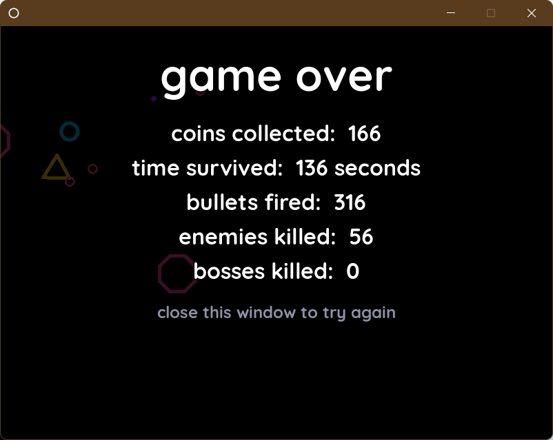
| Oct 3 01:37:42 | 1h 22m | windowkill | ♥ 4 | I came across this game on Twitter/X and after a few minutes of playing, I was amazed. I really like the sound design and the aesthetics in the game. Even though they're simple, they're so satisfying to hear and see and they work well with the concept. The gameplay is really interesting, especially with the constant shrinking down window. I love the idea of bullets helping to increase the window size and using multiple windows for later game enemies. I'm not sure if I got that far, but I enjoyed the experience a lot. It's a very neat idea. Window Kill - Coins collected 166 RSK.png |
| Oct 3 01:51:14 | 13m 32s | Fishbowl Rescue! | ♥ 2 | I'm not really a huge fan of first person 3D adventures as I find them disorienting, but I really love fish, so I gave this a try. The first thing that really stands out to me is the environment. The underwater world feels vast and vibrant. I guess the vast part goes against the theme of "limited space", but it was nice enough to experience the world. I like the menu music quite a bit. The game is also relatively easy to understand how to play. I just didn't quite understand what the metres were for. I know one metre is for water, but I'm not sure about the vertical one on the right side. It seemed to be unrefillable. It was amusing seeing sharks in a fishbowl, but I guess they're supposed to be either freshwater or perhaps sentient decor. Or maybe they're not supposed to be taken seriously at all. 😂 The movement did feel a bit disorienting; I kept ending up sideways despite not rotating. The up and down controls also felt weird - space and Ctrl, but I don't think they were unreasonable. I like how responsive the aiming and plunging are. Overall, this was a pleasant experience. |
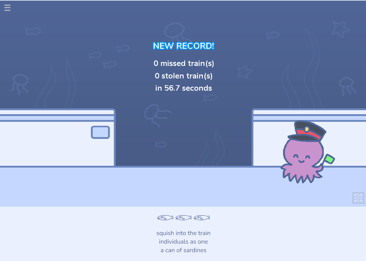
| Oct 3 05:24:33 | 3h 33m | Packed to the Gills | ♥ 8 | As far as cute sea-themed games go, you knocked it out of the park! All components come together so well to create a cohesive and cozy experience. It feels like a game you'd play to wind down, with the muted pastel colours in the art and the passive nature of the gameplay. It's very much a sit and react game where it took a bit of figuring out how to react to certain scenarios, but the fun part of the game was just figuring out how the game wanted me to position myself. The game was also very generous in letting you continue forward or retry the current level, so you never feel pressured to HAVE to retry (I retried anyway but only cleared level 3 with no misses). Great work with the music and the woodwinds. I love how everything feels relaxed and uplifting but also lively, which is strange given how laid back the rest of the elements feel. But it works! The woodwinds were such a nice touch and the chiptune works well with the art style. As far as sound effects go, I think most of them were satisfying and worked with the music/aesthetic. The only sound I couldn't get behind was the train sound at the beginning of each level. It sounds really garbled - which I imagine is to make it sound like it's underwater, but it comes across as really unsettling and uncomfortable to listen to and it doesn't go that well with the rest of the sound effects. I always felt a little off-put every time I started a level before the music kicked in. I was also wondering if the game supported keyboard controls in the menus once you're in the game itself. I noticed I could bring up the settings menu with the keyboard, but to progress through the actual levels or even the haiku, it seemed like I could only use the mouse. Honestly it feels like the entire game could have used more keyboard controls for UI stuff or at least when going through the haiku lines. Overall, I think the game is super well executed and I love the experience it brings and the emotions it makes me feel. I do love that touch of the haikus serving as the in-betweens of levels and hints of what's to come. The soundtrack is lively and fun and I will go and buy it now. Packed to the Gills - Level 3 no misses.png |
| Oct 4 00:45:33 | 19h 21m | Airpansion | ♥ 1 | I really love the sense of the limited world expanding over time and how the theme is also kind of explored by marking the end of the day and being able to only select two tools at a time. This game feels so heartwarming - there's something about the choice of the graphics and the music combined with the voice acting and cutscenes that felt emotionally moving. I like that some of the sound effects were voice acted too - from what I could hear anyway. This kind of game would really benefit from having having dynamic music - layers being added over a single theme as the perimeter of the world expands. The theme that was chosen works well given the timeframe. It seems like some of the barriers have no texture to them - I'm not sure if this was intentional or if time ran out and a graphic couldn't be found to be added. It seemed a little strange and took me out of the experience. Gameplay-wise, I found that picking and choosing the tools on the end-of-day screen were not always responsive. I would go over to a tool and click and sometimes, the tool wouldn't come into my hand. It seems like the game wants me to be positioned directly over the tool in the same hand as where I click, which is quite finicky. Airpansion - Unfinished textures.png Other than that, I really enjoyed this a lot and played it all the way through. I think I got to the end (spoilers I guess but there's a single image) but there was no option to replay or an indication that the game was indeed finished. However, on that screen, I could still hear myself being able to use my tools sometimes if I left or right-clicked. Overall, this was such a charming and comforting experience. |
| Oct 4 01:27:09 | 41m 36s | Bake Me One More Time | ♥ 2 | The art style for this game is nice and I like these kinds of baking/managing games a lot. The execution for this one was just very difficult to really get into and enjoy. It's definitely the kind of game that needs a lot more of a tutorial or guide in-game to ease the player into how the game works. I wouldn't have known how to make anything if not for the recipes in this post - I tried and it seemed like that was a requirement, which wasn't very fun. If part of the gameplay is to figure out how to make the recipes, then I think having the chaos of the customers crowding around you doesn't really work with that kind of gameplay because now the challenge of the game is split between two very different things that become overwhelming for a first time player. I made it through the first two days and on the third day, decided to upgrade to an extra dough station. I didn't realize that would make the game so much more difficult as I couldn't make dough anymore. Instead, I got a new room and a new material that I couldn't figure out what I was supposed to do. It didn't help that the music here changes to a slightly different theme the moment you enter it and the change is so noticeable and it's so easy to hop in and out of that room that the audio became very disorienting to listen to. I always appreciate the use of dynamic music in games, but I think the changes between the two tracks in those rooms is too jarring that it detracts from the gameplay experience. On a positive note, I do like the track used when you start going into the negatives - that was a good implementation of the audio. Overall, the art style is nice, the controls are smooth, there are some nice music choices here and there, but the game feels like it's trying to be two completely different things and as a result, it makes everything very confusing. Add on top of that having to start the entire game over from the beginning upon losing and it makes the experience even less fun. I think the game would have functioned better if it either focused on: 1. Having all the customers crowd around the kitchen, but you get the recipes and guides on how to create the items in-game. 2. Have no customers crowd around the kitchen - it's just you, but you have to figure out what the recipes are. Personally, this was just my experience with it. I think there are great elements hidden within this concept - it's just that the execution makes it very difficult to get into. (My review and ratings were made playing HotFix 2023-10-03[15-34].) |
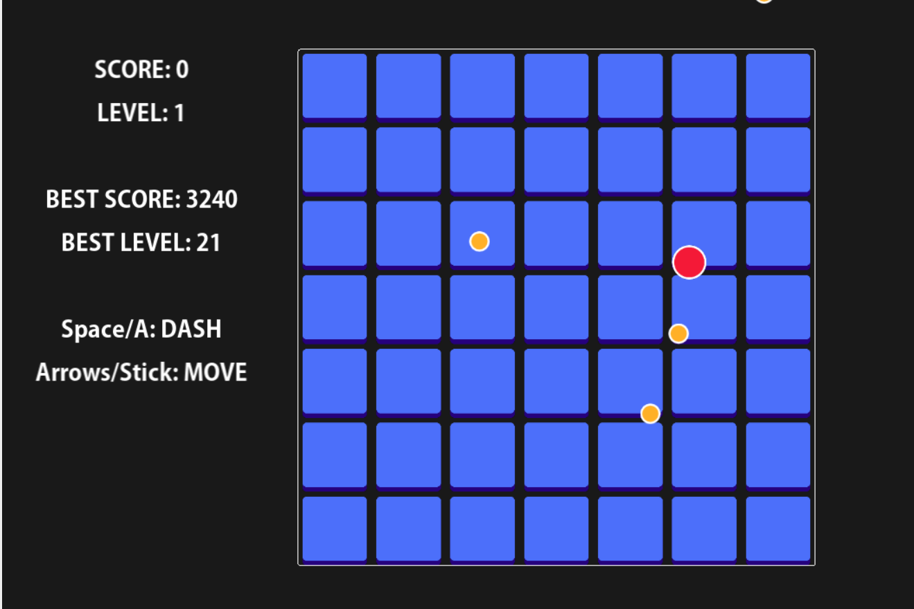
| Oct 4 01:47:24 | 20m 15s | Less Space | ♥ 1 | Simple concept, easy to pick up and difficult to master. I found this game to be a lot of fun - the progression of the levels becoming increasing small in terms of the safe spaces was well executed and I like that extra touch of being able to dash when all the loose tiles fall. It really challenges your risk vs. reward factor and I enjoyed it a lot. This page mentions gamepad support, but it didn't seem to recognize my gamepad. 🤔 The music had a nice beat to it, though the chords felt a bit off in terms of their notes. It wasn't bad, but I'm not sure how well this held up after multiple loops. The rest of the sound effects worked well enough. The graphics also were a suitable choice for this kind of gameplay. I did several real attempts but the highest I got was level 21 with a score of 3240. Unfortunately I pressed space before I could take the screenshot, but I still have the high score recorded on this screen below. Less Space Level 21 - 3240.png Overall this is a fun and well done entry. I hope you will be able to re-upload the images on this page, as they appear to be broken. It must have been around the time images started breaking on the LD site. I had it happen with an image I uploaded for another review, but the image issue appears to be fixed now. |
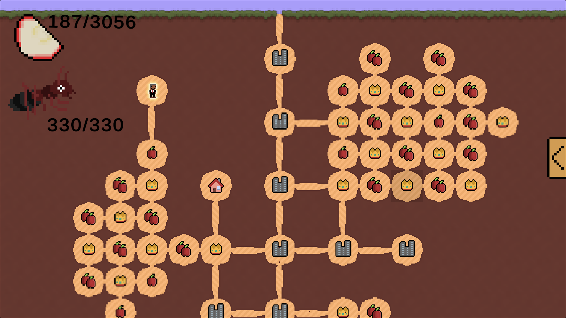
| Oct 4 06:25:44 | 4h 38m | Fun Ant Game | ♥ 1 | I played this...for an embarrassingly long time. It was quite addicting and satisfying to slowly but surely build up the colony. I like the concept a lot and I think the game was simple enough to understand and get into right away. The pixel art was definitely a standout and I liked being able to zoom in to see the details and zoom out to get a better look at my colony. I was kind of disappointed that ants only seemed to come out of the very first queen colony that was on the map to begin with, but all the other queens I placed didn't seem to produce any ants, so they were all concentrated at the bottom instead of spreading to all the other areas, especially the surface. What this game could have used more of is a sense of flow and urgency. As far as idling games go, this one was very manual and having to constantly go back and click on each action and wait for the food to fill up just made for a less engaging experience. The game also didn't really have much of a goal - I know there is a super expensive "Obama" in the shop and I decided to go for it and buy it, but it didn't really seem to do much. Kind of expected I guess, but also kind of disappointing. I thought it would be the end-game. 😂 I know Obama was put in for humour, but it also feels like the humour is too random in-game - the music and gameplay feel a little more grounded and serious and this just doesn't seem to gel that well with the rest of the elements. Fun Ant Game - Obama.png I like the idea of having to balance out these different elements of the house, food storage and queens and that placing these elements adjacent to one another can cause them to affect their output. It's strange that the upgraded versions also end up in the shop to begin with - I mean, once you get into the later game stuff, it's hard to justify even purchasing the lower-tier versions of the items. While the music was nice and fitting enough to be in the background, I did find the short loop in-game to wear out quite quickly especially after playing for a long time. I think the game could have also used some sound effects, particularly when you're trying to do something and you don't have enough resources for it. There's just not a lot of feedback in the UI to sort of guide the player into understanding why they can't initiate an action. I did notice some wonky UI stuff with the scrolling - moving the map up and down also caused the sidebar menu to scroll up and down, but the scroll wheel itself doesn't affect the sidebar menu options and I have to manually move the scrollbar with the mouse and cursor? 🤔 Overall, I would still say that my experience with this entry was more positive, if just for the pixel art and concept. It's pretty well done for a game made within 72 hours. |
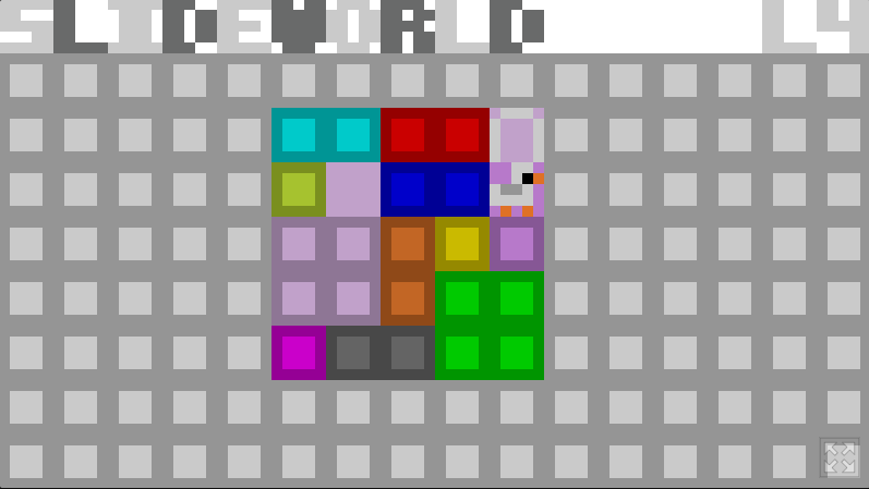
| Oct 4 08:14:48 | 1h 49m | Slideworld | ♥ 1 | I was immediately drawn to this game because of the graphics. The chunky pixel art birds did it for me - what can I say; I'm fickle when it comes to pixel art sometimes. I enjoyed the take on the Sokoban puzzle game for the most part. It's nice to have one with mouse controls and I love the addition of being able to slide the perimeters of the board around (at least that's what it looked like to me). Sokoban games always feel very limited so I feel like that was within the understandable boundaries of the theme. 😂 Not only did I appreciate the skip button, I also like that the levels loop around once you get to level 8 so I could take another shot at the ones I found more challenging. Strangely enough, levels 7 and 8 were considerably easier for me than the other levels (besides 1 and 2). I would say level 4 was the one that tested my patience the most, just because it involves so many crammed spaces and you really have to sit and think about how to strategically deal with all the pieces - that is, unless you're super familiar with these kinds of puzzles (which I am not). While I like the graphics a lot, I will say that the colours of the bird and one of the lighter blocks in level 4 made them blend in with the background blocks. One of my initial struggles with level 4 was that I thought one of the squares couldn't be moved because it looked like it was part of the main level's perimeters. I also found the understanding of how to move the level boundaries confusing. In level 3, there were some areas where I just couldn't move the level even though I had free spaces within the arena. I imagine the level area itself also has some boundaries that I couldn't see, though it does draw a lot of confusion from a player's perspective. It made the dragging feel unresponsive a lot of the time. Slideworld - Level 4 complete.png Overall, I enjoyed what you presented - it's the kind of entry that definitely deserves to grow a lot more outside the boundaries of a jam. Great job for a first entry. |
| Oct 4 22:27:29 | 14h 12m | Tele the Axolotl | ♥ 1 | I haven't played a lot of axolotl games, and this one felt like it definitely had the title going for it. I think the premise is pretty solid - a tight bullet hell with enemies that can drop blocks that limit your space. The teleport mechanic was also a great idea - I was confused exactly where I was teleporting to (was it random?) and I mostly just moved around the arena, shooting enemies. Even though the theme is "limited space", I think the starting arena is a bit too small, particularly around the openings between the rooms. Even when starting out, something about the movement felt very difficult to control to be precise. It also didn't really feel like there was a reason for there to be so many segmented rooms, since they would more easily get filled up with blocks anyway and I mostly just stuck to the room I started in. The ability to hold the mouse button to continuously fire would have been nice, especially once the game starts to pile up with enemies. Of course some audio would always be great for a post-jam version. Overall, I think you've got something good going here - the concept works well with the theme and I enjoyed the general premise of the gameplay. Congrats on producing a game in your first game jam and welcome to Ludum Dare! |
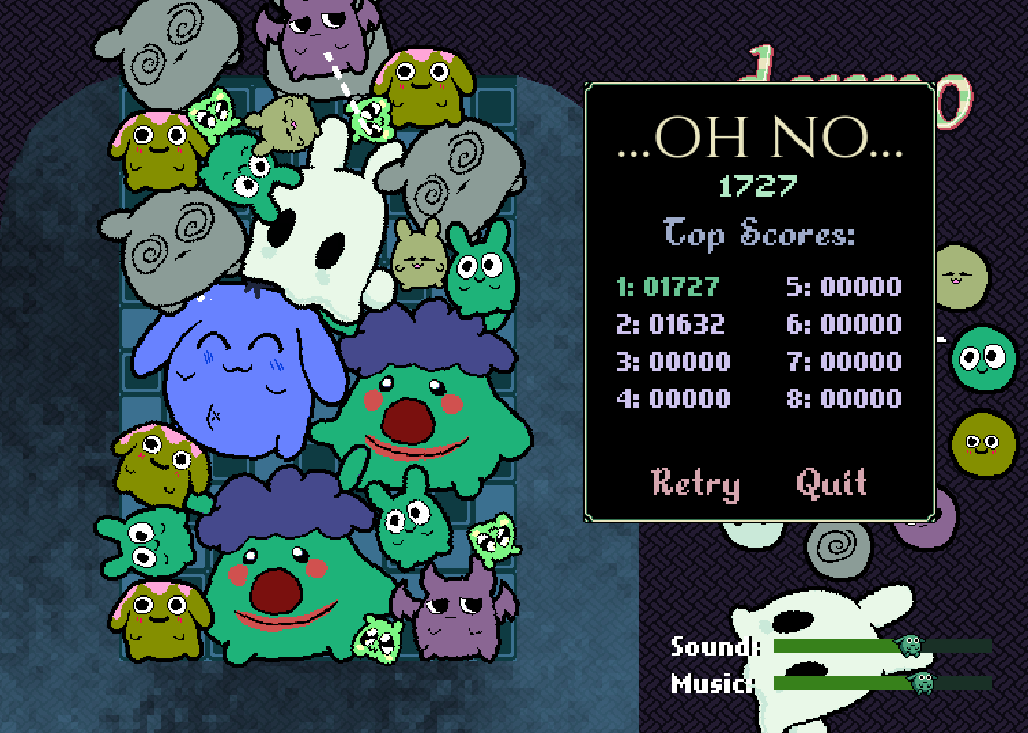
| Oct 5 01:11:17 | 2h 43m | Denpo | ♥ 1 | This game is just a little too addicting, which is an absolutely fantastic thing. Combining the characters together was very satisfying and I like that their larger size takes up less space, but makes them less prone to matching. Sometimes I feel like I'm almost going to lose, but then I get a good combination and seeing all those characters get set off by each other just makes it all the more fun. I also really like the music - it was just the perfect sort of tone for this kind of game and complemented the graphics and gameplay quite well. The art for the characters was also very cute. I'm not familiar with Denpafish but this was an aesthetic I very much enjoyed. I appreciate the sliders, but I noticed that the game registers actions while using the sliders, so when I tried to adjust the music volume for example, it fired off a character in that direction. Not sure if that was mentioned, but I was playing in the web version and that's what happened to me. The physics also seemed to be less forgiving in this - there were a lot of times when I thought I could push over other characters already in bin to nudge them towards others, but they often didn't budge as much as I thought they would. I think I'd get used to it after playing for a while, though I was a little taken aback by it. But aside from that, I think this is a very good entry. I really like that you don't lose when you hit the top, rather when a character falls off. That makes for some great opportunities for comebacks when you're just on the verge of losing. I didn't do super well in my few attempts, but I feel like I will be coming back to this one later. Denpo - RSK score 1727.png |
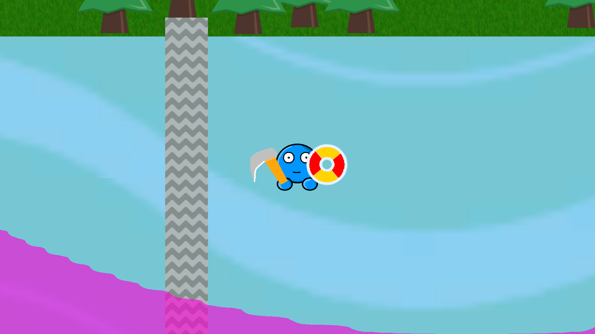
| Oct 6 16:48:10 | 39h 36m | Bullfrog Burnie | ♥ 2 | I love the pixel art and concept of incorporating frog-like mechanics into a platformer. The idea of the walls closing in is pretty neat, considering it can be more advantageous to wait for some levels to be narrower while being more prone to hitting the spiky wall sides. I really like how the music is used as well - the percussion picking up once you get to the actual tower climber portions was nice. While the composition in the track is very loopy, the instrument choices have pleasant timbres and the track doesn't wear out as easily. It enhances the environment of the game just right. At first, I struggled a lot with level 2 but the moment I started writing in my notes to complain about it, I got past it and made it up to level 13. My biggest issue is that with the interesting movement controls, I feel like this game would have benefitted a lot more from being an adventure-platformer, without the chaotic tower-climbing aspect. The controls are quite difficult to get used to - even with the tutorial, you still don't get the full extent of how the physics or angle of jumping works, which made level 2 so difficult to deal with. I know the wall-closing part is how the theme is integrated; it just doesn't feel like it goes that well together with the jumping controls, especially with the fall-jump mechanic which was difficult to get used to even in the tutorial. There's a lot of nuances that can be further fleshed out in an adventure-platformer to give the player a better sense of the controls and their quirks, then have the spiked wall levels either be interspersed with those regular levels or their own challenge entirely. I will echo the sentiment I read above about the disappearing blocks. Their signal when they disappear is too subtle, both in visuals and lack of sound cue. I also was curious about the use of the spacebar. It was mentioned in the tutorial but when I pressed it (in the web version), it didn't do anything. Overall, this is a cute entry with some difficult platforming because of the controls. I appreciate the volume slider and the interspersed checkpoints, though I do wonder why the checkpoints couldn't be after every level since not having them at level 2 and then dying gives the impression that you always start over from the very beginning once you die, which is just not true later on. |