Foon → Ludum Dare Explorer → LD43 → Feedback comment stats → Antti Haavikko
Feedback comments for LD43
Antti Haavikko's games and stats for all events →
| Timestamp | Since previous | Game | Antti Haavikko's comment | |
|---|---|---|---|---|
| Dec 3 15:20:22 | Sacrifice Carrier | ♥ 1 | Pretty neat! Crisp pixel art and nice tunes, as is quite often the case with PICO-8 titles. It was a bit confusing at first because the sacrificing button did not seem to do anything and normal shots were indeed killing the enemies just fine. But it all made sense after first encountering one of the big enemy ships and failing horribly against them. As you mentioned yourself, hitting the rocks was hard. And even with a fixed hitbox, it would be better if the little shots just didn't go through but instead stopped and maybe made some kind of immune indicating sound to more clearly point out that the power isn't enough. And against the little ships, it would be more satisfying if the fully charged shot wouldn't stop at the first ship and instead you could mow them all down with a single well placed shot. But yeah, well done! All that is really missing is more content and an actual difficulty curve. After going for a second run after my first success, it was very very easy. | |
| Dec 3 15:39:28 | 19m 06s | Crunch Clicker | ♥ 0 | crunch.png Even though it seems like nothing really impacted the game progress at all, it would have been nice to even have an illusion of choice. The "event" dialog popped on top of the stat displays so I couldn't even see what I should decrease. And a bit more variety would have been nice, maybe even as radical as allowing a stat increase sometimes so you could even minmax your build a bit instead of just slowly draining all your stats to zero. The messages were all funny and all that but just "go down a level on stat" or "got a new keyboard" got old pretty fast and revealed the actuality of nothing mattering at all. But maybe that was the message you were trying to tell. But yeah, good job and well done on achieving a zero crunch compo game. Can't quite say the same even though I slept the normal amounts and took plenty of breaks. |
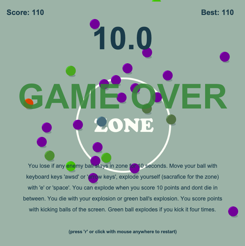
| Dec 3 16:09:05 | 29m 37s | Sacrifice for the zone | ♥ 1 | I think I'll have to end up with this as my hi score: zone110.png Very neat idea and also well executed. It looked good and sounded nice, pretty much only thing that irked me art wise was that explosion effect. First thing I'd "improve" UI wise is the timer. Would be more logical to have it start from the max and count down to zero. And even better would be to change it to be percent instead of seconds. And I think it would look better if the said timer and other UI elements would be "painted on the ground" just like the zone text and ring so the balls would appear on top of them. Another thing would be to somehow indicate the explosion cooldown somewhere. I liked the enemy variety even though there could be more and they weren't balanced quite perfectly. And of course there could be more different kinds. The green one felt a bit op. And speaking of that one, its functionality could have been indicated better. Maybe having it be be black (you know, bomb like) and have it blink red/yellow after the initial hit with a hissing sound would better indicate its behaviour. Or maybe have it grow spikes after the initial hit so it would look like a sea mine. I don't think there is a score based game that wouldn't be made more interesting by adding a multiplier system. That way even a same length run could result on different scores based on the experience of the player. Something like bumping up the multiplier on each quick chain hit and resetting it on explosion or too big of a delay. Or something along those lines. Powerups would be another thing to make the runs a bit more varied. Or even better. Make the enemies come in waves with shopping period in between them to allow purchasing of permanent upgrades of some sort. It would also help to pace the game a bit better instead of just being constant non-stop action. But yeah, well done! Very simple, yet interesting and super fun game. |
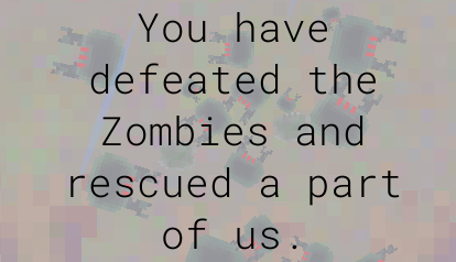
| Dec 3 16:33:51 | 24m 46s | They are coming. | ♥ 0 | After my first horrible run, this was truly a surprise and it happened quick: coming.png So yeah, it was super easy. I think I only killed like 5 zombies total on that run. Could be longer and have some kind of progressive difficulty curve. And maybe have a visible goal you're going for instead of just out of the blue claiming the player victor without them even doing anything really. And the balance wasn't quite right when on my first run I tried to kill them as much as I could only to find out that if there is any zombies in the bottom 10% section of the board, anything I'd send out will get immediately murdered. Wasn't a huge fan of the background graphics. It made even the character sprites bleed into this muddy mess. Combat didn't feel too good either. I think adding a bit of knockback to sword swing would make it better. It'd at least make it feel less awkward. And the whole game was over so fast that I didn't even get to familiarize myself with those different stats bars on the bottom of the screen. And a skip option for the intro would be very nice (after trying to go for a another try). I think it takes longer to watch through that than to actually beat the game 😃 Anyways, good job! |
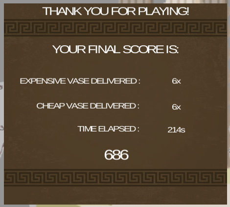
| Dec 3 16:51:22 | 17m 31s | Amphora delivery | ♥ 1 | amphora.png The art design was cool and so was the animation but the spit ball/splash and music felt very out of place. The combat was very easy and repetitive as hell. I think I got hit just two times on the whole run, one of them because I tried to see if the shield would actually do something and the other because I pulled two goat deer thingies at once and got ganked. Didn't even use those vases at all because the combat didn't warrant for the use of limited supply (in fear of whats to come). I tried those throwing spears once but didn't feel like they speeded up the killing that much either. So over half of the functionalities of the character were completely pointless, including the jump. Completely understandable that you got stuck implementing the different mechanics and didn't get to add different enemies etc. It's all about scoping your project correctly and prioritizing. Lessons learned, I guess. Anyways, good job! |
| Dec 4 15:05:29 | 22h 14m | Ultimate Snackrifice | ♥ 3 | fridge.png Very nice! Really brought me some nice memories of some weird suitcase packing game from the early 90s. One thing that game did better was that it presented the player with a predefined set of items that actually could all fit inside the suitcase. And it also had the additional complexity of allowing rotation of items. Can't really remember it that well but I'm pretty damn sure this one looked and sounded a whole lot better though. Super cute! Wasn't a huge fan of these mobile restrictions. Could easily fit all three screens next to each other on desktop. There also was a usability mismatch with the screen transitions, you could just hover to change when dragging an item but had to click without one. Yeah, super minor but still annoying. There is also a bit of a problem with the random nature of the game. It's very easy (borderline boring) until the very end and then it's all just up to the RNG. Like in the above screenshot, I went 100% fine until 2x2 space left and the game just decided to throw me a curveball in the form of never before seen wiener and other huge items that I possibly couldn't fit there. Those swap slots on the table/floor didn't really help much either since they couldn't even hold the problematic pieces. Until the very end you could easily just use the empty fridge space for the same functionality. And swapping would be better if the piece you're trying to put in the fridge only overlapped with one item, it would add the new item in and pull the existing item out. Aanywas, awesome job! |
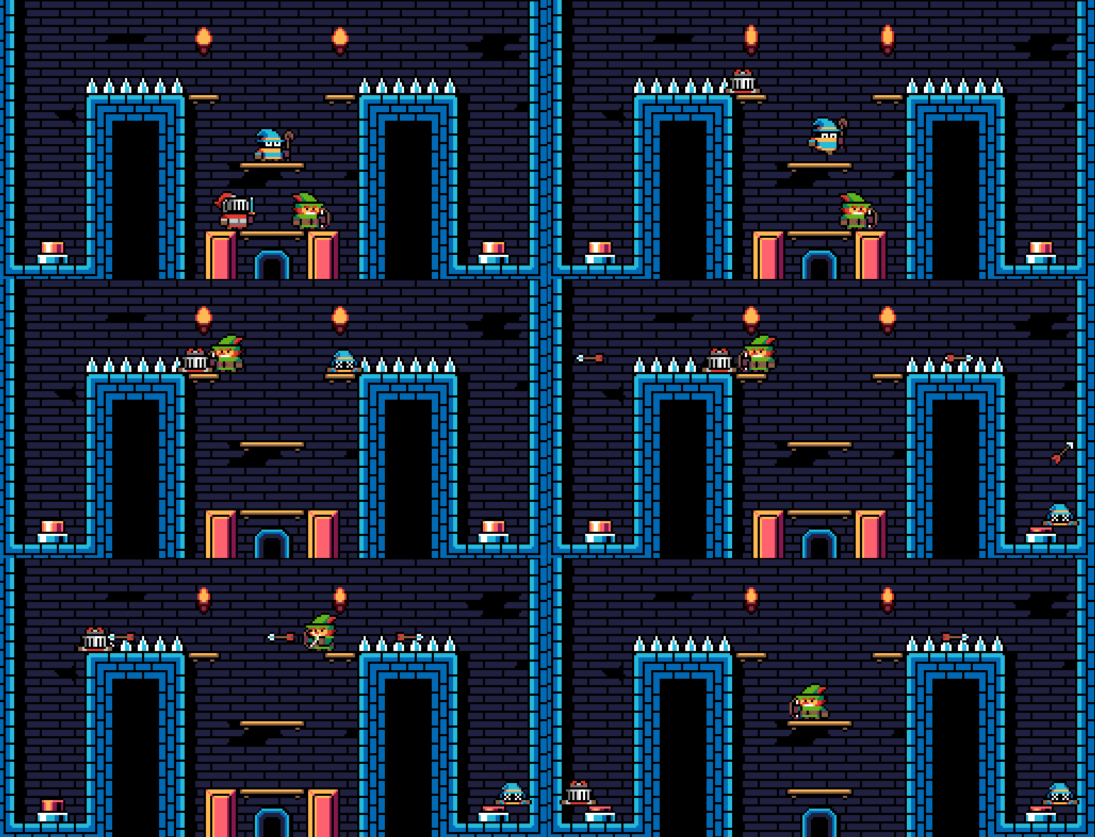
| Dec 4 15:47:17 | 41m 48s | Total Party Kill | ♥ 6 | Superb! I just want more of it. Banging tunes (still listening to that sweet ending track as I'm writing this), sweet pixel art, what more could one want? Loved the ending too. The sound effects were the only thing that wasn't 100% awesome and you were a bit stingy with them. There was quite a lot of actions that had no sound at all which made them feel weird. It this the actual intended solution? Seems kinda weird that the arrows behave differently on already dead comrades... tpk-huh.gif And I know for sure this one isn't the intended way... tpk-fly.gif Difficulty progression was a bit off and there were some levels next to each other that had the exact same solution. Even those samey levels would work if they didn't come right after the other. And the the difficulty curve doing a bit of a sine wave wasn't a huge issue either since it actually made the pacing feel nice since you didn't get stumped on every single level near the end. And the knights ability was completely pointless if you exclude the tutorial level. He was just there as a meat shield for the whole game afterwards. Well not really, he was kinda useful as a frustration vent when not figuring out the solution 😉 Anyways, great job! Easily my favourite so far... edit: Oh yeah, I actually worked on a game (that I never ended up finishing) with very similar idea couple of years ago but in it all the characters were the same and level varying amount of them had to reach the end. |
| Dec 4 16:29:19 | 42m 02s | Precedence | ♥ 1 | Neat! There wasn't a much of a game there but was interesting nonetheless. Would have been nice to have a bit clearer indication of when the world was going to end (which I think the shakyness was about). Went for a second run now and it was quite clear very near the end but it was way too late to react to it at all. The whole take/leave selection felt meaningless since I always just took them. Could have been just automatic or presented a bit more lore about the people with more interesting choices. For example some people could be bad and backstab you or something. You know, something along the lines of FTL events. Do the people you rescue actually impact the ending at all? I tried to go for a run where I only rescued only blue people but the ending was the same I think. I do know leaving alone or just with few people do at least change one line in there. Also would have been nice to have bit of a different look on the buildings I've already collected from, it was very easy to get confused about your surroundings because of the similar looking buildings. Turning felt a bit sticky, hasty and nauseating and at least those hourglass shaped buildings were floating off the ground. But anyways, cool game, good job! |
| Dec 4 16:55:25 | 26m 06s | Stjarna Höfuð | ♥ 0 | It was a bit weird. Even after reading that huge wall of text I was still a bit confused. First of all, the audio was not great. There was a ton of crackling in it can that collection sound got old very fast. Adding some variation and getting rid of that crackling is the key here. It was way too hard to get the game going. Had to try several times to actually reach a star before the mana ran out. And even after that, if the first start you went for wasn't purple, you were pretty much dead anyway. And the stars were so tiny in the beginning (and Alice's acceleration was so slow) that you pretty much had to take a stab in the dark and hope for the best. But once the momentum picked up it pretty much started playing itself becoming a DVD player screensaver and also impossible to lose anymore. Adding more control to the head and then adding some kind of fail state (maybe crashing into the moon when not big enough) would make it whole lotta better. Anyways, good job! |
| Dec 5 14:55:01 | 21h 59m | GameJam Sacrifices | ♥ 0 | The link says PC, Mac and Linux but only the Windows version is there... |
| Dec 5 15:23:54 | 28m 53s | Super Space Meltdown | ♥ 0 | ssm.png And half of that time was spent on waiting for elevators. Yeah, they were way too slow. Just having to wait for things is never fun. Probably best way would be to make them go lot faster when the player isn't on and a bigger delay on each end. The elevators sometimes also straight up refused to take me with them so I had to keep walking on them to stay on the ride. Losing those all those skills felt a bit much but I guess that was the point. Didn't even try the reverse one because that would have screwed with my brain too much. The air mobility one was the second one I sacrificed and it was just right at the end I realized what it actually did (the final bit where you had to go left). Not sure if you explained it in the help section but at least I forgot it if you did. Would have been better to squeeze the descriptions to the selection screen. The choices could have been made with keyboard also, not too intuitive to need to switch between mouse and keyboard for those choices only. The vision sacrifice was a huge annoyance for a first time player. Had to make so many jumps of faith because of it. The only thing that didn't seem like much of a issue to lose was the floatiness one. It was the first to go and never missed it, I think it actually felt better without it. Dunno why but I loved that landing pose. It had that mega man jumping like "YEEEAAH" attitude. It was hindered a bit by that weird jittering before actually hitting the ground and the slowdown while jumping forwards and trying to keep going but still cool. The music was cool also, obviously could have used some sound effects to go with it. Anyways, good job and welcome to LD! |
| Dec 5 16:41:47 | 1h 17m | Maroon3d | ♥ 2 | It was confusing as hell. The "attack" seemed more like a glitch and enemies have so big hitboxes that they hit you when they're not even nowhere here. Especially when they're above/below you. The hitbox in an isometric style game should only pretty much cover the feet portion so the sprites can easily overlap vertically without collision. The cultists phasing through walls was just unfair and they quite often ambush you so fast that you have to learn the whole level by mistake first. And your own "attack" is horribly inaccurate. The main character animations were cool. Some of that love could have been spread to other characters and the environment. Like the main character even had an idle animation yet the cultist had two frame walk cycle and the poor poor boys were just static cardboard cutouts. I liked the design of the cultist very much though. But anyways, good job! With mainly that hitbox annoyance fixed and maybe some audio, I bet it would be a fun experience. |
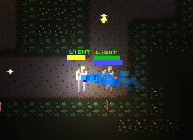
| Dec 6 18:35:28 | 25h 53m | Ludumiumings | ♥ 3 | ludium.png And even after that I'm still a bit confused about what was the actual intended way to play. What I really kept doing was sending as many fast peeps as I could before enemies started spawning. And afterwards just trying to send fast ones on the gaps of flies and when they eventually caught me, just click on them for a sec to let the flies pass. Now with a better understanding I went for a second playtrough and came up with a better strategy and was a whole lot faster too. At least I think it was better since I got a better score... ludrun2.png In the start I just mashed medium dudes for the whole amount and pretty much used the same initial stopping method or in a bigger mess used fortify on one dude so the others could go in peace. I tried using destruct too but timing that was just too hard in my opinion. In the end it still feels like it was unnecessary to have three different classes of dudes. I think it was also unnecessary to disable the speed button if you hadn't already sent out all your guys. It made it just tedious if you didn't want to send all your guys at once. The art was cool and so was the music. Was it the case that the miners weren't completely opaque? It looked a bit weird when they were walking close to each other on a vertical line. The color selection of the hp/ludumium bars and the name of the unit kinda clashed against the rest of the nice color palette and made them seem out of place. Overall my biggest issue on the game was the wording of those different numbers. Dunno why and what would be the better way to inform about that but "safe in base", "left on field" and "to send" didn't quite click with me before pretty much the very end of the game. Maybe having the "safe in base"/"to send" next to the corresponding doors would make it clearer. The left on field one could easily be scrapped altogether, it just made things more confusing. Maybe my confusion about those number was because I thought they were mining the ludumium from the level instead of just transporting it. These dudes can also shoot lasers from their crotches while walking... ludblast.png Anyways, good job! |
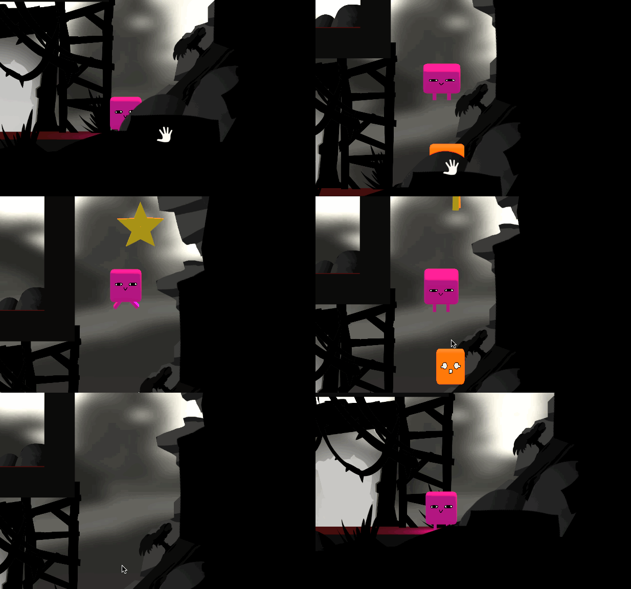
| Dec 6 19:25:29 | 50m 01s | JellyWay | ♥ 1 | 10.gif So is there actually an 11th star? Played it through second time just to verify that I grabbed a star on each level. Did one level have two of them or what? A level select would be nice for star hunting reasons... edit: Now right after writing this I immediately got it. Pretty clever, I'm dumb 😊 Found a bit of a game breaking exploit quite early on: jellycheat.gif It would have pretty much trivialized all the puzzles so I decided to play the game without it. And leaps of faith are never fun especially so if there is a specific spot you need to land at not to die. jellyleap.png The leftmost guy on the last level was completely unnecessary, because first you could manage to jump and grab this dude: jellygrab.gif And then dunno if this was even how you were supposed to do the next bit: jellyclimb.gif And even with that skip the last level felt a bit too long and hard. Sure it was easy on my second time through but I think it was just too much too fast. It would indeed be fine if the game had more levels and a more linear difficulty progression. The game looked and sounded sweet. I guess there was bit of a mismatch between the colorful characters and moody dark backgrounds but it still kinda worked. The laser cannons and the beams themselves looked quite out of place quality wise compared to the rest of the art. The same kinda goes for the spikes. That's pretty much all the critique I can come up with. I would happily solve more puzzles of this, good job! |
| Dec 7 18:41:56 | 23h 16m | Yahtzle! | ♥ 2 | Pretty damn cool! A whole lot better for sure than that normal boring stupid yahtzee. yahtzle.png At first I thought it was super hard and luck based but in the end I figured that the skills don't change sixes to ones so I was golden on my second try. I still taught it would be too RNG based on the start but I guess you can just bank some corn and make that six yourself if you keep missing it all the time like I did. I was also dumb enough on my first run to get too many yellow/brown dice so I couldn't even fit a red one in. The look (even though the graphics were a bit blurry) and sound were good. Sure, it could have used some spiffy effects and animations. And of course it would have been nice to have all that how to play/win stuff in the actual game and probably not in a format of a huge wall of text. The problem with that is that even though I skimmed through the help, when I actually got to the game I still didn't know what to do because I had zero context about anything when reading the rules. But my biggest issue with the game was the dice/button placement. I mean the player constantly has to constantly move the curosr between the left and right edges of the screen to perform anything. Especially so on a touchpad. I know it's kinda nitpicky and minor but adding hotkeys and/or reorganizing UI elements is also super easy. Anyways, good job! Could quite easily add some more scenarios to lengthen and vary the gameplay a bit. |
| Dec 7 19:21:32 | 39m 36s | Tower of Sacrifice | ♥ 1 | Pretty cool! Even though it was probably way too easy. There was so much blood that you could easily even skip couple of levels. I didn't even get hit once. Those floating eye thingies got close few times, I think just giving them some more movement speed could do the trick. And obviously other enemies could be beefed up some more too. Even the intimidating looking sword guys with their cheaty non-telegraphed attacks and missing attack animation sprite were no match for my dodgy skills. tos-broken-swordguy.gif And this thing also looks like you just didn't stretch the black background to be big enough 😃 tos.png Other than the difficulty, the overall gameplay was great. The controls felt good and responsive. The pixel art looked nice but could have used more variety. Same goes for the sound effects and the lack of music didn't help there much either. Could add in some more feedback when hitting the enemies like a flash them white or something along those lines. The camera did have some issues like erratic and jittery movements mainly when jumping/falling. It probably was because it was so aggressively sticking to the player sprite. But yeah, 2D cameras (and don't even get me started on 3D ones) alone could eat a weekend from a developer and still be far from perfect. Anyways, good job! |
| Dec 7 20:21:13 | 59m 41s | Ritual Slaughter | ♥ 1 | Couldn't beat it in couple of tries and I don't think I wanna slog through that intro bit another time anymore. Sure the ritual bit was neat the first time and gave a nice anticipation of whats to come but it should 100% be skippable considering how difficult the actual fight is. It was kinda weird that you had to sacrifice 5 things right from the get go, like wasn't that over half of the available abilities. I mean, you can't sacrifice what you don't have. Quite a lot of people seem to have gone with the sacrifice and ability and that probably would have worked better here too. Seems like the different abilities weren't balanced very well. Losing vision was a no brainer every time after I noticed that it just makes the screen a bit darker. And I didn't try the unnerfed melee but after sacrificing it became completely useless. So it seemed a lot smarter to just focus on the gun. Except it ran out of ammo and that reloading thing that has already been mentioned quite a few times. And I'm not even sure I managed to pick up any of those ammo drops. Were you supposed to pick them up by just walking over or did you need to hit E? I mean that's quite a lot for left hand only to constantly rotate around WASD to circle strafe around satan to dodge his fireballs and at the same time keep mashing R and E every second or so. I don't have enough fingers in one hand for that. The art was pretty good even though it wasn't quite cohesive. There were some classic z-ordering issues with the sprites where stuff that was further back (i.e. more up) were on top of closer things. I'd also increase some of the UI elements some more. Like the mission info box and definitely make the red text in the middle more readable by adding a white outline or something to it. It was a bit hard to read and I'm not even red green color blind. The font selection didn't help with that either. I at least didn't hear any music at all even though there was a slider for it in the menu and the sound effects were also quite bland and repetitive. Anyways, good job! I rarely complain about difficulty (being too high at least 😎), I'd happily bash my head against this mofo until conquered if it was a bit more accessible... |
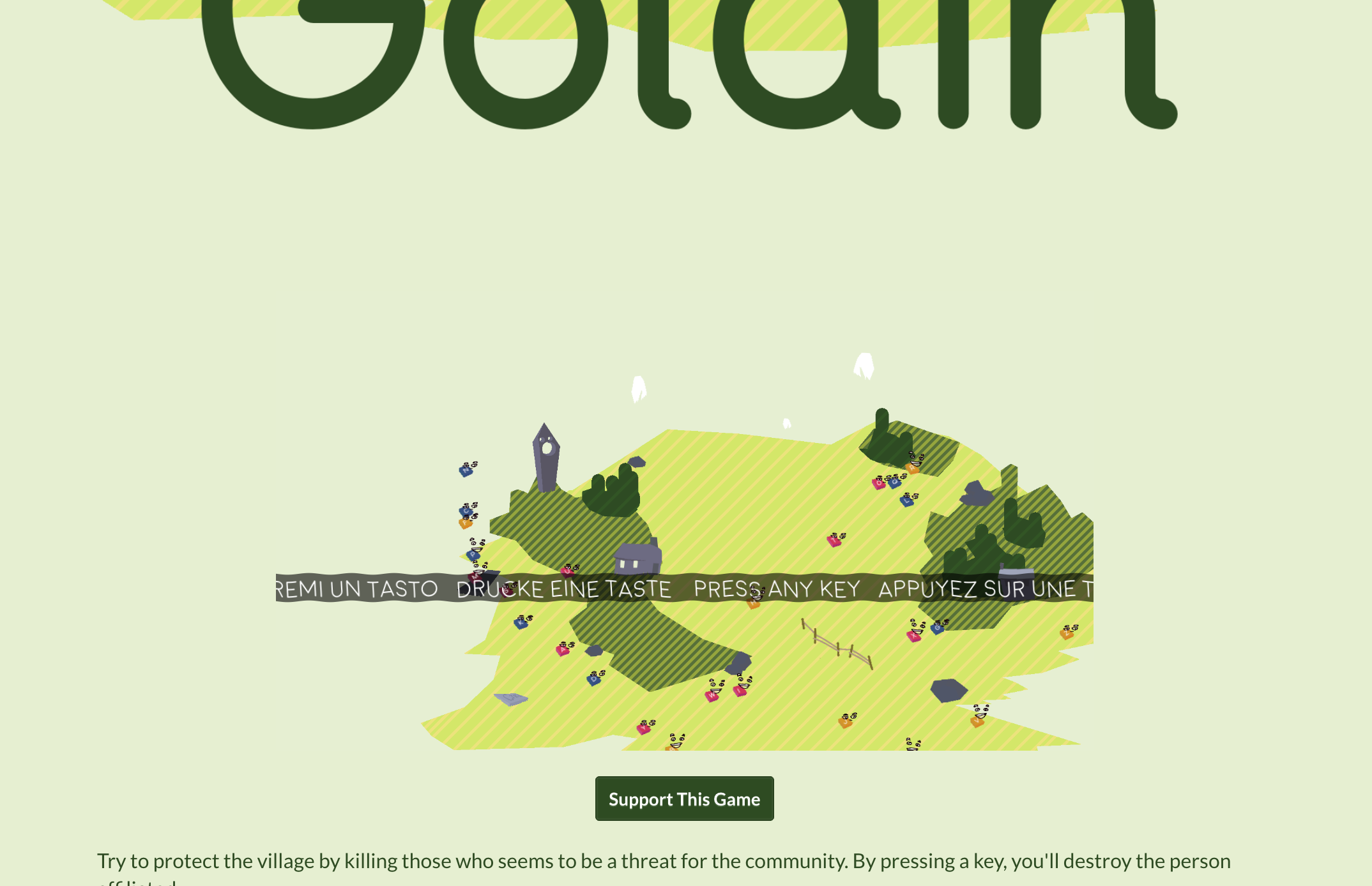
| Dec 8 10:39:02 | 14h 17m | Göldin | ♥ 1 | I got so close to actually getting to kill everyone. I did figure out that the same colored dudes would get mad if their brethren were killed. So I had to wipe them out one race at a time, kinda morbid btw. But the flashing and them grouping too much together got into way all the time. I always couldn't find one of the torch carrying ones or their letters in time. The letters were also kinda small and slanted to a weird angle so it was hard to clearly read them in time. I also tried the strategy of first positioning my fingers on top of the keys of the blue crew and then try to take them out in a quick swoop but somehow that method failed every single time as well as at least one dude miraculously always survived. The look was nice and cohesive. Super simple design but it worked very well. The sound effects were a bit bland, for example could have used some more oomph on that explosion sound. After I thought I was done with the game I came here to read the comments and saw you mention that you can actually finish without killing anyone so I had to go back to figure it out. Only to encounter this issue where the the camera was offset to either corner and I'd only see a portion of the screen. It was always this if not in fullscreen and 1/5 of the screen bottom right corner if in fullscreen so it became completely unplayable. Even refreshing the page didn't help here at all. golin.png And obviously while I was screenshotting and starting to write this I heard some new sounds from the game. Seems like the pacifist route was even easier that expected... Anyways, good job! |
| Dec 8 22:30:58 | 11h 51m | Cultist's Quest | ♥ 1 | So now I'm actually kinda pissed off. I spent a good hour and a half wandering around these desolate caverns just to suddenly die for some unknown reason. It was probably at least floor six or seven, the starting room had a rat and a goblin which I dispatched even though they took a surprisingly huge amount of hits to kill compared to anything else seen before. Oh the game actually seems to keep track of the action log from the previous run... cq37.png Well that's a lot of damage compared to all those single digit hits seen before. And I guess that goblin was one of those "hey I'm hiding under a door, so I guess lore wise I'm hitting you through a keyhole or something cause I give zero fucks" type of monsters. So suck it Rodney, your amulet can rot in that cursed dungeon... So I think you way over scoped your project and fell flat in your ambitiousness. You spread yourself so thin that you ended up with quite a lot of different functionalities (which still aren't enough for a classic roguelike) and none of them are very tight. Quite frankly, it ended up being quite boring. The floors were way way waaay too huge and empty. I mean I at least had nowhere near enough memory to remember even a 10th of these identical looking rooms and corridors. That's the beauty in classic roguelikes having the whole map visible at once, it's impossible to get lost. And even the bit more modern remakes of Nethack with graphics that can't fit the map to screen at once have a minimap. Did you even beat the game without using the zoomed out Unity editor as a makeshift map? The rooms and corridors were unnecessarily big too. The rooms had no reason at all to be bigger than 5x5 and those 50+ tile corridors were a slog (with no repeat key functionality). Quite a few times ran into these "cool" minute long corridors that just ended up in a dead end which resulted in me trampling over half of my 10+ sacfifices because of the frequent visits there. cqkey.png This key/door system you had was quite dumb. The classic way of any key opening any locked door would have been way better. Sure, I forgot that there is a bash door key which made it 100 times worse but can you really blame be, you drop quite a big list of keys for a player who doesn't know anything about your game and expect them to remember everything (without any contextual information about the actual game). That's another beauty in classic roguelikes, even though they had tons of different keys and ascii graphics, only thing you really had to remember was the ? key. So I did try K after getting frustrated about the lock & key system but you had gone the complete other route of making it be bash and not kick and also binding the key to something unexpected. I wouldn't have remembered the sacrifice button either if I wouldn't tried to search at one of these... cqsearch.png What's the point of those? Didn't see much value in the whole sacrifice/spell thing either. The spell wasn't really that much more useful than melee because there was no way to figure out whether a monster is a real threat or not. And up to my cruel end, I didn't even know the monsters could pose a threat at all since everything I had met that far was just tickling me and I had health potions galore in my inventory. Oh, it seems these comment posts actually have a character limit. To be continued in the post below... 😎 |