Foon → Ludum Dare Explorer → LD44 → Feedback comment stats → Antti Haavikko
Feedback comments for LD44
Antti Haavikko's games and stats for all events →
| Timestamp | Since previous | Game | Antti Haavikko's comment | |
|---|---|---|---|---|
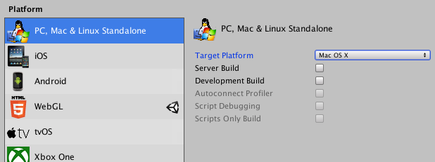
| Apr 29 14:34:04 | RoShamBo ++ | ♥ 2 | There is no Mac client inside the zip (nor Linux for that matter). Unity doesn't automatically make all three platforms when you build, gotta target and build each separately... builds.png | |
| Apr 29 15:07:27 | 33m 23s | Radioactive Worm Storm | ♥ 1 | Oh cool, someone using SunVox! Music was nice and moody and the pixel art was cool and crispy. Loved the animations, especially the clouds and the lightning. Nice touch and they really brought the game alive. So, nice to see a tutorial but I'm dumb and forgot the most important bit after reading the whole thing through and played without any memory about the scrolling mechanic. Needless to say that it was quite boring. Then I went for another round and tried to play properly (as far as I'm aware) but didn't really make it any further than on the first run. What is the intended strategy here? I tried to spread myself to both directions as far as possible to gain more energy but the long walk for the robots meant that the far towers kept getting bodied by maggots and then because of the wormholes they eventually boxed me in and ended me. Well, went for a third (and fourth) try and made it through with the boring strategy of just using three lightning rods and waiting. Not very immersive gameplay... rws.png Anyways, good job! |
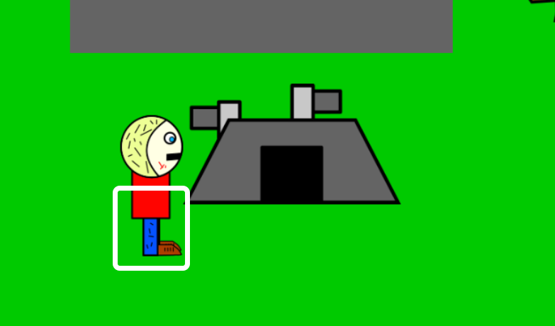
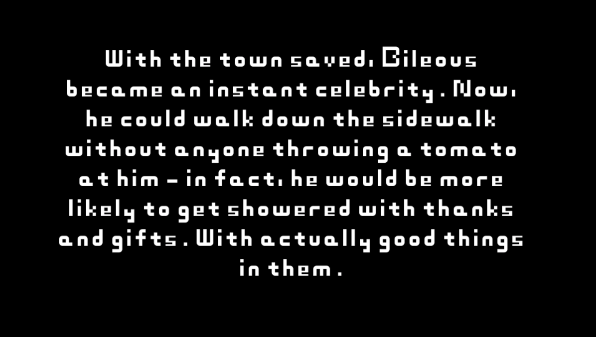
| Apr 29 15:28:21 | 20m 54s | The Adventures of Bileous | ♥ 2 | First of all, I have nothing bad to say about MsPaint graphics even though I personally enjoy hand drawn MsPain art more than the too symmetrical geometric shapes. But the color selection of just using bright pure colors hurts my eyes and soul. I'm no artist myself but I can wholeheartedly recommend using a tool like https://coolors.co/ to generate a palette of just a few colors that look nice together. I use it on almost every game jam! Then to the gameplay. The enemy spawning was cheap and didn't give any warning resulting of many unavoidable damages taken. The AI was quite relentless if you happened to corner yourself but on the other hand it was dumb enough to be exploited by getting them stuck on the buildings. The hitboxes were not very obvious and were too large. It would have made more sense if the character colliders was like this: hitbox.png ...since it's kinda mimicking isometric view anyway. And the hitboxes for damaging the player should always be way way smaller than the sprite itself to make it seem not unfair. Made it through on my second try! First time I would have probably made it too but I seemed to miss the weight item. bileous.png Didn't really see or understand the use for all the items either. Were they all even necessary? Anyways, good job! |
| Apr 29 18:21:35 | 2h 53m | Sour Business! | ♥ 1 | Funny stuff! No need to apologize about the audio, it fit the game perfectly and the graphics were adorable. And nice animations, good to see a fellow Anima2D user. The controls were my biggest gripe. Or more like lack there of. The jump when running failed like 50% of the time and clearing even one fruit without running start was a bit too tricky. The balancing could have used some more work too, quite quickly the field was littered with non good fruit and no lemons anywhere. Also would have been to have some kind of end screen so I could know the score in the end. I think my best score ended up being 10 bucks. Good job! |
| Apr 29 18:37:07 | 15m 32s | Grand Theft ATP | ♥ 1 | Nice idea, though it ended even before it really got going. Would have definitely needed more content. And half of the levels (if not all) were even setup so that it was impossible to fail. atp.png The visuals were clean and mouth sound effects are always cool in my books. The UI could use some love though, I'm not the biggest fan of solid white squares with black arial. You already had another font and a stylized play button in the intro screen, why not those in the game too instead 🤔 One nice touch was the see through background on the help view (and even having in game help needs to be acknowledged in the jam scene) since it made it easy to see how the board was set up without the need to close the help view at all. Even though, I would have preferred for the descriptions to be in the game view itself as tooltips for the actual objects and buy buttons. All in all, good job! |
| Apr 29 18:55:40 | 18m 33s | Lifeless -- A Little Depressing Game | ♥ 1 | Got this warning every time I ran it and it for some reason didn't work when I tried with terminal but ran just fine when I opened it from iTerm. life.png The whole giving and taking life thing wasn't very clear. I mean, if I was even doing it correctly (sure there was some color change I think) and what it did. I guess the bad red stuff was killing me and I could use the family members to get more life. But what is the point of taking their life, didn't seem to give any score or nothing. And one time the game opened with no red words at all, thanks for the infinite score! What is the max int in Rust, you can set that as my hi-score 😎 lifenored.png And yeah, gotta love to see some obscure engine choices in this se of Unity and Godot. Good job! |
| Apr 30 15:30:26 | 20h 34m | Haemogoblin | ♥ 3 | Very nice. Even though I pretty much hate tower defence genre. Lovely art and music and puns in game names are always good in my books. Only visual thing that stuck to me was the lack of shading on knights and gnome on the actual game scene. Made them pop out (and not in a good way) from everything else that was more detailed. Another thing that lack the polish that otherwise was there was the health bars. hg.png The balancing and overall progress flow were a bit off. The only way I was able to win was to just use 5 spiders on the first round and then completely drain the gnome. That with our savings from the first round are enough to bank a win. The traps were just too damn expensive to warrant their use. I see in the screenshot above that you had them as 60 at some point, seems more fair. The lack of progress was also quite depressing. You lost all your buildings each round and the enemies didn't seen to get harder or increase in number the further it went at all. I was just pretty much stuck in a loop of all the blood I could make with traps was barely enough to make as much blood the next round. The shopping cutscene looked nice but started to be a bit annoying after being in the fore mentioned loop for quite some while. Would be nice if it was skippable. The potion filling wrongfully played the sound on each click wether the previous one was done or not. Anyways, good job! |
| Apr 30 15:55:58 | 25m 32s | Victor Spumante And The Raindrops of Burgundy | ♥ 2 | Well that sure was, umm, something. I would have made more of an effort to hide the true nature of the game and keep a facade of being a clicker game for a bit longer (and better). You know, kinda like Frog Fractions where it goes for some while before completely going off the rails. Doing a game like this isn't probably a best idea in a jam, can't really focus that much on several different mini games and they end up just being boring and buggy speed bumps in progressing the story. I dunno how seriously I should feedback in a game like this but making a joke game shouldn't really go ahead of user experience. You used a whole bunch of different fonts and pretty much all of them were terrible. Most didn't really read very well and pretty much only one that did, arial, is just plain looking in a game and boring. But anyways, good job, you managed to do quite a lot! |
| Apr 30 16:15:20 | 19m 22s | Escape from Hell | ♥ 4 | Umm... efh.png So what did I miss, what was the whole point of that you die and go farm souls etc? The boss fight didn't get any easier and it wasn't really hard to begin with. Just tedious. Go forward, swipe (however many times you feel brave enough for) and walk back. Rinse and repeat for about ten straight minutes. The outside scene looked gorgeous. Can't really say the same about the inside bit, it looked a bit rushed in comparison. The slime enemies also seemed very very buggy. They liked to completely disappear at times and sometimes just died on their own. That or the sword hitbox was extremely funky. Controls didn't feel super great either. Sure, they did the job wouldn't really cut it if the game was more involved and the combat got even a bit harder. It should be more crispy and pixel perfect instead of floaty like this. Anyways, good job! Even though short and very repetitive, it was an enjoyable ride! |
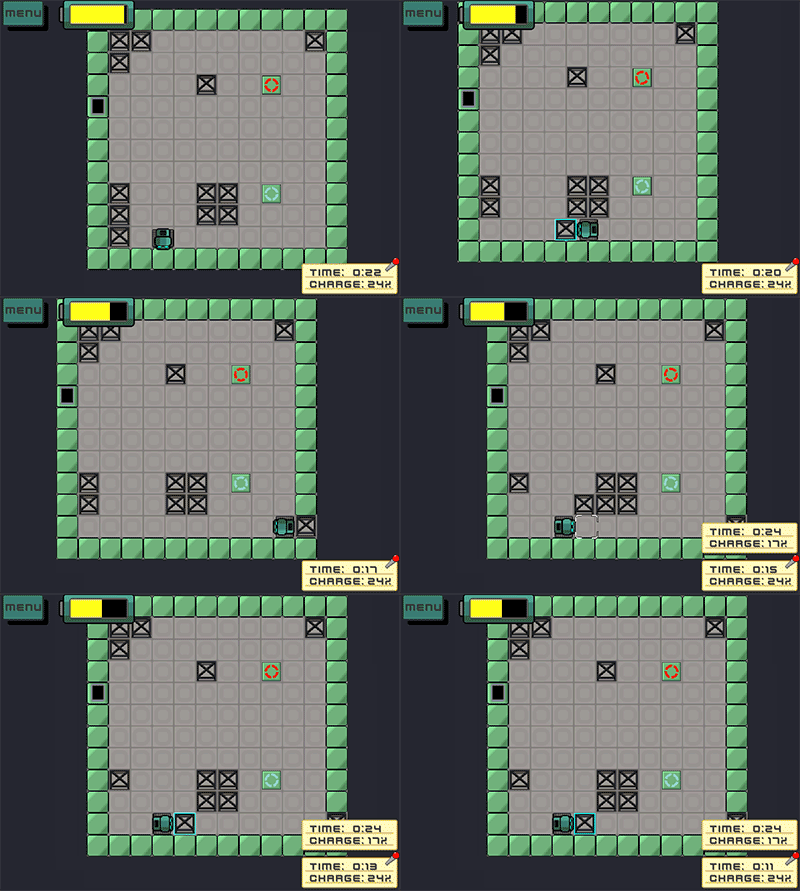
| May 1 16:54:17 | 24h 38m | Roboxery | ♥ 0 | Neat idea but just waiting around for a box to spawn is not fun. The smallest level was very easy, biggest hurdle was not getting bored while waiting for the spawns. But the other two gave me some problems... In the second level I just couldn't get enough energy from selling the low value boxes and breaking them wasn't really an option either since it was too reliant on RNG. I dunno, the box values were barely enough to make some profit but didn't seem like enough to warrant a journey to the charging station. Seemed like it would have taken ages to fill the battery. The biggest one I just couldn't even more the frames correctly to get a smooth path from spawn point to selling point and was constantly met up with the following bug(s) so I gave up. The box values also seemed as bad here as they were on the middle level. roboxery-bug.gif Also managed to break through the wall myself once and got stuck there which wasn't fun... roboxery.png Anyways, good job! |
| May 3 13:49:54 | 44h 55m | Showdown Arena | ♥ 0 | Made it to round eight until I ran out of ammo... showdownarena.png The robots posed no threat at all, the only way to lose is to run out of ammo. Even after always buying ammo with almost all the life I had, in the end it took me quite a while of idling next to two remaining robots for them to be able to kill me. Running and "aiming" (which made instructions confusing since mouse was aim and right click was actually zoom) both seemed unnecessary. The running had no downside at all so might as well keep that button held 100% of the time and that is never great gameplay. At least it should have been toggleable. And zooming didn't seem to do anything either, I managed to hit them just as well without it. It also would have been nice to be able to skip the countdown to next wave if done looting and shopping. Would have needed a lot more sound and visual feedback. I think you had only two sound effects, the robot ambient and the bullet hitting them. Different shot sounds for different guns for starters, that would have given them the needed personality. Also would have needed a better indication of bullets hitting the robots, it was sometimes unclear whether I hit them or not (because of this it's still unclear to me if I could shoot over the obstacles or not). Same goes for picking up health packs. Their hitbox was way too tiny so I quite often had to just dance around over one and stare at my health to know if I picked them up or not. Picking them up was especially unnecessarily hard when they landed on their side. The look was ok even though it was very desolate. The gun icons were very uninformative, the only one that was clear was the SMG, I only recognized the others from the vending machine. I wasn't a fan at all of the font and it's color. White would have been less obtrusive with maybe changing to red when you want to indicate something like low life or out of ammo. Anyways, good job! Pretty solid gameplay and I at least didn't encounter any horrible bugs. The biggest thing holding it back was the balancing. |
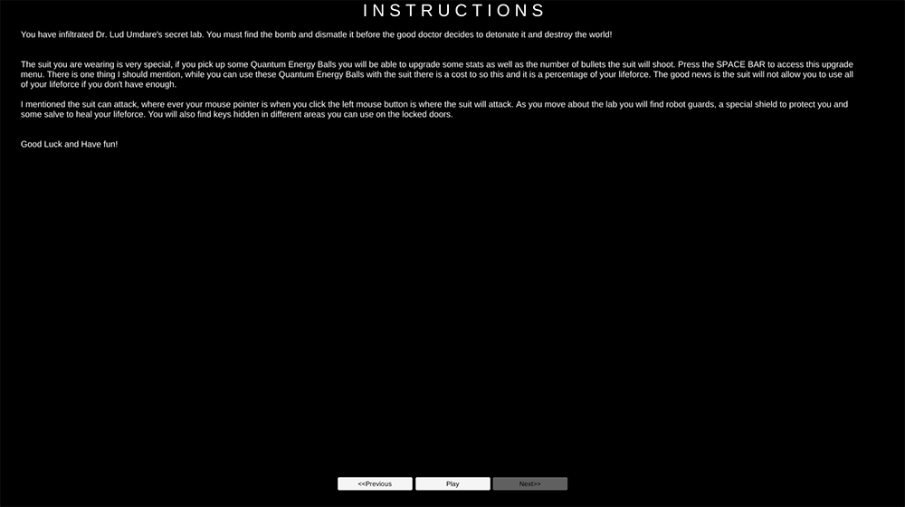
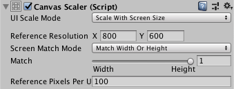
| May 3 14:11:27 | 21m 33s | Dr. Lud Umdare's Revenge | ♥ 0 | Well that was super easy. I only managed to die because walking to those instant kill walls. The difficulty(ness) curve made the whole upgrade system completely pointless. It sounded and looked ok but there were some minor issues... like the use of space here: drludspace.png Unity canvas has this option to scale with screen size, would have worked fine here. unitycanvas.png Also, sprinking in the controls on a wall of text isn't too fun. Should have had the lore text first and then the controls in a clear and separate section afterwards or something like that. And the whole epilepsy warning was kinda meh even though it maybe was needed because of this... drludhuh.gif And the gif doesn't even give full credit to all the blinking and flashing that happended there (each time I opened a door) because the low framerate. Also had some z-ordering issues. Usually it's best (in isometric-like games) to order sprite layers based on their y-axis coordinate. drludordering.png But yeah, it would have needed some length and difficulty to allow the upgrade system to actually kick in. Like first of all, make the enemies (if you can even call them that) move and be more threatening. Bullets would need more speed then though. The instant kill walls seemed unnecessary too and obviously a faster way to restart after death would be cool instead of needing to go through the whole menu. Anyways, good job! |
| May 3 15:06:10 | 54m 43s | Heartreasure | ♥ 1 | Geez, that was a tough one. The last one alone took me about 20 minutes to find and even the final 5 took me ages. 30.png It was really getting frustrating to find the final few. Some of them were hidden devilishly well and others were extremely tiny. I regretted it so much that I didn't download the standalone version to be able to see it full screen. Would have been nice to have full screen button on the web version too. Some kind of hint system would have been very welcome. Like a button that you could press every x minutes (to limit its overuse) that would tell how many hearts are on screen or something like that. The art was adorable and full of charm. This sign was probably my favourite though, such nonsense... sign.png The piano puzzle was cool even though I sucked at it because I somehow remembered that C was the first line 🤔. The other "main puzzles" were kinda bland. Would have been nice to get some audio/visual feedback when actually solving those puzzles. Same goes for all the hearts though, I think I got some by accident (ie. furiosly clicking everything randomly because I was getting mad). Some of them had those nice animations but other just vanished. Animations were a nice small boost of motivation to keep going so the fact that like 90% of them just disappeared wasn't too fun 😢 Anyways, awesome job, really lovely little puzzler! **edit:** Kinda funny and sad at the same time that majority of people talking about it being Mac only at the start, have a game themselves that is Windows only. |
| May 4 10:49:35 | 19h 43m | I've Got A Second Chance At Life But Now I'm An Axolotl And In Massive Debt | ♥ 1 | Yay, finally found it! Good thing you had the same username on here and itch.io First of all, you should probably update the links here to include Mac/Linux to not deter us weirdos away with the Windows only looking game. And you can consider the mac version tested, worked just fine except for the fact that a slice was missing from the top and bottom. About as much to only see half of the bubble icons. Lovely install instructions for the Mac version too on the itch.io page. Well, it's the same as Windows, just unzip and open the app. Looked great and the music was pretty good even though it didn't really fit. Definitely would have needed some sound effects. Other than the sound missing sound effects (and maybe a bit spicier particle effects), the "game feel" was juicy and on point with the screen shake and whatnot. One thing that I was kinda missing was an aiming reticule instead of just default mouse cursor. I at least seem to have this mouse cursor blindness that after launching a game and in the heat of action, I don't seem to see the default mouse cursor at all. The lack of other enemy types you told about (and even the boss) really messed with the difficulty here. If you can even call it difficulty since it was unexistent. The zombies were super unthreatening and the levels didn't get any harder, it was just repeating the same level again and again but you only got stronger. At least you should have increased the zombie count each level even though it wouldn't have really mattered either since they die so fast and do literally nothing. And after remembering the right click to suck the hearts, you make so much bank so fast that you can afford all the upgrades in a heartbeat. Speaking of the upgrades, the attack up was the only useful one (well, the speed up was ok too). All the different bubble (btw, big and spread were mixed) types were straight up worse than the default one. The walls were super glitchy. Well, not the walls but the player collider maybe. It was very easy to get stuck on walls, especially on corners. And shooting around corners quite often resulted in the bubbles just evaporating on the walls. Dunno how much time you spent on the level generation script but I think the whole going the roguelike route kinda held the game back a bit in this scope. The terrain was also very open, wouldn't have felt really different if it was just a big open rectangle with the ladder in a random spot. Adding hand crafted levels would have probably been better here and the time saved from not tinkering with the generation could have been used to add the additional enemies and threats. Anyways, great job! |
| May 4 12:33:40 | 1h 44m | utsvulten | ♥ 0 | Wow, what happened here, how did this blow up so much? Sure, it was awesome but the amount of ratings you've got is something I've never seen before... 🤔 So yeah, I really don't have much to say about it other than that it was super cool. The only thing really I can critique about was the fact that the hand grabbing point wasn't at the cursor position. If the cursor wasn't visible, it wouldn't have mattered but now it made grabbing things just more confusing. Other than that, everything was top notch. Looked awesome and sounded superb. Had to go for a second run to see if there was a different ending. By the way, there is at least one brain piece that isn't edible. Anyways, awesome job! Sure, it wasn't much of a game but for what it was, it was perfect. |
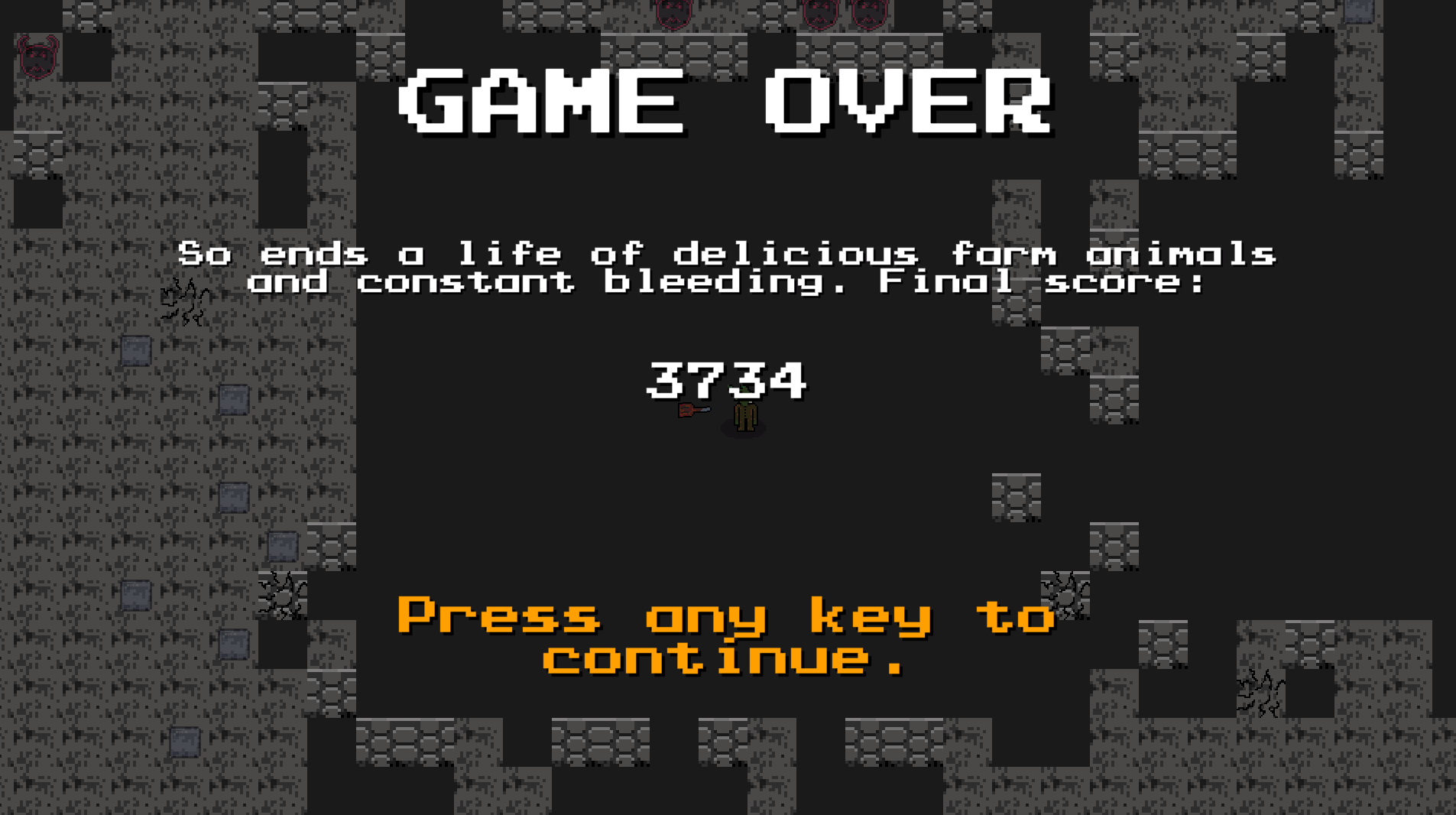
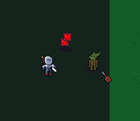
| May 4 17:45:53 | 5h 12m | Lunch Lord | ♥ 1 | After few tries, for some reason, I was determined to reach a high position on the leaderboards. And after maybe around two hours, I would be up there if the leaderboards were stable enough to work properly. llhi.png But they aren't and it's just stuck here... llwaiting.png Loads of small glitches and bugs that made the game less enjoyable as it could be. The biggest one was the weird teleportation behaviour of the enemies. Like they're still and when you get closer to them, they pretty much go super saiyan and sprint at breakneck speeds for a second or so. And the sheep do it too. Feels especially bad when you go close to a sheep that is with few enemies and then they're all like SYKE, sheep teleporting away from you and all the enemies ganking at your face instantly. The bullets didn't despawn between the transition from town to cave. And because of that the following could happen were one is just insta killed on spawn because some bullets happened to be on that spot on town map. lldead.png The walls and collisions overall had some issues too. Sticking to walls and not being able to move next to them made them the deadliest enemy of all. It was also possible for enemies to spawn outside the playable area. lloutside.png Then there are the balancing issues. The stunlock was straight up ridiculous. Quite often getting hit just once spelled your doom because of it. The spatula hitbox was way too tiny in my opinion. Sure, it's supposed to be bad I guess but it's still the only even closely reliable weapon. Majority of the buyables were just too expensive (life-wise) and not that great. Their material costs really were a non-factor, you couldn't get life fast enough for them to become an issue really. The blocks that spawned enemies were sometimes very unfair. They could spawn enemies all around you and you'd pretty much just be stuck between them gnawing at you from all angles. Especially the skeleton thingies were horrible at this since it was so hard to even spot them from all the bouncing bits. It looked and sounded pretty slick. The only part that bugged me about it visuals wise was the weird and confusing was the wall "bottom" part that is probably supposed to be the actual wall, like isometric wise, but it also functioned on its own without the "top" bit. Looked weird. The UI was clean and functional if not that one leaderboard part of end where you couldn't select with mouse. I smell some dev cheats on the screenshots you have up there. I hope you didn't only play the game like that during the development, it'd be an easy explanation to all these balancing issues. Anyways, good job! |
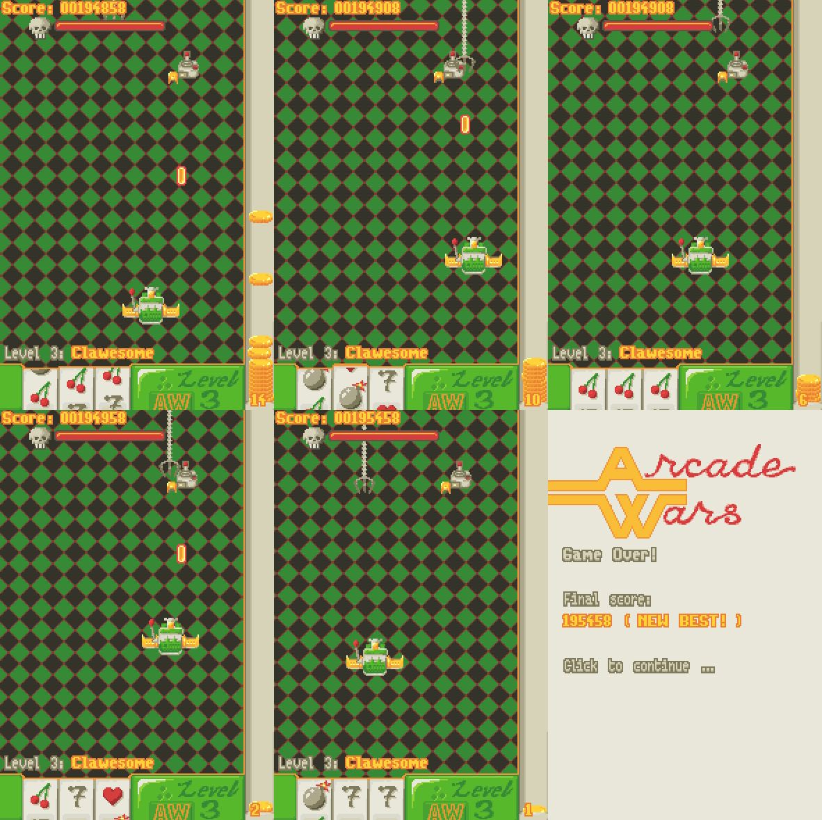
| May 7 15:29:20 | 69h 43m | Arcade Wars | ♥ 1 | I have no idea what I'm doing wrong here. The claw boss is just not taking any damage whatever I do. On my first run, the same thing happened but on the claw miniboss. You see it flashing white here but do damage is taken. Kinda infuriating really. aw.gif I love shmups so this is right up my alley. I like the touhou-like graze mechanic even though I wasn't quite sure in the heat of action whether it was like that or not but now reading the description I see that it was there. Couldn't really see it that well in the game itself since the hurt flashing was so quick and there were always non-bullet coins in the mix too. The bullet coins and just straight up pickup coins could have looked a bit more different even though it didn't really matter since you didn't gather either with your actual hitbox. I think the theme here was kinda working against the fun aspect of the game. The fact that spending too much money thinking that you'd get enough back soon enough was a bummer after dying and realizing that the starting life is the same you had after your shopping spree. And the whole slot machine thing sure was on theme but wasn't that fun either. Made the whole fast bullets thing way less cool than I thought when buying it since it always just triggered on times when it did nothing but waste my ammo/life. And I'm not even 100% sure what else was there (I'm quite sure you could get more bombs and maybe lives too). And my last nitpicks are the fact that you had to use the mouse between levels. It's kind of a golden rule that if your gameplay is keyboard only, your menus should work with it too. And same goes for mouse only games. Obviously it's the best way to include both always. And the last super minor nitpick is the somehow OCD-level annoyance of leaving the ship at the buy spot spot after being done shopping. FFS, you moved me there automatically, now move me back! 😠 And that's about it, nothing bad I can say about the visuals and sounds. Both were great and made it a cohesive experience. Good job! **Edit:** Oh yeah, one more thing. Another touhou staple that could work here is the variable movement speed. Unless you're familiar, there is a button that slows down the movement of the character for more precise dodging capabilities. The reverse would be needed here and it could even be combined with the shooting button, so moving faster when not shooting. It wasn't too fun noticing a huge pack of coins floating away and your puny movement speed was not enough to catch them. |