Foon → Ludum Dare Explorer → LD42 → Feedback comment stats → Antti Haavikko
Feedback comments for LD42
Antti Haavikko's games and stats for all events →
| Timestamp | Since previous | Game | Antti Haavikko's comment | |
|---|---|---|---|---|
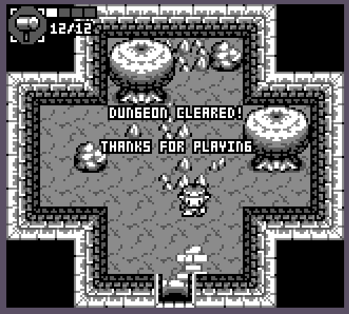
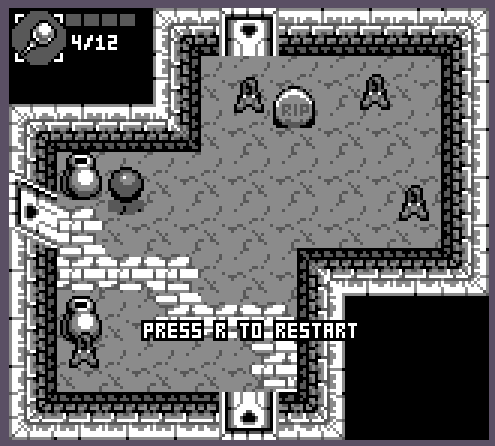
| Aug 13 14:42:12 | Crystalmancer | ♥ 6 | Finally, took me **ages**! crystalmancer_beat.png Very nice art and tunes, as always. Controls were kinda clunky but they worked quite well with the slow and methodical gameplay anyway. At least after I got used to them. Would have preferred for the hammer to be its own key instead of needing to swap between the two weapons. It was slow enough to use already that it was punishment enough not to use it in middle of combat. The clear area of the hammer was also quit awful, it could have almost been doubled in size. And having to manually clear the room for path was just a waste of time and didn't feel too fun (would have been better with forementioned better hammer hit area). I think the crystal rod was also quite inconsistent. There should always be some crystals left behind when hitting enemy or jar for that sweet sweet multikill potential. The enemy and their bullet hitboxes were too big. Quite often I got hit by something that I didn't think hit me and it felt very unfair. And speaking of unfair, I hate those flying ball enemies with a passion. I mean being invulnerable 90% of the time and still able to hurt the player and move faster than them was just bad. And when they weren't steamrolling over be hitting several times in a fracture of a second (invincibility frames please), they were being dicks floating around on the other side of the map wasting my time. The same somewhat applies to those spider enemies. I think they should have not been able to hurt the player mid jump. The slight randomness on enemies did more harm than good in my opinion. It made me sometimes instantly take a bunch of damage right after they spawned. And some rooms were just huge death traps if approached from the wrong direction, like this one. crystalmancer_cheap.png Good job, a very fun and frustrating game! | |
| Aug 13 15:20:35 | 38m 23s | A New Kingdom | ♥ 1 | @dylanbr Mac Chrome ran just fine for me. Jumping felt quite inconsistent to me. Controlling the height of the jump was way too hard to be useful and even when trying to do full jumps, sometimes it did weird baby jumps and I felt to my doom. Also could use some classic safety net action of allowing the player to jump for few frames even after running off the edge of a platform. Also, same technique could be used for buffering the next jump while still midair to help when the player is hitting the jump key few frames too early. And now after writing the whole thing, re-checking what I wrote I went for another run to find out that you can actually hold down the jump button and it will jump as soon as the character hits the ground so you can scratch that whole mention about the jump buffering. But even so it sometimes did those weird baby jumps. Arrow keys as alternatives would have been nice. I'm not left handed so just dedicating my main hand for just pressing jump button seems inefficient. It's a preference for sure but adding alt keys is fast as heck. Or better yet, stick to using Unity's own input system so even controllers would work with 0% additional effort. It was quite damn hard. Dunno if there is more levels but it could have started off a bit easier to ease the player into the gameplay. 80% of the people saved (especially so if it was only just the first level) seems quite a lot to me. I completely forgot about the key to fall faster right after the intro (because it's so rarely seen mechanic) so that made it even harder but that's totally my own fault. 😄 Anyways, good job! |
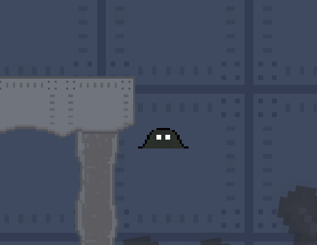
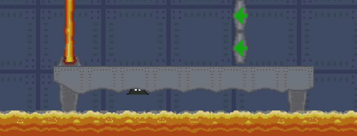
| Aug 13 16:15:21 | 54m 46s | A blob with a destination - LD42 | ♥ 1 | **Yay!** blobvictory.png Pretty neat graphics. Especially the blob (although it sometimes looked weird with the missing outline) and lava. The music was okish too but it really could have used some sound effects. And obviously it looked kinda weird when the character "died" with gory blood splatter and still kept going for few seconds before it restarted the level. I mean, turn the character visibility off, stop its moving and do blood splatter. The level outskirts could have used some killboxes or something, I get triggered when I see that Unity default blue background... 😃 Had some nice mechanics to it. The neat directional jumps (which I would have preferred without the ability to actually move at all) from that one game that I can't recall the name of right now. The direction switching from VVVVVV. Rechargeable double jumps from Celeste. The phasing through the walls must have been used somewhere as well. 😜 But it was kinda too short and introduced those mechanics with such a machine gun pace that it didn't let the player get used to them. And those help messages were not great, turned them off right away after reaching a semi hard level. And by the way, you can que in jump during the help text (which I did several times trying to skip it with mouse). Showing it just once should be more than enough. The execution could have used some polish, it was kinda riddled with bugs. There were invisible platforms and overall getting stuck on corners. blobinvisible.png It was also quite easy to glitch through the ground without the powerup on that same level (9th I think). blobstuck.png The overall level design was quite nice even though the difficulty spiked quite quick. It was nice that at least some levels had some freedom of choice and some tricky skips that could be performed. The levels weren't really ordered by difficulty in my opinion at least. But that isn't necessarily a bad thing, an easier level after a tough one is a nice change of pace. Wasn't a huge fan of the skill que system. For example that first double jump skill on the 11th level (the hardest one in my opinion) killed me so many times by blocking me out of phasing because I made it there without using the double jump just to get rewarded by getting my face melted off by the laser. Would it really have broken any levels that much if you were allowed to use the skills out of order? Anyways, good job! |
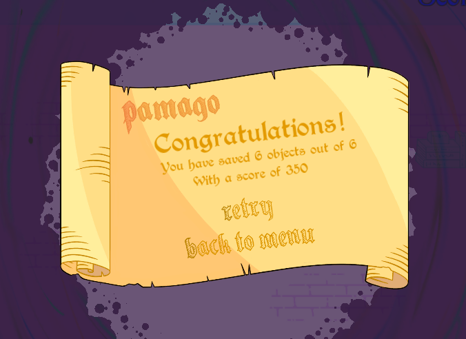
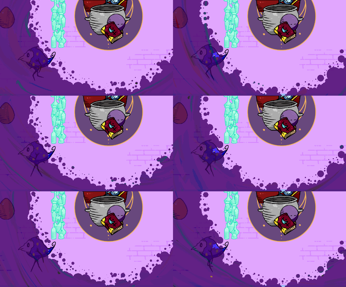
| Aug 14 14:07:54 | 21h 52m | Pamago | ♥ 2 | Normal was super easy, hard seemed too hard. pamago.png The differently colored first letters (as seen on the pic above) on menu items was kinda misleading. At least I thought it would be a keyboard shortcut, but nope. Some kind of level progression would have been nice instead of just being one offs. Start off with easy ones and increase the difficulty a bit with each new level. Would have resulted in a more lengthy gameplay experience. I've written this next "complaint" so many times that I probably should save it for later instead of just writing it again and again. Arrow keys as alternative would be nice (ie. use Unity's input manager instead of manually checking keys). Well they were for the second player but could as well use both when playing solo. I bet I'm not to only person to prefer not playing with just their non-dominant hand when no mouse usage is needed. The depth calculations could use some more work. For example when the bird is carrying an object, use the same depth (the bird one) for them both instead of using their y coordinate. It also felt kinda weird that the overhead carried items dropped at that same position instead of dropping the item on the feet of the bird. The character and its animation looked nice. I also liked the edge animation of the purple void quite a bit, I guess it was sprite animation? i'm guessing so because it looked a bit choppy and repeated quite fast. Could have done the same effect with particle effects for a smoother result. Managed to get stuck once. Even esc didn't work at this point anymore... pamago-stuck.gif Anyways, good job! |
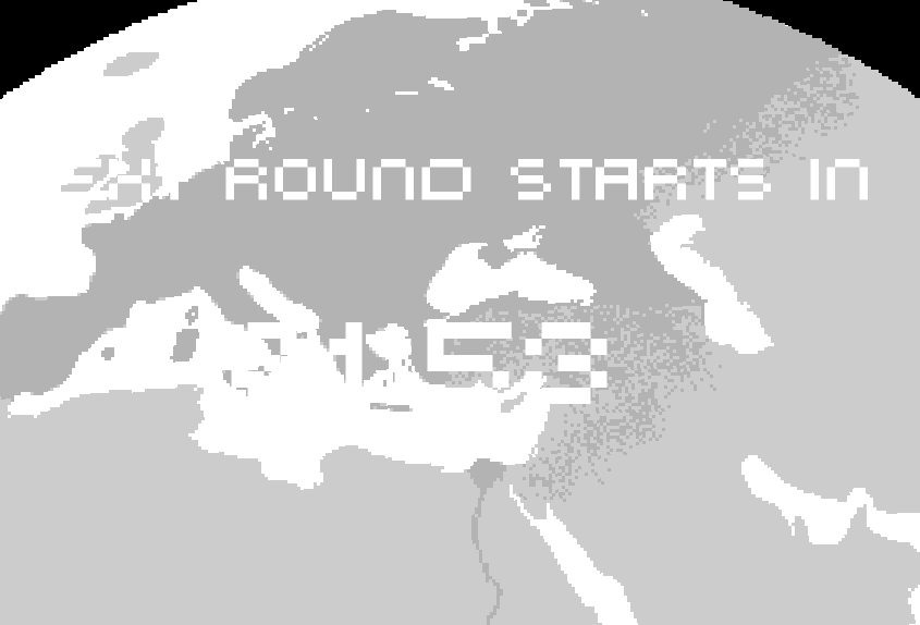
| Aug 14 14:46:40 | 38m 46s | YTTRE | ♥ 1 | This seems like a weird design choice to me. Took me longer than I'd like to admit to realise that it was already started and I had to just do some accelerating. yttre.png Thanks for adding arrow keys as alternative even though you didn't mention them. I dislike playing with my non-dominant hand when my main one is doing sweet FA. The black & white look was cool but I think it also was a bit of a downside. At least I was mainly staring at the arrows 100% of the time which made distinguishing those canisters from debris with my peripheral vision tricky. Having color here would have helped. And I still have no idea what those canisters even do... I think it could have been more clear that there is an actual level progress instead of just saying "ok, can you do it faster now". Also something about the par times was a bit off. On the 21 second par I finished with I think 24 seconds and the countdown timer still had three seconds left and it did move me to the next level too. And right now I played some more and beat the 18 second par one in 18.45 seconds. The ship tilting a bit was nice touch but I think the tilting speed was way too low. Especially so when changing direction suddenly, the ship would move to one direction and still be tilted towards the other. At least you should straighten the ship back to vertical when it isn't moving sideways at all. The difficulty is way too reliant on RNG. I'm currently stuck at the 17 second level and I don't think I can beat it unless I get super lucky. I'm not doing much wrong but the RNG just isn't on my side. I think I made it to around 95% once... Anyways, good job! |
| Aug 14 15:04:48 | 18m 08s | Dora De'athsplorer | ♥ 2 | dora.png Nice music and super clean art, I liked it. That one single hoppy sound got kinda repetitive fast... The falling platforms was quite pointless functionality overall. For first few seconds, it was a spamming check but it didn't matter at all since the beginning was so easy anyway and past that spamming wasn't punished at all. And them falling was also an annoyance if Dora just decides to do a U-turn and retrace their steps back to the falling ones. It was also quite hard if not impossible to where the character is going to turn to. It having total freedom of movement while the visual presentation only shows four directions didn't make it any easier. And the difficulty overall was heavily reliant on RNG. All in all, good job! |
| Aug 14 16:00:48 | 56m 00s | Deep Down | ♥ 0 | deepdown.png **Very cool!** Cute pixel art with some nice animations and controls were super tight. I guess the music wasn't done by you guys or at least not during the jam but holy heck it was awesome, especially when the second level track kicked in... Nice to see you covered all your bases with the control alternatives. Should pretty much be able to please everyone with WASD and arrow keys with separate jump button and also allowing you to jump with up. Sound effects had some weird issues when they sometimes just didn't play at all. I think it was mostly the death sounds but caught few wall sticking sounds missing as well. The sound effects were the weakest side of the game overall. I think adding a bit of pitch variation each time a sound is played would be an easy fix for them getting too repetitive. Some sounds, again the death sound especially, could have used some more oomph. The level design was well done and very intuitively taught all the necessary stuff without a word or even an icon. Everything went so smoothly like "oh that's a weird looking block, wonder what it does, lemme touch it, oh that, boom, understood". Only thing that really caught me off guard was the first spike, they could have looked more deadly. The branching paths were quite unnecessary. You just made me play the whole game twice to experience everything. You could have just taken those bits, added a bit of extra and boom, a third level. So yeah, my only complaint really is that there wasn't more of it. Good job! |
| Aug 15 13:48:33 | 21h 47m | Closing Arena | ♥ 0 | Can't play it because I'm not on windows so I won't be rating it but I can give you one nugget of feedback just based on the screenshot alone. The color selection is umm, quite aggressive. I can wholeheartedly recommend https://coolors.co/ for getting some eye pleasing color combinations. |
| Aug 15 14:20:26 | 31m 53s | DON'T RUN OUT OF SPACE | ♥ 2 | droos.png Very interesting and cool art & sound design. They fit together well too. And controls were also super solid. Some kind of "singing" sound appeared at some point and never stopped. Quickly after that the music also stopped and revealed annoying static drone sound. Here is a clip of that... https://youtu.be/Z_3MmWWjhg0 I would have liked to see some warning on the spots that the portals would appear at, they quite often appeared on top of me or right where I was going and ruined my combos. The portal spawning points could have used some "smartness" also instead of being pure random so they wouldn't spawn out of reach that often. The slow start was also quite boring after I had gotten accustomed to how the game works. A tetris like "press down to speed up the block spawning rate" would have alleviated that and made the beginning part more bearable with continuous retries. The exploding mechanic could have also used some work. There was no downside at all of using it and you got more blocks (ie. score) by using it. So you're just asking me to mash a button with my left pinky every second. So I think it could be fixed in at least two ways. The first one is by adding some kind of punishment of over using it like having it completely destroy the smallest blocks so you should be more careful on its usage. The second one is making it completely automatic so the character would explode once every second. Or at least let the player hold the button down but even even a button you need to hold down 100% of the time while playing is not great design. Anyways, good job! |
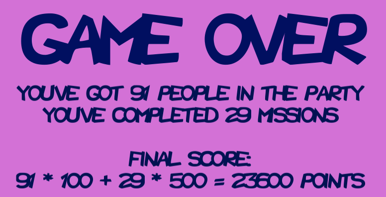
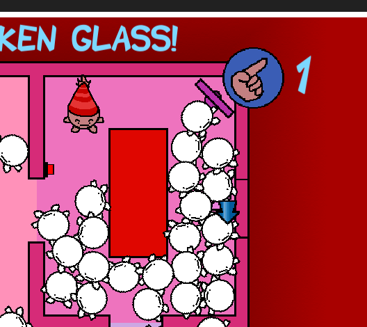
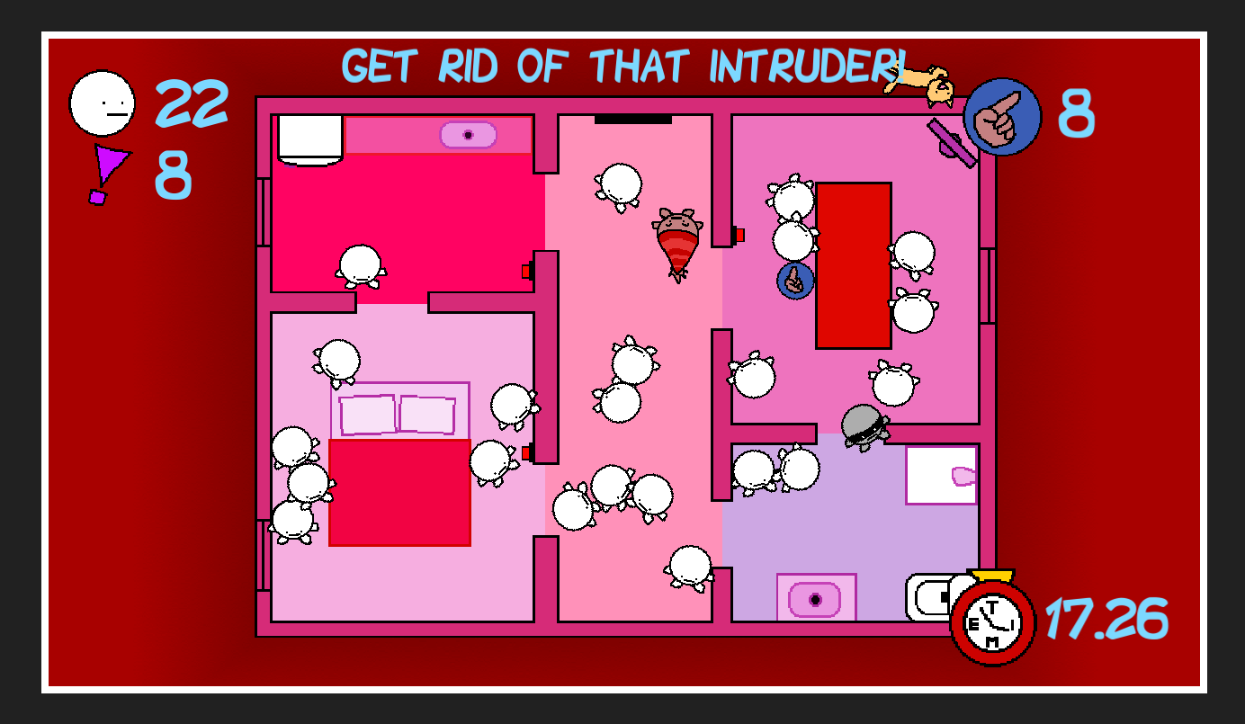
| Aug 15 15:19:34 | 59m 08s | Party Person | ♥ 1 | Hmm, it was actually X to get rid of someone, not C. This ended up being my best run. partypersonhiscore.png Very neat art style and the funny sound effects went well with it. I think you should have taken the mspaint aesthetic even further and drawn the rectangles and circles by free hand also. Dunno if it would have looked too messy but at least having some imperfection in them would be better in my opinion. Could have also added some variation to the legit guests to make the intruder harder to notice. And having more different kinds of intruders would make that even more interesting. Because the guests didn't move at all, were very hard to push around and the get lost cards were so un-plentiful, it was inevitable to run to a impossible situation at some point of time based on pure luck. So it's pretty much RNG deciding how much points you will get regardless of how "well" you do. And to make it even worse, then you just stare at that impossible situation until the time runs out. partypersonthx.png The dark rooms were quite annoying. Dropping the opacity down of that black darkness even a little bit would have made it more bearable. Also, the player character should be under that black veil too and the light switch arrow weren't moving like the rest of the task arrows. And speaking of tasks, I think having them take time was bit of a waste of time. They were mandatory to progress anyway so it's not like it was a choice of I had time to do a specific task at some point or not. Or at least add progress bar or something so I wouldn't need to mash on the keys to know if I'm still doing a task, free to move or just stuck because of the guests. *"Sure thing, I'll get rid of this intruder"*... The cat freaked out like they seem to do when you get rid of them but it didn't get rid of the intrusion task. It just kept running mainly somewhere off screen and periodically appeared on screen for a fracture of a second. partypersonintruder.png Well never mind, after posting this and looking at the pic, I can see the other intruder quite clearly. 😉 Maybe it's because the robber doesn't have a unique sound so I didn't notice him with my peripheral vision as my main focus was still on the cat. Anyways, good job! |
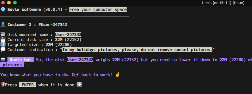
| Aug 15 16:29:26 | 1h 09m | Savle | ♥ 1 | Very interesting and scary looking setup (with that danger extruding warning text) you got there! Very original idea indeed. Could easily add more of these "puzzles" with some trickier requests but of course it would become quite huge. Well, adding some text based stuff or combinations of different file type requests would still work without getting too big. You could even do stuff like zips, even password protected ones and the password would be on another file somewhere etc. That one write protected file on the first customer folder was kind of a let down. I thought it was foreshadowing that the puzzles would get a lot trickier than they actually did. Loved the CupHead OST bit... I was pleasantly surprised that it worked well with my slightly modified monokai based dark iTerm theme. So you get a 5/5 in the imaginary graphics category from me. savle.png Managed to beat the 22 meg level with: `22 484 815 bytes (22,7 MB on disk) for 93 items` It was also easily the hardest level. That or I don't really know what a sunset is 😄 There also was one digit missing from the last level clue: ``` levelData4Size=145000 levelData4Sizeh="14M" ``` And now that I've looked at the code: - You really should variable those color changes. - One of us doesn't know what a sunset really is. - On level 4, you should probably also check for the non rush folder. And yes, I did eye out the script after playing and it looks safe 😉 Good job! |
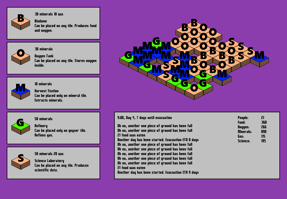
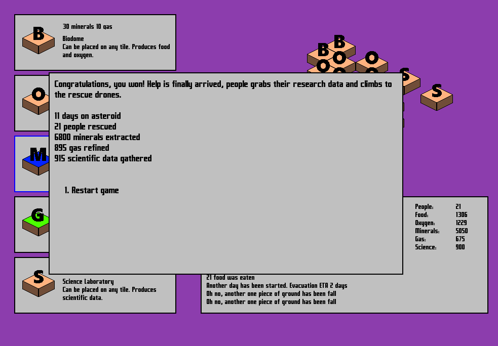
| Aug 15 17:42:41 | 1h 13m | Asteroid | ♥ 1 | First of all before I even start playing the game, I'm not a native english speaker but I think the intro text had some issues: - `You have a few resource` => `You have few resources` - `But the land is literally falls down` => `But the land is literally falling down` - `Use alpha keys` => `Use number keys` Alpha keys are letters, numeric/number keys are exactly that, alphanumeric are both... The FTL like events were cool but it would have been nice to be able to select the options also with mouse since the whole gameplay besides them is mouse based. Loads of typos in these too. And there should have been random possible outcomes and more of them overall. It was kinda boring to get same one four times in a row and you already knew the correct answer. The font was also quite hard to read. The look was otherwise pretty clean. I'm not sure about the color choices though. Blue and green, specifically seemed very close to being pure colors which don't look that great at least in my opinion. A great tool for getting nice looking color combinations is https://coolors.co/app which I actually used myself this jam. The gameplay is quite confusing and demanding at first. It throws a bit too much at the player right from the get go. And so much text everywhere. I think using icons for the resources etc would have made it less of a read fest and everything would have been faster to figure out with a quick glance. See how much easier stuff like would be to make sense of in a quick look (obviously adding tooltips etc would be necessary too). And that "can be placed on" text was extra filler too that was already more clear from the color. --- 🚶 5 🍖 65 🌬 10 💎 50 ⛽️ 20 ☢️ 55 --- 30 💎 10 ⛽️ **Biodome** Produces 🍖 and 🌬 --- Also you should dim or somehow make sure it's easier to see that you can't afford a building, it was way unnecessarily tedious to looks at the prices from the wall of text and then check my resources from the other side of the screen. I'd also highlight the newest message on that log thing somehow when it appears for a while to make it easier to notice. Something like bold text, differently colored background and even a sound effect. There were also needlessly lot of entries on that log. It was also quite annoying to have to click the building again if I wanted to build several of them in a row. And it was very easy to missclick while placing buildings. I wouldn't have made the building follow the cursor, just made the button for it seem activated (more so than that blue border) and focused the tile I'm going to build on with like a white outline or something. And once gotten the hang of, it was way too easy. On my final (and successful) run, I had pretty much already beat it few days in and then just had to wait around for ages doing nothing (except for those infrequent prompts which I had abundance of resources for) for the inevitable victory. I actually tabbed out of the game and started writing this post while waiting. asteroid.png And as expected... asteroidwon.png Anyways, good job! |
| Aug 16 14:07:01 | 20h 24m | The Flopp | ♥ 1 | Pretty neat! As seen on the @mza gif, double jumping was a bit off. You had to quickly do both the jumps to get the most air. I think it'd be better to reset the vertical velocity first and then add the second jump (to get rid of the potential downward velocity gimping up the second jump) so the optimal strategy would be the natural way of jumping again at the peak of the first jump. Gravity could overall be turn down just a notch to make the jumps more controllable. There was also sometimes this weird jittering when landing from a double jump. flopp-doublejump.gif I wasn't a huge fan of the blind drops of faith. Could pan the camera down while the character is crouching or something to alleviate that. The aesthetic was cool. Rarely see this mspaint style look with nice animations. There was bit of a mismatch between the character art style and the environment but it still worked and actually made the character pop out nicely. The respawning animation got a bit annoying, it could have been faster (at least after the first one). Well at least the game wasn't super hard and long so it didn't get super annoying. The new powerup text was way too small and quick to disappear. I quite often had to check the upper left controls for a clue on what I got. The text could have easily been big enough that the characters were the size of well, the player character. And speaking of powerups, I'm smelling a bit of running out of development time with that punching ability... 😉 Anyways, good job! |
| Aug 16 15:04:22 | 57m 21s | Space Out! | ♥ 3 | You can consider the Mac version tested. Very nice and super polished entry! This was my best run... spaceout.png The look was very clean and interesting, some planets had that kurzgesagt wibe. My biggest graphical issue was the text scaling with the zooming which made zooming out far enough almost completely useless. The text size could have been the same regardless of the zoom level. As everything else was done with mouse, I think the panning should have also been. Like for example if you click and drag on the empty space or when you do it anywhere with right mouse button. I know there was that RTS style edge of the screen panning but it was awkward to use back in Warcraft 2 days and is still. One other super minor thing was that the line/ship only appeared after you had already dragged to the destination planet. I think it should have started as soon as the player starts dragging. The line could have also represented if the target planet was in range to get rid of the need to drop it there and use that awkward dialog. It already showed if I had enough space bux to build there but it didn't update when I kept the line dragged to a planet waiting for my bux to accumulate. As I've already stated, the UI looked cool but there were some placement/UX issues. First of all, those popup dialogs with are you sure and not enough cash could be removed completely in my opinion or at least make them able to be accepted with keyboard shortcuts. The tech thing had a similar issue. The following workflow isn't the best of designs UX wise: - Click on a planet around the center of the screen. - Move mouse all the way to the right to pick a thing. - Move mouse to center to agree to building. - Move mouse back to right for using said building. - Guess what, back to center to pick a shuttle or agree or whatever. - And if you want to cancel at any point, the back button is all the way on the bottom left corner of the screen, as far as it possible can be. I think the better way would have been to not rob away the map control, just center on the planet and show the building options somewhere near it. And the cancel button could be if you just click anywhere else than the use/build. And yeah, those agreement popups were unnecessary here too and if not enough resources, it's enough to just show that information, not require the player to interact on it. It also would have been nice to be able to pan the map when selecting where to evacuate. It resulted on some almost unsolvable situations when I could pick from whatever happened to be visible. The cash, population and planet icon tooltips were also quite weirdly placed but that wasn't a huge issue because I only had to check them once. Anyways, very good job! A great game that with some UX improvements and balancing fixes could be awesome. |
| Aug 16 16:54:30 | 1h 50m | Exhaustion | ♥ 1 | Yay... exhaustion.png Yeah, the tutorial wasn't great. I was confused on which character I was and as I had seen the top character on menu, that "map" screen etc, I thought I was the upper one. And obviously because of that, using the cards didn't feel very responsive. So yeah, I died and you straight up quit the game? At least having the tutorial text be able to be skipped would be nice. Then I went in again and still bit confused about the gameplay, beat the game without even a near failure. It was way too easy and pretty much played itself. The only meaningful act of the player really was the card pick after a victory. And the status cards were the obvious choice because they were op as hell. The player cards always went before the the enemy, by having lots of clubs and those ice things, you were just unbeatable. The whole gameplay loop was just: draw a card, play it unless it's heal, repeat. So the card draw should be automatic one per turn and maybe you could draw an additional one if you had nothing you wanted to play. Both duelists should play at the same time to tone down the status cards. And maybe add more interactivity between the cards like for example the shield would reflect status back to the one playing it and something more along those lines. Of course it would make it more complex but I think few battles in the player is ready for more complexity instead of same things with different names and bigger numbers. You should take a page out MtG (aka the king of card games) book and make the actual effect of the card and flavor text look different. I wasn't invested in the lore enough to read the flavor text on the cards I didn't care about. The map screen was a nice addition for a small change of pace between the battles. Sure there could be a little more to it like maybe sprinkle in some nuggets of story instead of having it in the cards. That would have been even better pacing by separating the lore and action. And maybe not have the character walk in air. The whole card slots disappearing was a complete non-factor and seemed more like an afterthought to fulfil the theme. Anyways, good job! |
| Aug 16 17:44:37 | 50m 07s | Sticks and Stones | ♥ 1 | Neat stuff! Would have been more powerful if you didn't give the whole away with the warning and disguised it more as a game. So maybe stretch the beginning bit more, introduce the text elements as just UI elements that would maybe help to get to know the character a bit (which would also help the player care more about the coming story development) more and would lull the player into a false sense of security. That way the first red text wouldn't be as new and weird and obviously something bad. The look was pretty great. Nice cute graphics with a quite dark story, I like the contrast. One thing I wasn't a huge fan was the first big text font. The later texts seemed to be a more pixelated font which suited the other graphics better. The music was sweet and the few sound effects were ok. I guess it could have used a bit more of them and maybe some ambience so it wouldn't be completely silent at points. It would also be cool if the beginning and middle "stages" could be winnable. Obviously they should be hard to do so the main story would still be the main story. So something like you have to outlast the big text until it hits the wall and to do that you'd have to bob and weave between the letters (which I tried to do on my first run, but I guess the text hitbox is just a rectangle and there is pretty much just a time limit there too). And the middle stage could be pretty much the same as it is in the last one but with those things following you making it harder. Anyways, good job! It's good to see someone try deliver a message in a jam game... |
| Aug 16 18:38:51 | 54m 14s | The Gargoyle Landing | ♥ 0 | "Run stupid game", probably the easiest humor category points anyone could get. Interesting idea combining twin stick shmup with a match three puzzle game. Took me ages to notice that it was indeed a match three game as well. And I think it was a bit too hard to align the blocks correctly because they were actually 2x3 blocks on a grid. Having them be 1x1 would be more manageable and enjoyable. And when the arena starts to fill up, the AI just decides to screw the rules and walk through the blocks with their hilarious spinny animation (which seems like a programming bug that was too funny looking to fix). Well, the player character kinda cheats too by having a dagger that with a single swing can shoot a laser for the whole duration of the game and also gets points by shooting said laser at frozen enemies. The enemy sprite looked awesome (block or not). The player character wasn't bad either but it had a completely different style. Seems like there are two possible ways to play. Run around mainly killing stuff and dodging them and hope you get some matches or the methodical try to manually make matches while killing what you can. Whichever strategy I go with, I seem to end up with a very similar score in the end. garg.png Good job! **edit:** Oh no, you've opted out of humor category. That start button and the enemy spin were easily enough to push you far beyond the majority. |
| Aug 19 18:46:52 | 72h 08m | Space Escape | ♥ 1 | *"Post your high score"*... yeah, mine was zero. spaceesc.png I was a bit hard. And not hard in a way that would take some skill to execute (even though there was a bit of that too) but in a "bash your head against this until you've memorized the patterns" way. I dunno if adding visible tracks those death bringers travel would be too easy but at least it would with said memorization and would be easier to see where is safe and where isn't without so much trial and error. At least it would help with some places where a spike ball just suddenly runs at you with a speed our sound with no possible way to react to it. The difficulty curve was also a bit all over the place. I think I struggled the most on level five (until I stopped being so damn stubborn and arrogant and decided to take it more slowly and methodically). Even some of the later levels could almost be completed blind by just running through few spike balls. Of course this affects the scoring in the end and was probably the reason I ended up with none. 😉 The look was nice. The original Game Boy was my first ever own console so that aesthetic hold a fond place in my heart. Now I just gotta calibrate my screen to show everything a bit green and we're golden. The music was ok too but got kinda repetitive and monotone quick. Dunno, maybe adding drums to the tracks could help. And based on the music, I guess there was some kind of time limit per level also. I think it was level nine where I was finally almost at the door when the music changed, I got spooked by it (in my mind I thought some kind of bubble bobble like killer ghost would come after me) and ran straight to the only spike between me and the door. And I'm still not quite sure what that number on the top right of the screen was. Is it the time limit? Anyways, good job! |
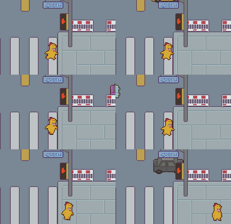
| Aug 19 19:01:51 | 14m 59s | I'm B'walkin' Here! | ♥ 1 | Well that was a bit on the easy side... bwuk.png The art was simply adorable and tune was bangin' but it could have used (even very simple) sound effects. The way you incorporated the timer to the actual game world was sweet. Always cool to see a hudless game with all the information needed still there. One thing that was missing though was the actual goal of the game. I only took a glimpse at the description and missed pretty much only saw the controls so obviously I failed at my first attempt (I thought the goal was to keep all the people from crossing the road). Maybe adding a simple arrow pointing to the right side of the screen on the first level would do the trick. I think the hitboxes of everything were a bit high. For example, I should be able to move trough here already well before my head is lower than the post... bwuk.gif And by the way, why isn't it failing in the above gif. Everyone had already gone past. Is it enough to just get over the street in time? That makes it even easier than I thought. Anyways, good job! |
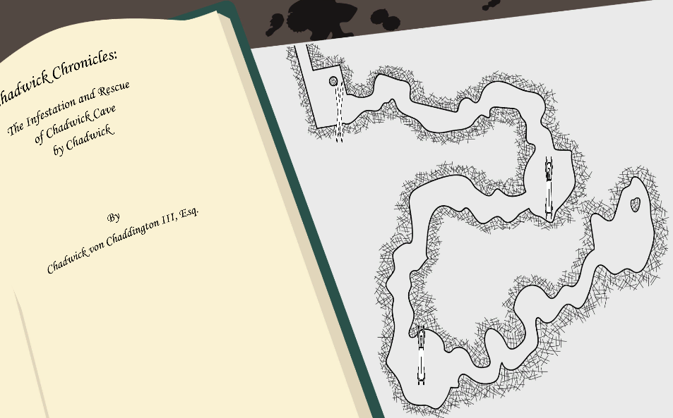
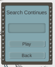
| Aug 19 19:12:04 | 10m 13s | Chadwick Cave Chronicles | ♥ 0 | I can't get past this screen. I've tried to press everything but nothing does anything. Tried the web version on Mac Chrome/Firefox. chadwickcavechronicles.png Never mind, went full screen and the X become actually noticeable and was clickable. Quite a lot of the text on the book at map page was still missing though, I guess you only designed it on 16:9. Unity editor has that dropdown on the game window for changing aspect ratio on the fly for easy testing. I think at least 16:10 is quite a common one at least (and it was also your web version windowed aspect ratio). The actual gameplay was maybe taking rail shooters a bit too far. There was pretty much nothing to do and almost impossible to fail. Took me quite a while to actually notice that the rocks even did damage on contact. And that if I'm correct at guessing that the first bar in the hud was health. Still have no idea what all the other bars were and and why I was even shooting at those purple plants/crystals. Dunno what was up with that spinny thing on the cave corners, it felt a bit silly and unnecessary. I think you should show dimmer versions or just the outlines of stars here to better indicate what that one box is at all. It also seems to completely forget the previous level scores when you beat a new one. That or I just failed to get any stars on the first two while completely dominating the final one (even though I was messing around trying to hit rocks etc on it). searchcontinues.png The music was nice but a bit too upbeat for the completely chill and non threatening gameplay. Maybe something slower and more atmospheric would have fit it better. |
| Aug 19 19:59:50 | 47m 46s | Polygon Bash | ♥ 1 | polybash.png I think the whole shooting recoil movement made the whole gameplay kinda awkward. It made the boring *"stay next to a wall between spikes and shoot everything from there"* the best tactic. The only downside to that tactic was that sometimes when you died to a spike, after respawning you couldn't move at all without dying right there and then again. I think respawning at the center of the stage would make more sense. One way to get rid of that boring tactic as being the best way to play would be to incorporate a multiplier that would go up every kill and would drop back to one if you touched a wall. Multiplier systems are always a nice and easy way to make scoring more interesting. If I understood correctly, the music wasn't made for the game during the jam so this bit of the rules applies. I'll just leave the audio category unrated... > You’re free to use 3rd party Artwork/Music/Audio assets, or assets you previously created, but we ask that you OPT-OUT of the respected voting categories (Graphics, Audio). The sound effects and visual effects were quite nice but could have used more of them. Enemy deaths especially would have felt more rewarding with that same pulse ring effect (maybe smaller though) and some nice booming explosion sound. Anyways, good job! |