Foon → Ludum Dare Explorer → LD41 → Feedback comment stats → Antti Haavikko
Feedback comments for LD41
Antti Haavikko's games and stats for all events →
| Timestamp | Since previous | Game | Antti Haavikko's comment | |
|---|---|---|---|---|
| Apr 23 08:20:38 | Sneaky | ♥ 1 | You listed macOS and HTML5 links but there only seems to be builds for Windows and Linux. | |
| Apr 23 08:23:34 | 2m 56s | Turo | ♥ 0 | The macOS download link directory is empty... |
| Apr 23 08:52:00 | 28m 26s | Brainiacs! | ♥ 1 | braniacs.png Pretty cool! I think this is the first time I've ever seen a Mac only game on LD... 🍎 I too got quite a lot of US-specific geography/politics questions which I obviously failed. But did manage to win quite easily because the enemy seemed to be missing (so kinda failing their questions) and the game was throwing me some real softballs like asking about the Doom release date and only having one answer option pre 2000. The concept is really nice. Dunno if the combat has enough depth to it for it to more anything more than a trivia game. Right now it seemed pretty much like race to X points with the correct answers giving out random amounts of points. Didn't seem like the characters were very well balanced either. My biggest criticism is about the question/answer box UI and the lack of feedback. The timer was too strict. Few times after reading the question, I noticed I had only few seconds left on the clock and didn't even get enough time to check all the options. I think you were also missing a message for when time ran out, it just showed my previous action again and went to enemy turn. The appearing messages should scroll in one letter at a time like they do in pretty much every game ever made. That serves two purposes, it focuses the eye of the player to what changed right then and it also gives less of a wall of text right at the beginning. Over half of the screen was the visual combat scene but nothing meaningful was displayed there (except for hp amounts and current turn with the bouncing). Would have been quite simple to add some attack animations (just nudge them towards the enemy instead of just bouncing up and down) and hit/miss indicators (along with sound more effects). With an addition of more in-depth combat system and hecka lot more questions, it would probably be super fun couch co-op game. Good Job! |
| Apr 23 11:02:02 | 2h 10m | Meta Defense | ♥ 2 | I didn't do too hot since I got bored halfway through the wall of text that was the tutorial and just decided to start instead. So I completely missed the last part about making enemies happy and just tried to kill them all instead. Like you said, breaking the wall of text apart and sprinkling them to the first level to relevant places would be a much better solution. But hey, wall of text in the game itself is still better than only having it in the game description page 😉 I think these should have been in the correct order on which they represent: iconmismatch.png Hive also had a weird issue where I think the play/earth tower were in wrong places: metahive.png I think the map was too big which resulted in bunch of waiting in the beginning of a wave and a load of miss clicks when action got near the hive. It really could have used to audio/animation feedback to make it more clear when a new label/speech bubble appeared somewhere. Not quite sure if having the building/status buttons on a panel on the right side was the best option either. Maybe a radial menu around the selected node (would lessen the unnecessary mouse movement between center of the screen and right edge) but that might just end up with even more clutter and miss clicks near the hive with the current zoom amount. Good job! |
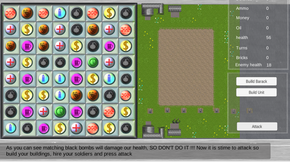
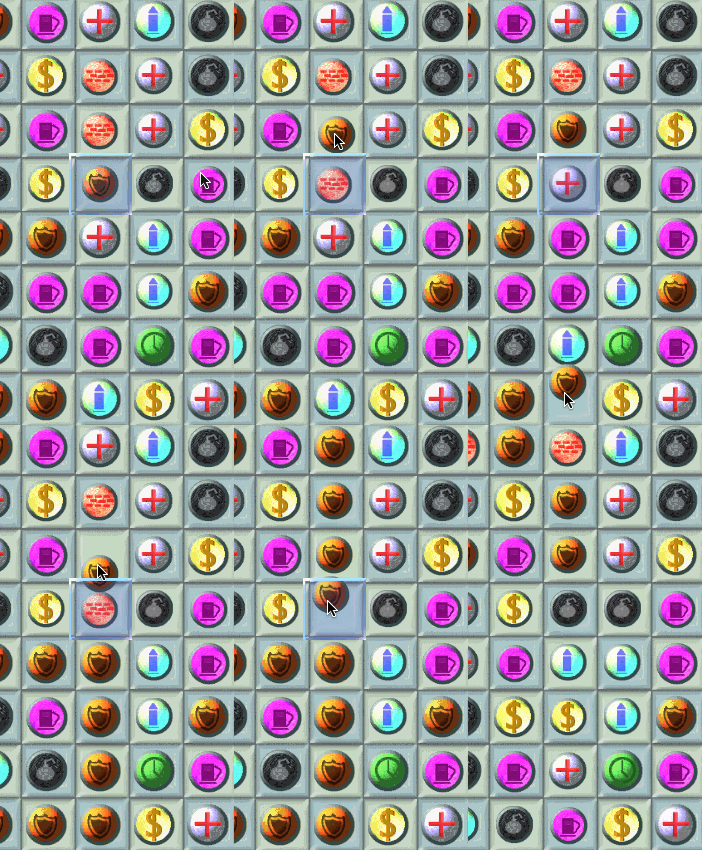
| Apr 23 11:28:35 | 26m 33s | Match3 attack | ♥ 1 | Hmm, *"some textual errors"* indeed... it was kinda charming 😜 So on my first try, got stuck in the tutorial at this point. Attack button doesn't do anything: match3stuck.png The I discovered a bit of a bug: match3bug.gif And with the said bug, the game can't keep up and the noise it made almost deafened me: match3err.png |
| Apr 23 11:41:35 | 13m 00s | The Cavern of Bad Ideas | ♥ 0 | Looks dope as heck! Are you really gonna make me boot up windows again? 🤔 |
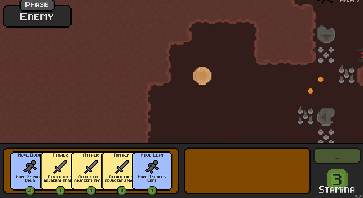
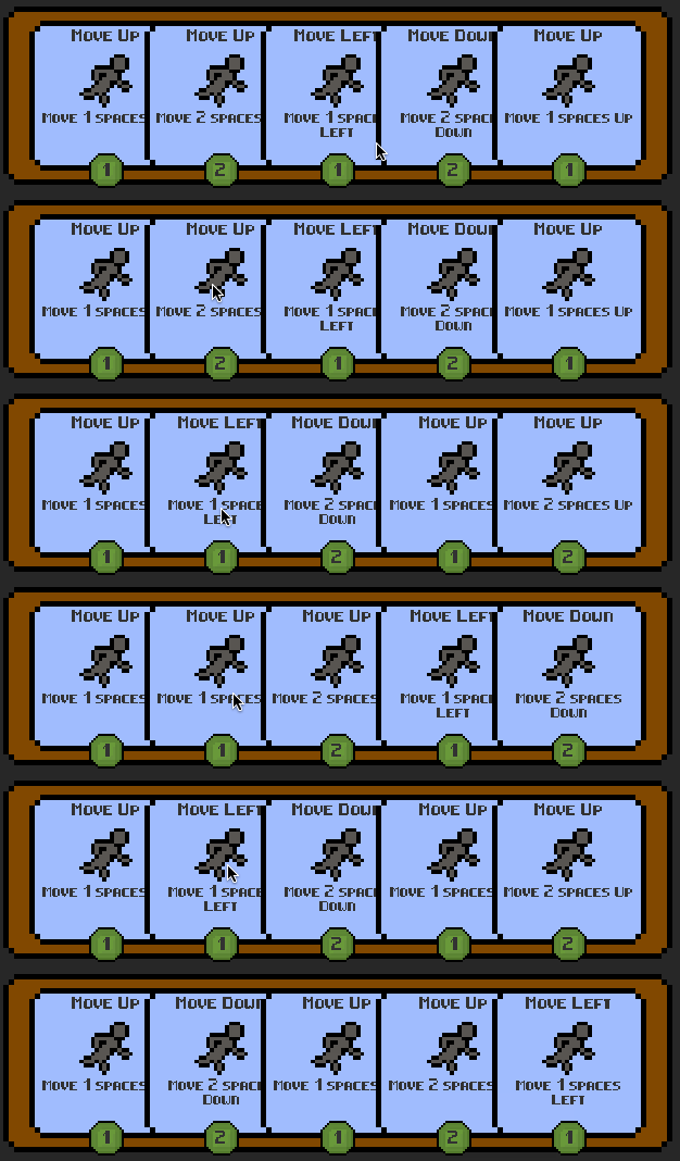
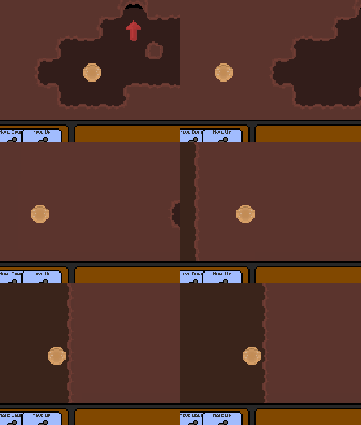
| Apr 23 12:32:24 | 50m 49s | Card Cave Adventures | ♥ 3 | I really enjoyed it until I got stuck. I think it might have happened because I dragged a card to the activation slot during the enemy phase. cca-stuck.png This bit especially was very clever, teaching the player about the new tile without the need for any words. cca-nicetut.png The gameplay was very slow. So much shuffling or just using dummy cards (like moving against the wall) not to waste needed attack cards over and over again while waiting for the right directions. Like the first few levels didn't require half of the cards at all and it of course just kept giving me those. My biggest issue with the game was card UI. You could have made the active cards are smaller and hand area bigger (so the cards in hand wouldn't overlap). The movement cards were still kinda hard to distinguish from each other because they all looked so similar. Maybe having an arrow instead of the running dude would help make them stand out with a quick glance. Also having the direction on top and stamina on bottom forces the player to pretty much read the whole card. The middle text bit was unnecessary since half of the time it was masked by another card. Also wasn't a huge fan of cards always returning to the top of the stack instead of where they came from. It made it harder to keep track of what card is what (probably in part of because they all look alike). At first I thought it was a bug giving me free shuffles of just one card 😜 cca-reorder.gif Another thing that kind bugged me was the constant need to move the cursor from left side to right side just to press the end button. Adding a hotkey for the button and maybe allowing just clicking on cards to send them back and forth between hand and play area would reduce the mileage of required cursor movement. All in all, good job! I thoroughly enjoyed it as long as it lasted (but not enough to slog through the beginning levels again)... Oh, one more thing... I tried to randomly mash buttons to see if I could get myself unstuck with no luck really but I discovered maybe some kind of debug key that still works (that being A). cca-moveleft.gif |
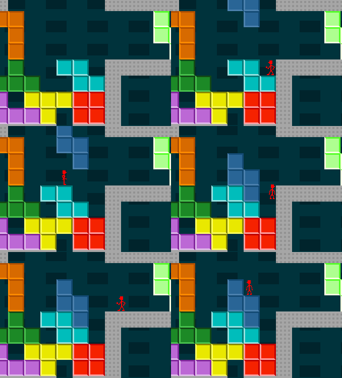
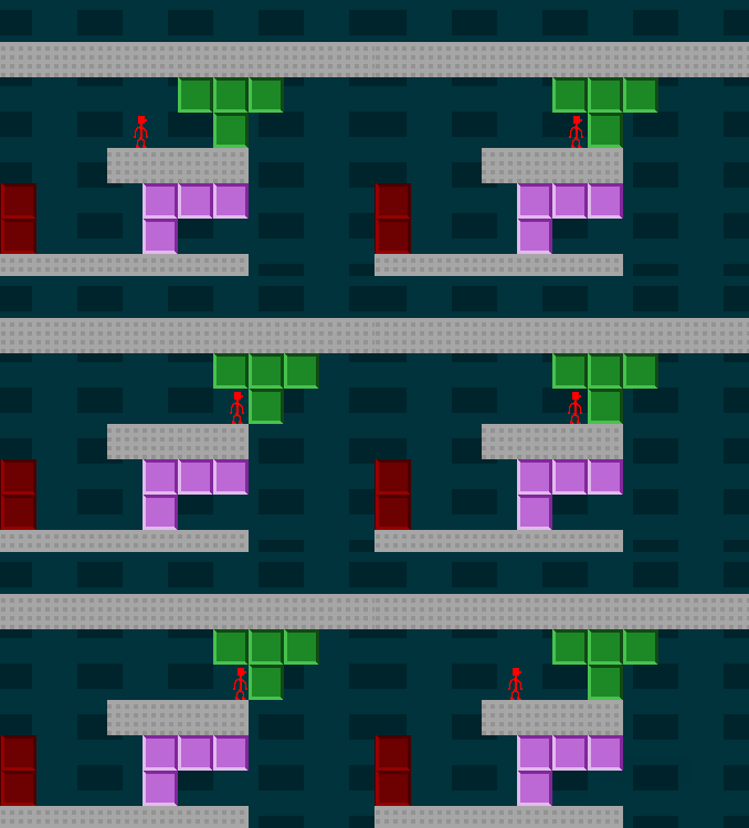
| Apr 24 18:16:32 | 29h 44m | Tetrario | ♥ 1 | Pretty cool! Started off very (maybe even too) easy but the last few levels actually had some difficulty in them. In part the difficulty was because of the clunky platforming controls. The jumping felt very inconsistent and costed me a bunch of restarts. The weird hitbox of the character and very quick acceleration made it sometimes very hard to precisely push the tetrominos. Pushing mechanics had some weirdness in it too. Like how you couldn't normally push a block you were standing on but could do it while airborne. tetrario2.gif Some easy visual changes would be a huge help too. Like flashing the made row few times before they disappear to make it more clear to the player what is going on. And playing back that character crushing move of a block. Currently you just jump immediately from crush detection state to retry without the actual crushing happening and it just made it look unclear on what even happened. tetrario.gif My biggest tip for you is, alternative controls. I think only a (loud) minority of players prefer to just with up key instead of having a separate jump button. I also am in understanding that most people prefer WASD instead of arrow keys so might as well slap them in as alternatives. If I'm not mistaken, the only alt key you had was for restart... what's the idea behind that? 🤔 Anyways, good job! |
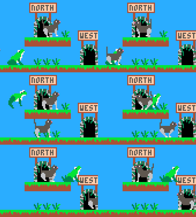
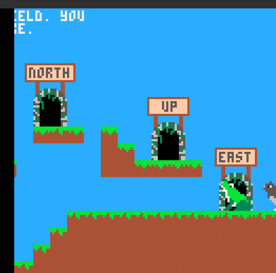
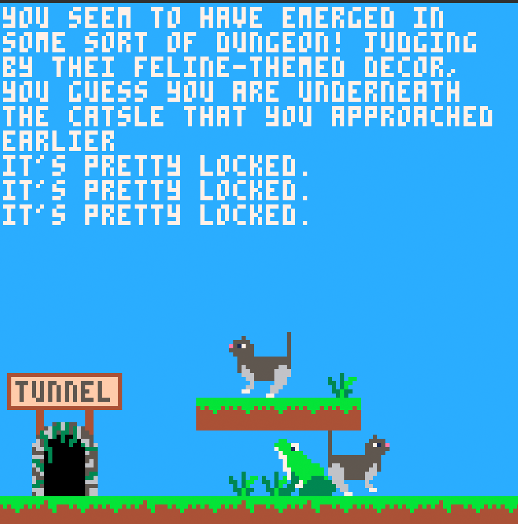
| Apr 25 08:51:05 | 14h 34m | Frogs vs. Cats | ♥ 1 | Cool idea but the execution needs some work. First of all the usual suspect of controls. Sure, being a PICO-8 game, it was easy enough to guess the controls. But having three different jumps was just weird. And it took me quite a while to realize that I can jump through the platforms with the straight up vertical jump. frogscats.gif It was really lacking on sound department. I think you only had two different sound effects, the jump and collision (which played way too much on stairs etc). They got annoying and repetitive very fast. The text portion of the game wasn't flawless either. The text was way too fast (at least for me) and had some weird positioning/repeating glitches. frogstext1.png frogstext2.png Then the items. It would have been nice if there was some visual indication of the chests, keys etc. Well, it kinda takes me back to early 90s point and click games where you sometimes had to methodically try to click on every pixel of the screen. Anyways, good job! |
| Apr 25 09:58:55 | 1h 07m | That Which Cannot Be Contained | ♥ 1 | Quite a novel concept and execution was pretty damn solid as well. I think this was my best score... eyes.png The difficulty is indeed there and it is way too heavily dependant on RNG. Sometimes it took ages for a purple/red to appear, so I had really no chance of survival for long because I got swarmed by the enemies. Dodging the bullets is easy enough, I think that is one portion that you pretty much nailed right. The bullets are slow enough and they're easily noticeable. The problem arises when the enemies eventually outnumber the destructive blocks, they start destroying them before you can match them, a downward spiral. For a smoother experience you could replace the full RNG based spawning with something pattern based. So it could be for example: One enemy, 5 blocks (with at least one guaranteed match), another enemy, 4 blocks, enemy, 3 blocks, 2 enemies, 5 blocks... etc It would result in a more fair and consistent experience on separate runs but still keeps it fresh enough because of some randomness like spawn positions and types. The controls were pretty spot on. I personally would have preferred the keyboard controls directional keys to be flipped so I could move with arrows and aim with WASD (didn't even try controller because Unity and you mentioned Xbox controller, so PS controls are most likely borked as hell). And the whole control thing could have been made more approachable by just using a one set of directional keys for combined aiming/moving but obviously that would not allow some of the more advanced techniques which are there now. The block throwing was great, the rounding you used to find the proper row/column was perfect. Allowed quick and precise throws to be made without being pixel perfect. I liked the visual style. The main protagonist and enemies had some nice charm to them. And as I already said, the bullets were big and visible which is super important in bullet hells (the player character hitbox size could be decreased though). The color palette was a bit too muddy for my taste. All in all, good job! |
| Apr 25 10:19:19 | 20m 24s | Dungeonball | ♥ 1 | I reached a black screen, is that the end? It looked nice, kinda brought me back to my youth playing Marble Madness. One minor offputting thing was the ball not always masking properly when behind a wall. Some nice visual effects (could of used even more though, like for example a better indication when getting hurt). Sounds were quite nice also but got annoying/repetitive without background music and any variation. The collision angles sometimes were off, but dunno, might have been intentional (especially when breaking stuff). I would have made the dragging start point way larger than it is now. The game shouldn't be about pixel perfectly being able to click on the center of the screen. The smallish window and it having no fullscreen option didn't help either. Is that really a thing in Godot, never seen a game with fullscreen made with it? I would also decrease the size of the player hitbox. At least so for enemies/bullets, it just didn't feel fair. Grabbing the diamonds/keys would be fine as it is now, even though it is indeed quite generous. Anyways, good job! |
| Apr 25 15:39:15 | 5h 19m | Platjectile | ♥ 0 | Neat idea of a game but sadly it was very short and super easy. The platforming controls weren't that great. Jumping was very floaty and movements didn't feel like they had any weight. Probably the hardest part in the whole game was the knocking down the very first tower of the tutorial because of the lack of momentum. It was also super easy to get stuck like this. platjectile1.png Seems like the collision detection had some issues with fast speeds. platjectile2.png Good job! All that really was missing was more content, some tweaking of the controls and maybe addition of visual/audio feedback. |
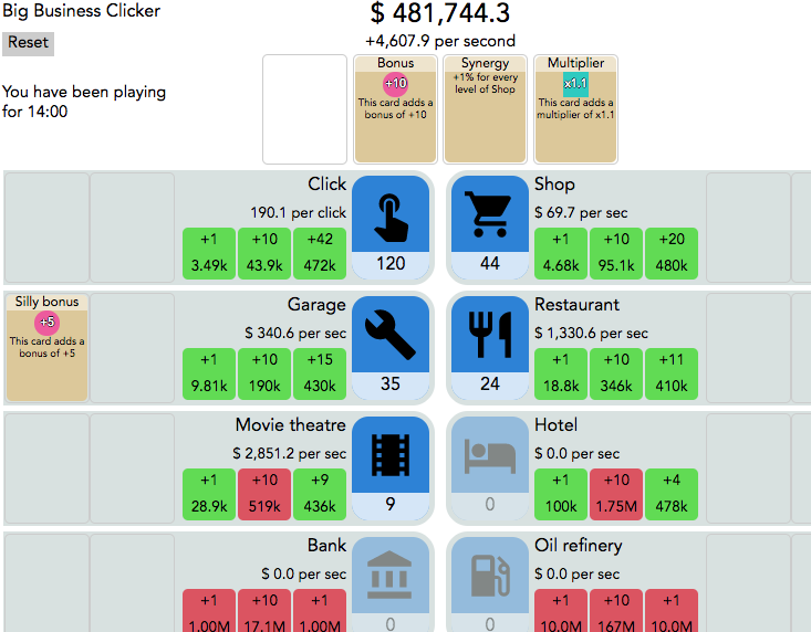
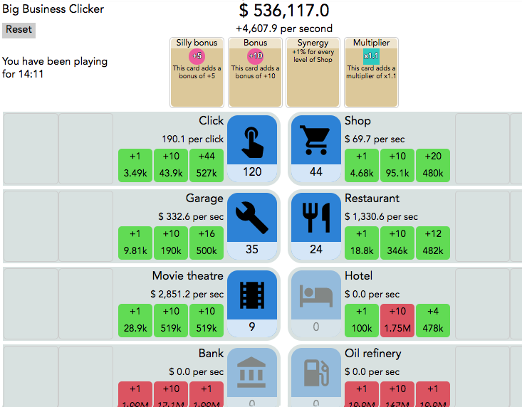
| Apr 25 16:19:17 | 40m 02s | Big Business Clicker | ♥ 0 | ~~First of all, dunno if that is your site or not but forcing to HTTPS and not having a proper certificate is never too great.~~ Didn't read the description before playing/posting, as always... ☺️ Not quite sure what to say about the actual game either. It's pretty much exactly what's promised. One thing that was kinda awkward was playing the cards, maybe allowing drag and drop would make it feel better even though it's the same amount of work. Also you should bump the moving card z position to be on top, it looks weird when it moves beneath the static cards. And I'm still not quite sure how the position of the cards really factors in to making money. It seems like maybe the top cards affect everything and the side ones only that row but why would these two situations result in the same income then... clicker1.png clicker2.png I think the rate of new card spawning is way too low. The actual interesting bit of the game only starts when you have like more than five cards and actually have to do something to optimise your income (especially so when the more interesting cards start appearing, the ones with tradeoff etc, dunno if they're random though) and most people will likely give up before that happens. Thank god it actually runs even on inactive tab. 😜 Now I think I got how the cards work, the side ones aren't for the whole row, they're just for that specific slot. The clicky slot made it a bit more confusing. And now I also take that bit about trade off cards back, they're straight up trash. It's strangely compelling, I can't get myself to close the tab... |
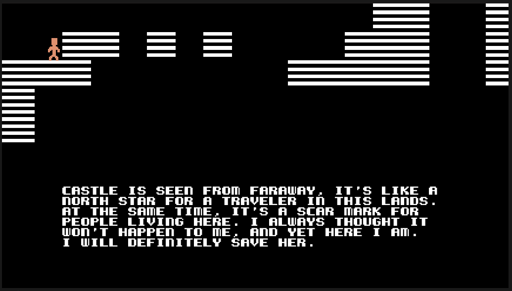
| Apr 25 16:54:43 | 35m 26s | Devil's Doll | ♥ 1 | I wouldn't even call it hard, just ridiculous. Having those two pixel perfect jumps in the beginning was straight up mean. Clearing those even with normal platformer controls wouldn't be easy. Got few times to this part where you need to do said pixel perfect jump blind and that's where I'll call it quits. Maybe if there were some checkpoints... dd.png Never realised how hard of a word 'jump' really was to type before. Good job! The concept was neat even though the text adventure bit was only typing 'jump' over and over again with an occasional 'right' thrown in there, everything else was completely unnecessary at least on the parts I got to. |
| Apr 26 09:28:35 | 16h 33m | Empty Space | ♥ 0 | Neat game. I gave up at about ten minutes only having completed one row. I just wished there was a bit of progression, maybe starting with a smaller puzzle at first. The daunting 4x4 puzzle was a bit too much for me (and I even messed up starting it few times because numbers/letters and unnoticed zero). The shmup bit was easy (maybe even too easy, felt almost boring at times), I just struggled to remember what direction I was supposed to get and then actually getting it. Some kind of icons instead of letters for the powerups would have made more sense. Now it took quite a long time to figure out what was what. And even after figuring them out, it was hard to distinguish them in the middle of the action. And the same goes for those bars, they made no sense to me but didn't matter anyway, powerups kept them filled pretty much all the time. The ammo amount thing when you ran out of your green shots was just straight up annoying. It did nothing but waste one's time. Didn't find much use for the boost either. Good job! |
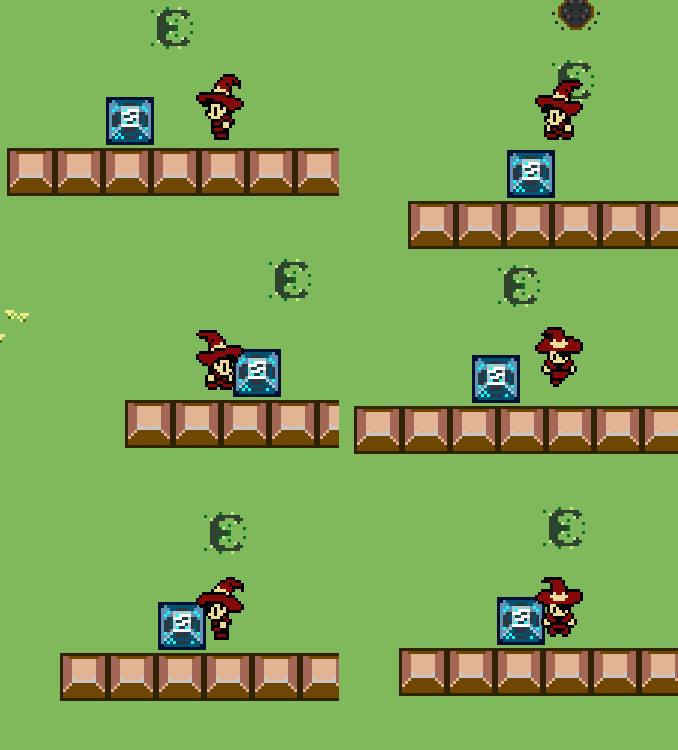
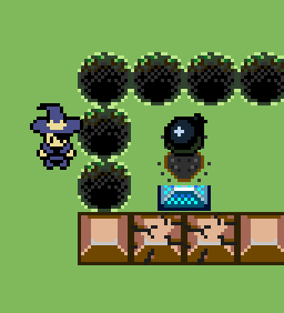
| Apr 27 09:59:43 | 24h 31m | Candy! | ♥ 3 | Nice mechanic, sweet tunes and crispy spritework! First of all, the block pushing was horribly slow and you had to do it once because you only learned about color switching after that spot. The blocks and bombs were also very good at getting stuck on walls. candy1.gif The mechanic was interesting and could probably and you could do a lot more with it, you pretty much just scratched the surface here. Quite a few of the puzzles felt a bit samey and it pretty much ended right after I started getting used to the powers. The amount of tutorial was spot on. I like how you weren't too hand-holdy and just game the player the tools and left it for themselves to figure out how to use them properly in a safe and contained space where you'd have to figure them out to proceed. The visuals had some weird glitches all the time. The grass flickered with some extra lines every now and then and the sprite depth orders were constantly messing up like this. candyzissues.png There was also a weird inconsistency where if you stood too close, your flames didn't go past the bushes. And then right in the end there was a possibility to completely soft lock yourself out of the game. Too bad the weird wall clipping inconsistencies didn't affect the player and no matter how hard I tried, I couldn't glitch out of there. I had to completely start from the scratch just to find out that it was the end. candysoftlock.png All in all, good job! |
| Apr 27 10:19:31 | 19m 48s | Litur Teningur | ♥ 1 | Very nice! I had some difficulties judging depth and actual physical structures of block formations because the lack of shading. Everything was flat shaded so obviously everything just looked flat. Wasn't that huge of a hurdle though because there was no time pressure or any other real dangers not allowing you to inspect your surroundings very carefully. Would have wanted a better way to change paint colors. For example, the scan tool could be made to double as an eyedropper tool so you could just pick up colors straight from the walls with RMB. That's about all I've got to criticize about. Maybe adding some more structure like starting with a smaller world which you would beat with a certain score and could then proceed to a bigger one. But that might be taking it to a different more puzzle like direction than the one you intended. Anyways, good job and welcome to the LD! |
| Apr 27 10:39:51 | 20m 20s | Street Chess | ♥ 1 | Awesome idea, super sweet name and so on. Gotta love it! There are just some balancing issues. Against AI at least (if kept at a level where it doesn't finish in a blink of an eye), it's just too easy to move one pawn out of the way and just go ham with the queen always winning with just three or four moves. And I'm not quite sure if there is a way to fix that either. Maybe if you'd restrict the movement of the same piece over and over again (but that'd kinda go against normal chess rules) so you couldn't move the same piece again before the opponent has done a move. The story mode was great and the characters were nicely designed and super charming. Would have loved to see that style more incorporated to the actual game instead of just having a generic chess board setup. Like have the player/opponent character artworks on the sides along the lines of Super Puzzle Fighter or Tetris Attack. Good job! Can't even imagine what kind of a huge tanglement of fingers it would be to play thing against a human on a touch device... |
| Apr 27 17:24:39 | 6h 44m | Twin Stick Runner | ♥ 1 | Controls were all broken for me (PS4 controller). I could only move and use the shotgun with left trigger. And now I can't even go to the controls section of the game anymore. It's also kinda weird that you can open the pause menu when you're in the actual menu and they completely clip each other. Okay... restarted the game and now it seems to work. The game was very easy, even when I couldn't use the normal gun at all. The floating blocks didn't really pose much of a threat. Does it get harder the further you go? It didn't really feel like it. I also found a method for probably infinite score. Just hold left from the beginning, the score will slowly go up and enemies will never spawn. The shooting sound got very repetitive fast. And maybe there should be some kind of downside to shooting, otherwise it could be completely automatic. There is no point on forcing the player to hold the button down if it is 100% of the time. Well the shooting did stutter every now and then but I'm guessing that was something along the lines of having a max bullet amount and you weren't clearing them fast enough. One thing to consider with these trail like particle systems is to change their spawning to be distance based instead of just constantly spewing up particles. So in the emission module, remove rate over time and add some rate over distance. That results in a nicer looking stream of particles and will not cause those clumps that appear there now when the ship slows down. Anyways, good job! |
| Apr 28 10:12:26 | 16h 47m | LeChaudron | ♥ 1 | Very solid entry! Obviously one key thing that was missing was audio but other than that, here are few things I think could improve it... The gameplay could use some more structure. Like changing it to a level based system instead of just endless mode with score. The levels could be for example self contained sections where you'd have to do a certain recipe (so a sequence of ingredients) few times in a row without any wrong ones to pass. Maybe with an added time restriction to add more pressure and not just allow the player to wait for the perfect opportunities. Or if you wouldn't want to take the level route, you could add in some scoring systems like getting a multiplier on the score the less time passed from the previous ingredient. Or maybe the ingredient gets individual multiplier based on if you've bounced it. And then you could add some kind of strike system to make it end at some point. The art and especially animations were mostly great. The overly jagged look of the foods and information bubbles didn't match the quality of the chef and cauldron. They looked more like a result of a scaling algorithm than actual pixel art like the rest. And that default blue background of Unity is always a bit off putting to me. Some visual feedback would also help. Like maybe flashing or otherwise highlighting the wanted ingredient bubble for a few seconds when it is about to change. And then highlighting it even more when it changes to draw the players focus to it more. Didn't find any reason to actually move the chef at all. You could just as easily stand in one spot and do everything from there. You could add some kind of system to force the player to actually move. Maybe the chef can't get hit by the ingredients so you'd have to dodge them or maybe there could be some extra ingredients on the ground that you'd have to deliver by foot. Lots of different options to make it actually useful, now it's just unnecessary functionality. And one big thing that I already mentioned is audio. Even simple beeps and boops, generated with Bfxr or the like, add a lot more oomph to the actions. And a quick and dirty hack to make them less repetitive is to add a random amount of pitch variation on each play time. Of course music is another thing but it is harder and more time consuming (for me at least, I've only recently started familiarizing myself with making it). But anyways, nice game and good job! |