Foon → Ludum Dare Explorer → LD55 → Feedback comment stats → Gyncoca
Feedback comments for LD55
Gyncoca's games and stats for all events →
| Timestamp | Since previous | Game | Gyncoca's comment | |
|---|---|---|---|---|
| Apr 16 15:31:14 | Bail Out! | ♥ 1 | Nice little game, I like the interpretation of the theme! The hitbox for cops catching you could be just a bit smaller to make it feel more fair. Sometimes the cops don't seem to register the donuts. Think it would give the game a bit more depth if skating on grass was impossible or really slow or any other updates that gave the player more reason to use walking in some places. I got stuck once between a tree and the firehydrant around the bottom-left corner of the map (after skating into them diagonally). | |
| Apr 16 16:28:45 | 57m 31s | King of the Pit | ♥ 1 | Nice game, it was satisfying how the symbols appeared and were voiced. A full-screen mode with doubled pixel-size or such would be nice! The LD page is showing the game for me with scrollbars and a bit too small. I'd love to play with arrow keys in place of the mouse buttons because the arrow icons would register faster for my brain. That said mouse would be even better if you'd let the player summon the creatures where your cursor was at the time of finishing the spells. This could add a bit more tactical depth to the game. The crystals could have a tiny bit bigger colliders. |
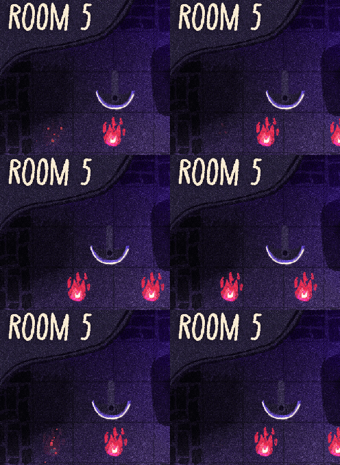
| Apr 17 12:34:06 | 20h 05m | Summon Squad | ♥ 2 | Love the aesthetics on this one! I observed a few bugs with the fireball spawning one block to the right and not being able to break the wall if there is something on the other side of it. ss2.gif And the blades getting stuck on room 5. ss.gif For improving the UX I think you should allow placing summons on the player since you can step on them anyways. It would be nice to see a "ghost image" of the summon or a highlight on the tile you are about to place to. I second continuous movement. Or movement by clicking on an nearby tile, so that the whole game could be played with the mouse (or touchscreens). Solid entry, I had fun! |
| Apr 17 16:32:04 | 3h 57m | Demon At Duty | ♥ 3 | Very cute game. I like what you did with the cooking upgrades. I think the arrow guys shouldn't hurt me just by touching. It would be also cool to be able to break arrows by dashing through them. I found the difficulty jump was a bit sudden on the second level, you could let the player get 1 or 2 more upgrades before that (or make it a bit easier with the above suggestions). Being hurt could give a bit more feedback like some audio, screen shake. Maybe adding some invicibility frames where you can't be hurt twice in a short time (or making this longer if it is already in there) would make it feel a bit more fair. Being able to kill the summoners accidently could be funny. Overall a solid entry! |
| Apr 17 16:59:54 | 27m 50s | Summoner's Basement | ♥ 2 | Cool aesthetics on the voxel models and lights. I found the minigames to be more on the annoying side and their plain look was very detached from the rest of the game, even immersion breaking. Frankly I think the game would be better without these minigames. It could be more of a cozy, combinatory puzzle or exploration game where you can check out different demons through combinations and have a laugh at those funny comments for the ingredients. The hectic minigames deterred me from trying out more than two combinations. |
| Apr 17 17:20:33 | 20m 39s | Summoning Ritual | ♥ 1 | Nice story and music. The player controls are tight and satisfying. The level with the moving stack of platforms was a bit confusing. Took a long time to realize you could only jump on the platforms from the side. I was expecting the protagonist to sacrifice themself at the end to summon back their pet, but the story was touching nevertheless! Think you forgot to add a cover image. |
| Apr 17 18:15:56 | 55m 23s | INFINIWITCH | ♥ 2 | Awesome game over all aspects! My favourite so far! I wish there was a fullscreen mode built-in or the game would capture the mouse. At the end it would be nice if the camera panned to the boss dying as I missed it because I was away from it when it happened. Great work from everyone involved! |
| Apr 17 18:30:09 | 14m 13s | Hyper Hydra | ♥ 0 | Very polished entry with all the tutorial and overall smooth controls and cohesive graphics. I feel the cards semi-covering the heads is a bit awkward, could just let the player see the heads and let the placement interaction happen on those. Because the cards contain the health and the info but the placement relative to the grid is very important and there is a bit of disconnect there with the cards' size and location. Maybe if the grid cells were as wide as the cards, it would work better? |
| Apr 17 18:52:01 | 21m 52s | Druid Island | ♥ 1 | Great little game. The foxes are surpisingly powerful! I could see this playing nicely on a gameboy advance. Would be cool to have a summon log to help remember already discovered combinations. Rocks could give cover from arrows. I guess you could omit the need for the pot clicking and just summon when the third ingredient is selected to ease the process. Overall very polished and cohesive. |
| Apr 17 19:23:13 | 31m 12s | A Heavy Crown | ♥ 1 | Good writing and results on the different choices! I think the font choice on the texts are hurting the game as it is difficult to read it. I'd suggest keeping the old styled font for the titles but using something simpler for the bulk of the text. Could be nice to have some ending text that summarizes what happened to your kingdom based on your final score. Think there is a typo at the end of the "raiders come" text with "dilema". |
| Apr 17 19:38:11 | 14m 58s | Burnout Purgatory | ♥ 2 | Good work on the sprites! I think the role icons should be on the description list to make it more clear what is what. While the inner world navigating is pretty cool stylistically, I think it actually distracts from making meaningful choices. I'd be curious to see the game with all the candidates laid out clearly, right now I think the player is more likely to just hire whoever comes first out of time pressure. Maybe it would be nice to be able to let go some summons. It's a cool concept and has nice details but overall feels a bit incohesive and like you were trying to do more than the game really needed. |
| Apr 17 20:44:44 | 1h 06m | Samuel, The Summoning Squirrel | ♥ 1 | Nice game with a chill and somewhat bitter vibe (us being the last one and fighting till the end). While the tutorial crow is nicely implemented it would be better to not have to wait for it each run. Interaction could be done with Space or mouse instead of E. At the end it'd be nice to see how far you got. Solid entry nevertheless! |
| Apr 17 21:02:20 | 17m 36s | FAINA | ♥ 1 | Very polished and cohesive game! I loved the designs of the creatures and the sail shaped particles. It would be cool to have some difficulty to the game though as winning seems like just a matter of time, but maybe this is the nature of the clicker genre. I'd still like to see a time trial or "x number of summons" restriction. |
| Apr 17 21:37:30 | 35m 10s | Hellmouth Pizza | ♥ 2 | Awesome art style and cute game overall. There is a bit of a flaw in the design in that if you mess up one pizza, you probably won't have time for the next one either (since it was running out as you were messing up the first one), but you instinctively try to solve the next only for it to also run out of time and so on, it's easy to get stuck in this vicious cycle as it is quite counter-intuitive to let go of the second pizza as well and wait for the third to appear. Maybe simply not having a second order appear at all would solve this as it's not like you can prepare or do anything with the second order until you are done with the first anyway. I'd like to be able to draw the sauce in one go, think it would provide a better flow to the game. Small detail but visually I think it would fit the style better if the customer sprites would just slide out the door instead of scale down because no other graphics scales in the game and it breaks the "printed paper" immersion a bit. There could be some ending or increased difficulty as the game can be played indefinitely if you get the hang of it and it's never ideal if the player needs to let themselves die to finish. More target shapes for the sauce or more sauce types would also be cool. To add more variation you could have some special orders without cheese or sauce or "rush orders" that run out extra fast. The paws could have a grab frame for pickups instead of dissappearing. All that said this is a great entry and it made us super hungry for pizza too ^^ Awesome job! |
| Apr 17 21:51:11 | 13m 41s | Necropets | ♥ 1 | Cool concept and mood! I think it would be nice to keep the surviving builds after battles. Making builds could be simplified, even though thematically it works well to have to pick up and bury, it becomes a bit of a chore. I'd like to have some choice in the battles but I understand the automatic mechanic comes with the genre. I enjoyed the animations and polished pixel art throughout! |
| Apr 18 11:34:27 | 13h 43m | Summoning for Dummies | ♥ 2 | Cool game! The visual polish is very nice! While the minions going to their respective spots when summoning is great, I find it to be a bit buggy, as they can easily get stuck on the pedestal and not be able to go to their place. sum.gif There is some issue with the animation mixer, possibly trying to access despawned objects or something. It seems to get worse over time to the point of becoming very laggy. The sound also cut off at one point for me never to return (when I exited the fullscreen and gone to record the above footage). Played the web version. Think you should add one or two frames to the player's walk cycle as now it seems as if they just extend one leg and hop on the other repeatedly. I felt like my small minions weren't doing much in battles and died a bit too easily. Maybe there could be a weaker enemy type at the beginning to feel more fair or just having some more visible punch to their attacks would make me believe they are trying. The stepping sound was a bit out of place for me, maybe something more muffled like you are walking on soft grass would work better for the visuals. When you have no minions following, it is a bit weird to have their sound play when pressing on a spot. Would be cool to have some cursor appear at the last point you sent your minions. Overall most of these are small nitpicks and you did a great job! Especially impressive work on getting all the tutorial and intro sequences in and keeping it all so cohesive with such a large team. |
| Apr 19 12:51:06 | 25h 16m | Mage Matrix | ♥ 1 | Cool idea with the bidirectional summon ability! I think fewer but more polished levels would help the game. Often they can feel random and there is a lot of places where you will obviously won't need to go, these just add noise. It might be worthwhile to follow the "less is more" dogma here. In terms of graphics I found the art to be a bit incohesive. Maybe the hand-drawn style of the mages could be reflected on the grid, or the reduced minimal style of the grid could be used for the mages. For example you could try applying some line art shading and less straight edges to the grid-cells or simpler icons for the castles and mages. Layout-wise I felt a bit of confusion just by the way the tiles look and the things are placed. Maybe you could drop the double white border and just have one grid line on the background to make it less busy. The mages could have their base on the intersection where they are standing. That said I wonder if the game could work better if you were walking on cells instead of the spaces between them. I think it'd be nicer if you'd restrain the user to a specific number of moves on each level. It might add more challenge and puzzle, as right now it is easy to bruteforce each puzzle and players often choose the boring bruteforce (even if it hurts their experience) if you let them. Even just showing the target moves for crystals and your progress while playing would help a bit with motivation here. It would be cool to see previous moves as traces on the levels. Instead of the "select-summoner->select-summoned->select-position" you could just let the user drag any mage over to another (given it has properly colored spaces around him), I think this would be a big improvement to the UX. Overall I think this game has potential but the levels need more reduction and you might need to introduce some other mechanic to make it easier to design more interesting levels. Examples include, a mage that can change tile colors, mage that cannot be summoned by others or mages that can only summon some but not all other mages, a mage that can't move at all, one that destroys tiles where they go and so on. Anyways, good job on the game! |
| Apr 19 19:12:40 | 6h 21m | Slimeleon | ♥ 1 | Nice game and groovy soundtrack! I wish you would summon the things at the center of the symbol you draw. It would feel more satisfying and would allow for more tactics I think. I had trouble spawning bombs which was somewhat annoying, it would often detect regular circles instead. I think it could be a rectangle or an upright triangle for easier distinction. I feel the bomb/mine looks a bit out of place, having a similar creature like the others but stationary and spikey would fit better to the rest of the game. Some levels could contain enemy mines you need to clear out. Some subtle texture on the background would really tie the graphics together. A healthbar or some damage indication for bases would be nice. Impressive game nevertheless! |
| Apr 19 20:56:54 | 1h 44m | Decades And Dragons | ♥ 4 | Awesome writing and just overall great design on this one, definitely one of my favorites from the jam! It would've been nice to be able to see the comments for each time slot just by clicking them instead of dragging and being able to check them out similarly after clearing the level (but before clicking the summon button). If a slot was outside of the current time selector it could be signalled somehow, I was second guessing a bit with the border being able to cover the selector and still be considered solved. I'm not sure the scoring based on the amount of drags is really meaningful as it is often more about just meticulously dragging them the least amount (while essentially doing the same solution). That said I'm not sure how else could different scores could be given (without designing for multiple solutions with less moves). The "skip?" prompt could appear less often or you could just have it as an always visible button on the side I think. I can see this game being expanded upon by some special ability for each character that can be used once in each round or something to make some extra modification to slots like * fighter could split a slot into two * ranger could shorten an existing slot * wizard could swap two slots in a character * bard could stick together two adjacent slots to be able to drag them using one move * thief could steal a slot from another character and put it into his own lane or the other way around Or something along these lines :) These and special slots like some that cannot be moved at all could add further opportunities to level designs and solutions. Anyways, great job from everyone involved! |
| Apr 19 21:21:54 | 25m 00s | NECRO RUSH | ♥ 5 | I like the polished and cohesive art on this one but I feel the gameplay is missing something as I don't have much choice to do anything beside wander around. I'd love to send my summons to a place or select an enemy to target to feel more in control or be able to activate picked up items when I need to instead of them being automatic. Overall it could be a nice mobile game with a bit more player agency. That said, good job on your first LD entry and welcome! |
| Apr 19 22:13:52 | 51m 58s | Principal's Office | ♥ 0 | Nicely polished art and UX and funny writing. I enjoyed the chat-like presentation of the text game formula. The mystery was well thought out, I just love to have an ending chapter where I can decide about the fate of all students and some confimation about being just. |
| Apr 20 19:32:16 | 21h 18m | Manku the Magician | ♥ 5 | Loved the interpretation of the theme and the super polished art and presentation on this one! I could see the gameplay upgraded a bit with maybe some multi-tasking mechanics (to stay true to the upcoming streamer experience) like * having to moderate your own chat by occasionaly clicking on toxic messages to not alienate other viewers * thanking donations by clicking on them when they appear, this could add some multiplier for future donos or dono chance * trying to summon items that chat requested other than the rabbits, to freshen up the main mechanic a bit Anyhow, good job everyone! PS: Think you forgot to include actual links to your socials in the credit section here. |
| Apr 20 20:27:24 | 55m 08s | Idle Hands | ♥ 0 | Funny writing and nice models! The gameplay might need a bit of shuffling for the furniture and rooms to make them a bit different each job. Hiding items in wardrobes and including red herring items would add a bit more to the searching mechanic. |
| Apr 26 14:13:02 | 137h 45m | Rosabelle | ♥ 0 | A promising solitaire game with a nice atmosphere and design. My biggest issue was that I don't know how to flip. My assumptions were * clicking the yellow number on the hover popup on a dice * double clicking on a die * dragging the die onto some "flip area" on the table Later I realized I had to pick up and put the die onto the flipped value which is something I thought of very late (after trying to complete the game without flipping), because the hover menu disappear normally when trying to click it without a dice which made me assume it is purely visual and non-interactable. Other than a more intuitive or explained flip, here are a few improvements I could think of * being able to drag dice onto cards instead of "pickup->drop", I was repeatedly trying to drag and drop on instinct, only to lock and having to unlock instead before being able to continue the proper way, not sure if locking alone is even an action that should be in the game as placing a die on a card already locks it and you usually want to lock with regard to a card anyway. * sets on die could be shown without having to hover, surely one can learn the sets but as a newcomer much of my gameplay was spent on hovering and inspecting different dice to find my targets were instead of making statistical decisions. I think this hurts the gameplay the most. * locked in the same round (unlockable) and permanently locked (from previous rounds) die should have some distinct visual clues, same-round locked die should be able to be burned without having to unlock first * die that were placed on a card to be locked could stay there for the next rounds A couple of other nit-picks * different die could use some separate color scheme as well as being smooth/flat * having to roll the die after it was already rolled in a sense is a bit confusing, they could just spawn in the air or appear in the middle of the table without being thrown/rolled * the camera could use a smaller FOV and be farther so that the die on the sides don't get as much perspective distortion * the candle light sticking out of view at the top of the screen while everything else is contained inside feels a bit off * actions like burn could have audio clues to be more engaging * the die row could have the top numbers aligned upward or the die could be left on the table for a more authentic boardgame feel Overall I think the game has potential but I feel like its presentation hurts it as it falls between not embracing the possibilities of showing enough information in the digital context and not going full analog simulation either. If the goal is to have an immersive experience * the camera could be zoomed in and die should not be picked up in a neat row but instead just lay where they landed after thrown * every interaction should be done by moving a die somewhere on the table * die should not be stacked on cards so that their sum can be read without additional UI * die sets could be shown as a permanent pamphlet on the table instead of the hover popup (which could also open up to show the rules as well) If the goal is to be a thinky videogame, the game could have much more UI and information visible at once, there is much available space and hovering for information is not the best experience imo. Instead the game could show * each die type and their sets in a legend on the side or around each die at all times * incoming die in next rounds * the remaining values on cards * hovering should be reserved to highlight contextual stuff, like if you hover a diamond card, your die with diamond values get highlighted and vice-versa I am tempted to suggest the first approach because the summoning mood and atmosphere is worth preserving. Would be nice if the game summoned something at the end. |
| May 1 12:18:59 | 118h 05m | HTON | ♥ 1 | Good world building with so little stuff. A nice example of minimalism. I think you should either allow the player to select a choice with the mouse or step the textual parts with Space or Enter. Gameplay-wise I felt like much of the choices were not too intriguing, ignoring the call and rejecting help leads to no interesting outcomes, maybe if the game said something about what happened at war or hunger/famine with the people after you've rejected to respond would make these choices more interesting. Some progress that would carry over between runs would also be nice. |
| May 1 12:36:11 | 17m 12s | Summoner's Pit | ♥ 1 | Good job with the textures and look of the arena, also cool music! I think the game could be improved with a bit more juice, particularly for killed enemies, them popping out of existing without much feedback is not as satisfying as it could be. Being damaged should have some sound effect or more feedback in general. Most times I was killed by enemies from behind without noticing them which is a bit of a let-down. To combat this issue the newer Doom games for example made it so that enemies outside your field of view will be less likely to attack you and damage less, they will also try to get in front of you to attack. The former tweak is somewhat easy to implement and could already make a big difference in game-feel I think. You should try enabling threads (and SharedArrayBuffer support on the host), not sure if it's possible on the LD page but on itch.io this fixes the stuttering audio on Godot web builds, which happens on this game as well. |
| May 1 12:59:10 | 22m 59s | Tug Of Slime | ♥ 0 | A nicely polished entry with a cute and cohesive art style! I found the game to be a bit hard even on easy mode first, but once you get a lead and just spawn the 50 mana slimes you can easily overpower the enemy. Only talking from trying Easy and Normal but I think there could be more incentive to spawn the smaller or bigger units. I was never anywhere close to unlocking the last spell either so that might need to be a little cheaper to have actual use. The view dragging could match the distance your cursor travels to feel less floaty. The game could have some target limit so that slimes could attack the base if there are enough of them already attacking the one spawned enemy slime in front. Being able to cancel the fire strike spell would be nice. Good job anyways! |
| May 1 13:31:27 | 32m 17s | And Don't Open Your Mouth Again | ♥ 1 | Solid writing and cool interface on this one! That said, I am not sure if the control really serves the game and some people who would otherwise enjoy the writing and exploring the case might bounce off from the game because of the relative clunkiness of typing commands. I think the vibe could still be preserved with the same look and feel if you had a bit more menus where you could pick entries from a list while staying with character-based rendering, like how the "new wave" of terminal apps do it, for example [lazygit](https://github.com/jesseduffield/lazygit) instead of vanilla git. You could * always have to focus on the input field even if the user scrolls the view, if you focus the text your up-down-enter will work but backspace and characters do not. * drop the "The" from the name of topics, it makes you feel like you need to type that even if you don't * if not going the menu route, let the player choose interactively with numbers or initials like many CLI programs do for multiple choice prompts and lists * the input field locking when doing "Next" for text blocks felt a bit antithetical to terminals, although I get why it's good to have the text appear in chunks and not sure what would be a better way to progress * the colors of jurors could be shown on the list provided by the output of the empty `interview` command * make it even more minimal by having the command prompt be on the same area as the output like regular terminals (instead of the separate input field and "Send" button) * add some sound to user typing and sending the command to make it more immersive |
| May 1 13:48:26 | 16m 59s | Ballad of Lead Shroud | ♥ 1 | Cool idea with the piano notes on interactions, it adds greatly to the mood! I think you should capture the cursor on every click in web builds for these type of games, so that the game doesn't become unplayable if you ever hit escape and want to come back. I was a bit annoyed in the ending corridor by the texts appearing and stopping me at wherever I was and wherever I looked at the moment, it also felt a bit awkward. I don't think it's a good idea to take away the control from the player this repeatedly. You could just have a longer corridor and let the sentences appear as the player walks toward the end to make it all feel more fluid. Think you missed a chance to add a bit more detail by not specifying the favorite record and book as you did with the absinthe. |
| May 1 14:01:54 | 13m 28s | Nexus Conquest | ♥ 2 | Nice graphics and music! There is a lot of depth and detail here but the game falls a bit short at the level of fundamental controls and pacing. Think you should make it work with mouse or at least let the player step through the crew with keys instead of having to navigate to them for selection, this was by far the most hectic aspect for me and it makes the game much slower than it could be. There is a bit too much moving around as well without any interesting choice to make or action to have, you could make smaller levels or somehow let the player move multiple units together to help with this. Either way, it's an impressing entry, especially considering your team size which I imagine could have been hard to coordinate. |