Foon → Ludum Dare Explorer → LD50 → Feedback comment stats → Antti Haavikko
Feedback comments for LD50
Antti Haavikko's games and stats for all events →
| Timestamp | Since previous | Game | Antti Haavikko's comment | |
|---|---|---|---|---|
| Apr 4 12:46:36 | LightQuest | ♥ 1 | Did you forget to hit publish on your itch project? It's showing 404. | |
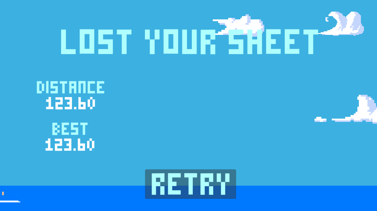
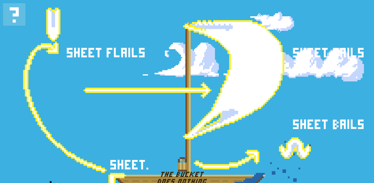
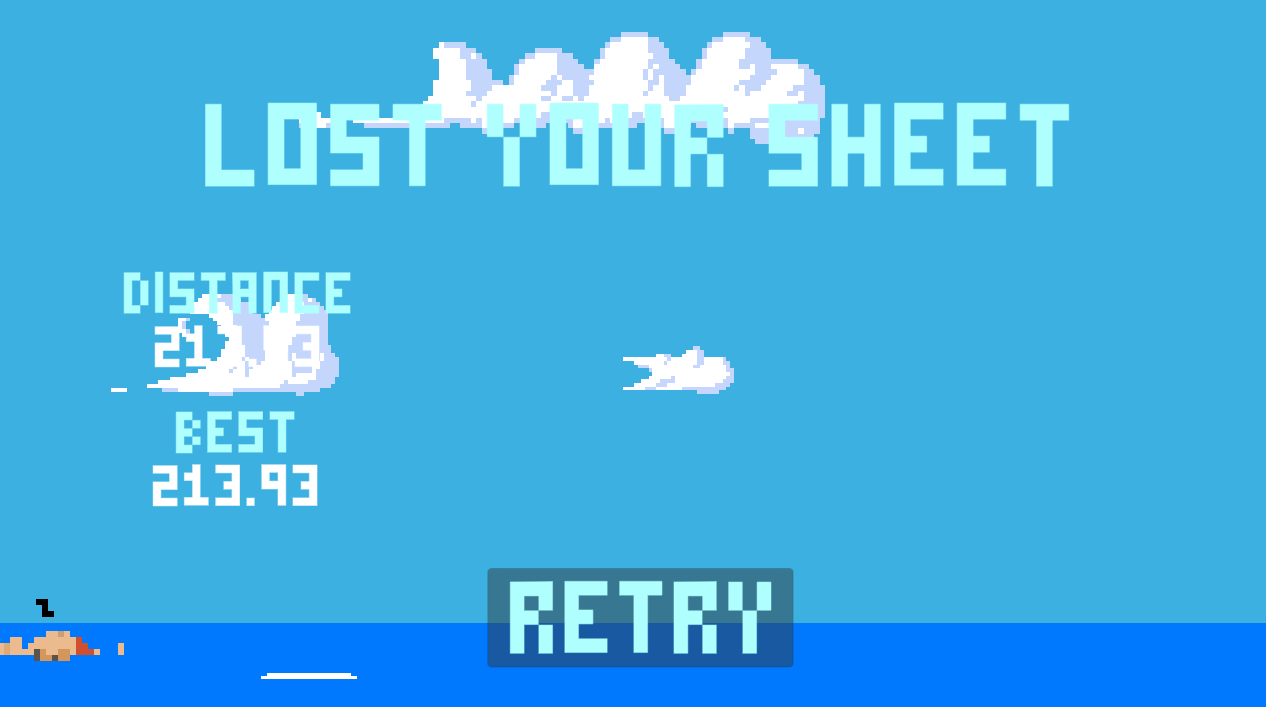
| Apr 4 13:35:01 | 48m 25s | Losing Your Sheet | ♥ 6 | Pretty neat! Screenshot 2022-04-04 at 15.56.20.png The instructions were confusing. I think they actually made the game harder. But I did kinda enjoy trying to figure it out, it's a big part of the fun as the main game loop here is quite repetitive and gets quite boring fast. Oh and the help texts getting masked by the clouds didn't help either. Screenshot 2022-04-04 at 15.50.11.png Looked quite good, pretty pleasing colors and so on. The pixel art looked nice but the pixel size was all over the place. Nice water physics too! But could have used more particles (to make it look nicer) and a more consistent pixelated style for those too for consistencies sake. Aight, went for some more tries and I'm calling this good enough... Screenshot 2022-04-04 at 16.27.42.png Sadly the best strategy seems to be the most boring one. Just sit there doing nothing for a good 2 minutes. Ie. ~125 distance so good job @thoastbot for achieving on getting less than what you do by doing nothing. 😉 Then just clear the boat whacking the dude and repeat as long as is needed for the boat to be empty. Then just rinse and repeat until you get bored and fail on purpose. It seems like the difficulty (dude splashing and boat splashing increase) ramps up fast around 120 to 130 but it doesn't get any more difficult after that. The dude slapping was annoyingly finicky. Even a fraction of a second of him splashing will mean tenfold that time emptying the boat again. And I tried all the things from wildly waving the sail in the sweet spot to slowly and accurately trying to time a slap when he gets on but found no good rhyme or reason on how to do it with minimal (or no) splashes. So yeah, that's about it. Good job! 👍 |
| Apr 4 14:40:18 | 1h 05m | Anonymous VS Death | ♥ 1 | Yeah the WebGL version worked just fine for me. So umm, where to start even... First I thought that the bomb double jumping wasn't intended mechanic as it made the stages pretty much trivial. But then I reached the final level (I think as I didn't manage to beat Skeletron) and seems like it was indeed intended as there was no other way up. The controls didn't feel great. As a platformer it got stuck on edges and so on but it didn't matter as much as I was always just holding jump and flappy birding around dropping bombs on fools. The zoom mechanic was completely pointless in my opinion. Well at least you could remember the zoom level the player had set so I wouldn't need to fully zoom out on the start of each level/run. But why would anyone ever be less than fully zoomed out? And same goes for the map, you could have the it remember the level the player was on. Those two annoyances were probably my biggest deterrents with repeatedly trying to beat ~~Skeletron~~ Death. And the boss design next then! Broke some cardinal boss design rules here. The swings were completely untelegraphed ie. unavoidable and up to luck really. Didn't feel like there was any pattern and the boss might just randomly swipe you to death at any point where ever you were. Or maybe it's just my old man reflexes not being quite up the par for the task. On your next project, familiarize yourself with Unity's canvas scaler component that is automatically added to each canvas. You can use it to make UI elements be proportionally sized so they won't be like 50% of the screen on non full screen mode as they are now. Haha I completely feel you on that "waiting for Unity compiling etc" stuff. Feels like assembly reload has gotten awfully slow for any non nearly blank project since like few years ago. Might wanna revise yourself with the compo rules at least on the using existing sounds/music part. Don't see any link for sources either unless they're included with the Windows executable. Anyways, good job! 👍 |
| Apr 4 18:30:30 | 3h 50m | Cleric Wanted | ♥ 1 | Close call but managed to pull it off (with the whole party alive too)! Screenshot 2022-04-04 at 21.04.43.png Can really relate to this as always a healer class player in MMOs. 😆 At first it seemed like it'd be mega grindy. But of course it wasn't as there wasn't really much more to do besides get more party members and repeat the same stuff until you beat it. So my first party member pick was the tank. Tanks are the healers best friends, right? How could I have been that wrong, they're worthless! So I just stood there in the dungeon with him doing jack shit but hey, at least I was learning what the UI elements actually mean (needlessly confusing btw, more on that later) and how to do stuff. So my next line of logic, tanks don't work so lets go full DPS and get a mage friend. And that was indeed the correct route. Few trip down the dungeon and I had cleaned the shop, now time to go for the clearing goal. I did try the tank again and gave the goon a chance too but they didn't really seem to be any better than going triple mage. Tank just stands there, sure soaking a lot of damage but so does an empty space. Goon was like a worse mage, dies just as easily but doesn't do that much damage. So yeah, me and my 🧙♀️🧙♀️🧙♀️ friends managed to beat the dungeon by the skin of our teeth (or just two of them actually). It did have some spark of interestingness kick in near the end when the rotation of your three spells actually mattered. Could be still made more intriguing though with more spells and more choices. Oh and that one (expensive) spell even being completely uncastable wasn't cool. 🤬 Kinda funny how it was the exact opposite on how healing works in FFXIV. There you mainly heal with your cheap spells and bigger ones are more like the panic one and comboing one. And here it was so that the biggest was the most hp per mana spent but due to long cd, you couldn't only rely on that. Neat! But yeah, it would really have needed some deeper mechanics like the tank actually holding aggro etc or maybe some actual control on the party members even to fully shine. But it was very boring at start and when it started showing some signs of difficulty and actual needing to do something else besides masking a single button, it was over. So it really should ramp up more smoothly from mashing single button to complex rotations in the end (could be a bit more complex as it was now) more smoothly where the monotonous starting bit would be over sooner too. So the UI was confusing and way too complex. Only the top bit with the actual characters was needed. The player/selected panels were just making it more confusing than it needed to be. Would have also helped if the enemy sprite on the first level was something completely different looking than the player or hires to more easily make it clear who is who and what is what when getting started. But yeah, very fun game. Sadly it ended up being a lot more thin that at what it first seemed and left me wanting for more in the end (which is a good sign). Good job! 👍 |
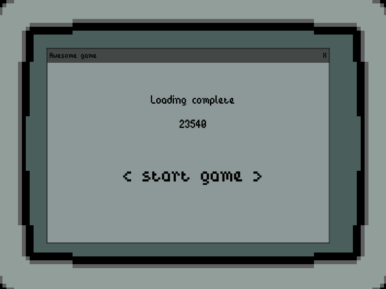
| Apr 6 13:43:49 | 43h 13m | Loading... | ♥ 3 | Neat! Of course it's not the most original concept in the world but with a nice art/story(ish) and plays pretty well. A weird setup to require mouse input for menu (and restarting) while everything else is keyboard only. Screenshot 2022-04-06 at 16.41.10.png At first I though that horizontal movement was absolutely pointless and you should be just fixed to right edge and always shoot that way. But yeah there are situations where you need to snake behind the gnome who is blocking your shots to a crate. The crates overwhelm you so fast that it really isn't needed cause your time is better spent on just focusing on unblocked crates. It was somewhat annoying how after just a few seconds, there is too much stuff for you to really handle and it's just trying to mow as much as possible. Sure it fits the theme but doesn't make it feel any better really. The biggest issue with this really to me seems to be the large height of the play area and the slow movement of the gnome. In the same time where you move from top to bottom, one newly spawned crate has already moved to the center point of the screen. Of course you do want the player to miss them too but might feel better if it wasn't that much that soon. The punishment for missing could be more and the amount missed less still resulting in the similar amount of play time. The box spawning could start with a smaller y difference from the middle and slowly increase as the game progresses. The other gnomes were a nice design touch. They really nicely punish for mindlessly spamming your way through the game. And having them linger there for a bit even after getting shot so they soak up even more bullets if spammed was the cherry on top. Good choice! It was quite hard for me to try to align myself properly for long shots. The screen being "backwards", the flat background and the long distance are surely the reasons for this. Did you toy around at all with an idea of a laser sight or something like that to alleviate the problem? I guess there was some kind of bullet limit too. Sometimes shooting just made an annoying boop sound and no bullet came out. Any specific reason for this choice? It felt arbitrary and pointlessly punishing for having fun. This isn't NES and Mega Man where you can only have few sprites on the screen at once. I would also go as far as have the shoot button be able to be held down to shoot constantly. You already had a minor knockback on the player while shooting so that (and the civilian gnomes obviously too) would still make sometimes not shooting mandatory. The sprite work did look nice but could still be improved. The thing that I'd change the most was the bullets. Could be bigger and brighter for more clear visibility/contrast. No need to try to mess with the classics, I think a decently sized white circle would be the best call here too. A bit more oomph in the juice department wouldn't hurt either. Stuff like screen shake for explosions, muzzle flash and so on are super quick to add but make a huge difference on how the game feels. The sprites should also be ordered by their y position so that the stuff would appear to be in correct depths. The music was ok and the sound effects weren't anything to write home about. Bfxr/sfxr bleeps and bloops work just fine (for me at least) but some variety would be needed. Most easily achieved by adding a bit of random pitch shifting when playing samples. And if you go a bit further and composite your effect from two different pitch shifted sound samples the received variety spikes up even more. The gnomes getting shot would have needed some sort of sound effect too in my opinion. I also came up with my own genocide game mode... Screenshot 2022-04-06 at 16.12.46.png Dang, looks like the character limit on posts has been decreased. To be continued... |
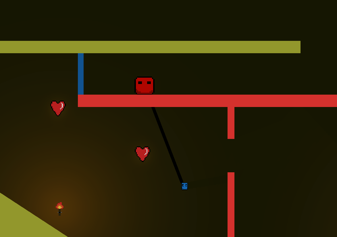
| Apr 6 15:22:00 | 1h 38m | Colorful Love | ♥ 1 | Finally managed to beat the last pesky level! Screenshot 2022-04-06 at 17.49.54.png The last two levels were really annoying. If the second to last on you couldn't really see what was going on in the first jump and the drop down then seemed very up to luck how the smaller slime would like to bounce around uncontrollably. But the last level was truly a challenge (to my patience too). The first jump started off tricky and I though it was BS up to luck as you sometimes just swing to the ceiling but learned to positioning the bigger one is the key to success here. The gap was needlessly tough though. Having that precise jump that you need to repeat over and over again with unwieldy controls isn't too fun. But of course the main challenge was still ahead... Screenshot 2022-04-06 at 17.47.31.png This thing was so damn annoying. For either of those two hearts, doing anything but the absolutely perfect movement meant instant death. First I tried doing it my stopping the blue one under the heart and then jumping with red one but obviously that meant death. And trying to stop that swinging was a nightmare. And that notoriously placed blue wall was such a dick move too. Then I tried going with speed and grabbing the left one first. Well of course the rope shortening will pull the blue slime straight to wall, what a surprise. But yeah, eventually did manage to pull it off. The most disheartening part about these tries was the god damn delay between. Sure that transition looked cool but delay after death to transition, then the transition itself and as a cherry on top a (luckily skippaple but that was glitchy too) story moment every try. Those story things were a nice touch and a cool way to kinda tutorial the game but no need to show it every time (and even have a dedicated button for skipping it, could at least hide it when movement starts). In though games restarting needs to be QUICK! Well, this wasn't that tough really so it'd be forgivable without the forced speech bubbles but it has some potential to get much harder if more content is introduced. Obviously it would be easy to come up with more content as this was just scratching the surface even with just these mechanics. I did like the look of it. The were few quite off-putting visual glitches that made it less appealing. There was some flashing black stuff periodically visible, I think it was the shadow going out of controls I think when the slimes aligned perfectly. Maybe due to dunno, a bit erroneous angle calculations or something. You know, sin and cos and stuff. 😅 Another small visual interference was that the rope didn't properly attach to the small slime all the time. Sometimes the gap was even the same size as the slime itself. There were also two kinda different art styles fighting against each other here. The pixel style of the characters, torches and so on and the flat vectory style of the environment, lights etc. Probably sticking with just one style and making everything fit that would be better. Oh and there was another visual glitchiness with the speech bubbles too. Sometimes when the text was wrapping to second line, the background color couldn't keep up and for a split second the text was overflowing the box and it looked ugly. But yeah, these few annoyances are of course just visual and super small but I do mention them because otherwise the game looked very sharp and nicely polished. The controls were a bit janky. Could use the default 2d platformer treatment. Jump buffering (not that important in what was needed at its current state), coyote time (so letting player jump for a fraction of time even after running off the platform) and bigger gravity after peak of jump (to make it less floaty). By the way, I've had a very similar idea for a game floating around in my head at times. Never got around to work on it and dunno if I ever will either. 🤷 But yeah, awesome game, good job! 👍 |
| Apr 6 16:04:31 | 42m 31s | Knighthood | ♥ 2 | Almost 💯. Screenshot 2022-04-06 at 18.38.46.png The look was ok but could use a whole lot more feedback. I have no idea if the enemies were damaging me or if it was just the time. And you already had red flash when the melee attack damaged the parasites, the laser could do the same so the player actually knows they're doing something. And if the enemies indeed were damaging the player, the same treatment should be done to that too. The melee swing could also get some more visual swing arc representation. If you've ever played games like Strider or Hollow Knight, you'll know what I'm talking about. The range was very hard to figure out due to no visual feedback. The melee attack speed also felt annoyingly slow. That and the enemies were needlessly tanky. Having two different attacks felt pointless. You really couldn't effectively use both and the laser did so little damage (also awkward to shoot, why not just require RMB?) that after some trying it out I ended up just going full on melee. The melee was also able to attack multiple enemies per swing as it hit everything around you it seems. The laser look didn't really fit with the look of everything else being pixel art either. The pixel art was nice but the pixel size wasn't consistent and varied on pretty much every separate sprite. Keeping everything the same scale will make it look more cohesive and consistent. The texts in the intro were notoriously hard to read due to being so low resolution and still scaled that big. Good job on spacing the intro tutorials to different small sections though instead of just showing a huge wall of text. But having them shown in the middle of the game would really have been the way to go (as the action wasn't that hectic in the start anyway). Having some marker show up where the parasites would spawn as a bit of a warning would have been nice. Now they can (and will) kinda surprise corner you. The gameplay loop also a bit repetitive and the scoring is boring. It could be easily made more interesting with some other pickups besides just health and maybe some kind of multiplier system to beef up the score system giving it more depth and hence replayability. The sound work was a bit meh. Very little different sound effects and no variety it them made them not great to listen to. And the mega short and simple music loop didn't really help here that much either. Adding even a random pitch shift to sounds would have done wonders adding variety to em. Good job! 👍 |
| Apr 6 18:30:28 | 2h 25m | Fountain of youth | ♥ 2 | Can't really say I loved it. Kinda soft lock the game. So many places you get stuck on and have no to proceed than just wait for death... Screenshot 2022-04-06 at 20.44.21.png Making the player just flat out wait is never a good design choice. On my first time I even got completely soft locked as I somehow lost the key I got from the left side and ended up with just two keys and an empty map. The whole using keys to get more keys stuff was super confusing too. Making the three keys you need to pass to the end of the game be something completely else would have been so much better. After restarting completely it was a breeze though and two manned it. Would have even had enough time to do it with Robert but I don't think there is a way back up to get to the right side double keys after opening that door without respawning. Or is there? Screenshot 2022-04-06 at 21.08.16.png It was really hard to look at. Not that the art work was bad but there wasn't enough contrast between the ground and the back wall. The character animation was a bit odd though. You just decided to do a mix between idle and walk and use the same for both? It also kinda looks like flossing. The paintings were awesome though, I think I recognised almost all of em. The dungeon could also use more "landmarks" just like those paintings to help differentiate areas from others. Not everything looked very much the same and was super easy to get lost and because of that fall to the same soft lock traps again and again. The walking speed was painfully slow even for the younger side of the character and obviously it got notoriously awful with elder folk as in addition even clearing single tile gaps became a pixel perfect jumps. And having long corridors with a dead end and a "prize" of a bit less time back than what you wasted exploring that nook doesn't feel very rewarding. I guess you had some dedicated audio guy and the music pieces do sound nice. Not very fitting to the game overall theme and feel though. But where are all the sound effects? They add so much atmosphere and tactileness to games. Anyways, it wasn't bad at all even if I'm just complaining about stuff. 😅 Just quite a few frustrating things that could have easily been avoided. Good job! 👍 |
| Apr 8 08:25:52 | 37h 55m | Operation Slow & Steady | ♥ 2 | Cool! It was very much on the easy side, especially being that short. Screenshot 2022-04-08 at 10.51.04.png I love the MSPaint aesthetic! But everything should have been the same style, now there was a mismatch of two different styles, the paint one and the more pixel arty style of the environments, boxes etc. The simple but very effective character animations too! Could spice them up a bit more by adding some squash and stretch. The space key icon is flipped upside down by the way. Usually space is depicted as |______| instead. Took me surprisingly long to figure out what that picture meant... 😅 Screenshot 2022-04-08 at 10.46.41.png The ordering of the sprites seemed to be a bit all over the place. Snail walking behind doors etc. Didn't look quite right. Also the sliding doors looked a bit glitchy with the boxes on em. Ahh, that's probably cause the doors are actually straight up on/off and the opening and closing animations are just visual. Noticed this in that level where you drop the box on the button right next to the end door. If the door opening was the same as the animation, you could just open the door by standing on it and then quickly running through. The controls were pretty damn good. Really a rarity in jam games so kudos on that! The jump felt good and weighty and even the wall jumps were smooth and nicely controllable. The only thing is that the falling speed should probably decrease while wall hugging. It's always annoying when the game is completely playable with keyboard but you need to use mouse for menus and restart. Especially if the difficulty were to increase, this would become a huge annoyance on restarts. You could skip a portion of (I think it was) level three by just ignoring the boxes and going up to the door with wall jumps instead. The second to last level was a bit tedious with that much repetition. Biggest annoyance on it actually came from not seeing the snail off screen and then dropping on straight on it. So it would be nice to have some indicator on the edge of the screen pointing towards the snail if it wasn't visible. Other thing was the amount of buttons and getting confused on what triggers what. Easy solution here would be to have a visible cable connect between a button and whatever it controls. Both of these changes would keep the difficulty of the level exactly the same but just save some stupid mistakes and time waste. So yeah, fun game. Not the most innovative one in the world and the theme connection was a bit of a shoehorn. In the end it did leave me wanting for more so I guess that's a good sign. Good job! 👍 |